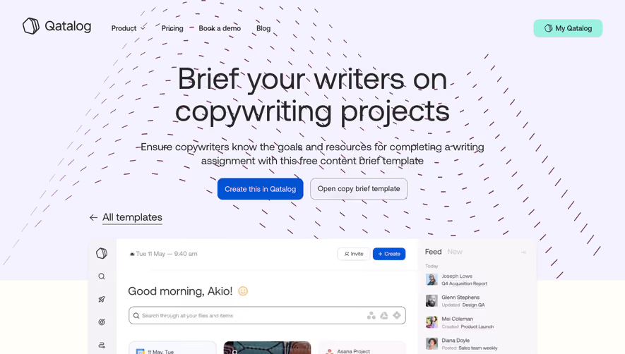
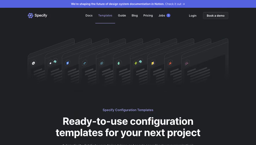
Generate a new design based on this screen using your own content.
Thank you! Your submission has been received!
Oops! Something went wrong while submitting the form.
# Design from Reference: Figma Templates Library
Create an original, high-fidelity visual design inspired by the reference. Prioritize composition, typography, colors, spacing, and component styling over technical implementation.
## Reference
- **Product:** Figma
- **Category:** Templates Library
- **Screenshot:** https://cdn.prod.website-files.com/5e9dc792e1210c5325f7ebbc/62ec9c6e3da29ee7baf53ab6_1659621509864-screenshot-device-bfa79163a521004e369ed204232730b3-1659601151431.webp
Analyze the screenshot first. If inaccessible, request it rather than guessing.
## Content
{{content.instructions}}
{{content.data}}
Preserve essential messaging and factual accuracy. Adapt structure and copy length for visual balance; never invent product claims.
## Visual Design
Use this context to reproduce the reference's visual language: layout, typography, colors, spacing, borders, radii, and distinctive elements. The screenshot takes priority if descriptions conflict.
## Direction
{{preferences.fidelityInstructions}}
## Output
{{output.instructions}}
Deliver a polished, cohesive design with precise alignment, hierarchy, and spacing. Produce the requested visual artifact, not just a description. If unsupported, explain the limitation.
Figma’s Templates page embodies a sleek, modern aesthetic with a strong emphasis on clarity and creativity. The design is unapologetically minimalist—ample white space balances vibrant accent colors, ensuring the focus remains on the product visuals. Professional without being sterile, the interface feels accessible to novices and inspiring to seasoned designers alike.
Layout and Structure
The page opens with a bold hero section that immediately communicates its purpose with concise copy and impactful visuals. An intuitive grid layout follows, showcasing template categories with visual previews and subtle hover animations. While the structure skips typical SaaS elements like testimonials or pricing due to the nature of the content, the sticky navigation bar and well-organized footer ensure seamless exploration and easy access to related resources.
Visual Elements
High-fidelity template thumbnails dominate the visuals, acting as eye-catching entry points. Soft shadow effects and micro-animations on hover make the browsing experience interactive without overwhelming users. Custom icons guide users between template categories, and subtle UI elements like dividing lines enhance organization.
Color Palette and Typography
A disciplined yet lively palette pairs crisp whites and grays with bursts of Figma’s signature purple and playful gradients. Typography is both readable and elegant—sans-serif fonts, well-sized headings, and clear hierarchy guide attention from headline to CTAs, emphasizing simplicity and sophistication throughout.
User Experience Patterns
Consistent sticky navigation, intuitive filtering, and clear primary buttons support rapid exploration. Infinite scroll presents new content seamlessly, minimizing load times and maximizing inspiration. Thoughtfully placed CTAs and a robust footer drive engagement without distraction.
Unique or Notable Design Choices
Noteworthy touches include dynamic hover states, the immediate preview of templates, and a sense of *creative momentum*—the interface invites experimentation and discovery at every turn. The page’s tone balances innovation and trust, further cementing Figma as a destination for design excellence and user empowerment.