Design with AI
Generate a new design based on this screen using your own content.
# Design from Reference: Fiberplane User Onboarding
Create an original, high-fidelity visual design inspired by the reference. Prioritize composition, typography, colors, spacing, and component styling over technical implementation.
## Reference
- **Product:** Fiberplane
- **Category:** User Onboarding
- **Screenshot:** https://cdn.prod.website-files.com/5e9dc792e1210c5325f7ebbc/6acbca328313d4c6c0cc4016_6acbc82d476aea3982e5f6b2_cms-86f9215e688dcac684d2493d.webp
Analyze the screenshot first. If inaccessible, request it rather than guessing.
## Content
{{content.instructions}}
{{content.data}}
Preserve essential messaging and factual accuracy. Adapt structure and copy length for visual balance; never invent product claims.
## Visual Design
### Overall aesthetic
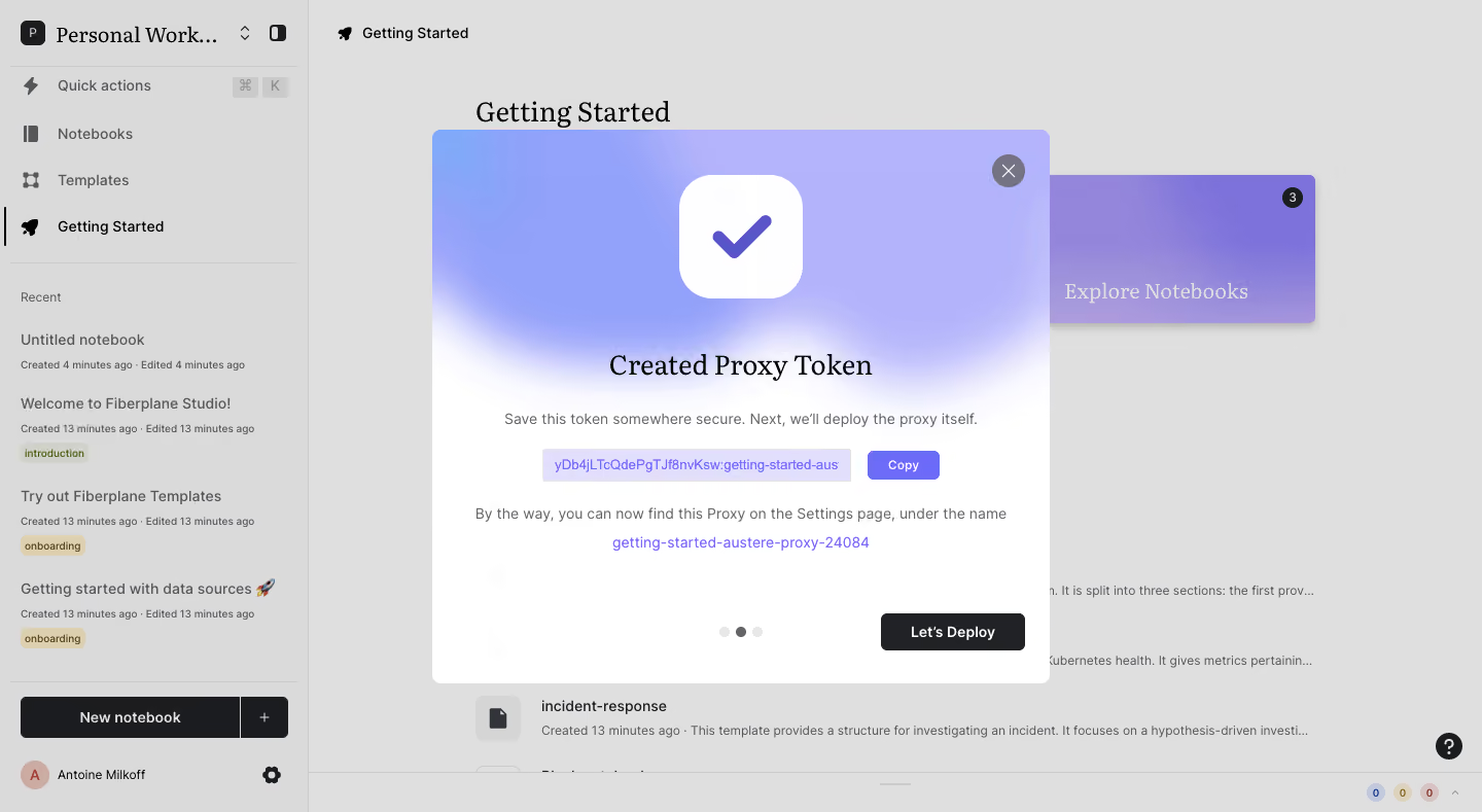
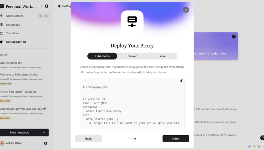
- **Character:** A notebook application onboarding success modal with a soft purple gradient, large check icon and contrasting dark next-step action.
- **Evidence scale:** Original 1440 × 789 pixels. Dimensions are image-pixel estimates; sampled backdrop grays include the visible scrim.
### Page composition
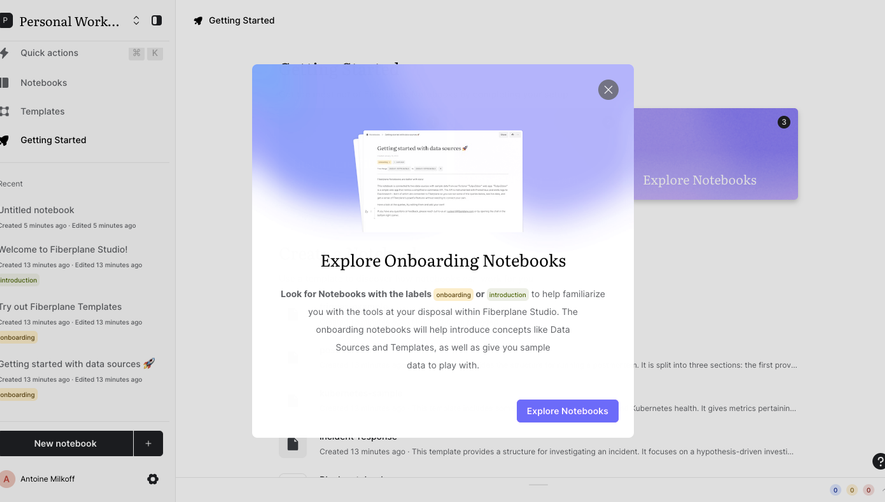
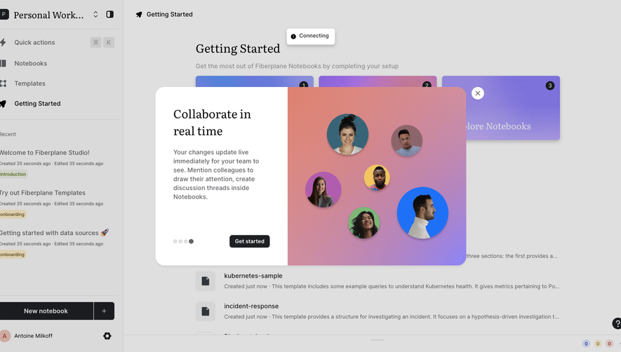
- **Underlying shell:** Left workspace sidebar and Getting Started content remain visible beneath a dim overlay.
- **Modal:** Approximately 600 × 538 px centered white panel begins around x420, y126.
- **Header area:** Large white rounded-square check icon sits over a blue-to-lavender gradient fading into white.
- **Body:** Centered serif success heading, explanatory line, token display with Copy button and a second explanatory/link block.
- **Footer:** Three progress dots center near the bottom; dark Let's Deploy action aligns right.
### Information hierarchy
- **Success:** Oversized check and serif token-created heading lead.
- **Credential area:** A lavender text strip and small purple Copy button draw attention to the generated token without requiring its characters for visual reproduction.
- **Next step:** Dark deployment action is strongest at the bottom.
- **Progress:** Middle of three dots is darker, indicating the visible step position.
- **Background:** Notebook list and introductory content remain secondary under the overlay.
### Typography
- **Modal title:** Unverified serif, approximately 28 px regular with 36 px line height.
- **Body:** Unverified sans-serif around 14 px regular, 22 px line height.
- **Token/link:** Approximately 14 px sans-serif in purple; actual token characters are intentionally not reproduced.
- **Buttons:** Around 14 px medium; dark action label semibold.
- **Background:** Serif workspace/page headings contrast with sans-serif sidebar metadata.
### Colors & surfaces
- **Modal:** White #FFFFFF.
- **Backdrop:** Sampled #DFDFDF and #DADADA are composited dimmed surfaces.
- **Gradient:** Lavender #B3B3FB/#B4B4FB and blue #92A1FA fade into white.
- **Credential surface:** Pale lavender #E2DFFD.
- **Action:** Near-black #1B1C1F; purple check/Copy accents.
### Components
- **Modal shell:** Approximately 8 px radius, with no heavy visible border.
- **Success icon:** Roughly 120 px rounded white square and thick purple check.
- **Close:** Gray circular control with white cross at upper right.
- **Token row:** Lavender inline code-like strip beside a compact purple Copy rectangle.
- **Next action:** Approximately 140 × 36 px dark rounded button.
- **Progress:** Three small gray dots with darker center.
- **Background sidebar:** Workspace selector, quick actions, notebooks/templates/getting-started links, recent items with tags and a split New notebook control.
### Visual rhythm
- **Centered stack:** Icon, heading, explanatory copy and token row align to one center axis.
- **Spacing:** Large gap between icon and title, compact credential rows and generous empty space before bottom controls.
- **Layering:** Scrim and high-contrast modal establish depth while preserving context.
- **Footer balance:** Centered dots and right-aligned action separate progress from navigation.
### Responsive
- **Observed limit:** Desktop modal only; mobile behavior is unverified.
- **Recommendation:** Use a fluid modal within viewport gutters and allow long token displays to scroll or wrap safely.
- **Interaction recommendation:** Keep Copy, close and next action keyboard-accessible, with clear focus and announced success state.
### Adaptation guidance
- **Retain:** Pair successful credential creation with a clear copy control and explicit next step.
- **Implement:** Use soft gradient celebration, restrained body copy and a strong dark progression action.
- **Verify:** Confirm fonts, scale and actual copy/deployment behavior separately; no token was copied, used or deployed.
Use this context to reproduce the reference's visual language: layout, typography, colors, spacing, borders, radii, and distinctive elements. The screenshot takes priority if descriptions conflict.
## Direction
{{preferences.fidelityInstructions}}
## Output
{{output.instructions}}
Deliver a polished, cohesive design with precise alignment, hierarchy, and spacing. Produce the requested visual artifact, not just a description. If unsupported, explain the limitation.