Design with AI
Generate a new design based on this screen using your own content.
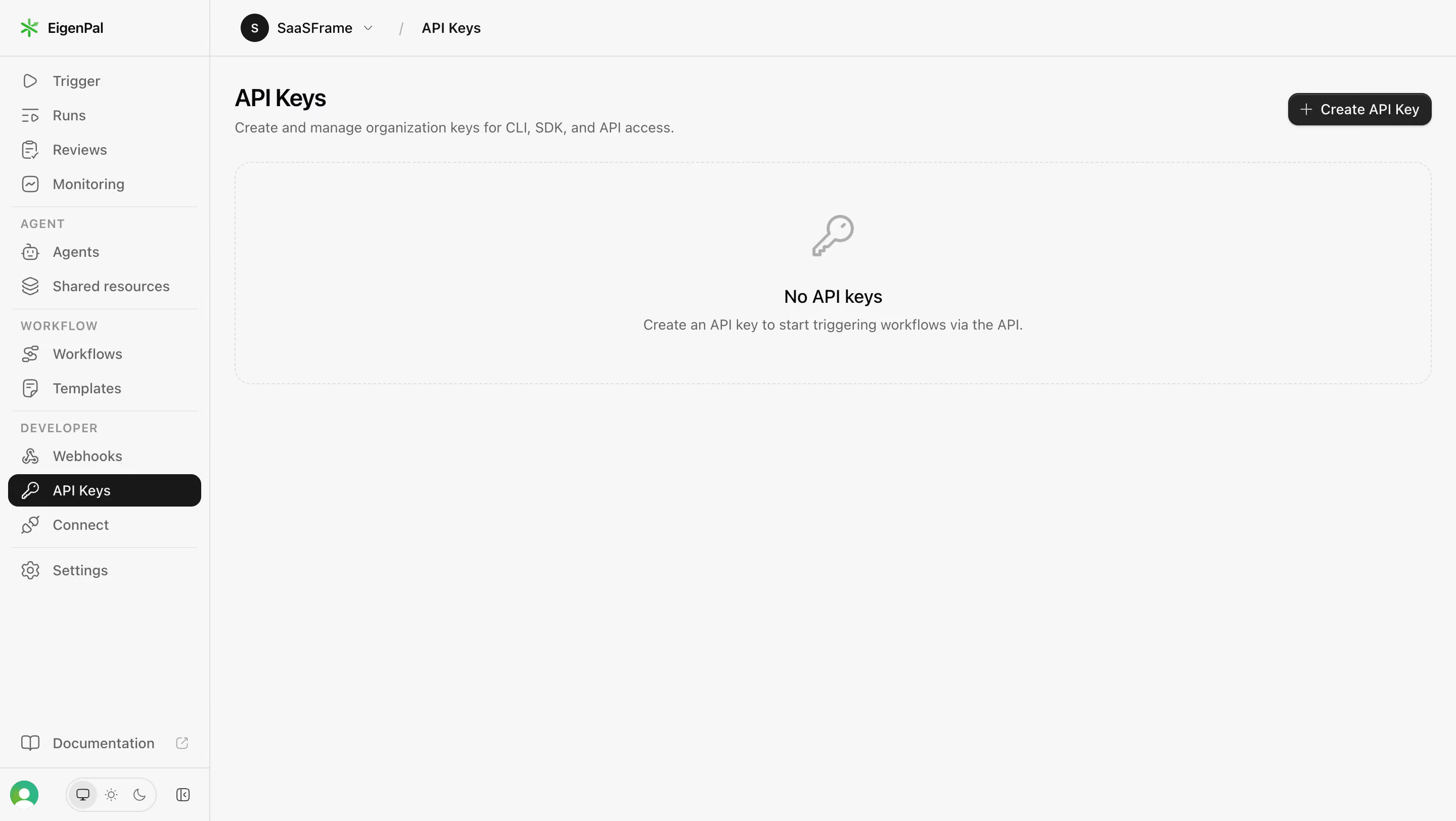
# Design from Reference: EigenPal API keys empty state
Create an original, high-fidelity visual design inspired by the reference. Prioritize composition, typography, colors, spacing, and component styling over technical implementation.
## Reference
- **Product:** EigenPal
- **Category:** Empty State
- **Screenshot:** https://cdn.prod.website-files.com/5e9dc792e1210c5325f7ebbc/6acb61a8c08cd859ff851937_6acacfd40c49d10a7abca5d7_cms-1cfa09090b363aca7e3073bc.webp
Analyze the screenshot first. If inaccessible, request it rather than guessing.
## Content
{{content.instructions}}
{{content.data}}
Preserve essential messaging and factual accuracy. Adapt structure and copy length for visual balance; never invent product claims.
## Visual Design
### Overall aesthetic
- **Style:** Monochrome developer settings with a quiet API-key empty state.
- **Visual character:** Pale gray canvas, compact navigation, dark active item, and minimal line icons.
- **Surface treatment:** The empty state uses a broad dashed rounded outline instead of a raised card.
### Page composition
- **Screenshot size:** 2880 × 1624 image px. CSS estimates assume an unverified 2× capture.
- **Sidebar:** Approximately 208 CSS px wide with product mark, grouped navigation, documentation, profile/theme controls.
- **Topbar:** Workspace avatar/name and API Keys breadcrumb above a thin divider.
- **Page header:** API Keys title and short CLI/SDK/API explanation at left; dark creation button right.
- **Empty panel:** Wide dashed rectangle beneath the header, containing a key icon, No API keys title, and one-line instruction.
- **Lower area:** Large unused pale canvas below the empty panel.
### Information hierarchy
- **Active context:** API Keys is the dark selected Developer navigation item.
- **Primary task:** Create API Key is the only high-contrast action.
- **Empty-state hierarchy:** Key outline, short title, and supporting sentence explain the absence of keys.
- **Grouping:** Agent, Workflow, and Developer captions divide the navigation into functional areas.
- **Secondary utilities:** Documentation and appearance controls remain at the sidebar bottom.
### Typography
- **Family:** Neutral proportional sans serif; exact family unverified.
- **Page title:** Approximately 24 CSS px, weight 600, line-height 30 px.
- **Empty-state title:** Approximately 18 px, weight 500–600.
- **Body/navigation:** Approximately 14 px, line-height 20 px.
- **Section captions:** Approximately 12 px uppercase with increased tracking.
- **Button:** Approximately 14 px, medium weight.
- **Precision:** Sizes and assumed CSS scale are visual estimates.
### Colors & surfaces
- **Canvas:** Sampled sRGB #F7F7F7.
- **Active navigation:** Sampled #181818.
- **Creation button:** Sampled #242424.
- **Borders:** Sampled #DEDEDE and #E8E8E8.
- **Secondary text:** Sampled #656565.
- **Primary text:** Sampled #09090B.
- **Empty icon/muted detail:** Sampled #AEAEAE and #929292.
- **Local brand accent:** Small green symbol in product lockup; functional content remains grayscale.
### Components
- **Creation action:** Dark rounded button approximately 142 × 32 CSS px, plus icon, white label, 10 px corners.
- **Empty panel:** Approximately 1180 × 220 CSS px, dashed pale border, 16 px corners.
- **Empty icon:** Gray outlined key approximately 40 px, centered above text.
- **Sidebar selection:** Dark full-row rounded rectangle, roughly 32 px high, with white key icon/text.
- **Workspace identity:** Black circular initial avatar, workspace dropdown, and breadcrumb slash.
- **Theme controls:** Small segmented icon group at bottom for display/light/dark options.
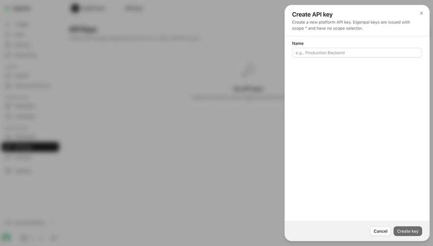
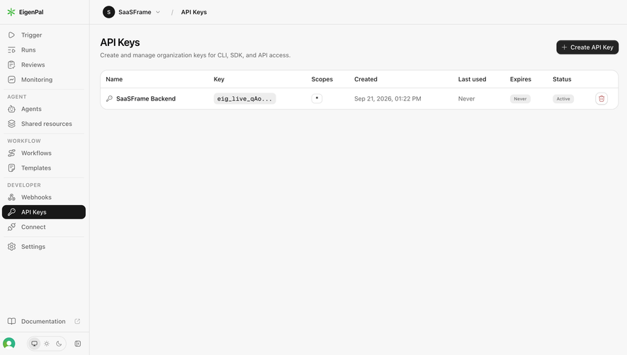
- **Observed state:** No keys exist; creation, key visibility, and deletion are not shown.
### Visual rhythm
- **Header alignment:** Page title and dashed panel share a left edge around 24 CSS px from content boundary.
- **Empty stack:** Icon, heading, and helper use roughly 20–24 px vertical intervals.
- **Navigation rhythm:** Tight row spacing with thin dividers between named groups.
- **Whitespace:** The shallow empty panel and large lower blank area maintain a calm administration layout.
### Responsive
- **Observed version:** Desktop only.
- **Navigation recommendation:** Collapse sidebar into a drawer.
- **Header recommendation:** Wrap creation action below the explanation when necessary.
- **Panel recommendation:** Use fluid width and reduce blank height while retaining centered icon/text.
- **Text recommendation:** Allow helper sentence to wrap with comfortable line-height.
### Adaptation guidance
- **Preserve:** Clear create action, dashed empty-state panel, monochrome developer styling, and grouped navigation.
- **Content fidelity:** State actual API access purpose and organization scope.
- **Starting values:** Approximately 24 px title, 14 px body, 32 px action height, and 16 px panel radius under assumed scale.
- **Security fidelity:** Later key creation should use the target product's real permission and secret-display rules.
- **Interaction fidelity:** Screenshot only establishes an empty state; do not invent populated table columns or hidden controls.
Use this context to reproduce the reference's visual language: layout, typography, colors, spacing, borders, radii, and distinctive elements. The screenshot takes priority if descriptions conflict.
## Direction
{{preferences.fidelityInstructions}}
## Output
{{output.instructions}}
Deliver a polished, cohesive design with precise alignment, hierarchy, and spacing. Produce the requested visual artifact, not just a description. If unsupported, explain the limitation.