
Thank you! Your submission has been received!
Oops! Something went wrong while submitting the form.
Get SaaSFrame Pro
Monthly
$18
Quarterly
$48
Yearly
$180
Upgrade to access this feature
Browse all screens & flows
Filter and search screens & flows
Access Figma files
Access mobile versions
Bookmark screens & flows
Join now
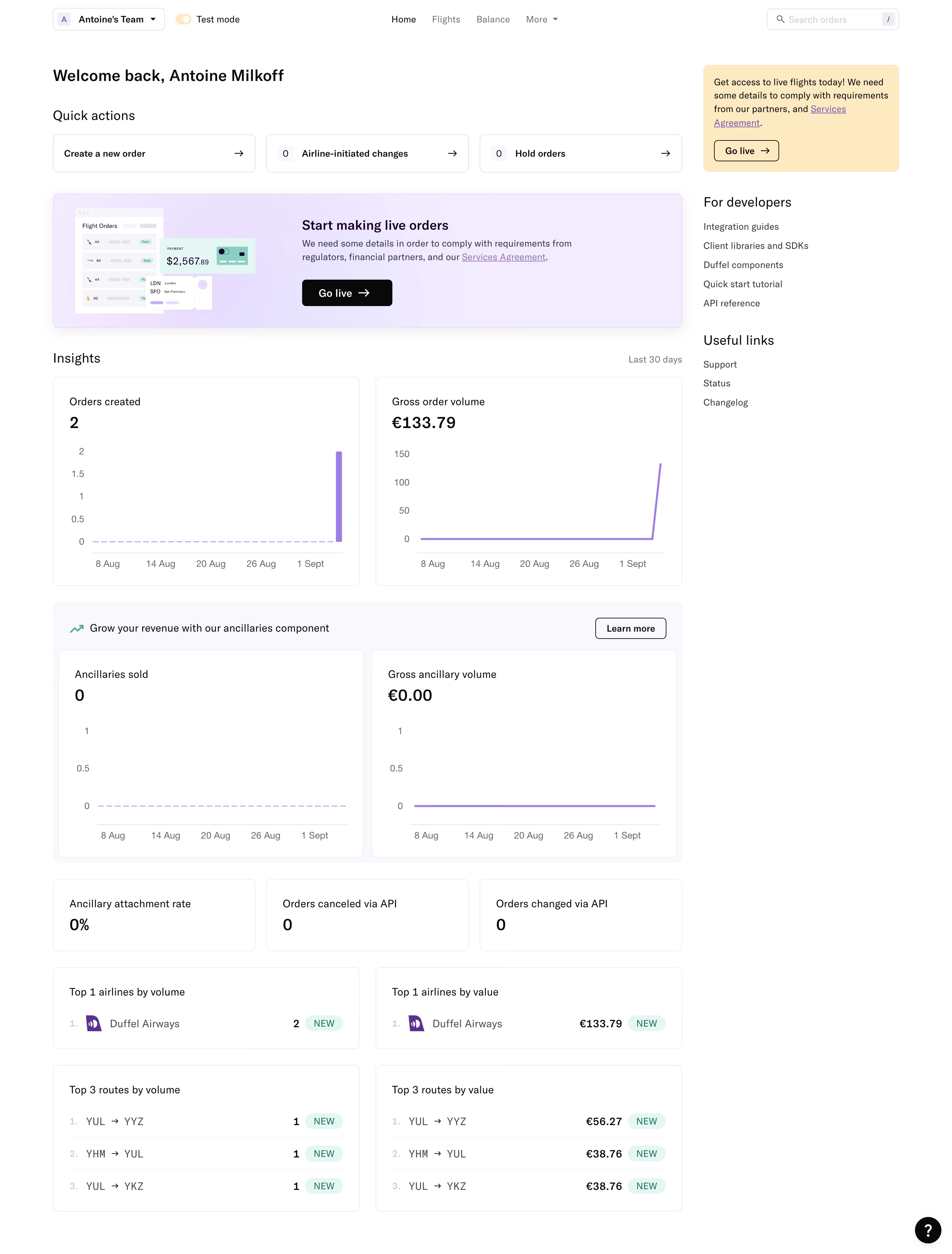
Duffel Dashboard

Duffel
The complete toolkit for selling travel online.
Designed by
No items found.

Bookmark
Bookmark

Design with AI
Thank you! Your submission has been received!
Oops! Something went wrong while submitting the form.
# Design from Reference: Duffel Dashboard
Create an original, high-fidelity visual design inspired by the reference. Prioritize composition, typography, colors, spacing, and component styling over technical implementation.
## Reference
- **Product:** Duffel
- **Category:** Dashboard
- **Screenshot:** https://cdn.prod.website-files.com/5e9dc792e1210c5325f7ebbc/6acadb78494a081980ea08f3_6acada9673700052692a4d37_cms-36e7d4e7951d6b2aa24c7321.webp
Analyze the screenshot first. If inaccessible, request it rather than guessing.
## Content
{{content.instructions}}
{{content.data}}
Preserve essential messaging and factual accuracy. Adapt structure and copy length for visual balance; never invent product claims.
## Visual Design
### Overall aesthetic
- **Character:** A light operational dashboard uses thin rounded outlines, black typography, lavender charts and promotional surfaces, plus small mint status accents.
- **Evidence scale:** The screenshot is 2880 × 3794 pixels. Both readable portions were inspected. CSS dimensions assume an unverified 2× capture density.
### Page composition
- **Top navigation:** A team selector and Test mode switch sit left, central navigation links occupy the middle and order search aligns right.
- **Main grid:** A broad primary column contains welcome text, three quick actions, a lavender onboarding banner and analytics. A narrower right rail holds a yellow activation notice and developer/support links.
- **Analytics sequence:** Two primary charts precede a pale ancillary-revenue group with two more charts, three compact metrics, two airline-ranking cards and two route-ranking cards.
- **Utility:** A small circular help control sits at the lower right.
### Information hierarchy
- **Immediate tasks:** The welcome heading and quick-action cards establish the operational entry points; counts distinguish change and hold-order actions.
- **Activation:** The illustrated lavender panel and yellow rail notice both highlight moving from test activity to live orders.
- **Metrics:** Card titles precede bold totals and simple time-series plots. Lower ranking cards expose airline/route labels with right-aligned counts or currency values.
- **Secondary links:** Developer references and useful links use compact text lists with minimal decoration.
### Typography
- **Headings:** Welcome text is approximately 24 pixels semibold; section labels are about 20 pixels regular-to-medium.
- **Metrics:** Primary values are roughly 24–26 pixels semibold; card labels are around 16 pixels.
- **Supporting roles:** Navigation, quick actions and links use approximately 14 pixels; axes and timing labels are around 13–14 pixels in muted gray.
- **Identity:** A neutral sans-serif is visible, but its family is unverified. Titles and values use weight rather than color to establish emphasis.
### Colors & surfaces
- **Measured base:** ICC-to-sRGB sampling identifies #FFFFFF as the canvas and cards, #F9F8FC as pale supporting panels and #09090A as a near-black foreground.
- **Measured promotional surfaces:** #F4EBFF is the lavender onboarding region and #FFE9BC the yellow rail notice.
- **Measured status:** #E1F8F4 supplies mint badge surfaces; #EDEDF2 appears in subtle neutral separation.
- **Chart accent:** Lavender-purple lines and bars carry data on white charts; neutral labels remain subordinate.
### Components
- **Quick actions:** Three outlined horizontal cards have left-aligned labels/count chips and right arrows, approximately 58 pixels tall.
- **Activation banner:** A wide rounded lavender panel pairs a small order/payment illustration with heading, explanation and black Go live button.
- **Charts:** Two equal-width cards show orders and gross volume, with titles/totals above minimal axes. Two additional cards in the ancillary group use the same geometry and zero-state lines.
- **Compact metrics:** Three small cards summarize attachment rate, canceled orders and changed orders.
- **Rankings:** Two-column cards display numbered airline or route rows, right-aligned values and mint NEW badges; route rows have faint dashed separators.
- **Right rail:** A yellow rounded notice has an outlined Go live control; developer/support sections beneath it use unboxed vertical links.
### Visual rhythm
- **Grid alignment:** Quick actions, onboarding panel, chart groups and ranking pairs share the same main-column boundaries.
- **Spacing:** Approximately 24-pixel gutters separate chart pairs and major blocks; card padding is roughly 24 pixels.
- **Chart consistency:** Repeated plot sizes and date labels maintain comparison across primary and ancillary metrics.
- **Density:** Dense lower rankings balance the generous whitespace around the right rail and introductory area.
### Responsive
- **Observed scope:** Only a desktop test-mode state is visible; search, menus and activation flows are not shown.
- **Recommended stacking:** Move rail notices below the welcome section, wrap quick actions and reduce charts/rankings to one column on phones.
- **Recommended chart behavior:** Preserve meaningful axes at narrow widths and offer text values alongside visuals; let long route or airline labels wrap without colliding with totals.
### Adaptation guidance
- **Dashboard pattern:** Prioritize immediate operational actions, then activation guidance, aggregate trends and detailed rankings.
- **Visual semantics:** Reserve lavender for analytics/onboarding, yellow for setup notices and mint for compact status badges.
- **Data fidelity:** Populate totals, rankings and time windows from real data and distinguish test from live activity clearly.
- **Implementation:** Verify typography and density, add accessible chart summaries and define focus/loading/empty states for interactive controls.
Use this context to reproduce the reference's visual language: layout, typography, colors, spacing, borders, radii, and distinctive elements. The screenshot takes priority if descriptions conflict.
## Direction
{{preferences.fidelityInstructions}}
## Output
{{output.instructions}}
Deliver a polished, cohesive design with precise alignment, hierarchy, and spacing. Produce the requested visual artifact, not just a description. If unsupported, explain the limitation.


Category
Tech Stack


Added on
September 6, 2023
Similar screens
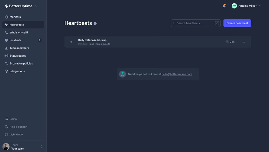


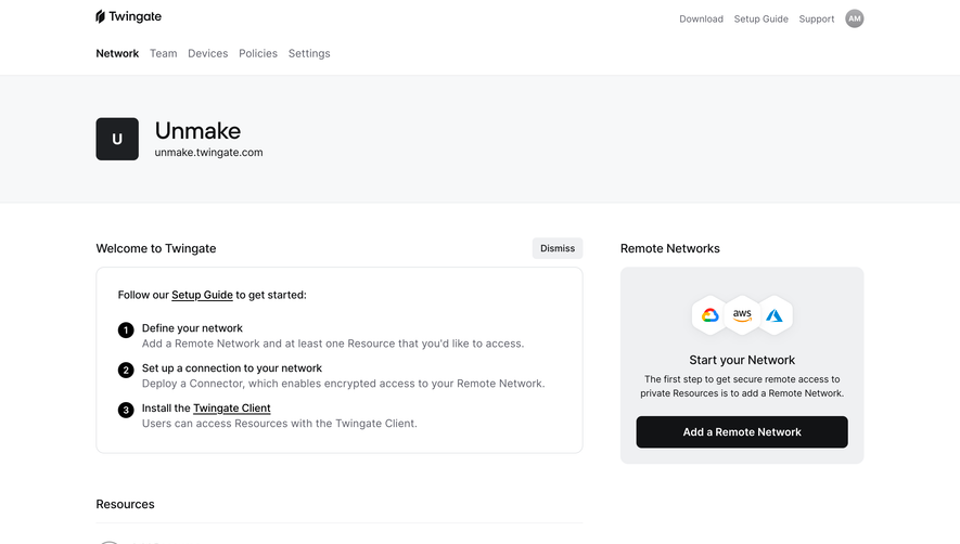

Upgrade to SaaSFrame Pro now to see similar examples.
Monthly
$18 /month
Billed $18 monthly
Browse all screens & flows
Filter and search screens & flows
Search text in screenshots
Access Figma files
Access mobile versions
Join now
Quarterly
$16 /month
Billed $48 quarterly
Browse all screens & flows
Filter and search screens & flows
Search text in screenshots
Access Figma files
Access mobile versions
Join now
Yearly
$15 /month
Billed $180 yearly
Browse all screens & flows
Filter and search screens & flows
Search text in screenshots
Access Figma files
Access mobile versions
Join now