Generate a new design based on this screen using your own content.
Thank you! Your submission has been received!
Oops! Something went wrong while submitting the form.
# Design from Reference: Duffel Blog Post
Create an original, high-fidelity visual design inspired by the reference. Prioritize composition, typography, colors, spacing, and component styling over technical implementation.
## Reference
- **Product:** Duffel
- **Category:** Blog Post
- **Screenshot:** https://cdn.prod.website-files.com/5e9dc792e1210c5325f7ebbc/6acadb74494a081980ea087e_6acada916cd44b3ad4d8db73_cms-b66543506ae7e636c37de006.webp
Analyze the screenshot first. If inaccessible, request it rather than guessing.
## Content
{{content.instructions}}
{{content.data}}
Preserve essential messaging and factual accuracy. Adapt structure and copy length for visual balance; never invent product claims.
## Visual Design
Use this context to reproduce the reference's visual language: layout, typography, colors, spacing, borders, radii, and distinctive elements. The screenshot takes priority if descriptions conflict.
## Direction
{{preferences.fidelityInstructions}}
## Output
{{output.instructions}}
Deliver a polished, cohesive design with precise alignment, hierarchy, and spacing. Produce the requested visual artifact, not just a description. If unsupported, explain the limitation.
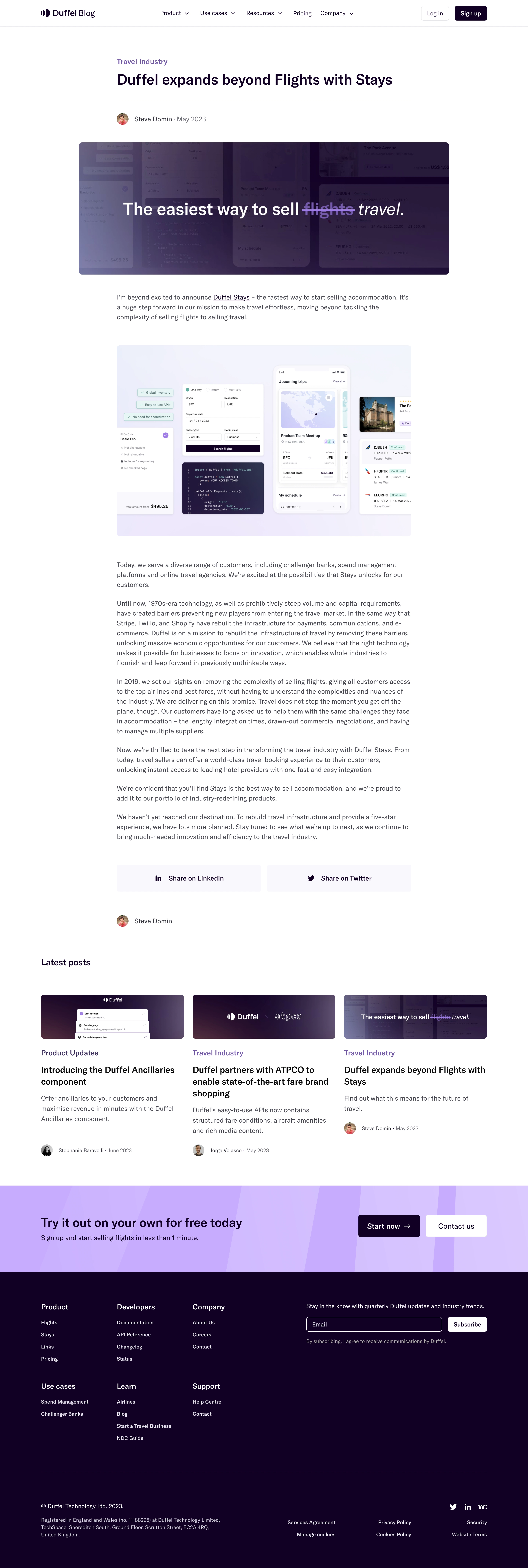
Duffel’s blog page exudes a modern, minimalist sensibility with a professional yet inviting touch. The design leverages generous white space and crisp lines, creating an uncluttered, readable experience that positions the brand as innovative and trustworthy.
Layout and Structure
The layout begins with an impactful hero section featuring a spacious headline, subtext, and subtle accent graphics, instantly drawing readers into the page. The content body is segmented by clear typography and visuals, optimizing scannability—perfect for SaaS visitors who value efficiency. While this is a blog page, design patterns like sticky navigation and consistent information hierarchy echo broader SaaS product layouts.
Visual Elements
Custom illustrations and geometric elements are integrated seamlessly, lending visual warmth without distraction. Modules are separated by soft dividers and graphic flourishes, while featured imagery enhances the storytelling. The restraint from heavy animations results in smooth scrolling and fast load times, emphasizing substance over spectacle.
Color Palette and Typography
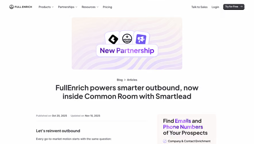
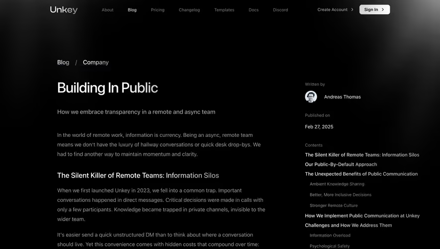
A core palette of navy blue, teal, and soft gray establishes a calming, authoritative feel, punctuated by lively accent colors that guide attention. Typeface choices mix a modern sans-serif for headers with a legible body font, using weight and size for effortless hierarchy and navigation.
User Experience Patterns
Navigation is streamlined with a sticky, accessible top bar and clear CTAs both in content and header. Content sections are well-spaced and easy to digest, supporting both skimming and deep reading. Scroll cues and interactive links encourage further exploration.
Unique or Notable Design Choices
Subtle use of geometric motifs visually ties the SaaS product’s tech-forward identity to its storytelling. The page maintains focus on clarity and brand confidence, balancing visual engagement with a frictionless, delightful reading experience—ideal inspiration for SaaS teams prioritizing usability.