Design with AI
Generate a new design based on this screen using your own content.
# Design from Reference: Dub Signup
Create an original, high-fidelity visual design inspired by the reference. Prioritize composition, typography, colors, spacing, and component styling over technical implementation.
## Reference
- **Product:** Dub
- **Category:** Signup
- **Screenshot:** https://cdn.prod.website-files.com/5e9dc792e1210c5325f7ebbc/6acb6f533156cd8dbc47138c_6acb6e773156cd8dbc46a932_cms-caf0254815d05874fdbd8eaf.webp
Analyze the screenshot first. If inaccessible, request it rather than guessing.
## Content
{{content.instructions}}
{{content.data}}
Preserve essential messaging and factual accuracy. Adapt structure and copy length for visual balance; never invent product claims.
## Visual Design
### Overall aesthetic
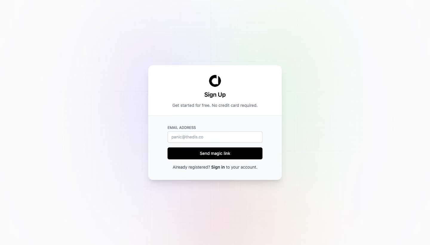
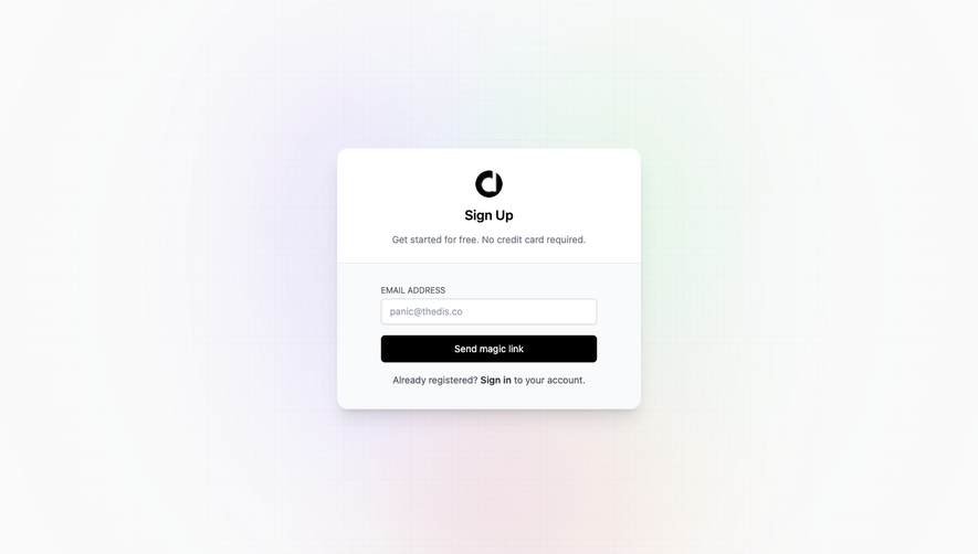
- **Character:** A compact signup card floats over a very pale multicolor glow and fine grid background.
- **Capture evidence:** The screenshot measures 1440 × 821 pixels. Approximate dimensions are image pixels; near-1× CSS scale is plausible but unverified.
- **Tone:** Black-and-white controls and restrained color atmosphere create a minimal technical-product signup.
### Page composition
- **Background:** A faint square grid spans the page with lavender, mint and peach glows behind the center.
- **Card:** A centered approximately 448 × 385px rounded panel contains branding and the signup form.
- **Upper area:** A black symbol, Sign Up title and short reassurance are centered on white.
- **Lower area:** A pale form section contains one email field, black Send magic link action and sign-in sentence.
- **Surround:** No navigation or footer is visible outside the card.
### Information hierarchy
- **Task:** Sign Up is the strongest live-text label.
- **Reassurance:** Smaller muted copy states free entry and no credit card requirement.
- **Field:** An uppercase email label precedes the populated-looking email input.
- **Primary action:** Send magic link is the only filled button.
- **Alternative:** Sign in is emphasized within the final account sentence.
### Typography
- **Family:** A neutral sans-serif is visible; exact identity is unverified.
- **Title:** Approximately 20px bold with 26px line-height.
- **Supporting copy:** Approximately 14px regular, muted gray.
- **Field label:** Approximately 12px uppercase.
- **Input/action:** Approximately 14px regular-to-medium.
- **Alternative link:** Approximately 14px with bold sign-in wording.
### Colors & surfaces
- **Card:** Sampled #FFFFFF supplies the upper panel.
- **Lower section:** Sampled #F9FAFB supplies the subtle form-area tint.
- **Background:** Sampled #FAFAFA and nearby #FAFAFB/#F9FAFA/#F9F9F9 supply pale neutral grid surroundings.
- **Controls:** Black supplies the brand symbol and primary action.
- **Text:** Dark gray and muted blue-gray establish heading/body hierarchy.
- **Atmosphere:** Very pale lavender, mint and peach glows remain decorative.
### Components
- **Card shell:** Approximately 448px wide with 18px radii and a broad soft shadow.
- **Header divider:** A thin light-gray rule separates centered branding from the form.
- **Email input:** Approximately 318 × 38px, white, with thin gray outline, 5px radii and subtle shadow.
- **Magic-link action:** A matching-width black rectangle around 40px high uses white text and small radii.
- **Logo:** A roughly 40px black circular letterform sits above the title.
- **Grid:** Fine low-contrast lines remain visible behind the soft glows.
### Visual rhythm
- **Centered axis:** Logo, title, reassurance and card align centrally.
- **Form padding:** Approximately 64px horizontal inset produces a narrower control column.
- **Control gaps:** Around 16px separates field and action, followed by a compact sign-in line.
- **Vertical balance:** The card sits near the viewport center with broad empty margins.
- **Surface contrast:** The lower tint distinguishes form interaction without creating a second card.
### Responsive
- **Evidence limit:** Only a desktop form state is visible; submission and mobile behavior are unverified.
- **Card recommendation:** Use fluid width with 20–24px viewport margins.
- **Padding recommendation:** Reduce horizontal inset on narrow screens while preserving readable labels.
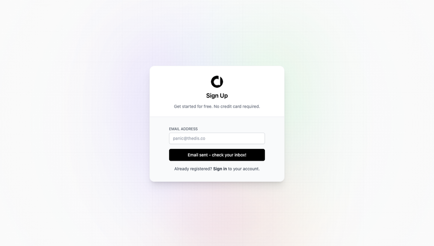
- **Feedback recommendation:** Provide inline validation and sent-link confirmation without obscuring the input.
### Adaptation guidance
- **Authentication:** Preserve the single-field magic-link route and clear existing-account option.
- **State design:** Define email validation, loading, success and retry states separately.
- **Privacy:** Use representative email data in demonstrations.
- **Accessibility:** Label the input, use email autocomplete and provide visible focus and accessible submission feedback.
- **Decoration:** Keep grid and glow backgrounds subtle enough to preserve control contrast.
Use this context to reproduce the reference's visual language: layout, typography, colors, spacing, borders, radii, and distinctive elements. The screenshot takes priority if descriptions conflict.
## Direction
{{preferences.fidelityInstructions}}
## Output
{{output.instructions}}
Deliver a polished, cohesive design with precise alignment, hierarchy, and spacing. Produce the requested visual artifact, not just a description. If unsupported, explain the limitation.