
Thank you! Your submission has been received!
Oops! Something went wrong while submitting the form.
Get SaaSFrame Pro
Monthly
$18
Quarterly
$48
Yearly
$180
Upgrade to access this feature
Browse all screens & flows
Filter and search screens & flows
Access Figma files
Access mobile versions
Bookmark screens & flows
Join now
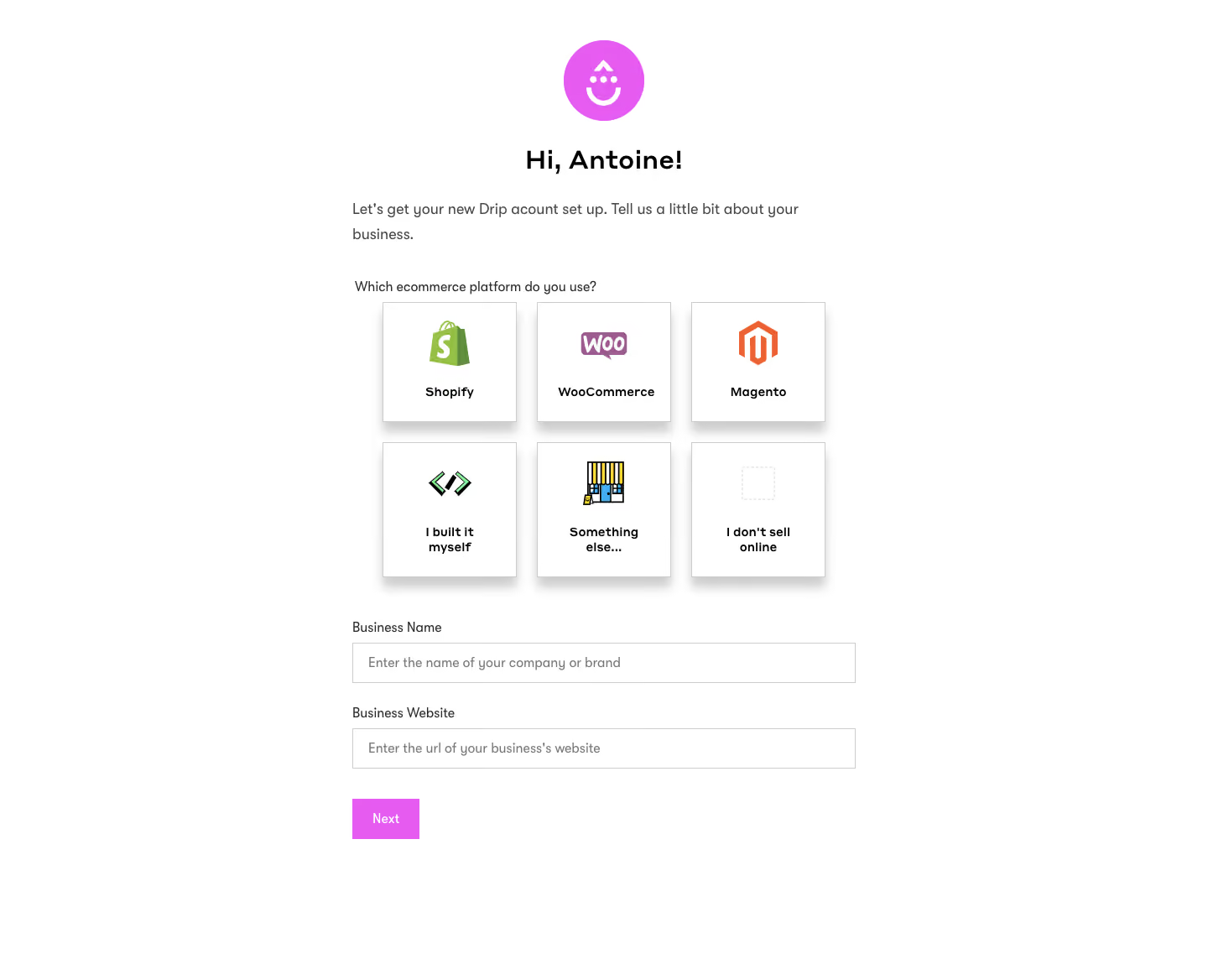
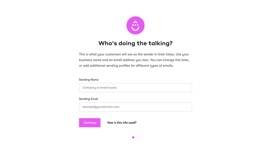
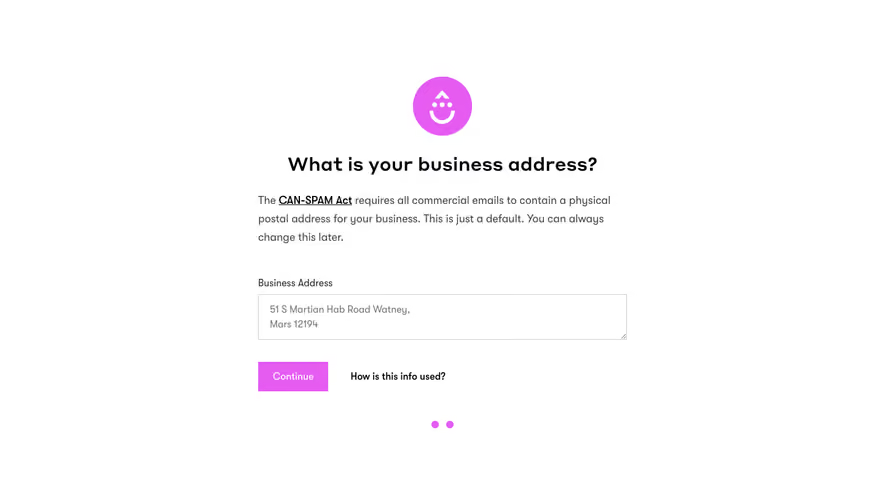
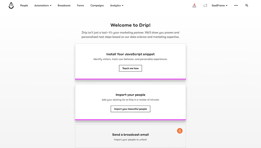
Drip Sign Up Flow

Drip
Marketing Ecommerce CRM Platform
Designed by
No items found.

Bookmark
Bookmark

Design with AI
Thank you! Your submission has been received!
Oops! Something went wrong while submitting the form.
# Design from Reference: Drip Sign Up Flow
Create an original, high-fidelity visual design inspired by the reference. Prioritize composition, typography, colors, spacing, and component styling over technical implementation.
## Reference
- **Product:** Drip
- **Category:** Account Setup
- **Screenshot:** https://cdn.prod.website-files.com/5e9dc792e1210c5325f7ebbc/6acbc994f9eac5af75463bee_6acbc735f145f33405de5fcf_cms-12fd145aa20824422da630d2.webp
Analyze the screenshot first. If inaccessible, request it rather than guessing.
## Content
{{content.instructions}}
{{content.data}}
Preserve essential messaging and factual accuracy. Adapt structure and copy length for visual balance; never invent product claims.
## Visual Design
### Overall aesthetic
- **Character:** A sparse onboarding form pairs a friendly magenta smile symbol with a centered greeting, ecommerce-platform tiles, and two straightforward business fields.
- **Evidence:** The screenshot is 1440 × 1168 image pixels, inspected at 1400 px width. Dimensions below are approximate source-image pixels; CSS scale is unverified.
- **Surface language:** A plain white canvas and substantial side margins keep the form focused. Stronger tile shadows provide most of the depth.
### Page composition
- **Form column:** A centered column roughly 600 px wide holds the greeting, introduction, platform selector, fields, and Next action.
- **Opening:** A round magenta icon sits above a bold centered personal greeting. Supporting copy below aligns left and wraps into two lines.
- **Platform selector:** A question label precedes six selectable-looking tiles arranged in three columns and two rows.
- **Business details:** Business Name and Business Website labels each sit above full-width empty inputs.
- **Action:** A small magenta Next button aligns with the fields' left edge. No global navigation or footer is visible.
### Information hierarchy
- **Welcome:** The icon and greeting establish the onboarding tone before the business question.
- **Selection:** Recognizable platform logos distinguish the top row; custom-built, other-platform, and no-online-selling choices form the second row.
- **Inputs:** Labels remain outside the fields, while muted placeholders explain expected values.
- **Current state:** No tile has a clearly distinct selected appearance. Both fields are empty, with no visible validation message.
### Typography
- **Family:** A neutral sans serif carries greeting, field labels, and descriptions; exact identity is unverified.
- **Greeting:** Approximately 30–32 px bold with roughly 38 px line-height.
- **Introductory copy:** About 18 px with 29 px line-height and medium-gray color.
- **Tile labels:** Approximately 15–16 px bold, centered, wrapping into two lines for longer options.
- **Fields and button:** Labels and placeholders are around 16 px; the button uses a compact white label at a similar size.
### Colors & surfaces
- **Measured palette:** Source samples include white #FFFFFF, magenta #E65CF1, border gray #CCCCCC, and subtle near-whites #FEFEFE, #FCFCFC, and #FDFDFD.
- **Text:** Headings and tile names use black; explanatory copy and placeholders use medium gray.
- **Logo accents:** Platform graphics introduce green, purple, orange, and small multicolor details without changing the shared white tile surface.
- **Depth:** Tile shadows are conspicuous and fall below the boxes; inputs use thin neutral outlines without heavy shadows.
### Components
- **Welcome icon:** A magenta circle approximately 96 px in diameter contains a white stylized smile/mark.
- **Platform tiles:** Roughly 160 px wide and 142–160 px tall, with thin gray borders and largely square corners. Logos occupy the upper center and labels sit underneath.
- **Selector grid:** Approximately 24 px horizontal and vertical gaps separate tiles. The tile grid is slightly narrower than the full text/input column.
- **Inputs:** Around 600 × 48 px with square corners, a 1 px gray border, and about 18 px horizontal padding.
- **Next button:** Approximately 80 × 48 px, magenta, with square corners and centered white text.
### Visual rhythm
- **Opening spacing:** Generous space separates icon, greeting, and explanatory copy.
- **Form cadence:** The platform question leads directly into tiles; a larger break separates the grid from business fields.
- **Field rhythm:** Labels sit about 10–12 px above inputs; roughly 28 px separates each field group.
- **Whitespace:** Wide empty sides and a large lower margin keep the six-tile selector from overwhelming the short form.
### Responsive
- **Observed limit:** Only desktop is visible; actual validation, selection, and mobile behavior are unverified.
- **Recommended layout:** Use a fluid form with 20–24 CSS px side gutters. Change the tile grid to two columns on narrow screens and let labels wrap.
- **Recommended controls:** Keep input text readable and ensure tile hit targets and Next remain comfortably tappable.
- **Recommended feedback:** Expose selected tiles, errors, and focus clearly without relying only on color.
### Adaptation guidance
- **Preserve:** Keep the friendly welcome, recognizable platform artwork, consistent tile anatomy, external field labels, and single progression action.
- **Implement:** Use accessible radio-style selection for mutually exclusive platform choices and programmatically associated input labels.
- **Layout:** Let tile heights accommodate text while maintaining aligned rows. Preserve proportional logo sizing rather than stretching assets.
- **Validate:** Confirm fonts, actual CSS dimensions, keyboard order, selected/disabled states, and field validation. The screenshot shows an unfilled starting state.
Use this context to reproduce the reference's visual language: layout, typography, colors, spacing, borders, radii, and distinctive elements. The screenshot takes priority if descriptions conflict.
## Direction
{{preferences.fidelityInstructions}}
## Output
{{output.instructions}}
Deliver a polished, cohesive design with precise alignment, hierarchy, and spacing. Produce the requested visual artifact, not just a description. If unsupported, explain the limitation.


Category
Patterns
No items found.
Tech Stack

Added on
February 4, 2023
Found in 1 flow


Similar screens



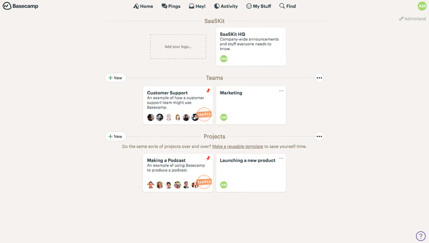



Upgrade to SaaSFrame Pro now to see similar examples.
Monthly
$18 /month
Billed $18 monthly
Browse all screens & flows
Filter and search screens & flows
Search text in screenshots
Access Figma files
Access mobile versions
Join now
Quarterly
$16 /month
Billed $48 quarterly
Browse all screens & flows
Filter and search screens & flows
Search text in screenshots
Access Figma files
Access mobile versions
Join now
Yearly
$15 /month
Billed $180 yearly
Browse all screens & flows
Filter and search screens & flows
Search text in screenshots
Access Figma files
Access mobile versions
Join now