
Thank you! Your submission has been received!
Oops! Something went wrong while submitting the form.
Get SaaSFrame Pro
Monthly
$18
Quarterly
$48
Yearly
$180
Upgrade to access this feature
Browse all screens & flows
Filter and search screens & flows
Access Figma files
Access mobile versions
Bookmark screens & flows
Join now
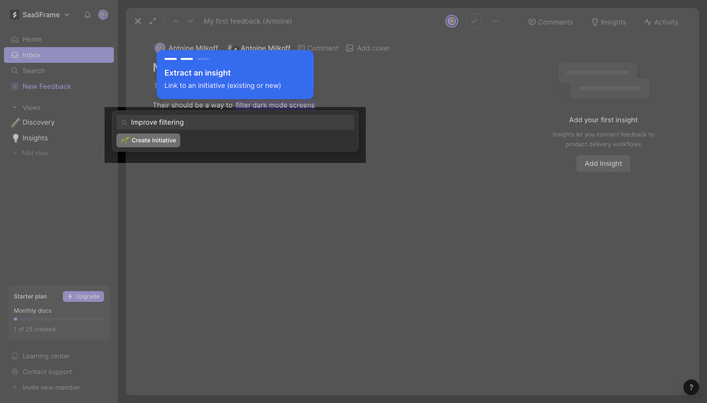
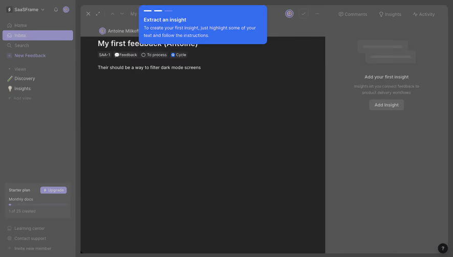
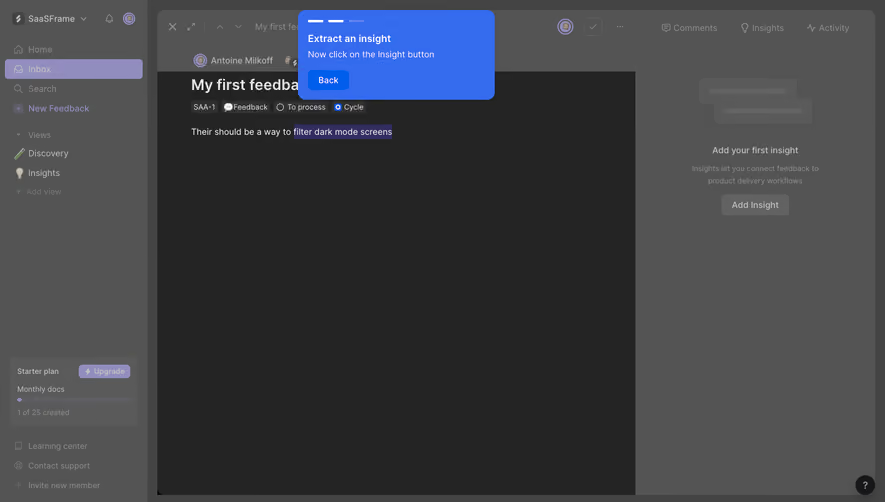
Cycle Product Tour

Cycle
Ship stuff people need.
Designed by
No items found.

Bookmark
Bookmark

Design with AI
Thank you! Your submission has been received!
Oops! Something went wrong while submitting the form.
# Design from Reference: Cycle Product Tour
Create an original, high-fidelity visual design inspired by the reference. Prioritize composition, typography, colors, spacing, and component styling over technical implementation.
## Reference
- **Product:** Cycle
- **Category:** Product Tour
- **Screenshot:** https://cdn.prod.website-files.com/5e9dc792e1210c5325f7ebbc/6acbb9bfd1be8ecd2912de87_6acb70750e8221f13084b3c1_cms-1c351c65dd565ea764335681.webp
Analyze the screenshot first. If inaccessible, request it rather than guessing.
## Content
{{content.instructions}}
{{content.data}}
Preserve essential messaging and factual accuracy. Adapt structure and copy length for visual balance; never invent product claims.
## Visual Design
### Overall aesthetic
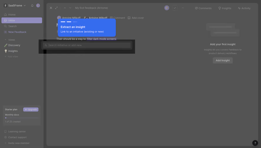
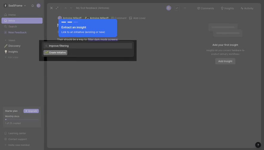
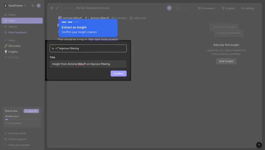
- **Character:** A guided product-tour state uses a heavily dimmed dark workspace, a vivid blue instructional tooltip, and a spotlight around an initiative-linking popover.
- **Evidence:** Source dimensions are 1440 × 821 image pixels. Measurements below are approximate source pixels; CSS scale is unverified.
- **State distinction:** Most gray colors belong to the visible tour overlay. The undimmed product palette cannot be recovered reliably from these pixels.
### Page composition
- **Sidebar:** A narrow left rail contains workspace controls, navigation, views, plan usage, and support links.
- **Main editor:** A rounded workspace panel fills the remaining screen, with a document toolbar, title/body region, and right-side comments/insights/activity area.
- **Tour tooltip:** A blue rounded rectangle floats near the top-left of the document, above the highlighted text and linking popover.
- **Spotlight:** A dark rectangular focus region surrounds a search-and-create popover beneath the selected document phrase.
- **Right empty state:** A dimmed illustration, explanatory text, and Add Insight action occupy the right panel.
### Information hierarchy
- **Instruction:** The blue tooltip is the clearest foreground object, with a bold extraction instruction and a smaller linking explanation.
- **Progress:** Three small horizontal segments appear at the tooltip top; two are bright and one muted.
- **Target:** A selected phrase in the document and a search field containing an initiative query connect the instruction to its target.
- **Secondary UI:** Navigation, document controls, and insight empty state remain legible but visually suppressed.
### Typography
- **Family:** A neutral interface sans serif is used; exact identity is unverified.
- **Tooltip:** Approximately 16 px semibold title and 14 px regular supporting line, with around 22 px leading.
- **Popover:** Search text is about 14 px; create action is approximately 12–13 px.
- **Underlying UI:** Navigation and toolbar labels are roughly 13–14 px, but overlay dimming limits precise weight assessment.
### Colors & surfaces
- **Measured pixels:** Frequent source colors include overlay gray #545454, #444444, #5A5A5A, blue #346BEF, dark #313131, and #404040.
- **Semantic use:** Saturated blue distinguishes the tutorial message. The remaining interface is muted by a gray veil.
- **Selection:** A pale violet selected navigation row and text highlight remain visible through the overlay.
- **Depth:** The tooltip is solid and rounded; the popover uses a dark surface, fine outline, and compact internal controls.
### Components
- **Tooltip:** Approximately 320 × 100 px, with around 12 px radii and 16 px padding. Progress segments precede two text lines.
- **Popover:** Roughly 500 × 84 px with 8–10 px radii; a full-width search field sits above a small Create Initiative action.
- **Search:** Leading magnifier, entered text, and a muted dark input surface.
- **Underlying editor:** Top icon toolbar, split content/insights regions, and a lower-right help launcher remain visible.
- **Plan block:** A small sidebar card contains plan name, upgrade action, usage label, and progress bar.
### Visual rhythm
- **Focus grouping:** Tooltip, selected phrase, and popover cluster within the upper-left content area.
- **Overlay balance:** Large dimmed empty areas ensure the small tutorial target receives attention.
- **Internal spacing:** Compact 8–16 px gaps organize the popover and instruction.
- **Sidebar rhythm:** Repeated icon/text rows and separated lower utilities provide underlying structure without competing with the tour.
### Responsive
- **Observed limit:** Only this desktop tour step is shown; responsive anchoring and subsequent steps are unverified.
- **Recommended positioning:** Anchor the tooltip to the target with viewport collision handling rather than fixed coordinates.
- **Recommended sizing:** Constrain popover width to the available viewport and allow instructional text to wrap.
- **Recommended accessibility:** Manage keyboard focus, provide an accessible step description and dismissal, and keep the highlighted target operable.
### Adaptation guidance
- **Preserve:** Keep one clear instruction, visible step progress, and a tight spatial relationship to the highlighted control.
- **Implement:** Separate overlay, spotlight, tooltip, and target popover components so their contrast and placement can be controlled.
- **State discipline:** Do not treat dimmed screenshot colors as the normal workspace theme.
- **Validate:** Confirm fonts, true CSS dimensions, focus behavior, dismissal, target scrolling, and narrow-screen positioning. Later tour states are absent.
Use this context to reproduce the reference's visual language: layout, typography, colors, spacing, borders, radii, and distinctive elements. The screenshot takes priority if descriptions conflict.
## Direction
{{preferences.fidelityInstructions}}
## Output
{{output.instructions}}
Deliver a polished, cohesive design with precise alignment, hierarchy, and spacing. Produce the requested visual artifact, not just a description. If unsupported, explain the limitation.


Category
Patterns
No items found.
Tech Stack

Added on
March 6, 2023
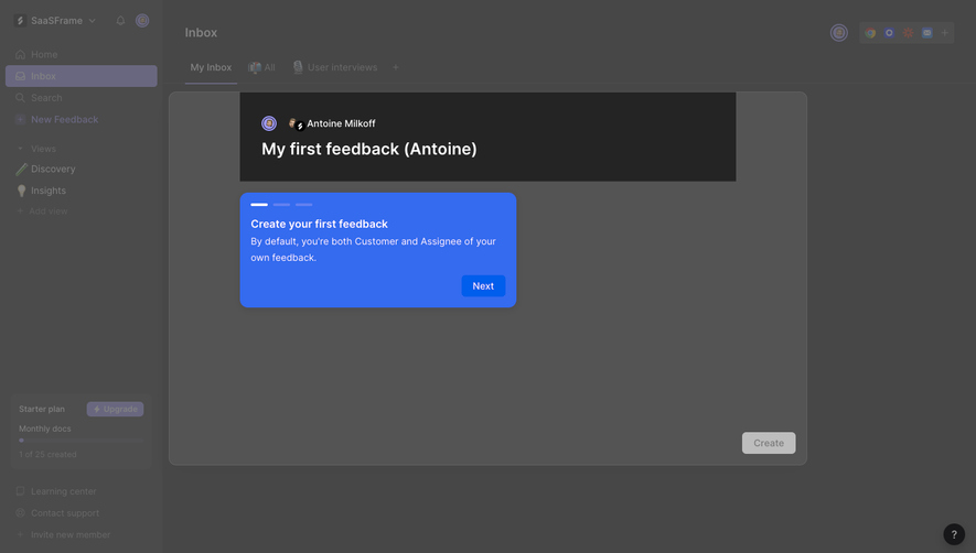
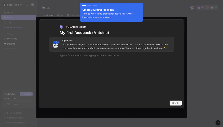
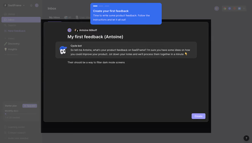
Found in 1 flow

Similar screens






Upgrade to SaaSFrame Pro now to see similar examples.
Monthly
$18 /month
Billed $18 monthly
Browse all screens & flows
Filter and search screens & flows
Search text in screenshots
Access Figma files
Access mobile versions
Join now
Quarterly
$16 /month
Billed $48 quarterly
Browse all screens & flows
Filter and search screens & flows
Search text in screenshots
Access Figma files
Access mobile versions
Join now
Yearly
$15 /month
Billed $180 yearly
Browse all screens & flows
Filter and search screens & flows
Search text in screenshots
Access Figma files
Access mobile versions
Join now