Design with AI
Generate a new design based on this screen using your own content.
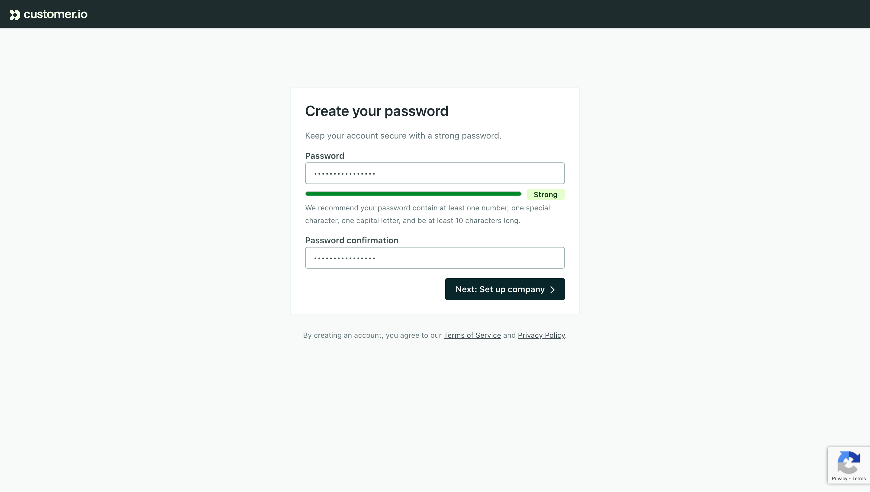
# Design from Reference: Customer.io Password Setup
Create an original, high-fidelity visual design inspired by the reference. Prioritize composition, typography, colors, spacing, and component styling over technical implementation.
## Reference
- **Product:** Customer.io
- **Category:** Signup
- **Screenshot:** https://cdn.prod.website-files.com/5e9dc792e1210c5325f7ebbc/6acad4ba1025e911ae518372_6acad37f18446cb8d6986776_cms-897a691e9fe9a0be38a2e55a.webp
Analyze the screenshot first. If inaccessible, request it rather than guessing.
## Content
{{content.instructions}}
{{content.data}}
Preserve essential messaging and factual accuracy. Adapt structure and copy length for visual balance; never invent product claims.
## Visual Design
### Overall aesthetic
- **Style:** A restrained account-setup screen uses a pale gray canvas, white form panel and dark teal branding.
- **Character:** Clear labels and a visible green strength state prioritize form comprehension.
### Page composition
- **Capture:** The original measures 2880 × 1630 pixels. Estimated CSS dimensions below assume an unverified 2× capture.
- **Header:** A dark teal bar around 48 pixels high contains the small brand at left.
- **Form:** A centered outlined white panel around 480 × 375 pixels begins roughly 145 pixels below the top, with title, helper, two fields and right-aligned action.
- **Legal:** A small centered agreement line sits below the panel.
- **Peripheral badge:** A small verification-service badge appears at bottom right.
### Information hierarchy
- **Heading:** Create your password leads the form.
- **Guidance:** A short helper line precedes the first labeled field.
- **Strength:** A green bar and Strong badge appear beneath the masked password, followed by two lines of recommendations.
- **Confirmation:** The second masked field follows with its own label.
- **Action:** A dark filled next-step button anchors the panel's lower right.
### Typography
- **Family:** Neutral sans serif; exact identity is unverified.
- **Heading:** Approximately 24 pixels, semibold.
- **Labels/body:** Around 14 pixels, with labels heavier than helper copy.
- **Recommendations/legal:** Approximately 12 pixels with 20-pixel leading.
- **Action:** Around 14 pixels, semibold, white.
### Colors & surfaces
- **Measured canvas:** Near-white #F8F9F9 surrounds white #FFFFFF.
- **Brand surfaces:** Dark #1B2C2D and #00282C define header/action tones.
- **Borders:** Pale #EAF0F1 appears in subtle UI surfaces; field outlines are muted blue-gray.
- **Strength state:** A saturated green bar and pale green status badge indicate the observed strong state; exact green hex is unverified.
- **Depth:** Flat surfaces and thin borders replace conspicuous shadows.
### Components
- **Panel:** Small corner radius, thin pale outline and roughly 24-pixel padding.
- **Inputs:** Approximately 430 × 36 pixels, outlined, with masked dots and small radii.
- **Strength indicator:** A thin rounded green horizontal track ends before a compact Strong badge.
- **Next action:** Approximately 198 × 36 pixels, dark teal, small radius and a right chevron.
- **Legal links:** Underlined terms and privacy labels sit inline in the agreement text.
### Visual rhythm
- **Alignment:** Title, copy and fields share one left edge; action aligns with the right field edge.
- **Spacing:** Tight label-to-field gaps contrast with larger breaks before confirmation and action.
- **Whitespace:** Broad empty canvas surrounds the compact setup task.
### Responsive
- **Evidence:** One desktop form state is shown; validation transitions and mobile behavior are unverified.
- **Recommended width:** Use a fluid panel with 20–24-pixel viewport insets.
- **Recommended action:** Allow the action to span the available width on narrow screens.
- **Accessibility:** Associate labels and strength guidance with fields and expose status through text as well as color.
### Adaptation guidance
- **Preserve:** Keep the teal shell, compact white panel and explicit strength feedback.
- **Scope:** Masked entries reveal no password values; do not infer them.
- **Implementation:** Define password rules and validation from actual requirements rather than treating screenshot copy as a security specification.
- **Behavior:** The next-step result is not shown.
Use this context to reproduce the reference's visual language: layout, typography, colors, spacing, borders, radii, and distinctive elements. The screenshot takes priority if descriptions conflict.
## Direction
{{preferences.fidelityInstructions}}
## Output
{{output.instructions}}
Deliver a polished, cohesive design with precise alignment, hierarchy, and spacing. Produce the requested visual artifact, not just a description. If unsupported, explain the limitation.