
Thank you! Your submission has been received!
Oops! Something went wrong while submitting the form.
Get SaaSFrame Pro
Monthly
$18
Quarterly
$48
Yearly
$180
Upgrade to access this feature
Browse all screens & flows
Filter and search screens & flows
Access Figma files
Access mobile versions
Bookmark screens & flows
Join now

Current Landing Page

Current
All your team’s work in one place
Designed by
No items found.

Bookmark
Bookmark

Design with AI
Thank you! Your submission has been received!
Oops! Something went wrong while submitting the form.
# Design from Reference: Current Landing Page
Create an original, high-fidelity visual design inspired by the reference. Prioritize composition, typography, colors, spacing, and component styling over technical implementation.
## Reference
- **Product:** Current
- **Category:** Landing Page
- **Screenshot:** https://cdn.prod.website-files.com/5e9dc792e1210c5325f7ebbc/6acb6771994832179b5607c1_6acb66c9096561906c2429cf_cms-4b0130260202ce2e5f4ae166.webp
Analyze the screenshot first. If inaccessible, request it rather than guessing.
## Content
{{content.instructions}}
{{content.data}}
Preserve essential messaging and factual accuracy. Adapt structure and copy length for visual balance; never invent product claims.
## Visual Design
### Overall aesthetic
- **Character:** A bold collaboration-product landing page combines an acid-lime hero, near-black narrative sections, oversized geometric sans-serif typography, and large product-feed imagery.
- **Visual identity:** Rounded pills, square-grid patterns, floating service marks, and strong light/dark section changes create a distinctive technical/editorial style.
- **Observed scale:** The source measures 2880 × 18858 pixels. CSS estimates assume a 2× capture, equivalent to a 1440-pixel-wide page; actual pixel ratio is unverified.
- **Capture appearance:** Several product demonstrations in the dark middle region are heavily faded. Their visible content can be described, but a specific animation or loading state cannot be assumed.
### Page composition
- **Header:** Current branding sits left on a lime band; Features, Pricing, Support, Changelog, Sign in, and a dark signup pill align right.
- **Hero:** A huge centered two-line headline and explanatory copy sit above two pill actions. A large rounded product-feed screenshot fills the lower hero.
- **Trust strip:** A small centered caption precedes six monochrome customer logos in bordered cells.
- **Problem narrative:** A dark region uses a pixel-like world-map pattern and floating service icons around a centered heading and paragraph.
- **Unified feed:** A second centered heading and explanation lead into a faded grid of product-update cards.
- **Weekly summary:** A large heading, short explanation, Watch video control, and tall dark newsletter/feed demonstration continue the narrative.
- **Feature inventory:** A white section contains a left heading, right Explore features pill, and six icon/text items in a three-column, two-row grid.
- **Security:** A dark grid-backed section contains a centered title, two columns of checkmarked statements, and lime contact action.
- **Customer story:** A white region pairs heading and oversized carousel arrows above a bordered quote/author panel and customer-logo panel.
- **Closing/footer:** A dark final invitation leads into an enormous lime Start for free pill, two outlined secondary actions, and compact product/legal/social footer groups.
### Information hierarchy
- **Hero dominance:** The very large dark headline is the first anchor. Selected words in the supporting sentence have stronger weight.
- **Action priority:** A saturated blue-purple signup pill leads the hero; an outlined demo pill is secondary.
- **Narrative progression:** The page moves from scattered work to a unified feed, then automated summaries, feature breadth, security, and customer evidence.
- **Feature scan:** Six compact items use line icons and short titles rather than enclosing cards.
- **Security presentation:** Checkmarks and Soon badges distinguish the captured statements and future-oriented items.
- **Customer evidence:** Quote, author portrait/role, and customer mark are grouped in a large bordered module.
- **Historical scope:** Product claims, security/compliance assertions, customer statements, and availability labels are captured marketing content, not independently verified current facts.
### Typography
- **Typeface appearance:** A broad geometric sans-serif with circular forms and tight headline tracking is used. Exact family is unverified.
- **Hero headline:** Approximately 92–100 CSS pixels, bold, with line-height near 100 pixels and deliberate two-line wrapping.
- **Major dark headings:** Around 64–72 pixels, medium/bold, centered across broad measures.
- **White-section headings:** Around 46–52 pixels with compact line-height.
- **Supporting copy:** Hero text is approximately 24 pixels; section explanations around 19–21 pixels with 28-pixel line-height.
- **Feature text:** Titles are roughly 19–20 pixels; descriptions around 16–18 pixels.
- **Utility roles:** Navigation/buttons/footer use around 16–18 pixels. Small uppercase eyebrow labels have expanded tracking.
- **Final action:** Start for free uses unusually large text, around 60–64 pixels, within a wide pill.
### Colors & surfaces
- **Measured dark:** #121212 dominates the long dark regions; #1E1E1E and #151515 appear in demonstration surfaces.
- **Measured lime:** #E5FF76 forms the bright hero/CTA family, with #D8F170 also sampled in related detail.
- **Measured white:** #FFFFFF and #FDFDFD form the feature/customer-story sections and product imagery.
- **Measured secondary dark:** #2A2939 and #202020 occur in muted demonstration/control detail.
- **Action contrast:** The hero’s primary action is saturated blue-purple; later major actions use lime over dark.
- **Text hierarchy:** White headings and muted gray paragraphs dominate dark sections; near-black headings and gray copy appear on white/lime.
- **Surface style:** Fine grids, rounded frames, and thin outlines replace heavy shadows. The hero screenshot has a soft lime-tinted glow.
### Components
- **Hero actions:** Two broad pills, roughly 265 × 65 pixels, use filled blue-purple and outlined treatments. A small no-card reassurance sits below.
- **Product-feed image:** A large white rounded workspace shows a top navigation bar and three-column update cards with thumbnails, author details, comments, and reactions.
- **Trust cells:** Six customer marks sit in equal bordered cells across the lime region.
- **Problem artwork:** Small square pixels form a dark map-like pattern; service logos float around its edges.
- **Feed demonstration:** Faded update cards show media thumbnails, titles, snippets, author metadata, and reactions. The exact reason for their low visibility is unverified.
- **Weekly-summary demo:** A tall dark panel contains a dated newsletter heading, purple AI-summary box, workstream label, avatars, and large update imagery.
- **Video action:** A dark outlined pill contains a small play icon and Watch video text.
- **Feature inventory:** Six line-icon items cover reminders, Slack broadcasting, private streams, comments/reactions, collaborators, and notifications.
- **Security list:** Two columns of three checkmarked statements include small Soon pills on selected entries.
- **Customer carousel:** Large outlined square arrow controls sit above a split module. The wider left panel contains quote/portrait/role; the right contains a blue customer logo.
- **Final conversion:** A full-width lime pill spans the central container, followed by two large outlined pill regions for contact and demo.
- **Footer:** Product and Legal groups align left; Social aligns right. A large subdued brand symbol and lower attribution/copyright line finish the page.
- **Unshown states:** Signup, video playback, carousel transitions, live feed updates, and security detail pages are not visible.
### Visual rhythm
- **Strong section contrast:** Lime, dark, white, dark, white, and dark regions create a clear long-page sequence.
- **Oversized spacing:** Broad vertical intervals separate centered narrative headings and demonstrations.
- **Grid repetition:** Fine square patterns recur behind problem, summary, security, and closing regions.
- **Density shifts:** Large screenshots and sparse headings alternate with compact feature lists and testimonial content.
- **Rounded action language:** Pills recur from small header controls to the enormous final signup action.
- **Faded middle visuals:** Low-opacity demonstration areas leave large dark gaps; preserve the observation without treating it as a mandatory final animation state.
### Responsive
- **Evidence limit:** Only a desktop page is captured. Mobile and animation behavior are unverified.
- **Recommended hero:** Reduce headline size to around 44–56 CSS pixels and stack actions when needed.
- **Recommended demonstrations:** Use focused crops or enlarged views to keep feed details meaningful on small screens.
- **Recommended grids:** Collapse feature/security columns and stack quote/logo content.
- **Recommended final actions:** Reduce oversized pill text and height while preserving touch targets and clear hierarchy.
- **Recommended accessibility:** Provide readable contrast, keyboard carousel controls, image alternatives, and reduced-motion support for any implemented movement.
### Adaptation guidance
- **Preserve the narrative:** Explain scattered work, unified visibility, summaries, collaboration features, trust, and conversion in that order.
- **Validate claims:** Confirm security wording, compliance, integrations, customer permissions, and coming-soon states before reuse.
- **Separate demo imagery from state:** Faded cards and AI-summary artwork do not establish live processing or actual user results.
- **Use reusable tokens:** Standardize lime/dark/white sections, pill controls, grid texture, large headings, and bordered modules.
- **Control scale:** Translate observed dimensions only after confirming capture ratio, and test headings at real content widths.
- **Implement accessible interactions:** Define signup, demo, video, carousel, and navigation states independently from the static screenshot.
Use this context to reproduce the reference's visual language: layout, typography, colors, spacing, borders, radii, and distinctive elements. The screenshot takes priority if descriptions conflict.
## Direction
{{preferences.fidelityInstructions}}
## Output
{{output.instructions}}
Deliver a polished, cohesive design with precise alignment, hierarchy, and spacing. Produce the requested visual artifact, not just a description. If unsupported, explain the limitation.


Category
Patterns
No items found.
Tech Stack

Added on
June 12, 2023
Similar screens
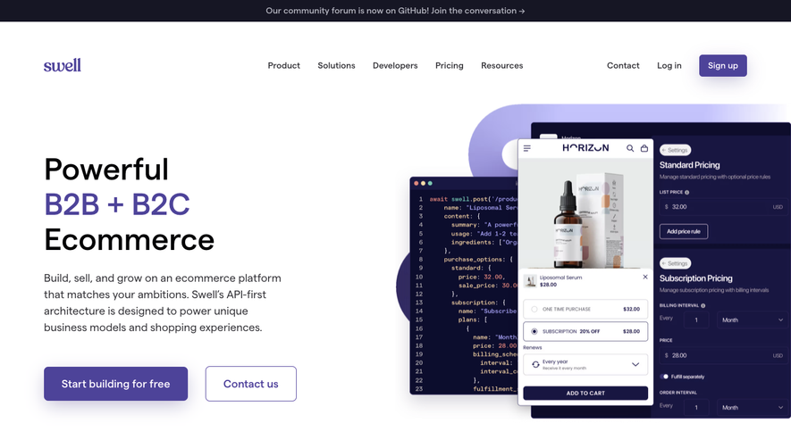


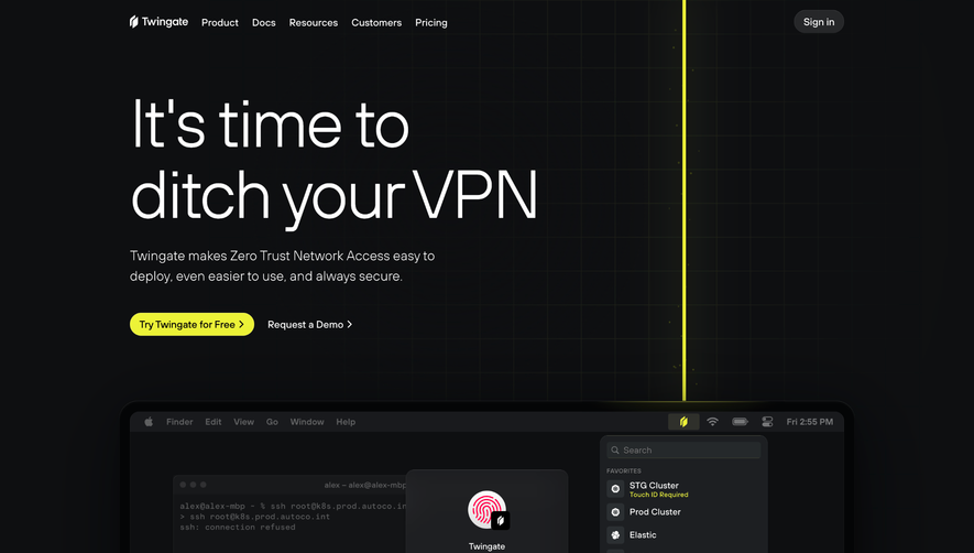



Upgrade to SaaSFrame Pro now to see similar examples.
Monthly
$18 /month
Billed $18 monthly
Browse all screens & flows
Filter and search screens & flows
Search text in screenshots
Access Figma files
Access mobile versions
Join now
Quarterly
$16 /month
Billed $48 quarterly
Browse all screens & flows
Filter and search screens & flows
Search text in screenshots
Access Figma files
Access mobile versions
Join now
Yearly
$15 /month
Billed $180 yearly
Browse all screens & flows
Filter and search screens & flows
Search text in screenshots
Access Figma files
Access mobile versions
Join now