Design with AI
Generate a new design based on this screen using your own content.
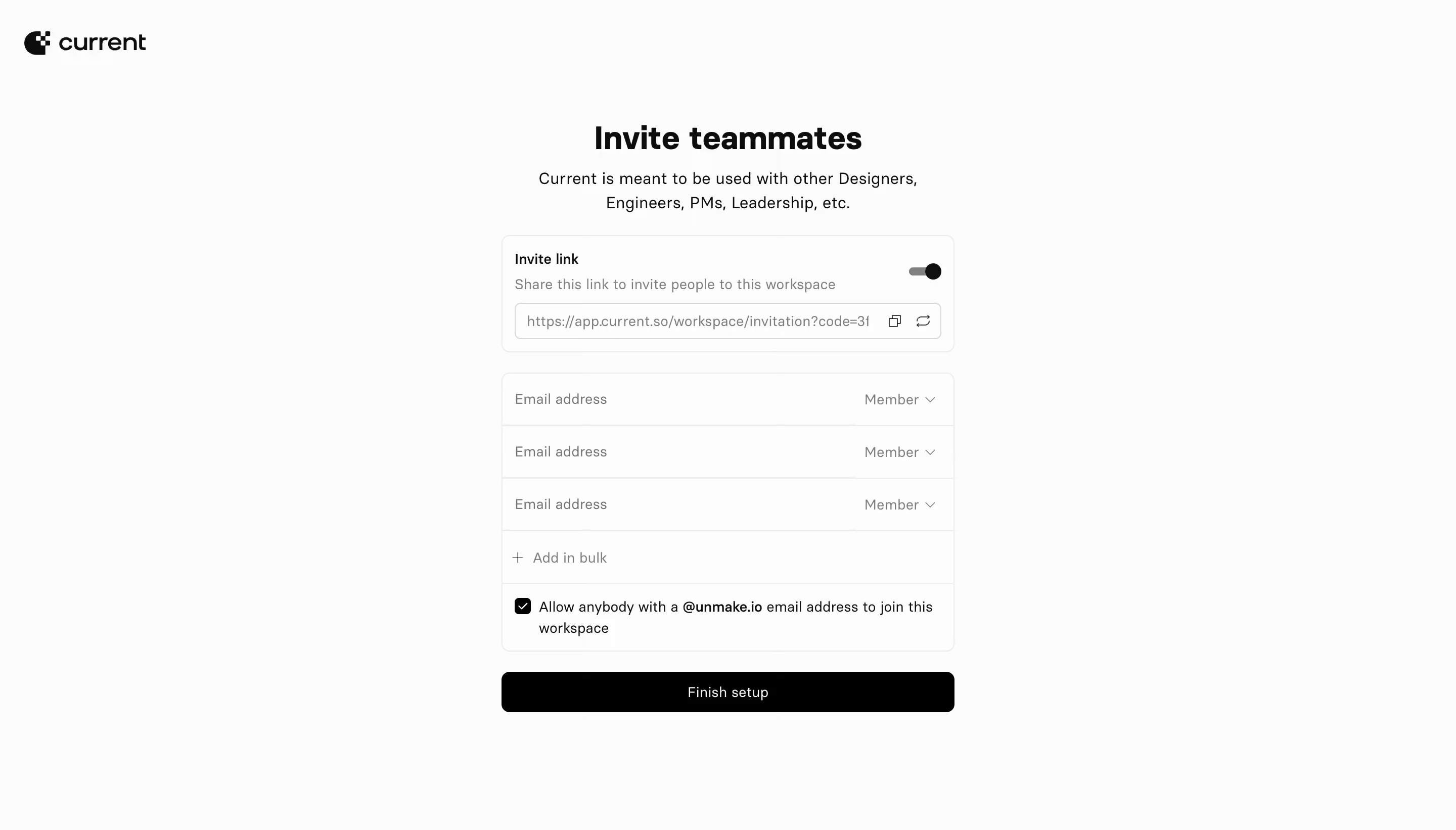
# Design from Reference: Current Invite Team Members
Create an original, high-fidelity visual design inspired by the reference. Prioritize composition, typography, colors, spacing, and component styling over technical implementation.
## Reference
- **Product:** Current
- **Category:** Invite Team Members
- **Screenshot:** https://cdn.prod.website-files.com/5e9dc792e1210c5325f7ebbc/6acb676d994832179b56075a_6acb66c6563b2e222dd2ee9b_cms-dfe87bb9e18ae6952a7eb66b.webp
Analyze the screenshot first. If inaccessible, request it rather than guessing.
## Content
{{content.instructions}}
{{content.data}}
Preserve essential messaging and factual accuracy. Adapt structure and copy length for visual balance; never invent product claims.
## Visual Design
### Overall aesthetic
- **Character:** Minimal monochrome workspace onboarding, with a small black Current wordmark and a restrained central invitation form.
- **Evidence scale:** The image is 2880 × 1642 pixels. Dimensions below are estimated CSS sizes at an unverified 2× capture scale; sampled colors describe converted sRGB pixels.
### Page composition
- **Canvas:** A near-white full viewport with the brand approximately 24 px from the left and 32 px from the top.
- **Main column:** A roughly 448 px column sits on the horizontal centerline. Its heading begins around 120 px down; the final action ends around 705 px.
- **Regions:** Centered heading and two-line introduction precede an invitation-link card, an email-entry card and a separate full-width completion button.
### Information hierarchy
- **Primary message:** The bold invitation heading is the largest text; centered explanatory copy immediately explains collaboration.
- **Input order:** Link sharing comes first, followed by three email-and-role rows, a bulk-add row and a checked domain-access option.
- **Action priority:** The solid black Finish setup button is the strongest filled element; copy and refresh icons remain small secondary utilities.
### Typography
- **Heading:** Unverified sans-serif, approximately 32 px, bold 700, with a compact 38 px line height.
- **Introduction:** Approximately 16 px regular, 24 px line height, centered over two lines.
- **Controls:** Approximately 14 px regular with 20 px line height; the link-card title is medium weight and the domain within the access sentence is bold.
- **Tracking:** Mostly neutral spacing; hierarchy relies on weight and tone rather than decorative lettering.
### Colors & surfaces
- **Canvas and panels:** Large sampled surfaces are #FCFCFC and #FDFDFD, with very subtle separation between page and cards.
- **Text and action:** Black #000000 anchors the button and branding; near-black #0D0D0D appears in text.
- **Dividers and muted text:** Light #EBEBEB boundaries and mid-gray text, including sampled #7E7E7E, create low-contrast supporting structure.
### Components
- **Link card:** Approximately 448 × 116 px, 1 px pale border, 8 px corner radius and 12 px inset. A label and helper sentence sit above a 36 px bordered URL field.
- **Sharing controls:** A compact enabled-looking toggle sits at upper right; copy and refresh line icons occupy the URL field's right edge. No interaction outcome is visible.
- **Invitation card:** Roughly 276 px tall with three approximately 52 px rows. Each row pairs an email placeholder with a right-aligned Member dropdown.
- **Additional options:** A plus-marked bulk row precedes a two-line permission sentence with a black checked square.
- **Completion:** Full-width approximately 40 px black button, white centered label and 8 px radius; no shadow or loading state is visible.
### Visual rhythm
- **Vertical gaps:** About 24 px separates introduction from link card, 20 px separates cards and 20 px precedes the main button.
- **Alignment:** Card edges and button edges coincide; email placeholders, helper text and option labels share consistent left insets.
- **Density:** Wide unused side margins and generous space above the form keep an otherwise detailed permission flow calm.
### Responsive
- **Observed limit:** Only a desktop composition is supplied; no mobile layout is verified.
- **Recommendation:** Preserve the single-column order with 20–24 px viewport gutters and a fluid column capped near 448 px.
- **Control handling:** Let the domain permission sentence wrap naturally, truncate long invitation URLs and retain accessible copy/refresh targets.
### Adaptation guidance
- **Retain:** Combine link-based and individual invitations in distinct bordered groups, then use one clear completion action.
- **Implement:** Use a modest spacing scale around 12, 20 and 24 px, thin neutral dividers and 8 px radii.
- **Verify:** Confirm actual font, capture scale and permission behavior independently; the screenshot establishes appearance and checked state only.
Use this context to reproduce the reference's visual language: layout, typography, colors, spacing, borders, radii, and distinctive elements. The screenshot takes priority if descriptions conflict.
## Direction
{{preferences.fidelityInstructions}}
## Output
{{output.instructions}}
Deliver a polished, cohesive design with precise alignment, hierarchy, and spacing. Produce the requested visual artifact, not just a description. If unsupported, explain the limitation.