
Thank you! Your submission has been received!
Oops! Something went wrong while submitting the form.
Get SaaSFrame Pro
Monthly
$18
Quarterly
$48
Yearly
$180
Upgrade to access this feature
Browse all screens & flows
Filter and search screens & flows
Access Figma files
Access mobile versions
Bookmark screens & flows
Join now

Crisp Customers Page

Crisp
Customer Messaging Platform
Designed by
No items found.

Bookmark
Bookmark

Design with AI
Thank you! Your submission has been received!
Oops! Something went wrong while submitting the form.
# Design from Reference: Crisp Customers Page
Create an original, high-fidelity visual design inspired by the reference. Prioritize composition, typography, colors, spacing, and component styling over technical implementation.
## Reference
- **Product:** Crisp
- **Category:** Customers Page
- **Screenshot:** https://cdn.prod.website-files.com/5e9dc792e1210c5325f7ebbc/6acc0c10128c0d0450eaab8d_6acc0b7f0e2f8bd1e14e0cd0_cms-138f45921e7ae19479db6314-optimized-v3.webp
Analyze the screenshot first. If inaccessible, request it rather than guessing.
## Content
{{content.instructions}}
{{content.data}}
Preserve essential messaging and factual accuracy. Adapt structure and copy length for visual balance; never invent product claims.
## Visual Design
### Overall aesthetic
- **Style:** Bright, approachable customer-proof page combining a long testimonial catalogue with illustrated brand scenes and video case studies.
- **Character:** White surfaces, navy headings, muted blue body text, bright blue conversion actions and generous rounded imagery. Colorful portraits and illustrations soften the otherwise orderly grid.
- **Surface treatment:** Most content sits directly on white. Fine pale-blue borders define testimonial cards; larger rounded panels distinguish the closing conversion area and footer.
### Page composition
- **Capture scale:** 2880 × 17602 image px. CSS estimates assume an unverified 2× capture, corresponding to approximately 1440 × 8801 CSS px.
- **Main container:** Approximately 1185 CSS px wide, centered with about 128 px side margins. The closing CTA and footer expand closer to the viewport edges.
- **Header:** Logo at left, compact navigation across the middle and login/trial actions at right. A thin full-width rule separates it from the page.
- **Hero:** Two columns pair a bold three-line customer-proof headline and supporting paragraph on the left with a seated illustrated character and floating customer-logo discs on the right.
- **First case study:** A large nearly square video thumbnail occupies the left half. The right half contains a two-line heading, a bordered author/story card with a blue action and a separate centered quotation card.
- **Customer grid:** A centered Stories from around the world heading introduces a long three-column grid of portrait-led testimonial cards. The final row is incomplete rather than padded with invented content.
- **Second case study:** Another two-column video/story block presents Emma, reusing the first block's author card and quotation panel structure.
- **Review grid:** A repeated centered section heading precedes three columns of bordered review cards. Each begins with a coral review-platform mark and five stars; the last row contains two cards.
- **Third case study:** A Reedsy video block repeats the left thumbnail/right story-and-quote composition.
- **Social proof:** Users' thoughts in 280 characters introduces another three-column card grid, with portraits, handles, short posts, blue linked mentions and occasional emoji.
- **Closing conversion:** A wide dark navy rounded banner pairs award badges, a large white headline, email/trial control and demo button with a colorful illustrated café/customer-support scene.
- **Footer:** A pale rounded navigation panel contains brand copy, social icons, download link, language selector and four link columns. Below it, a large rounded illustrated landscape fills most of the width. Status, copyright and Europe attribution sit on the final line, with a floating chat button at the lower right.
### Information hierarchy
- **Primary promise:** The hero headline communicates adoption and customer relationships; the illustration supports rather than replaces that message.
- **Proof levels:** Featured video stories provide depth, portrait testimonials provide breadth, star reviews provide quick credibility and social-post cards add an informal voice.
- **Story hierarchy:** Each case study uses a bold outcome heading, identifiable author/company information, explanatory paragraph, video action and visually separate pull quote.
- **Card hierarchy:** Portraits and bold names lead, company or handle lines are quieter, and quote text occupies the main reading area.
- **Conversion hierarchy:** Blue actions recur in the header and stories. The dark closing banner introduces the strongest final trial action alongside a separate demo route.
### Typography
- **Family:** Modern rounded sans serif with compact, heavy headings. Exact family is unverified.
- **Hero title:** Approximately 32–34 CSS px, weight 700, line-height around 36 px and tight tracking.
- **Section headings:** Approximately 38–40 px with 44–48 px leading, semibold or bold, centered above proof grids.
- **Case-study headings:** Approximately 26–28 px, bold, with close 30 px leading; usually two lines.
- **Body and small cards:** Approximately 14–16 px with 20–22 px leading. Names are bold; company labels and handles use a softer blue tone.
- **Review quotations:** Larger than ordinary testimonial copy, approximately 19–20 px with about 32 px leading.
- **Pull quotes:** Centered italic text, approximately 18–20 px with generous leading, under a large pale quotation mark.
- **Scale qualification:** All typography values are visual CSS estimates under the assumed 2× capture.
### Colors & surfaces
- **Main canvas:** Sampled sRGB #FFFFFF dominates the long page.
- **Secondary surface:** Sampled #FCFCFD supplies a near-white reference for subtle panel backgrounds.
- **Heading palette:** Sampled #242F47 and closely related #242E47 provide dark navy heading tones.
- **Supporting palette:** Sampled #5D6B98 is a muted blue reference for supporting copy; #404968 provides a darker blue-gray used in prominent secondary text.
- **Card borders:** Sampled #E9ECF5 supplies the pale cool border/reference tone around cards and soft quotation details.
- **Darkest details:** Sampled #000000 and #030E26 appear in dark text or illustration regions; avoid flattening all navy text to pure black.
- **Action and proof accents:** Bright blue buttons, coral review stars and colorful brand illustrations are visible. Their exact accent values are not established by the dominant-color sample and should be selected against the reference.
### Components
- **Testimonial cards:** Approximately 375–380 CSS px wide, with about 24 px padding, 10–12 px radii and thin pale-blue borders. Rows adapt to the longest quote within their shared row.
- **Author rows:** Circular portraits around 48 px in diameter sit beside stacked name/company text; consistent alignment makes the repeated cards easy to scan.
- **Video thumbnails:** Approximately 600 × 600 CSS px, softly rounded, with a prominent white play symbol near the center and customer identity at the bottom left.
- **Story cards:** White bordered rectangles with author metadata, compact paragraphs and blue rounded Watch the story buttons.
- **Quotation panels:** Separate bordered containers with generous padding, a large pale quote glyph and centered italic copy.
- **Review cards:** Larger text blocks begin with the review-platform icon and five coral stars. These use no portrait row in the captured region.
- **Social cards:** Portrait, name and handle at top; short post text below. Linked mentions use a noticeably stronger blue than surrounding prose.
- **Trial controls:** A white pill-shaped email area contains a blue trial button; a separate white demo pill sits beside it. Fine supporting trial terms sit underneath.
- **Footer panels:** Broad corner radii, approximately 40–50 CSS px, give both the link area and landscape illustration a softer silhouette than the small cards.
- **Chat launcher:** Bright blue circular control with white speech symbol, visually floating at the bottom right.
### Visual rhythm
- **Long-page pacing:** Dense proof grids alternate with larger two-column video sections, preventing the page from becoming one uninterrupted set of small quotes.
- **Grid repetition:** Three consistent columns, roughly 24 px gutters and repeated author rows establish a predictable scanning rhythm.
- **Section spacing:** Centered headings and substantial white gaps distinguish each type of evidence.
- **Color progression:** The top and central catalogue stay predominantly white; large illustrated scenes and the navy CTA make the closing regions more expressive.
- **Shape consistency:** Small cards use modest radii, while hero imagery, CTA and footer use larger curves appropriate to their scale.
### Responsive
- **Evidence limit:** Only desktop is visible; recommendations below are not observed behavior.
- **Grid recommendation:** Reduce testimonial, review and social grids to two columns on tablets and one on phones, preserving readable paragraph widths.
- **Story recommendation:** Stack video, heading, author/story card and pull quote in a logical reading order.
- **Hero recommendation:** Place text before illustration, reduce headline size moderately and keep customer-logo discs from colliding with copy.
- **CTA recommendation:** Stack email input, trial action and demo button with comfortable touch targets; crop the café illustration away from important text.
- **Footer recommendation:** Stack or collapse navigation groups and scale the landscape independently from functional links and status information.
### Adaptation guidance
- **Use authentic evidence:** Replace every quote, portrait, logo, review score and adoption claim with authorized target-product proof.
- **Preserve variety:** Mix a few detailed stories with shorter testimonials and social proof only when those content types exist.
- **Match volume:** Reduce grid length to available evidence; do not create empty or fabricated endorsements to mimic the screenshot's height.
- **Retain the system:** Combine white canvas, navy headings, muted blue copy, pale card borders and bright conversion actions.
- **Adapt illustration purposefully:** Use coherent brand scenes to frame the page, while leaving testimonials and actions easy to read and compare.
- **Interaction recommendation:** Provide accessible video controls, meaningful link labels and properly labeled email input; these behaviors cannot be established from the static image.
Use this context to reproduce the reference's visual language: layout, typography, colors, spacing, borders, radii, and distinctive elements. The screenshot takes priority if descriptions conflict.
## Direction
{{preferences.fidelityInstructions}}
## Output
{{output.instructions}}
Deliver a polished, cohesive design with precise alignment, hierarchy, and spacing. Produce the requested visual artifact, not just a description. If unsupported, explain the limitation.


Category
Patterns
No items found.
Tech Stack


Added on
August 11, 2025
Similar screens
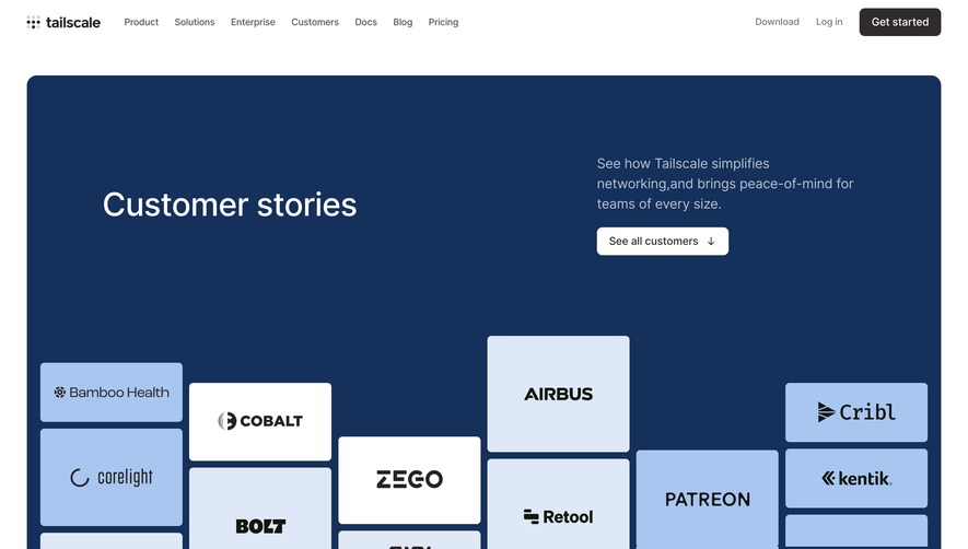


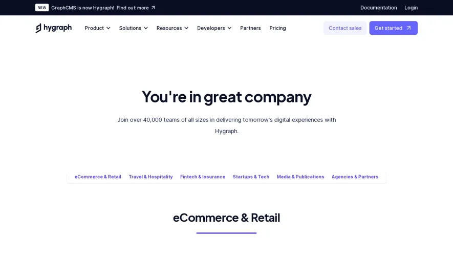



Upgrade to SaaSFrame Pro now to see similar examples.
Monthly
$18 /month
Billed $18 monthly
Browse all screens & flows
Filter and search screens & flows
Search text in screenshots
Access Figma files
Access mobile versions
Join now
Quarterly
$16 /month
Billed $48 quarterly
Browse all screens & flows
Filter and search screens & flows
Search text in screenshots
Access Figma files
Access mobile versions
Join now
Yearly
$15 /month
Billed $180 yearly
Browse all screens & flows
Filter and search screens & flows
Search text in screenshots
Access Figma files
Access mobile versions
Join now