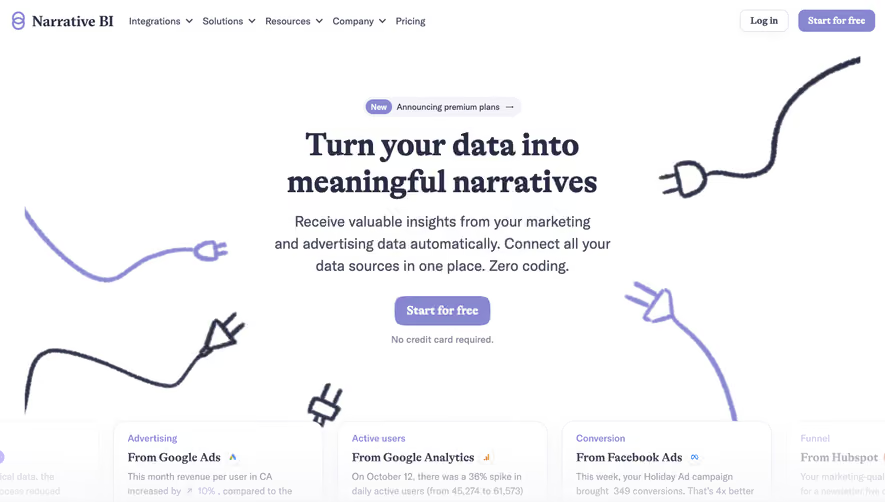
Generate a new design based on this screen using your own content.
Thank you! Your submission has been received!
Oops! Something went wrong while submitting the form.
# Design from Reference: Crew Landing Page
Create an original, high-fidelity visual design inspired by the reference. Prioritize composition, typography, colors, spacing, and component styling over technical implementation.
## Reference
- **Product:** Crew
- **Category:** Landing Page
- **Screenshot:** https://cdn.prod.website-files.com/5e9dc792e1210c5325f7ebbc/6acbbe32476aea3982e3f96e_6acbbcd1d01e36484766438b_cms-f445d90103cea21fb60e35f9.webp
Analyze the screenshot first. If inaccessible, request it rather than guessing.
## Content
{{content.instructions}}
{{content.data}}
Preserve essential messaging and factual accuracy. Adapt structure and copy length for visual balance; never invent product claims.
## Visual Design
Use this context to reproduce the reference's visual language: layout, typography, colors, spacing, borders, radii, and distinctive elements. The screenshot takes priority if descriptions conflict.
## Direction
{{preferences.fidelityInstructions}}
## Output
{{output.instructions}}
Deliver a polished, cohesive design with precise alignment, hierarchy, and spacing. Produce the requested visual artifact, not just a description. If unsupported, explain the limitation.
CREW.work embodies a forward-thinking minimalism, balancing sharp professionalism with energetic, youthful undertones. The design leans heavily on breathing space and crisp edges—delivering a polished, inviting impression. Strategic dashes of saturated accent colors inject life and approachability without overpowering the clean white and soft gray backdrop.
Layout and Structure
The homepage adopts a confident, modern SaaS structure: a visually commanding hero section immediately clarifies value with bold headlines and a central CTA. Below, digestible feature summaries use well-proportioned grids and sparing copy. Testimonials, integrated seamlessly, establish trust early. The footer is succinct but information-rich, containing quick access links, social buttons, and subtle branding for continuity.
Visual Elements
Illustrations take precedence over stock photography, with playful-yet-geometric vector graphics creating an instantly recognizable identity. Micro-animations bring the interface to life—gently highlighted transitions on hover and scroll cues reward user interaction. Custom icons throughout bolster both clarity and cohesiveness.
Color Palette and Typography
CREW.work’s color scheme is anchored by cool neutrals, with energetic blue and purple accents projecting innovation and trust. Typography strikes a balance: a modern sans-serif leads for headings, assertive and legible, while a lighter set supports body copy for readability and accessibility. Clear hierarchy through varied weight and size guides the user intuitively.
User Experience Patterns
Navigation is sticky and compact, minimizing friction as users scroll. CTAs—bright, pill-shaped buttons—are strategically placed and always prominent. Forms are minimal, requesting only essentials, and engagement is reinforced by subtle scroll-triggered effects and clearly marked interactive elements.
Unique or Notable Design Choices
CREW.work stands out through its deft use of animated vector scenes in the hero and features sections—immediately memorable, they showcase the platform's personality and functionality simultaneously. The site’s overall feel is innovatively friendly, balancing credibility with enough creative flair to invite sustained exploration.