Design with AI
Generate a new design based on this screen using your own content.
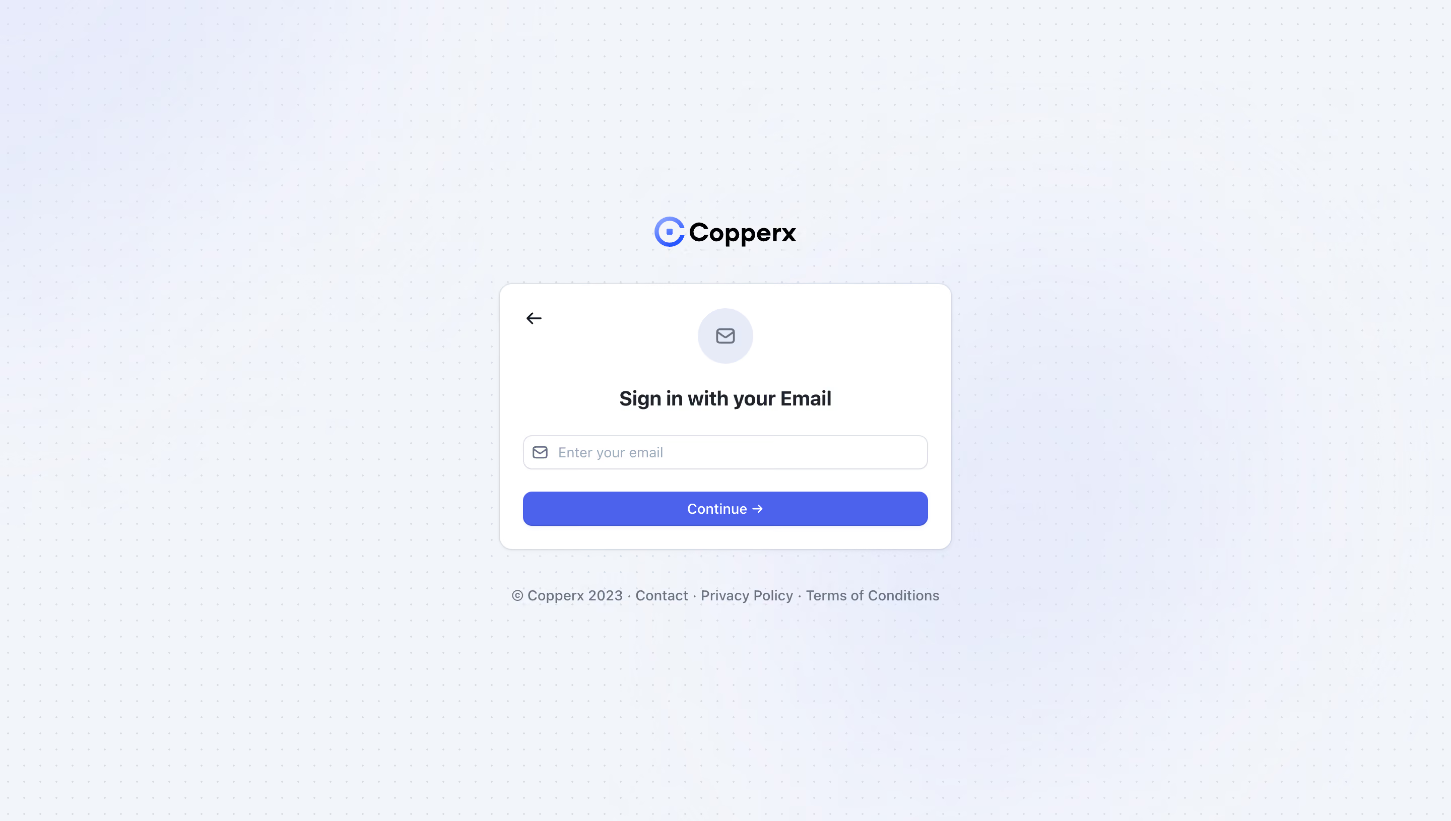
# Design from Reference: Copperx Signup
Create an original, high-fidelity visual design inspired by the reference. Prioritize composition, typography, colors, spacing, and component styling over technical implementation.
## Reference
- **Product:** Copperx
- **Category:** Signup
- **Screenshot:** https://cdn.prod.website-files.com/5e9dc792e1210c5325f7ebbc/6acad8a2d05a3f53c0a74c8c_6acad81b053419932ab66e4a_cms-1469d6cc9e9672e0fbed8959.webp
Analyze the screenshot first. If inaccessible, request it rather than guessing.
## Content
{{content.instructions}}
{{content.data}}
Preserve essential messaging and factual accuracy. Adapt structure and copy length for visual balance; never invent product claims.
## Visual Design
### Overall aesthetic
- **Style:** Minimal email-authentication screen with a white card, soft blue ambient background, tiny dotted grid and a saturated blue action.
- **Capture scale:** Source image 2880 × 1630px. Sizes below estimate a 1440 × 815 CSS viewport at 2× capture scale.
- **Visible state:** Although the record is titled Signup, the screenshot's heading reads Sign in with your Email.
### Page composition
- **Centered stack:** Copperx branding sits above a roughly 448 × 264px authentication card, with legal/contact links centered below.
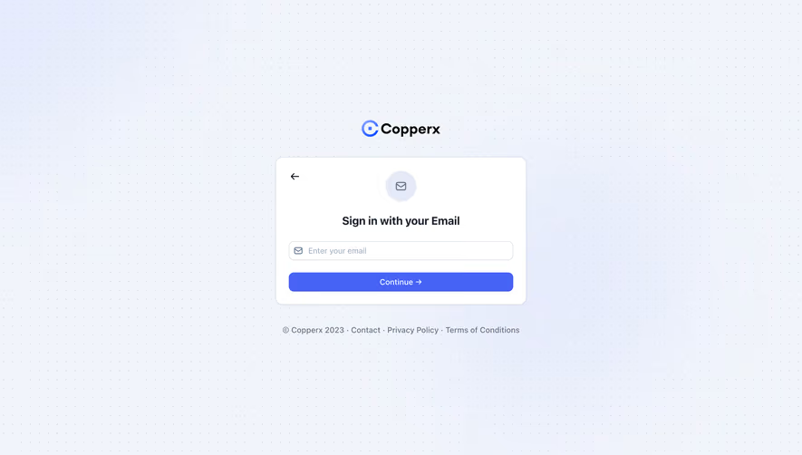
- **Card layout:** A back arrow occupies the upper-left corner, while a circular envelope badge, centered heading, email field and Continue action form the main vertical sequence.
- **Background:** The full viewport uses a very pale blue surface with evenly spaced small dots and diffuse lavender-blue glows; no navigation bar or side panel appears.
### Information hierarchy
- **Brand and task:** The Copperx mark establishes identity before the email sign-in instruction.
- **Input and progression:** One email field and a full-width Continue button make the task linear and compact.
- **Secondary navigation:** The back arrow offers a previous step; contact, privacy and terms links remain below the card. No validation, password field or provider choice is visible.
### Typography
- **Family:** Clean sans-serif; exact font identity is unverified.
- **Roles:** Estimated heading 20px/26px semibold, field and button text around 14px, footer links around 14px and wordmark about 27px bold.
- **Alignment:** Heading, branding and footer are centered; placeholder text is left aligned inside the field.
### Colors & surfaces
- **Sampled palette:** ICC-aware sRGB samples include pale blue #F1F5FB, #F0F4FB, #EFF3FC, #F0F4FA and #EEF2FC, plus white #FFFFFF.
- **Accent roles:** Bright blue fills Continue and the Copperx symbol. The envelope badge uses a pale lavender fill, with muted slate iconography and footer text.
- **Depth:** A thin cool border and faint shadow separate the white card from the patterned background.
### Components
- **Card:** Approximately 12px corners and 24px horizontal padding, with compact spacing and no heavy elevation.
- **Envelope badge:** Approximately 56px circular pale surface with a small outlined envelope centered inside.
- **Email field:** Approximately 400 × 34px, thin blue-gray border, 8px corners, left envelope icon and muted Enter your email placeholder.
- **Continue button:** Same width as the field and about 34px high, with 8px corners, centered white label and right arrow.
- **Footer:** A single compact line combines copyright, Contact, Privacy Policy and Terms of Conditions, separated by centered dots.
### Visual rhythm
- **Spacing:** Roughly 36–40px separates branding from the card; about 20px separates the field and action. The footer sits around 36px below the card.
- **Balance:** The small centered module is surrounded by broad empty space. The patterned backdrop remains subtle enough to avoid competing with the form.
### Responsive
- **Recommended adaptation:** Only desktop is observed. Use viewport width minus 32px for the card when space is limited and let footer links wrap.
- **Usability:** Maintain comfortable touch heights and keep the back control reachable without crowding the central badge.
### Adaptation guidance
- **Preserve:** Keep one clear email task, a compact white card, subtle patterned background and a strong full-width progression action.
- **Adapt:** Match the actual authentication state and destination. Do not add signup-specific fields merely from the record title or infer unseen verification steps.
Use this context to reproduce the reference's visual language: layout, typography, colors, spacing, borders, radii, and distinctive elements. The screenshot takes priority if descriptions conflict.
## Direction
{{preferences.fidelityInstructions}}
## Output
{{output.instructions}}
Deliver a polished, cohesive design with precise alignment, hierarchy, and spacing. Produce the requested visual artifact, not just a description. If unsupported, explain the limitation.