Overall Style and Aesthetic
The Close x ChartMogul case study page embodies a modern, minimalist aesthetic that exudes professionalism and clarity. Ample white space keeps the layout breathing and uncluttered, while subtle color accents add vibrancy without overwhelming. The design strikes a smart balance between approachable and authoritative, appealing to SaaS users seeking efficiency and sophistication. Layout and Structure
The content unfolds in a clean, logical sequence: a bold hero section immediately captures attention with customer logos and a succinct value proposition. Customer stories are presented through focused, modular blocks, combining brief copy with authentic visuals. The absence of extraneous elements ensures visitors can easily follow the narrative flow—from challenge, to solution, to results—without distraction. Visual Elements
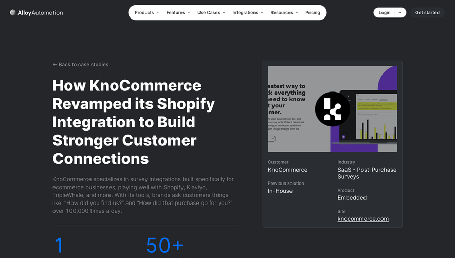
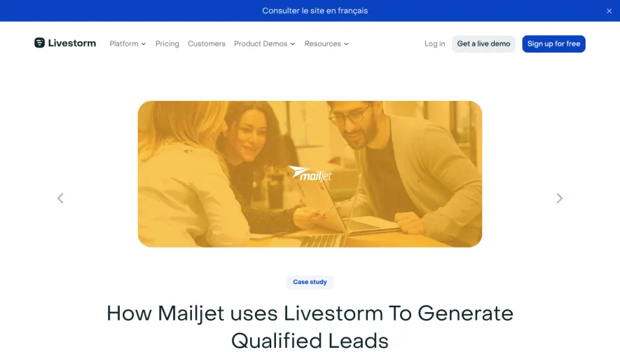
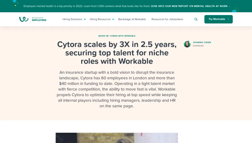
Professional headshots, product interface screenshots, and branded photography provide visual credibility and break up text. Logos of both companies reinforce partnership and trust, while clean iconography enhances understanding. There are no flashy animations; instead, imagery is purposeful and context-enhancing. Color Palette and Typography
The palette pairs deep navy with fresh whites and subtle grays, punctuated by occasional accent colors for CTAs and highlights. Typography uses a hierarchy of sans-serif fonts—bold headlines, clear subheads, and legible body text—guiding the reader’s eye and aiding readability. User Experience Patterns
Sticky navigation ensures seamless access to product info, while prominent, well-spaced CTAs (“Try Close Free”) drive user action. Content loads smoothly as users scroll, reinforcing ease of use. Testimonial quotes and metrics are visually emphasized for quick scanning. Unique or Notable Design Choices
The case study format is elevated with real customer quotes and practical insights, fostering authenticity. The page avoids overwhelming feature lists, focusing instead on storytelling and tangible outcomes. The overall tone is engaging, trustworthy, and solution-focused—perfect inspiration for SaaS designers seeking to blend function and form.