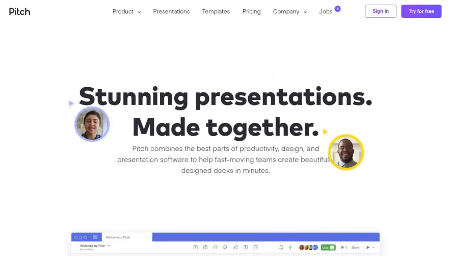
Overall Style and Aesthetic
Clearbit’s homepage exudes a polished, modern professionalism with minimalist sensibilities. The design leverages whitespace to create an uncluttered, spacious feel, letting carefully chosen content and visuals shine. A subtle vibrancy is introduced through vibrant accent colors, giving the interface an energetic, technology-forward vibe without overwhelming the primary clean aesthetic. Layout and Structure
The structure unfolds logically: a bold hero section with clear value propositions and call-to-action buttons draws visitors in immediately, followed by edge-to-edge rows for solution overviews, customer logos, product features, and social proof. Further down, strategic testimonials and succinct CTAs guide users toward exploring more or starting a demo. A streamlined footer quietly offers essential links and resources without visual burden. Visual Elements
Custom illustrations, smooth micro-animations, and playful iconography augment brand personality, making complex concepts more accessible. Dynamic product screenshots blend seamlessly with the design, allowing users to glimpse functionality instantly. Thoughtful movement—such as slide-ins or fades—adds energy and directs attention where it matters, enhancing both understanding and engagement. Color Palette and Typography
The palette centers around crisp whites, deep blues, and vivid teals—projecting clarity and trust. Pops of yellow and green in UI accents and buttons highlight actionable elements. Typography is modern, sans-serif, and highly legible, with varied font weights and sizes establishing an effortless hierarchy across headlines, body text, and captions. User Experience Patterns
Clearbit prioritizes usability: sticky navigation simplifies orientation, bold CTAs repeat tactically, and concise forms lower conversion barriers. Interactive sections and gentle hover effects guide the journey, offering discovery without friction. Clear, focused messaging communicates value rapidly, ensuring visitors never feel lost or overwhelmed. Unique or Notable Design Choices
A standout is the subtle interplay between motion and simplicity—micro-animations enrich the narrative without distracting. The use of well-spaced visual “breathing room” between elements invites exploration. The brand’s tone is confident and forward-thinking, inspiring trust while promising innovation, which aligns perfectly with SaaS audiences seeking both reliability and modernity.