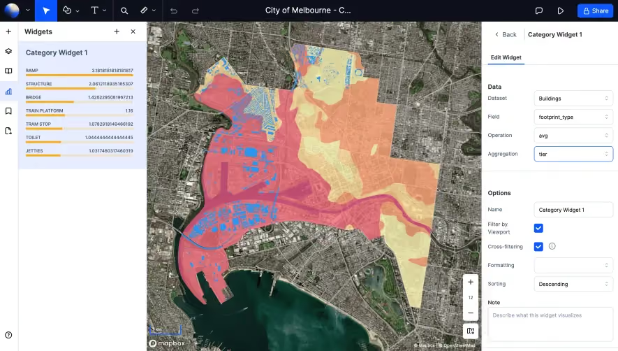
Generate a new design based on this screen using your own content.
Thank you! Your submission has been received!
Oops! Something went wrong while submitting the form.
# Design from Reference: Clearbit Analytics Interface
Create an original, high-fidelity visual design inspired by the reference. Prioritize composition, typography, colors, spacing, and component styling over technical implementation.
## Reference
- **Product:** Clearbit
- **Category:** Analytics
- **Screenshot:** https://cdn.prod.website-files.com/5e9dc792e1210c5325f7ebbc/62ecad61c09ba383560cf7ef_1659676506432-5eaecb9bcd1146669c798ae5_screencapture-dashboard-clearbit-batch-2020-05-03-15_47_38.webp
Analyze the screenshot first. If inaccessible, request it rather than guessing.
## Content
{{content.instructions}}
{{content.data}}
Preserve essential messaging and factual accuracy. Adapt structure and copy length for visual balance; never invent product claims.
## Visual Design
Use this context to reproduce the reference's visual language: layout, typography, colors, spacing, borders, radii, and distinctive elements. The screenshot takes priority if descriptions conflict.
## Direction
{{preferences.fidelityInstructions}}
## Output
{{output.instructions}}
Deliver a polished, cohesive design with precise alignment, hierarchy, and spacing. Produce the requested visual artifact, not just a description. If unsupported, explain the limitation.
The Clearbit Batch page embodies a crisp, modern aesthetic grounded in professional minimalism. Ample white space creates a calm, uncluttered feel, while subtle gradients and smooth shadows offer polish without distraction. This balance of clarity and sophistication highlights utility while exuding the reliability expected from a B2B SaaS platform.
Layout and Structure
The layout is highly intuitive, with a focused hero section featuring concise messaging and a prominent CTA. Content is streamlined—there are no overwhelming feature lists or crowded UI blocks. The dashboard metaphor is central, conveying action and simplicity. Navigation remains fixed, ensuring easy access to related tools, while concise vertical stacking gently guides users from overview to action.
Visual Elements
High-clarity icons, lightweight line illustrations, and minimalistic UI accents prevent visual fatigue. Light, cohesive backgrounds keep attention on interactive elements, while an understated upload module signals functionality. Animated feedback and microinteractions lend a sense of modernity and responsiveness, rewarding users for engagement without slowing them down.
Color Palette and Typography
A balanced palette of crisp whites, medium grays, and strategic blue highlights fosters both approachability and focus. Font choices emphasize clarity—likely sans-serif for headers (bold, impactful), paired with readable body text. Clear visual hierarchy supports rapid scanning and comprehension.
User Experience Patterns
Navigation patterns are familiar and effortless, with sticky menus and clear, high-contrast calls to action. The upload form is front-and-center, subtly animated to prompt interaction. Progress indicators and error handling are unobtrusive but informative, minimizing friction throughout the workflow.
Unique or Notable Design Choices
What truly stands out is the page’s restraint and purposeful simplicity—functionality is never obscured by ornamentation. The tone conveys trust and technical prowess, with just enough personality to feel inviting. Aspiring SaaS designers will find inspiration in its harmony of actionable UX and understated visual style.