Overall Style and Aesthetic
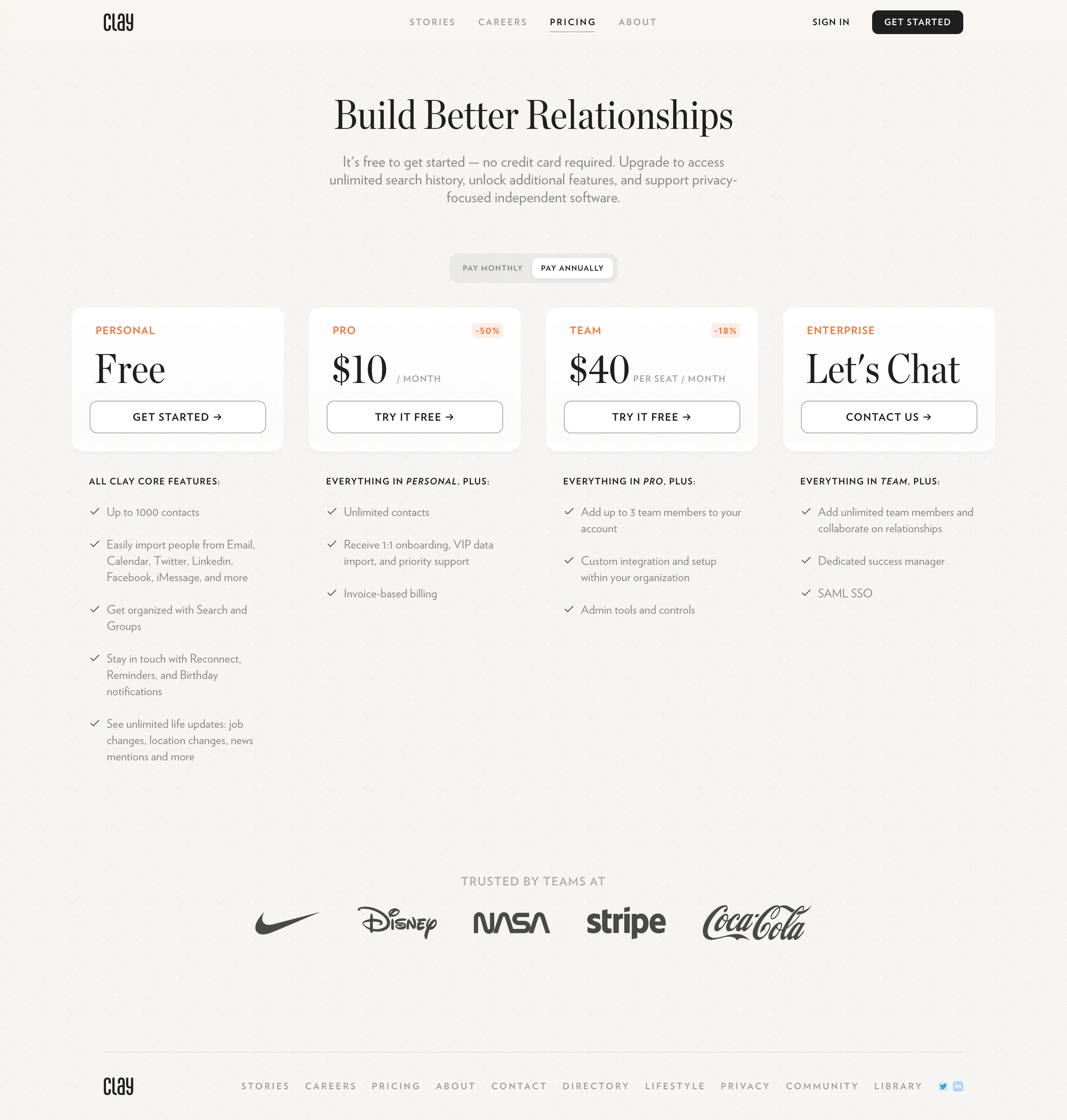
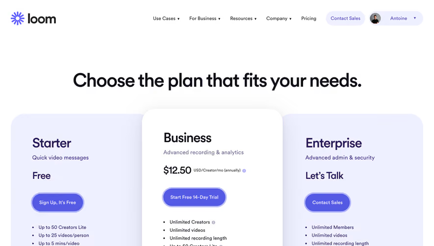
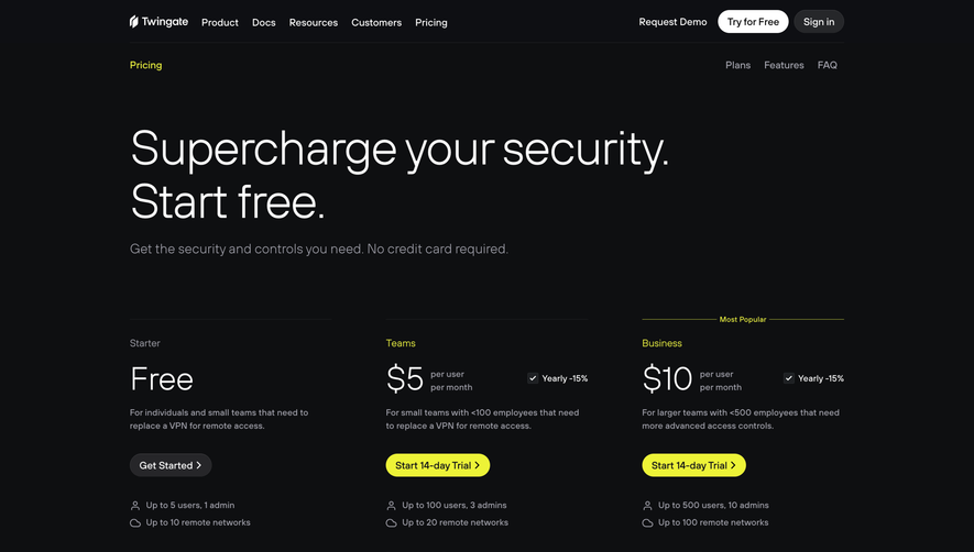
Clay’s pricing page epitomizes modern minimalism, balancing airy negative space with elegant, professional polish. The interface feels calm but inviting, projecting understated sophistication ideal for SaaS—no clutter, just clarity. Subtle gradients and delicate shadows add depth without distraction, while rounded corners and soft tones impart a friendly, approachable vibe. Layout and Structure
The page follows a focused, linear flow: crisp hero header, bold headline, and straightforward plan comparison. Each pricing tier is presented in vertically stacked cards, ensuring effortless scanning. Optional FAQ and a simple footer round out the journey, with content carefully prioritized to ensure instant access to the essentials. Visual Elements
Distinctive custom illustrations—stylized but restrained—act as visual anchors, complemented by thoughtful iconography that brings clarity to feature lists. Micro-animations gently highlight interactions (like plan selection), enhancing engagement without overwhelming users. There’s a refreshing absence of heavy photography or video, emphasizing clarity and simplicity. Color Palette and Typography
The palette embraces soft off-whites, tranquil blues, and subtle muted accent colors, conveying both trust and modernity. Typography features a clean sans-serif font, leveraging bold weights for headlines and delicate body copy for details. Clear hierarchy, spacing, and font sizing guide the eye naturally, making each section effortless to digest. User Experience Patterns
Sticky navigation keeps the user oriented, while prominent CTAs (“Try for free,” etc.) stand out in accent colors. Plans are instantly comparable, with toggle options (like monthly/yearly) seamlessly integrated. Motion is subtle yet purposeful, and support for dark mode reflects attention to accessibility. Unique or Notable Design Choices
Standout elements include soft shadow-boxed pricing cards, illustration-driven micro storytelling, and elegantly muted color accents. The tone is empathetic, quietly confident, and innovative, making users feel valued and understood—perfect inspiration for those aiming to craft trustworthy, conversion-optimized SaaS experiences.