
Thank you! Your submission has been received!
Oops! Something went wrong while submitting the form.
Get SaaSFrame Pro
Monthly
$18
Quarterly
$48
Yearly
$180
Upgrade to access this feature
Browse all screens & flows
Filter and search screens & flows
Access Figma files
Access mobile versions
Bookmark screens & flows
Join now

Designed by
No items found.

Bookmark
Bookmark

Design with AI
Thank you! Your submission has been received!
Oops! Something went wrong while submitting the form.
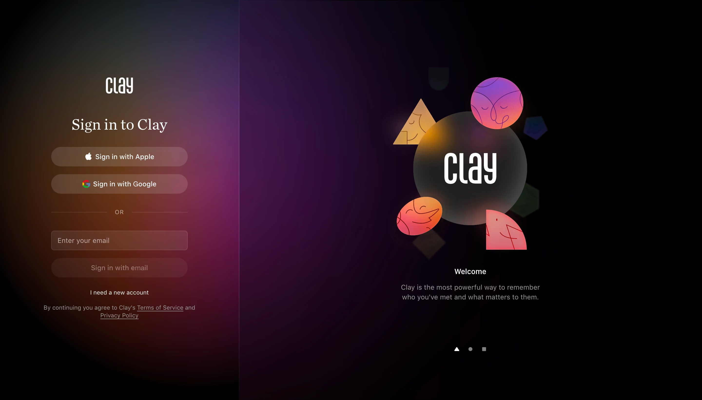
# Design from Reference: Clay Login
Create an original, high-fidelity visual design inspired by the reference. Prioritize composition, typography, colors, spacing, and component styling over technical implementation.
## Reference
- **Product:** Clay
- **Category:** Login
- **Screenshot:** https://cdn.prod.website-files.com/5e9dc792e1210c5325f7ebbc/6acb698e5e515b69c7964d56_6acb672cadcf005a3c5e199e_cms-7f9d0cce8eecf60168616a75.webp
Analyze the screenshot first. If inaccessible, request it rather than guessing.
## Content
{{content.instructions}}
{{content.data}}
Preserve essential messaging and factual accuracy. Adapt structure and copy length for visual balance; never invent product claims.
## Visual Design
### Overall aesthetic
- **Style:** Atmospheric dark login screen with translucent controls, warm/purple background light and a large illustrated welcome panel.
- **Character:** Black canvas, white brand/text, a serif sign-in heading and colorful abstract face shapes around a glass-like central disc.
- **Surface treatment:** Low-contrast translucent pills and input surfaces; a subtle vertical divider separates authentication from the promotional panel.
### Page composition
- **Capture scale:** 2880 × 1642 image px. CSS estimates assume an unverified 2× capture, approximately 1440 × 821 CSS px.
- **Left region:** Approximately 490 CSS px wide, containing a centered narrow authentication stack around 280 px wide.
- **Brand/title:** Clay wordmark sits above Sign in to Clay near the upper-middle of the left column.
- **Authentication stack:** Apple and Google sign-in pills, an OR divider, email field and muted email-sign-in pill appear in sequence.
- **Secondary copy:** New-account route sits beneath, followed by a centered two-line legal sentence.
- **Right region:** A much wider black promotional area contains a large central disc with Clay wordmark and surrounding colorful geometric faces.
- **Welcome copy:** Small centered heading and two-line description sit below the illustration.
- **Pagination:** Three small shape markers appear near the lower part of the promotional panel, with the first brighter than the others.
### Information hierarchy
- **Authentication focus:** The left title and stacked provider actions define the main task.
- **Alternative route:** OR separates third-party authentication from email entry.
- **Captured state:** Email is empty and the email action appears muted. No validation, loading or success state is shown.
- **Promotional hierarchy:** Large illustration leads, while Welcome and its description remain much smaller.
- **Secondary routes:** New account and legal links are quieter than sign-in actions.
- **Evidence limit:** Pagination-like markers are visible, but carousel timing, transitions and other slides are unverified.
### Typography
- **Brand:** Tall condensed stylized wordmark; exact typeface is unverified.
- **Sign-in title:** Serif, approximately 30–32 CSS px, regular/medium, with 38 px leading.
- **Controls:** Neutral sans serif around 14 px, medium weight.
- **OR label:** Small uppercase text around 11–12 px with increased tracking.
- **Promotional copy:** Approximately 14–15 px; heading is brighter and slightly heavier than description.
- **Legal/new-account:** Approximately 12 px with 16–18 px leading.
- **Measurement limit:** Values are visual CSS estimates under the assumed 2× capture.
### Colors & surfaces
- **Main canvas:** Sampled sRGB #000000 supplies the deepest background.
- **Near-black variation:** Sampled #010001 and #000001 occur among the dark composited gradient regions.
- **Foreground:** Sampled #FFFFFF supplies bright wordmarks and prominent text.
- **Neutral dark:** Sampled #212121 provides a related dark reference among interface/image details.
- **Atmospheric palette:** Amber, orange, burgundy and violet glows blend behind the left form and into the right panel. These are continuous image/gradient colors rather than confirmed flat theme tokens.
- **Control contrast:** Provider pills and email surfaces use translucent warm/light fills over the glow; secondary text is muted gray.
- **Illustration accents:** Coral, pink, purple and yellow geometric faces contrast with the smoky dark central disc.
### Components
- **Provider actions:** Approximately 280 × 40 CSS px, fully rounded, translucent warm surface, leading provider logo and centered light label.
- **Email field:** Matching width, approximately 40 px high, small 5–6 px radius, thin low-contrast outline and muted placeholder.
- **Email action:** Rounded pill with subdued fill/label in the captured empty-field state.
- **Divider:** Fine horizontal rules flank a small OR label.
- **Central disc:** Large dark translucent-looking circle with soft edge lighting and white Clay mark.
- **Face shapes:** Triangle, circle, oval and leaf-like forms carry simple line-drawn expressions and softly lit gradients.
- **Pagination markers:** Small triangle, circle and square, with differing brightness.
- **Legal links:** Underlined inline text, integrated into a centered sentence.
### Visual rhythm
- **Split layout:** Compact functional form contrasts with broad decorative space.
- **Control rhythm:** Equal widths and repeated pill heights make authentication options predictable.
- **Lighting:** Diffuse color glows create depth without enclosing the form in a card.
- **Whitespace:** Large margins around the illustration and lower markers keep the dark composition spacious.
### Responsive
- **Evidence limit:** Only desktop is shown; recommendations below are not observed behavior.
- **Layout recommendation:** Prioritize the authentication stack and move or simplify the welcome artwork on small screens.
- **Width recommendation:** Use full available control width with 24 px side margins and comfortable touch height.
- **Contrast recommendation:** Validate translucent controls against every background-light variation.
- **Motion recommendation:** If promotional slides animate, provide reduced-motion handling and accessible navigation.
- **Accessibility recommendation:** Use visible field labels, provider-specific names and clear focus states; these behaviors are not verified by the screenshot.
### Adaptation guidance
- **Preserve clarity:** Keep supported authentication options distinct from account creation and legal information.
- **Use real providers:** Include only implemented sign-in methods and genuine target-brand legal destinations.
- **Retain atmosphere carefully:** Use coherent gradients and abstract artwork without reducing form readability.
- **Keep state accurate:** Derive email-action availability and error feedback from real validation.
- **Avoid inferred interaction:** Do not invent carousel content or authentication success behavior from the static capture.
Use this context to reproduce the reference's visual language: layout, typography, colors, spacing, borders, radii, and distinctive elements. The screenshot takes priority if descriptions conflict.
## Direction
{{preferences.fidelityInstructions}}
## Output
{{output.instructions}}
Deliver a polished, cohesive design with precise alignment, hierarchy, and spacing. Produce the requested visual artifact, not just a description. If unsupported, explain the limitation.


Category
Patterns
Tech Stack
No items found.
Added on
May 25, 2023
Similar screens




Upgrade to SaaSFrame Pro now to see similar examples.
Monthly
$18 /month
Billed $18 monthly
Browse all screens & flows
Filter and search screens & flows
Search text in screenshots
Access Figma files
Access mobile versions
Join now
Quarterly
$16 /month
Billed $48 quarterly
Browse all screens & flows
Filter and search screens & flows
Search text in screenshots
Access Figma files
Access mobile versions
Join now
Yearly
$15 /month
Billed $180 yearly
Browse all screens & flows
Filter and search screens & flows
Search text in screenshots
Access Figma files
Access mobile versions
Join now