Design with AI
Generate a new design based on this screen using your own content.
# Design from Reference: Checkout.com Payments Dashboard
Create an original, high-fidelity visual design inspired by the reference. Prioritize composition, typography, colors, spacing, and component styling over technical implementation.
## Reference
- **Product:** Checkout.com
- **Category:** Dashboard
- **Screenshot:** https://cdn.prod.website-files.com/5e9dc792e1210c5325f7ebbc/6acad4c01025e911ae518420_6acad3d15af75170c4bcf35c_cms-85bae154986da9071ea9268d.webp
Analyze the screenshot first. If inaccessible, request it rather than guessing.
## Content
{{content.instructions}}
{{content.data}}
Preserve essential messaging and factual accuracy. Adapt structure and copy length for visual balance; never invent product claims.
## Visual Design
### Overall aesthetic
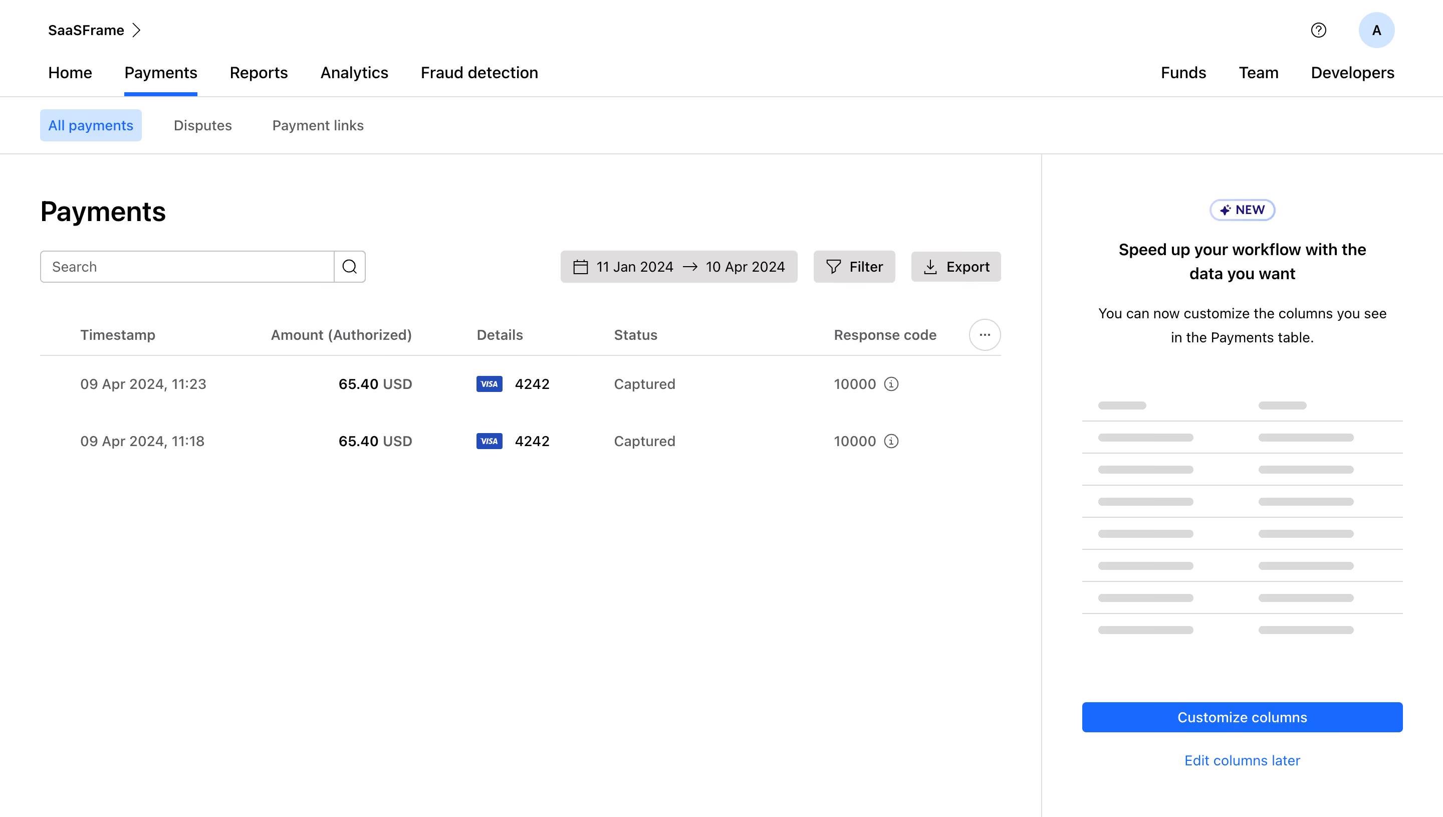
- **Character:** A white, utilitarian payment-management interface with layered horizontal navigation, a sparse transaction table and a separate feature-introduction panel.
- **Evidence scale:** Original 2880 × 1630 pixels; estimated CSS sizes assume an unverified 2× capture scale. Measured colors are converted sRGB pixels.
### Page composition
- **Header:** Workspace identity sits at upper left, with help and a circular initial avatar at upper right.
- **Navigation:** Primary product tabs occupy the next row, with Funds, Team and Developers aligned right; a second row contains payment subtabs.
- **Main region:** An approximately 1040 px area on the left contains the Payments title, search, date/filter/export controls and a two-row table.
- **Side panel:** A roughly 400 px right column is separated by a vertical border and contains a NEW badge, explanatory text, schematic table illustration and customization actions.
### Information hierarchy
- **Active location:** Payments has a blue underline in the primary navigation; All payments has a pale-blue filled active subtab.
- **Page task:** The bold Payments heading leads the content area, followed by the search/filter toolbar.
- **Transactions:** Amounts are bold while timestamps, status and response values use quieter gray text; tiny payment-network marks identify card details.
- **Feature introduction:** Centered text and a blue Customize columns button introduce the side panel's action, with a secondary defer link below.
### Typography
- **Page heading:** Unverified sans-serif, approximately 28 px bold with 34 px line height.
- **Navigation:** Around 16 px regular/medium; subtabs around 14 px.
- **Table:** Approximately 14 px body and column labels, with medium/bold amounts and lighter currency suffixes.
- **Panel:** Approximately 16 px semibold heading, 14 px regular explanatory copy with 24 px line height; compact button and badge labels around 13–14 px.
### Colors & surfaces
- **Base:** White #FFFFFF fills the header, table region and side panel.
- **Accent:** Measured #006BFF marks active navigation and the main customization button.
- **Active fill:** Pale blue #CAE5FF supports the selected payment subtab and avatar family.
- **Structure:** Gray #DFDDDD and #D9D9D9 appear in controls, rules and schematic table marks.
- **Text:** Black #000000 headings contrast with sampled #5C5B60 body and metadata text; dark blue #094EC0 appears in small brand/payment accents.
### Components
- **Search:** Approximately 325 × 32 px outlined field with a separate trailing square magnifier button.
- **Toolbar:** Gray rectangular date-range control followed by Filter and Export buttons with leading calendar, funnel and download icons; approximately 16 px gaps.
- **Table:** Five principal columns for time, amount, details, status and response code, plus a small circular ellipsis control at the header's right.
- **Rows:** Two roughly 56 px rows with generous white space, no heavy surrounding card and one thin rule beneath the header.
- **Side illustration:** Eight horizontal sample rows use pale dividers and paired short gray rounded bars; these are illustrative marks, not real transaction data.
- **Panel action:** Full-width roughly 320 × 30 px blue button with small radius, followed by a centered blue defer link.
- **Header utilities:** Small outlined help icon and a pale-blue circular avatar.
### Visual rhythm
- **Navigation bands:** Thin horizontal rules separate header/navigation layers from the content.
- **Main padding:** Approximately 40 px left/right inset in the table region; title and search share the same left edge.
- **Panel spacing:** Large gaps between explanatory copy, schematic illustration and actions maintain visual separation.
- **Data density:** The table uses only two populated rows, leaving extensive blank space below.
### Responsive
- **Observed limit:** Only desktop is visible; responsive table and panel behavior are unverified.
- **Recommendation:** Move the feature-introduction panel below the table or into a dismissible drawer when width is constrained.
- **Table handling:** Preserve meaningful column headings with horizontal scrolling, and allow toolbar controls to wrap without compressing search excessively.
### Adaptation guidance
- **Retain:** Keep transaction browsing separate from optional customization guidance.
- **Implement:** Use clear active tabs, consistent light dividers and a compact toolbar above an uncluttered table.
- **Verify:** Confirm fonts, scale, payment semantics and customization behavior independently; the screenshot is visual evidence only.
Use this context to reproduce the reference's visual language: layout, typography, colors, spacing, borders, radii, and distinctive elements. The screenshot takes priority if descriptions conflict.
## Direction
{{preferences.fidelityInstructions}}
## Output
{{output.instructions}}
Deliver a polished, cohesive design with precise alignment, hierarchy, and spacing. Produce the requested visual artifact, not just a description. If unsupported, explain the limitation.