Generate a new design based on this screen using your own content.
Thank you! Your submission has been received!
Oops! Something went wrong while submitting the form.
# Design from Reference: Checkout.com Intelligent Acceptance
Create an original, high-fidelity visual design inspired by the reference. Prioritize composition, typography, colors, spacing, and component styling over technical implementation.
## Reference
- **Product:** Checkout.com
- **Category:** Analytics
- **Screenshot:** https://cdn.prod.website-files.com/5e9dc792e1210c5325f7ebbc/6acad4c51025e911ae518495_6acad3d80d9cd1b8ccebe870_cms-182aaae9cc0061a4dfef8376.webp
Analyze the screenshot first. If inaccessible, request it rather than guessing.
## Content
{{content.instructions}}
{{content.data}}
Preserve essential messaging and factual accuracy. Adapt structure and copy length for visual balance; never invent product claims.
## Visual Design
Use this context to reproduce the reference's visual language: layout, typography, colors, spacing, borders, radii, and distinctive elements. The screenshot takes priority if descriptions conflict.
## Direction
{{preferences.fidelityInstructions}}
## Output
{{output.instructions}}
Deliver a polished, cohesive design with precise alignment, hierarchy, and spacing. Produce the requested visual artifact, not just a description. If unsupported, explain the limitation.
A Clean Dashboard That Actually Communicates Value
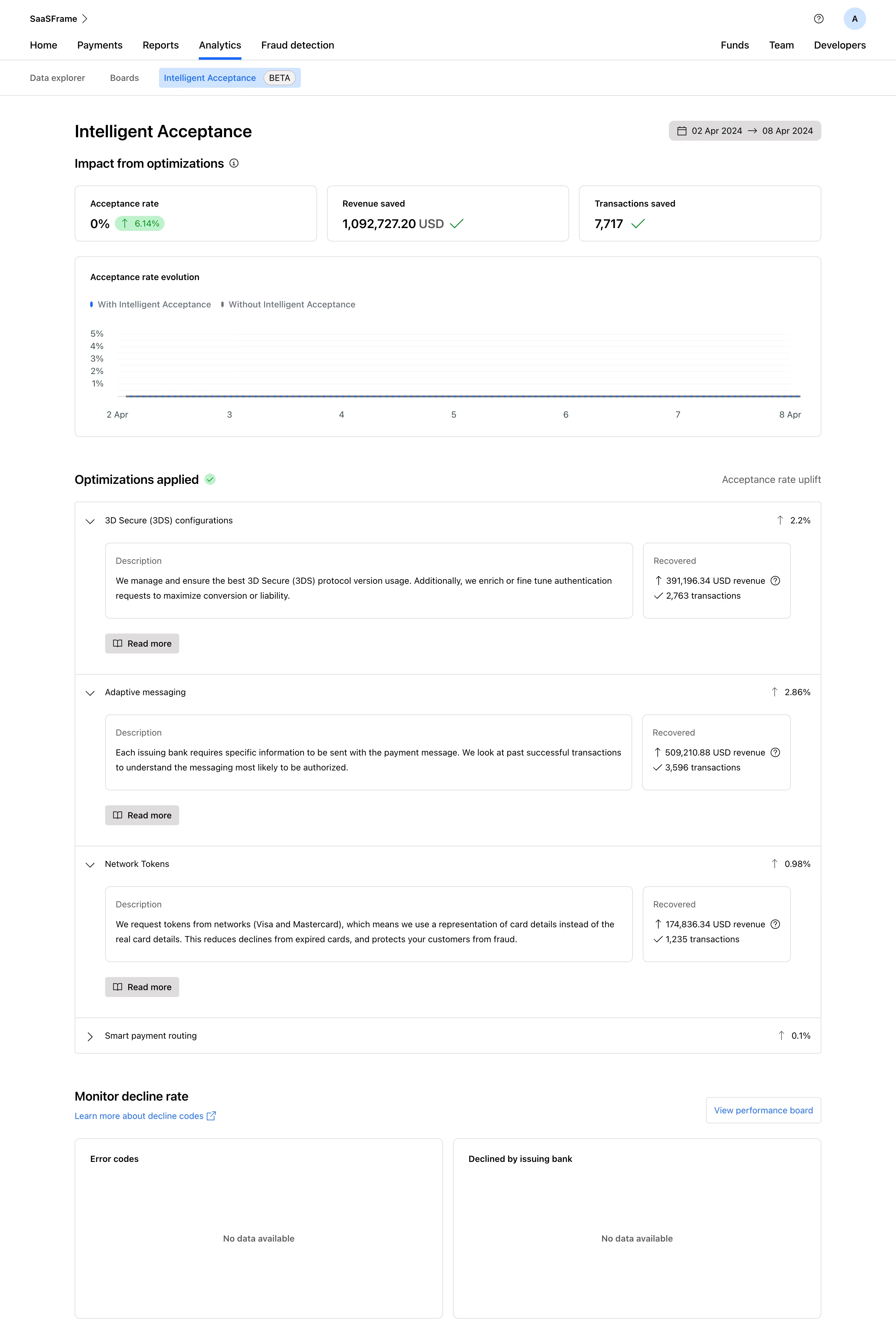
First thing you notice: the big green numbers up top. Revenue saved, transactions saved, acceptance rate uplift. They hit you immediately and make the product's value impossible to ignore. That's smart hierarchy at work.
Layout That Builds a Story
The page flows top to bottom like a report you'd actually want to read. Summary stats, then a timeline chart, then expandable optimization cards with descriptions and recovered revenue. Each section earns its space. The accordion pattern for 3D Secure, Adaptive Messaging, and Network Tokens keeps things scannable without hiding important data. You get the uplift percentage on the right before you even expand anything.
Restrained Color, Strong Signals
Almost everything is neutral gray and white. Color only shows up where it matters: blue for the acceptance rate line, green checkmarks for success states, and that small blue pill badge on the 6.14% uplift. Typography is clean system-style sans-serif with clear weight differences between labels and values. Nothing fights for attention.
What Makes It Stand Out
The "Recovered" boxes inside each card are a great touch. Showing exact dollar amounts next to transaction counts makes abstract optimizations feel tangible and real.