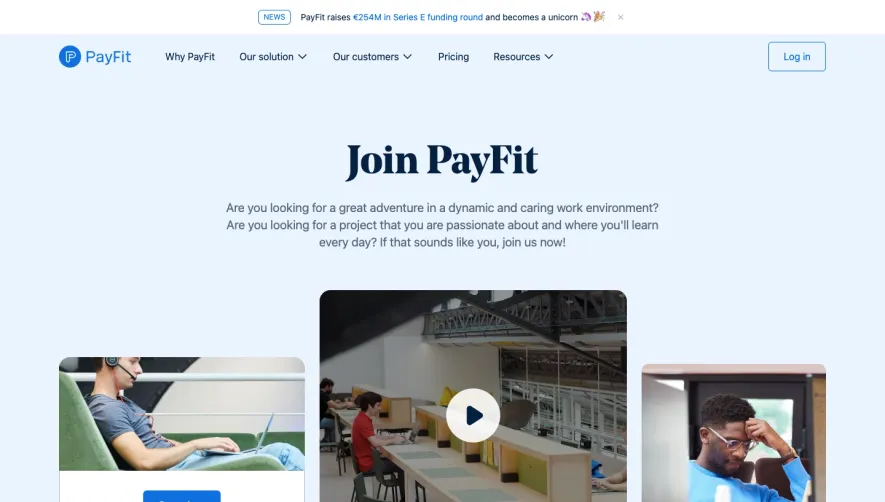
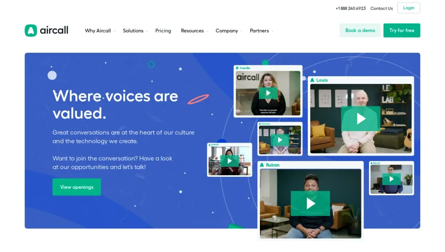
Generate a new design based on this screen using your own content.
Thank you! Your submission has been received!
Oops! Something went wrong while submitting the form.
# Design from Reference: Checkout.com Careers Page
Create an original, high-fidelity visual design inspired by the reference. Prioritize composition, typography, colors, spacing, and component styling over technical implementation.
## Reference
- **Product:** Checkout.com
- **Category:** Careers Page
- **Screenshot:** https://cdn.prod.website-files.com/5e9dc792e1210c5325f7ebbc/6acad793fbf1299940aab4fb_6acad38750cf4647822cd083_cms-e5cced5dfd58d4779cbd0255.webp
Analyze the screenshot first. If inaccessible, request it rather than guessing.
## Content
{{content.instructions}}
{{content.data}}
Preserve essential messaging and factual accuracy. Adapt structure and copy length for visual balance; never invent product claims.
## Visual Design
Use this context to reproduce the reference's visual language: layout, typography, colors, spacing, borders, radii, and distinctive elements. The screenshot takes priority if descriptions conflict.
## Direction
{{preferences.fidelityInstructions}}
## Output
{{output.instructions}}
Deliver a polished, cohesive design with precise alignment, hierarchy, and spacing. Produce the requested visual artifact, not just a description. If unsupported, explain the limitation.
Checkout.com’s careers page radiates a refined, modern professionalism with minimalist sensibilities. Clean negative space creates a focused atmosphere, while subtle color gradients and vibrant accent hues inject energy without overwhelming the visitor. The tone is uplifting and inclusive, positioning the brand as forward-thinking and open.
Layout and Structure
The page opens with a compelling hero section featuring an engaging headline and concise call-to-action, immediately setting the aspirational tone. Content is organized into clearly defined sections—employee stories, company culture highlights, a showcase of benefits, and a streamlined job search module. Each section employs generous spacing, ensuring natural visual flow and digestible content.
Visual Elements
Photography dominates, with authentic, dynamic images of team members that personalize the brand. Light animations (such as hover effects or understated fades) add a modern touch without distracting. Custom icons punctuate key information and help break up text, while subtle transitions between sections enhance the feeling of seamless navigation.
Color Palette and Typography
A restrained palette combines Checkout.com’s signature blue with neutral whites and greys, creating an elegant base that directs attention to key CTAs and visuals. Bold, geometric sans-serif fonts (consistent with the brand) establish a clear typographic hierarchy—large headlines draw the eye, while body copy remains highly readable.
User Experience Patterns
Navigation is sticky and concise, with smooth anchor scrolls and clear CTAs guiding users to explore roles or learn more about culture. Filters and search make job exploration effortless. Forms are sparse and intuitive. Persistent action buttons invite interaction without risk of overwhelm.
Unique or Notable Design Choices
Subtle microinteractions—such as animated icons or transitioning backgrounds—add polish. Employee testimonials are interwoven with portraits, making stories feel authentic and accessible. The careers experience feels both welcoming and aspirational, embodying the innovative, human-centered ethos of a leading SaaS brand.