Design with AI
Generate a new design based on this screen using your own content.
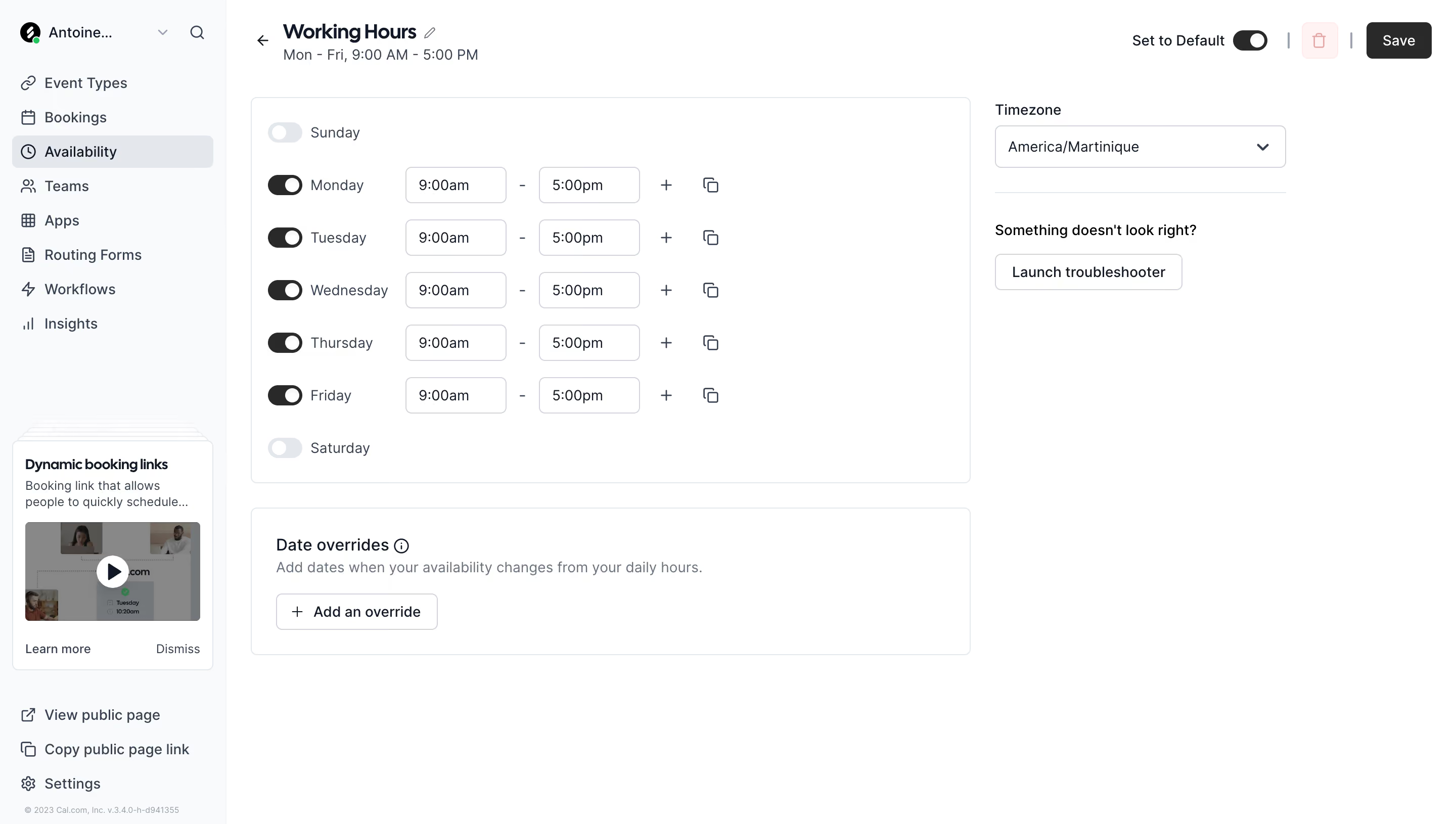
# Design from Reference: Cal.com Availabilities Settings
Create an original, high-fidelity visual design inspired by the reference. Prioritize composition, typography, colors, spacing, and component styling over technical implementation.
## Reference
- **Product:** Cal.com
- **Category:** Settings
- **Screenshot:** https://cdn.prod.website-files.com/5e9dc792e1210c5325f7ebbc/6acad8add05a3f53c0a74e08_6acad82b6cd44b3ad4d80f5e_cms-c2618c3aaaab20e9ca8535fc.webp
Analyze the screenshot first. If inaccessible, request it rather than guessing.
## Content
{{content.instructions}}
{{content.data}}
Preserve essential messaging and factual accuracy. Adapt structure and copy length for visual balance; never invent product claims.
## Visual Design
### Overall aesthetic
- **Style:** Restrained scheduling settings with white surfaces, pale gray navigation, dark toggles and thin outlined controls.
- **Scale:** Source 2880 × 1630px; sizes estimate a 1440px-wide CSS layout at 2× capture scale.
### Page composition
- **Navigation:** A roughly 224px sidebar contains account context, scheduling sections, a small learning card and lower public-page/settings links.
- **Header:** Working Hours and a weekday summary sit left; Set to Default, delete and Save controls align right.
- **Main regions:** An approximately 712px-wide weekly-hours card sits beside a narrower timezone/troubleshooter column. Date overrides occupies a second card below the schedule.
### Information hierarchy
- **Weekly availability:** Seven day rows show inactive Sunday/Saturday and active Monday–Friday, each with 9:00am–5:00pm controls.
- **Supporting configuration:** Timezone is selected separately at right; a troubleshooting prompt and button follow beneath a divider.
- **Exceptions:** Date overrides explains exceptions to daily hours and offers Add an override.
### Typography
- **Family:** Neutral sans-serif; exact font identity is unverified.
- **Roles:** Estimated title 20px bold, summary/body/labels 14px, date-overrides heading 16px medium and helper text 14px/20px.
- **Density:** Compact row labels and values keep the weekly schedule scannable.
### Colors & surfaces
- **Sampled palette:** ICC-aware sRGB samples include white #FFFFFF, sidebar #F9FAFB, borders #E3E7EB, gray #888888, dark #292929 and slate #344153.
- **States:** Enabled toggles and Save are dark; disabled weekend toggles are pale gray. Delete uses a faint pink surface and icon.
- **Depth:** Cards are defined by fine borders and small corners, without strong shadows.
### Components
- **Schedule rows:** Approximately 52px vertical cadence, with toggle, day label, two 100px-wide time fields, plus and duplicate icons.
- **Time fields:** Around 36px high with 5px corners, thin cool-gray borders and inset text.
- **Timezone:** Roughly 288px-wide outlined select with right chevron; no menu is open.
- **Overrides:** Wide bordered card with explanatory copy and compact outlined plus-prefixed action.
- **Sidebar learning card:** Small layered-card illustration, video thumbnail/play control and Learn more/Dismiss links.
### Visual rhythm
- **Alignment:** Day names and time columns remain fixed across active weekdays. Schedule and override cards share width and outer edges.
- **Whitespace:** The short right column and empty lower workspace keep the schedule as the focus.
### Responsive
- **Recommended adaptation:** Only desktop is observed. Collapse the sidebar and place timezone/troubleshooting above or below the weekly card.
- **Rows:** Allow day labels and time controls to wrap while preserving clear start/end association and accessible toggles.
### Adaptation guidance
- **Preserve:** Keep weekly rules distinct from date-specific exceptions and timezone configuration.
- **Adapt:** Use actual hours and timezone values; implement clear copy/add interval actions without assuming unseen menus or validation.
Use this context to reproduce the reference's visual language: layout, typography, colors, spacing, borders, radii, and distinctive elements. The screenshot takes priority if descriptions conflict.
## Direction
{{preferences.fidelityInstructions}}
## Output
{{output.instructions}}
Deliver a polished, cohesive design with precise alignment, hierarchy, and spacing. Produce the requested visual artifact, not just a description. If unsupported, explain the limitation.