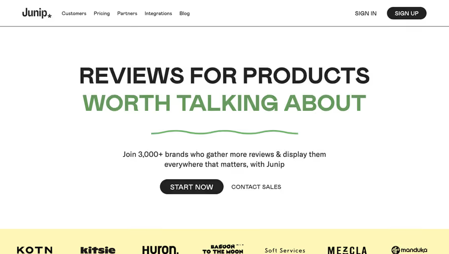
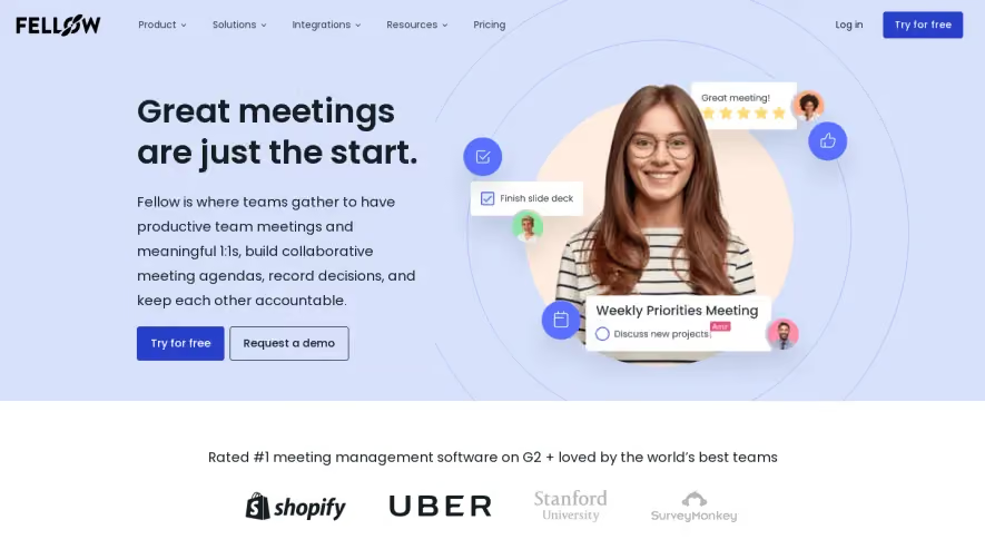
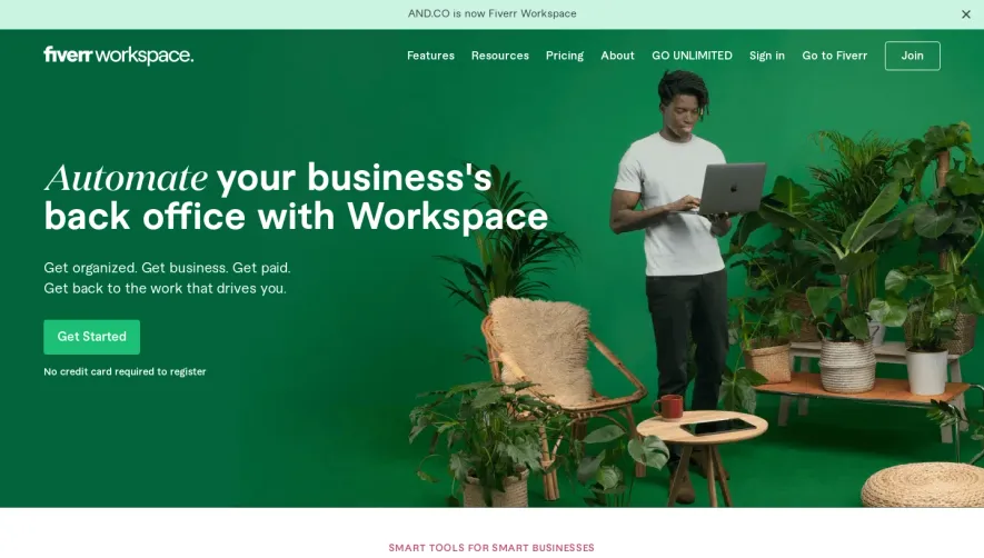
Generate a new design based on this screen using your own content.
Thank you! Your submission has been received!
Oops! Something went wrong while submitting the form.
# Design from Reference: Café Landing Page
Create an original, high-fidelity visual design inspired by the reference. Prioritize composition, typography, colors, spacing, and component styling over technical implementation.
## Reference
- **Product:** Café
- **Category:** Landing Page
- **Screenshot:** https://cdn.prod.website-files.com/5e9dc792e1210c5325f7ebbc/6acb7273b10d21a746c47d7f_6acb7038b328e2f9e303ef63_cms-f2a78adba44a46de13392f7b.webp
Analyze the screenshot first. If inaccessible, request it rather than guessing.
## Content
{{content.instructions}}
{{content.data}}
Preserve essential messaging and factual accuracy. Adapt structure and copy length for visual balance; never invent product claims.
## Visual Design
Use this context to reproduce the reference's visual language: layout, typography, colors, spacing, borders, radii, and distinctive elements. The screenshot takes priority if descriptions conflict.
## Direction
{{preferences.fidelityInstructions}}
## Output
{{output.instructions}}
Deliver a polished, cohesive design with precise alignment, hierarchy, and spacing. Produce the requested visual artifact, not just a description. If unsupported, explain the limitation.
at.cafe crafts an effortlessly modern and ultra-minimalist vibe, stripping away distractions to focus attention on smart visuals and copy. The aesthetic is crisp, clean, and slightly playful, blending professionalism with a friendly warmth. It communicates approachability while still feeling cutting-edge and user-focused.
Layout and Structure
The website leans into simplicity through a linear, single-page layout. A boldly understated hero section dominates above the fold—delivering the brand’s message with punchy typography and concise copy. Scrolling reveals clearly segmented sections: features are displayed with ample white space, an engaging mockup carousel, and recognizable visual cues. Instead of cluttering with testimonials or complex footers, the content is streamlined—every component feels intentional.
Visual Elements
Illustrations and product mockups—often animated with gentle micro-interactions—add depth and movement. Trendy, abstract blobs and gradients occasionally highlight CTAs, while reimagined interface screenshots ground the SaaS offering. Custom icons and subtle transitions enhance interactivity.
Color Palette and Typography
The palette is deliberately muted: warm off-whites, deep gray-blues, and soft accent hues for highlights. Typography is bold yet inviting, pairing modern sans-serif headers with readable body text. Hierarchy is crystal clear, guiding the eye from headline to CTA without friction.
User Experience and Standout Details
Navigation is radically minimalist—a sticky navigation bar, with immediate access to all sections via short anchor links. Primary CTAs stand out with color and animation. Notably, the hero headline creatively uses kinetic type, and product features are shown in-context, making abstract features feel tangible. The overall tone is trust-building, innovative, and quietly energetic, embodying best-in-class SaaS web design principles.