Design with AI
Generate a new design based on this screen using your own content.
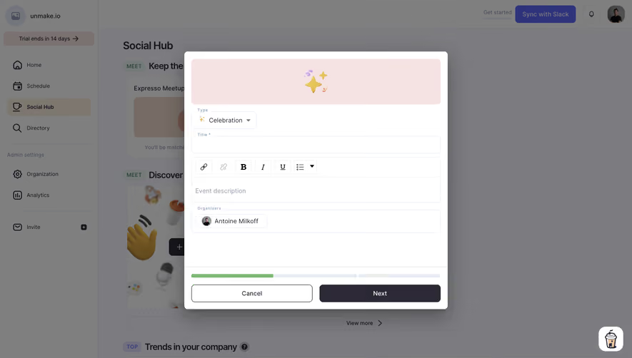
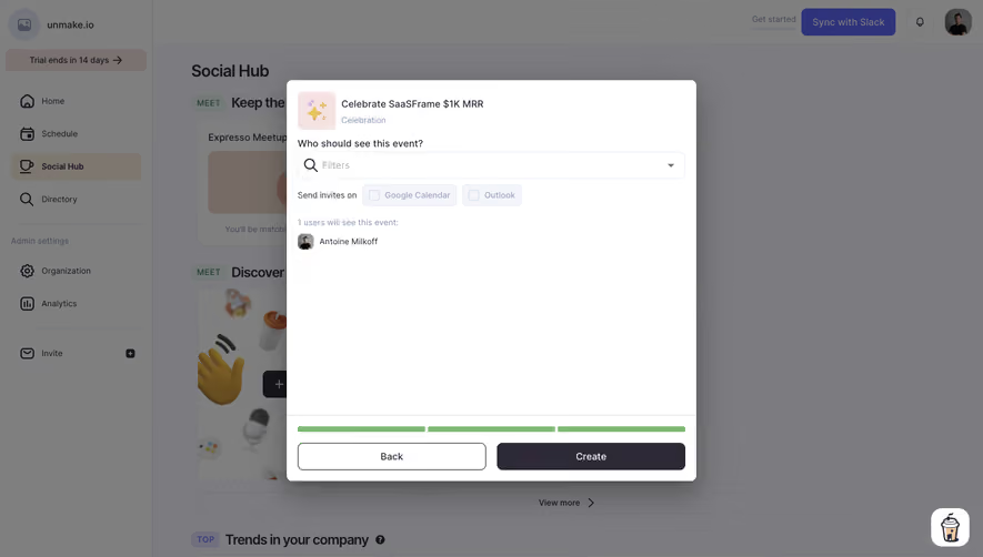
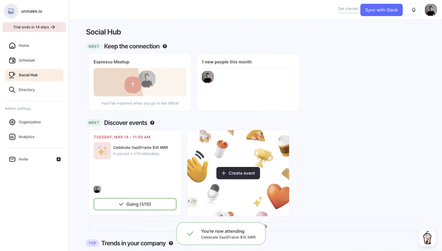
# Design from Reference: Café Create An Event
Create an original, high-fidelity visual design inspired by the reference. Prioritize composition, typography, colors, spacing, and component styling over technical implementation.
## Reference
- **Product:** Café
- **Category:** Add & Edit
- **Screenshot:** https://cdn.prod.website-files.com/5e9dc792e1210c5325f7ebbc/6acb72aa018523cfee2d9f50_6acb6f1afb17204a8e2453e0_cms-35efed992c7642b78c45cbf4.webp
Analyze the screenshot first. If inaccessible, request it rather than guessing.
## Content
{{content.instructions}}
{{content.data}}
Preserve essential messaging and factual accuracy. Adapt structure and copy length for visual balance; never invent product claims.
## Visual Design
### Overall aesthetic
- **Character:** Social-event creation wizard in a compact white modal over a dimmed workplace dashboard.
### Page composition
- **Capture:** 1440 × 821 screenshot pixels; estimated CSS scale approximately 1×.
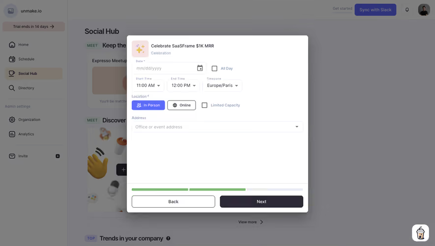
- **Structure:** Centered event modal with icon/title, date/time/timezone controls, location mode/capacity and address; fixed bottom progress segments and Back/Next.
### Information hierarchy
- **Priority:** Event identity anchors the header; required date/location inputs lead into bottom progression controls.
### Typography
- **Family:** Sans serif; exact family unverified.
- **Estimated CSS sizes:** Event title/body 14px, input labels 11–12px and buttons 14px.
### Colors & surfaces
- **Measured palette:** Modal white #FFFFFF, dimmed backdrop #7C7C7F/#7F7F7F with #7B7B7E/#7C7C7E variations and dark Next #2D2936.
- **Accents:** Violet selected location option, green progress segments and pale blue-gray input borders.
### Components
- **Elements:** Calendar picker, All Day checkbox, time/timezone dropdowns, In Person/Online choice, limited-capacity checkbox, count input and address selector.
- **Estimated geometry:** Modal approximately 600px wide, 8px radius, 16px padding, 38px controls and equal-width footer buttons.
### Visual rhythm
- **Spacing:** Compact top form leaves a large blank lower body; footer progress and actions remain visually separated.
### Responsive
- **Suggested adaptation:** Use a full-width sheet, wrap time/location controls and keep bottom actions accessible. Mobile behavior is unverified.
### Adaptation guidance
- **Transfer:** Preserve required-field cues and grouped time/location controls. Tie progress to actual wizard completion.
Use this context to reproduce the reference's visual language: layout, typography, colors, spacing, borders, radii, and distinctive elements. The screenshot takes priority if descriptions conflict.
## Direction
{{preferences.fidelityInstructions}}
## Output
{{output.instructions}}
Deliver a polished, cohesive design with precise alignment, hierarchy, and spacing. Produce the requested visual artifact, not just a description. If unsupported, explain the limitation.