
Thank you! Your submission has been received!
Oops! Something went wrong while submitting the form.
Get SaaSFrame Pro
Monthly
$18
Quarterly
$48
Yearly
$180
Upgrade to access this feature
Browse all screens & flows
Filter and search screens & flows
Access Figma files
Access mobile versions
Bookmark screens & flows
Join now
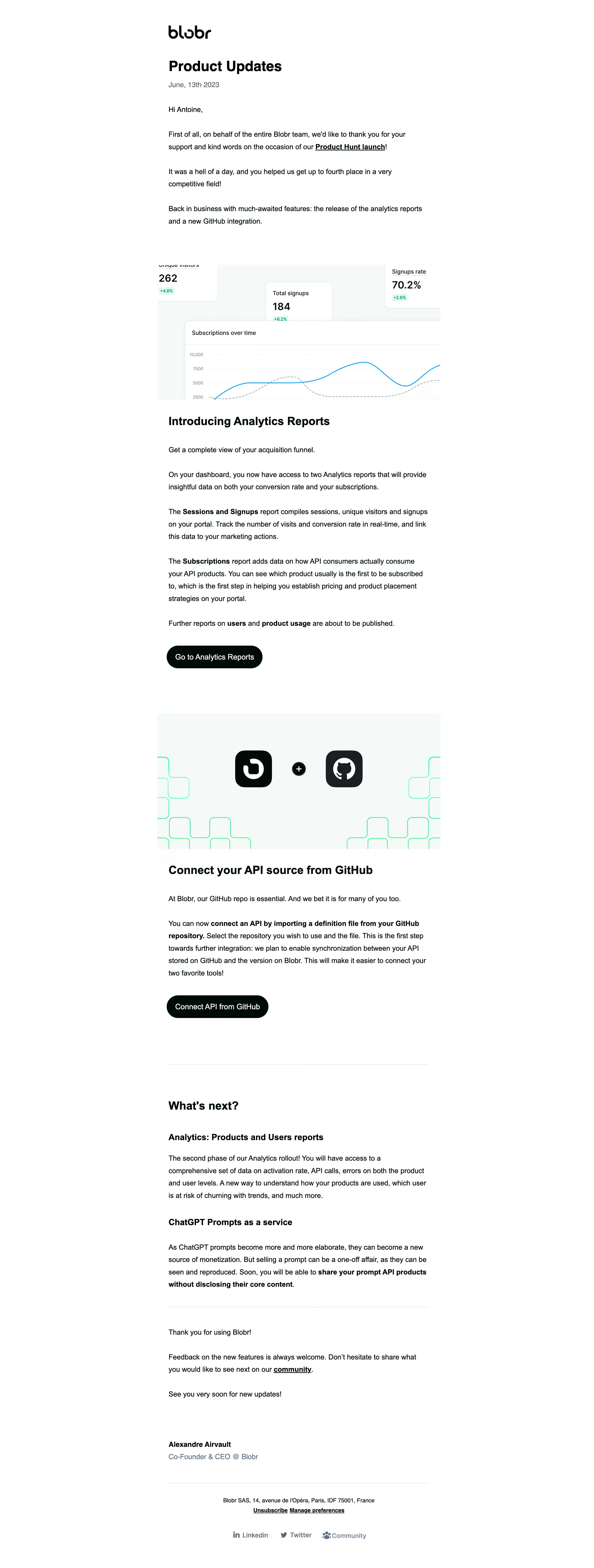
Blobr Product Update Emails

Blobr
More API usage, more subscribers
Designed by
No items found.

Bookmark
Bookmark

Design with AI
Thank you! Your submission has been received!
Oops! Something went wrong while submitting the form.
# Design from Reference: Blobr Product Update Emails
Create an original, high-fidelity visual design inspired by the reference. Prioritize composition, typography, colors, spacing, and component styling over technical implementation.
## Reference
- **Product:** Blobr
- **Category:** Product Update Emails
- **Screenshot:** https://cdn.prod.website-files.com/5e9dc792e1210c5325f7ebbc/6acb645ab206c0d3f8f064d6_6acb62c2b99fcdeb3f94c332_cms-7375689f8eb16815db113c01.webp
Analyze the screenshot first. If inaccessible, request it rather than guessing.
## Content
{{content.instructions}}
{{content.data}}
Preserve essential messaging and factual accuracy. Adapt structure and copy length for visual balance; never invent product claims.
## Visual Design
### Overall aesthetic
- **Character:** A text-led product-update email uses a plain white background, black rounded brand mark, substantial explanatory prose, and sparse near-black pill actions.
- **Evidence:** The original image is 2516 × 6640 px, inspected across three crops at 1400 px width. Measurements below use inspection pixels; actual email CSS scale is unverified.
- **Visual support:** Two wide product illustrations interrupt the prose: an analytics dashboard and a Blobr/GitHub integration graphic.
### Page composition
- **Reading column:** A narrow centered text column approximately 615 inspection px wide begins near x397. Illustrations extend slightly wider, to about 668 px.
- **Opening:** Logo, bold update heading, muted date, greeting, and several introductory paragraphs form the opening block.
- **Analytics module:** A dashboard image precedes a bold section heading, introductory line, multiple explanatory paragraphs, and a dark reports CTA.
- **Integration module:** A pale branded illustration precedes another bold heading, two paragraphs, and a dark integration CTA.
- **Roadmap and close:** A divider introduces a next-features section with two subheadings and prose. Another divider separates the sign-off and signature. Address, unsubscribe/preferences links, and social/community links form the compact footer.
### Information hierarchy
- **Main identity:** A black wordmark and large bold update heading clearly identify the email; the date is subordinate.
- **Section landmarks:** Bold feature headings are followed by regular body text with selected feature names or phrases emphasized in bold.
- **Actions:** Each shipped feature has one left-aligned dark pill action. Underlined inline links provide secondary destinations.
- **Roadmap:** Smaller bold subheadings distinguish upcoming items from the two main feature announcements.
- **Footer:** Signature name is bold, role is muted blue-gray, and administrative links are small and centered.
### Typography
- **Family:** A conventional sans serif is used for prose and headings. Exact identity is unverified; the brand mark is a separate asset.
- **Heading:** Main update title is approximately 34–36 inspection px bold. Feature and roadmap section titles are about 27–29 px bold.
- **Body:** Approximately 17–18 px with 29–30 px line-height, creating an open reading texture across long paragraphs.
- **Subheadings and actions:** Roadmap item headings are about 21 px bold. CTA labels are around 18 px, medium weight.
- **Footer:** Administrative text is around 13–14 px, with slightly larger social labels and a muted signature role.
### Colors & surfaces
- **Measured palette:** Sampled source colors include white #FFFFFF, pale illustration background #F5F9F9, very dark green-black #000A07, black #000000, charcoal #1A1F23, and pale gray-blue #F0F4F5.
- **Semantic use:** White dominates the email; green-black grounds body text and actions. Muted slate-blue appears in role and social text.
- **Illustration accents:** Analytics uses bright blue chart lines and pale green metric chips. The integration image adds fine mint-green geometric outlines around dark brand tiles.
- **Separators:** Thin pale gray rules divide major closing sections. The email has no outer panel border or visible drop shadow.
### Components
- **Primary actions:** Dark pill buttons approximately 225–240 × 54 inspection px, with full rounded ends, white labels, and comfortable horizontal padding.
- **Analytics image:** Approximately 668 × 320 px, showing cropped white metric cards and a larger line-chart panel on a pale canvas. Shadows and rounded corners belong to the embedded dashboard illustration.
- **Integration image:** A similarly wide pale rectangle centers rounded dark brand tiles and a small plus sign, with mint outline shapes clipping at the edges.
- **Text links:** Black underlined inline links are used within paragraphs and the administrative footer.
- **Signature:** Bold sender name and muted role sit as a two-line block with generous space above.
- **Footer:** Centered address and administrative links sit above a horizontal row of small service icons and labels.
### Visual rhythm
- **Paragraph spacing:** Prose uses large paragraph gaps and open leading. Important phrases are emphasized inline instead of being isolated in cards.
- **Image breaks:** Broad illustrations provide clear pauses between text-heavy announcements.
- **Section separation:** Roughly 90–110 inspection px of white space separates feature actions from the next illustration or divider.
- **Alignment:** Headlines, prose, CTAs, signature, and rules share the same left reading edge. Footer text changes to centered alignment.
### Responsive
- **Observed limit:** Only a wide email rendering is shown; client-specific mobile behavior is unverified.
- **Recommended fluidity:** Use a max-width single-column email with 20–24 CSS px mobile gutters and proportionally scaled images.
- **Recommended readability:** Keep prose as live text and preserve comfortable line-height. Let action labels wrap or widen naturally without overflowing.
- **Recommended image fallback:** Provide concise alternatives for dashboard and integration artwork; do not rely on tiny metrics or embedded text to explain the announcements.
### Adaptation guidance
- **Preserve:** Keep the simple editorial structure, long-form explanation, two clear shipped-feature modules, and separate roadmap section.
- **Implement:** Use robust email-compatible markup and inline styles, with reusable heading/prose/image/action modules.
- **Assets:** Treat dashboard metrics and integration graphics as illustrative assets rather than live application controls or verified product-state evidence.
- **Accessibility:** Use descriptive links, image alternatives, strong contrast, and a logical heading sequence.
- **Validate:** Confirm font scale, email-client rendering, narrow layouts, image-blocked behavior, and link treatment. Interactive outcomes and button states are absent from the screenshot.
Use this context to reproduce the reference's visual language: layout, typography, colors, spacing, borders, radii, and distinctive elements. The screenshot takes priority if descriptions conflict.
## Direction
{{preferences.fidelityInstructions}}
## Output
{{output.instructions}}
Deliver a polished, cohesive design with precise alignment, hierarchy, and spacing. Produce the requested visual artifact, not just a description. If unsupported, explain the limitation.


Category
Patterns
No items found.
Tech Stack

Added on
July 25, 2023
Similar screens
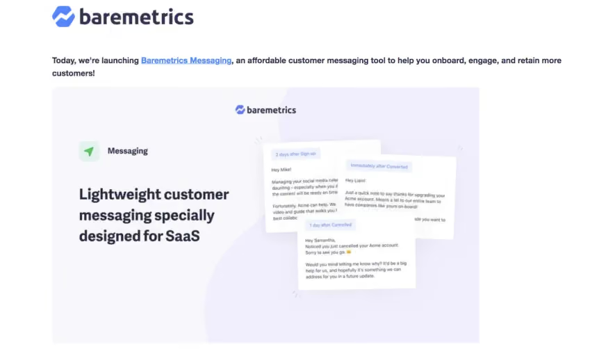


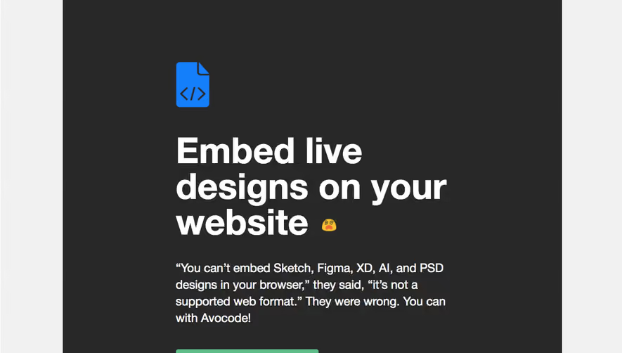



Upgrade to SaaSFrame Pro now to see similar examples.
Monthly
$18 /month
Billed $18 monthly
Browse all screens & flows
Filter and search screens & flows
Search text in screenshots
Access Figma files
Access mobile versions
Join now
Quarterly
$16 /month
Billed $48 quarterly
Browse all screens & flows
Filter and search screens & flows
Search text in screenshots
Access Figma files
Access mobile versions
Join now
Yearly
$15 /month
Billed $180 yearly
Browse all screens & flows
Filter and search screens & flows
Search text in screenshots
Access Figma files
Access mobile versions
Join now