Design with AI
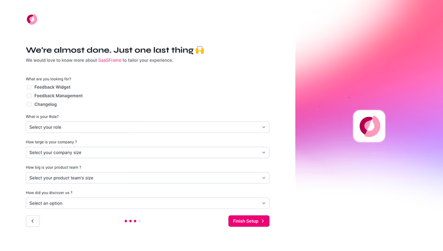
Generate a new design based on this screen using your own content.
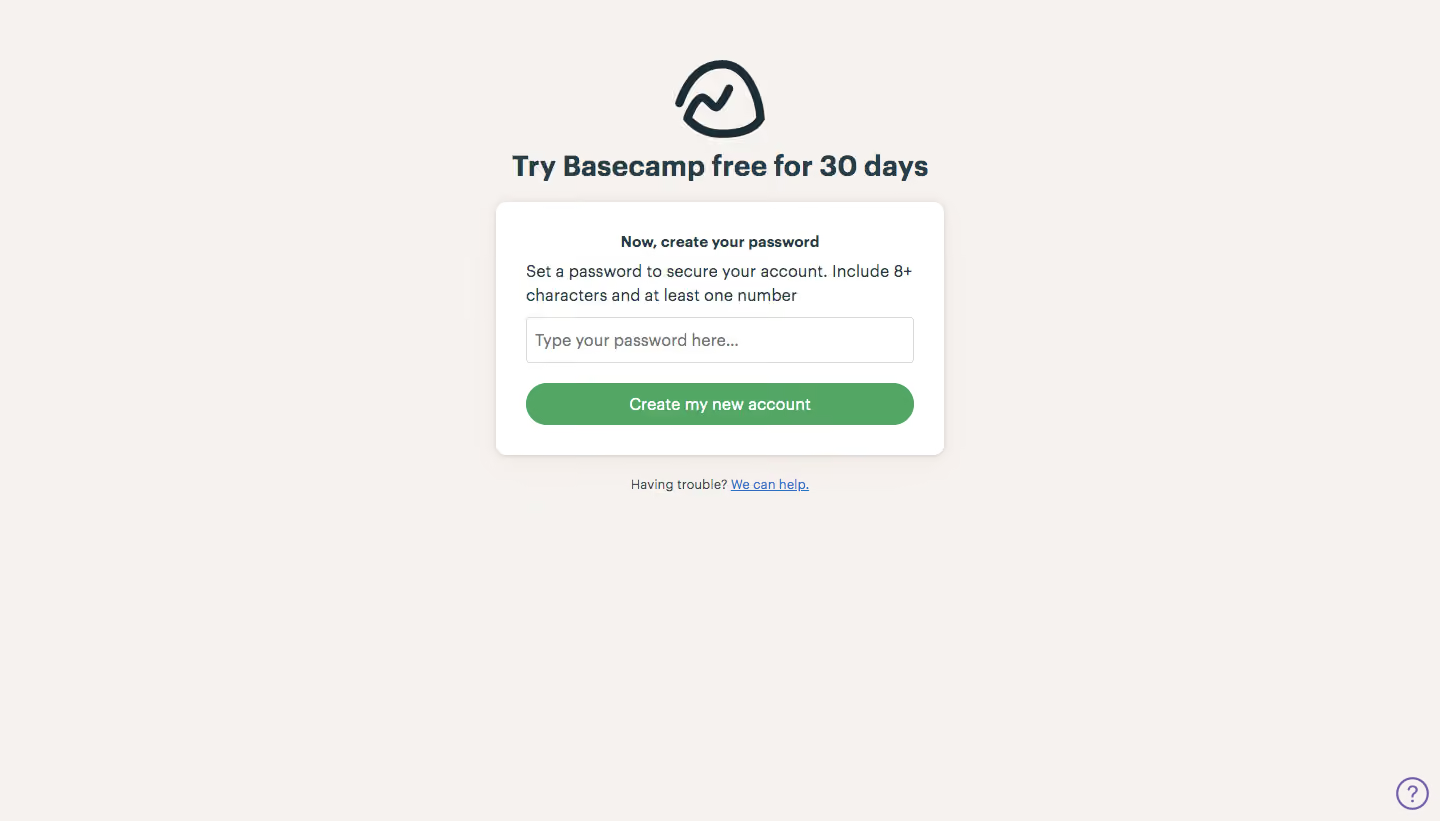
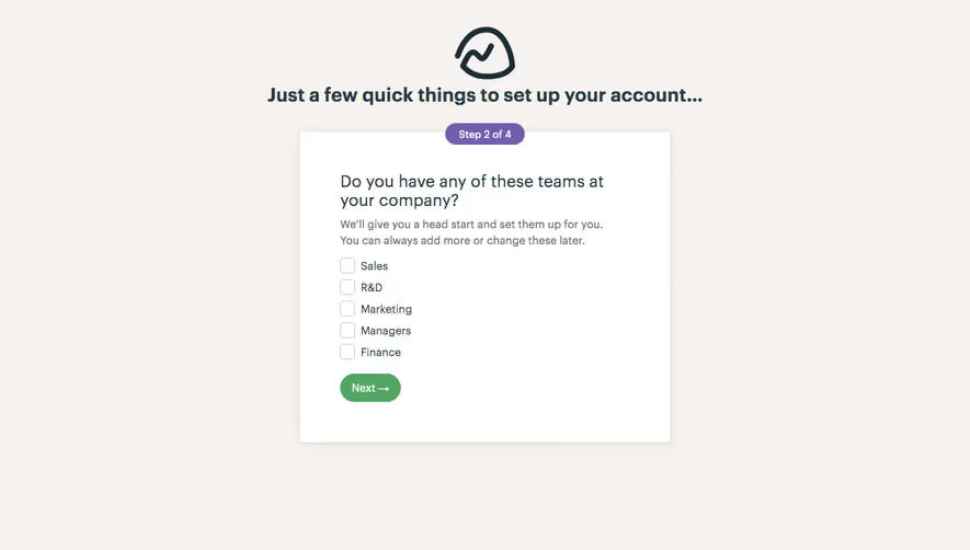
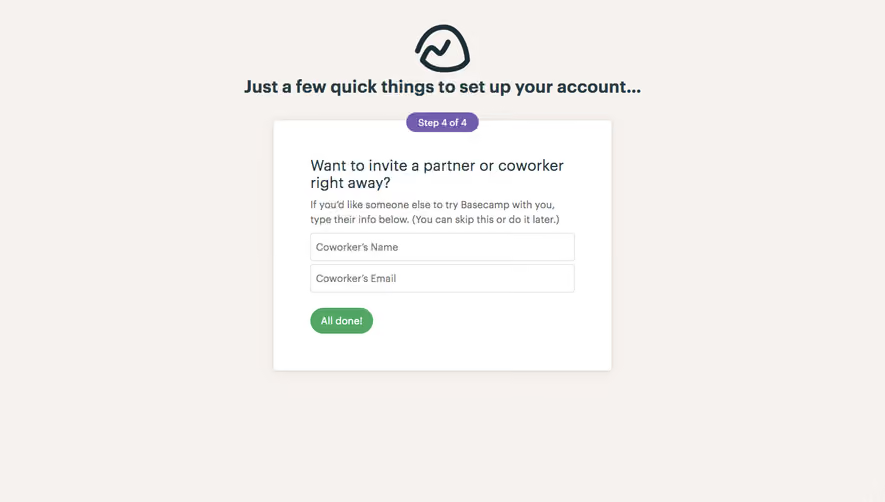
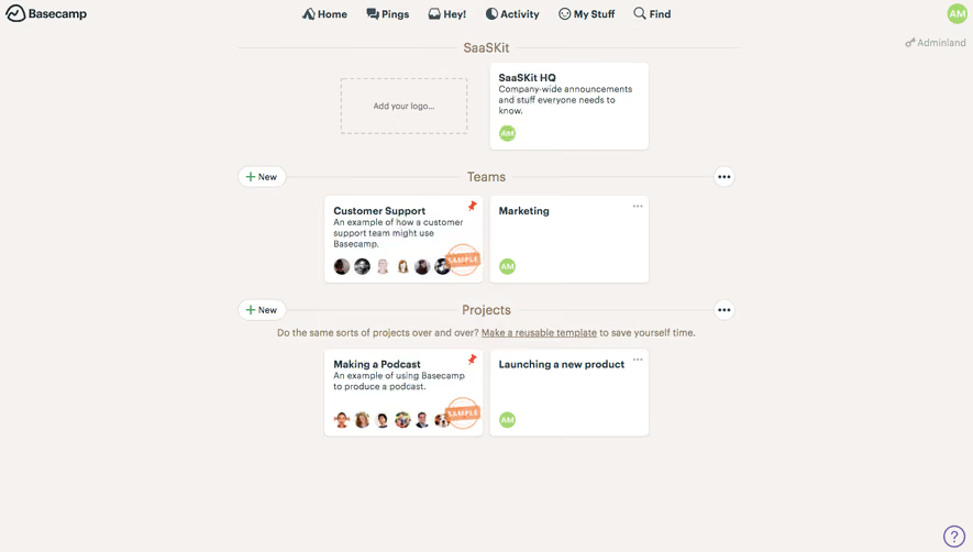
# Design from Reference: Basecamp Sign Up Flow
Create an original, high-fidelity visual design inspired by the reference. Prioritize composition, typography, colors, spacing, and component styling over technical implementation.
## Reference
- **Product:** Basecamp
- **Category:** Account Setup
- **Screenshot:** https://cdn.prod.website-files.com/5e9dc792e1210c5325f7ebbc/6acbc98ef9eac5af75463b40_6acbc72b79661806cce6e0c6_cms-950214ba729a9d47571424c9.webp
Analyze the screenshot first. If inaccessible, request it rather than guessing.
## Content
{{content.instructions}}
{{content.data}}
Preserve essential messaging and factual accuracy. Adapt structure and copy length for visual balance; never invent product claims.
## Visual Design
### Overall aesthetic
- **Character:** Warm, minimal password-creation step with a white card and green completion action.
### Page composition
- **Canvas:** 1440 × 821 screenshot px.
- **Structure:** Centered outline brand icon and trial heading above a compact card; card contains password instruction, requirements, one input and full-width green button; help link below.
### Information hierarchy
- **Priority:** Trial headline establishes context; password guidance sits directly beside entry. Create my new account is the only main action.
### Typography
- **Family:** Humanist sans serif, exact font unverified.
- **Scale:** Estimated screenshot headline 28 px bold, card subheading 16 px bold, body/input 16 px and help 13 px.
### Colors & surfaces
- **Sampled palette:** Warm surround #F6F2EF/#F6F1EE, white #FFFFFF, action green #53A663 and dark text #283C46.
### Components
- **Geometry:** Estimated screenshot card 450 × 250 px, 10 px corners, subtle shadow and 30 px padding.
- **Controls:** Thin outlined rectangular password field, fully rounded green button and underlined blue help link; small outlined help circle lower right.
### Visual rhythm
- **Spacing:** Compact 16–20 px internal gaps contrast with broad empty margins.
### Responsive
- **Observed:** Desktop only.
- **Adaptation:** Fit card within 20 px gutters and keep password rules visible above the field; allow room for validation feedback.
### Adaptation guidance
- **Preserve:** Single-field focus, warm background and clear green completion action.
- **Replace:** Use current password policy and verified trial terms.
Use this context to reproduce the reference's visual language: layout, typography, colors, spacing, borders, radii, and distinctive elements. The screenshot takes priority if descriptions conflict.
## Direction
{{preferences.fidelityInstructions}}
## Output
{{output.instructions}}
Deliver a polished, cohesive design with precise alignment, hierarchy, and spacing. Produce the requested visual artifact, not just a description. If unsupported, explain the limitation.