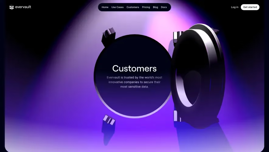
Overall Style and Aesthetic
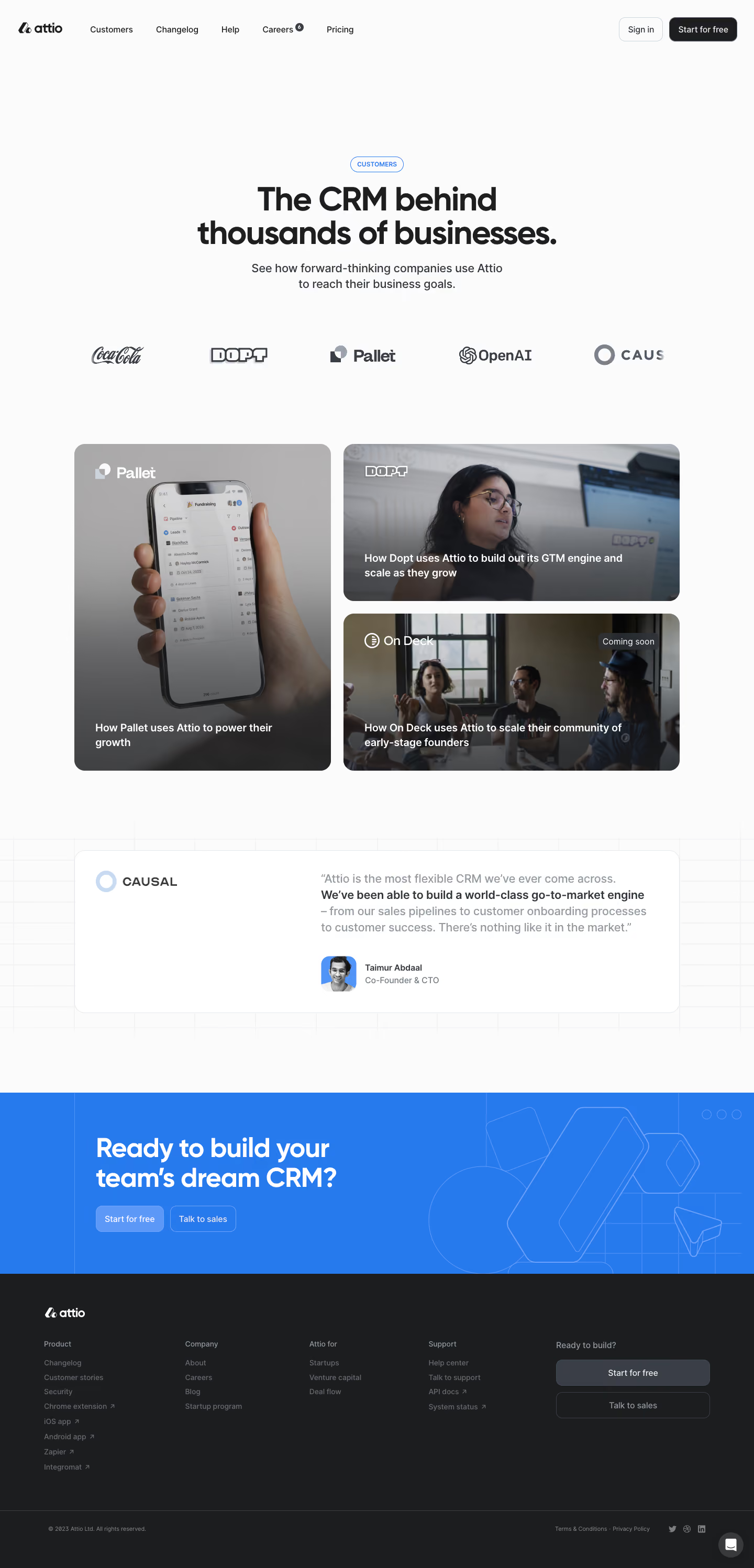
Attio’s “Customers” page radiates a minimalist, modern sophistication built on clarity and confidence. The design steers clear of unnecessary ornamentation, focusing instead on clean lines, generous spacing, and a professional yet approachable vibe. This aesthetic signals reliability, catering to business users while remaining visually engaging and distinctly contemporary. Layout and Structure
The layout relies on a purposeful flow. The hero section leads with a powerful statement and succinct subtext, immediately setting expectations. Below, customer logos act as instant social proof, followed by a mosaic of case studies—each framed within a neat card structure. Instead of overwhelming with lengthy testimonials, the page uses concise success narratives and scannable highlights, culminating in clear calls to action and a well-organized footer. Visual Elements
Photography features prominently: portraits of real customers are thoughtfully integrated, humanizing the SaaS brand and providing relatable context. Each case study is accompanied by crisp product UI snapshots and subtle hover effects, adding interactivity. Logos and modular cards are used for hierarchy and easy navigation. Subtle, animated transitions and micro-interactions smooth the browsing experience. Color Palette and Typography
A cool, refined palette dominates—crisp whites, muted grays, and soft, brand-accent colors infuse energy without overpowering. Typography is clean and geometric, leveraging bold sans-serifs for headings and ample white space for breathing room. Information hierarchy is clear, guiding the eye via font weights and subtle coloring. User Experience Patterns & Notable Choices
Navigation remains anchored at the top for easy access. Compelling CTAs, like “Read case study” buttons, stand out through restrained use of accent colors. Noteworthy is the dynamic grid of cards—each case study feels distinct yet cohesive within the layout. The entire experience feels trustworthy, human-centric, and quietly innovative, striking an elegant balance between inspiration and usability.