Generate a new design based on this screen using your own content.
Thank you! Your submission has been received!
Oops! Something went wrong while submitting the form.
# Design from Reference: Anchor Blog Feed
Create an original, high-fidelity visual design inspired by the reference. Prioritize composition, typography, colors, spacing, and component styling over technical implementation.
## Reference
- **Product:** Anchor
- **Category:** Blog Feed
- **Screenshot:** https://cdn.prod.website-files.com/5e9dc792e1210c5325f7ebbc/6acbcc4de13ab9df8f053294_6acbcaf8a4008ddb747a9d01_cms-620780e5003bee9ab8f9ed2c.webp
Analyze the screenshot first. If inaccessible, request it rather than guessing.
## Content
{{content.instructions}}
{{content.data}}
Preserve essential messaging and factual accuracy. Adapt structure and copy length for visual balance; never invent product claims.
## Visual Design
Use this context to reproduce the reference's visual language: layout, typography, colors, spacing, borders, radii, and distinctive elements. The screenshot takes priority if descriptions conflict.
## Direction
{{preferences.fidelityInstructions}}
## Output
{{output.instructions}}
Deliver a polished, cohesive design with precise alignment, hierarchy, and spacing. Produce the requested visual artifact, not just a description. If unsupported, explain the limitation.
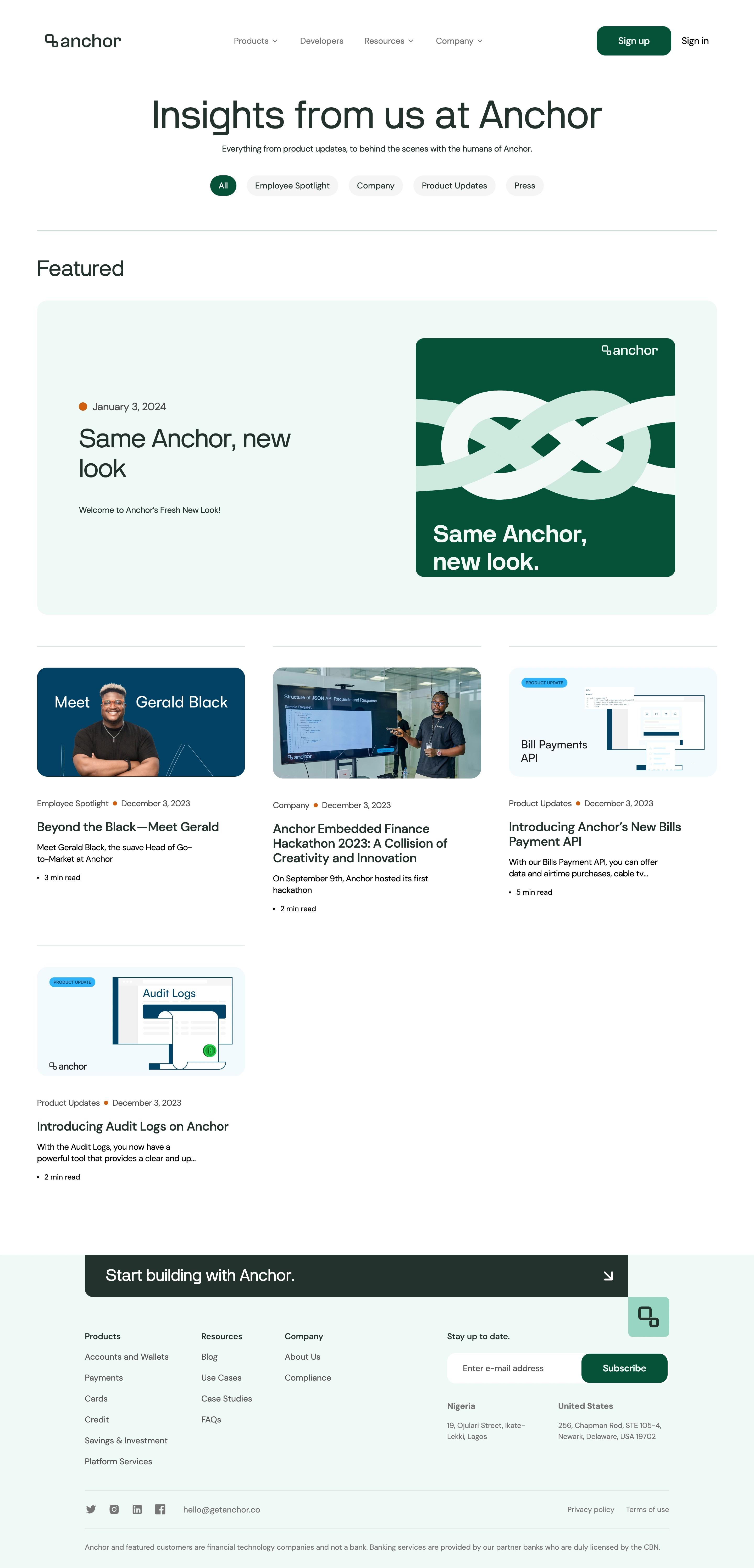
GetAnchor’s Blog page exhibits a clean, modern aesthetic, leaning into a minimalist visual language paired with playful touches. The use of generous whitespace and soft rounded shapes crafts a sense of professionalism while conveying an approachable and fresh vibe, perfect for startups and forward-thinking SaaS brands.
Layout and Structure
The structure is streamlined for easy reading. The header is minimal, ensuring focus remains on content. Blog articles are presented in a uniform grid, each card featuring a concise preview—the image and headline serve as clear entry points. There’s no clutter: no hero banners or distracting elements, just immediate access to valuable content. The sticky navigation fosters seamless browsing, and a functional yet elegant footer caps the experience with concise links and subtle branding.
Visual Elements
Vibrant custom illustrations and iconography inject energy, while cover images on article cards help guide attention. Subtle hover animations on cards add interactivity, responding smoothly to user input. There’s a deliberate absence of stock photography, keeping visuals coherent and on-brand; this elevates the design and avoids generic pitfalls.
Color Palette and Typography
The color scheme relies on a harmonious balance of muted pastels with bold accents in purple and yellow, fostering memorability and warmth. Typography is unfussy—bold headings contrast with easy-reading body text, all set in a modern, geometric sans-serif for clarity and digital friendliness.
User Experience Patterns
Navigation is frictionless: the sticky top nav, prominent blog categories, and well-placed CTAs foster exploration. Blog cards invite clicks with intuitive design and clear visual hierarchy. Every interaction feels smooth and intentional, supporting fast content discovery.
Unique or Notable Design Choices
Notably, the dedication to custom illustration, consistent iconography, and micro-interactions (like card hover effects) elevate this SaaS blog well above template-based designs. Overall, the tone is trustworthy and energetic—positioning Anchor as both relatable and innovative for a digital-first audience.