Design with AI
Generate a new design based on this screen using your own content.
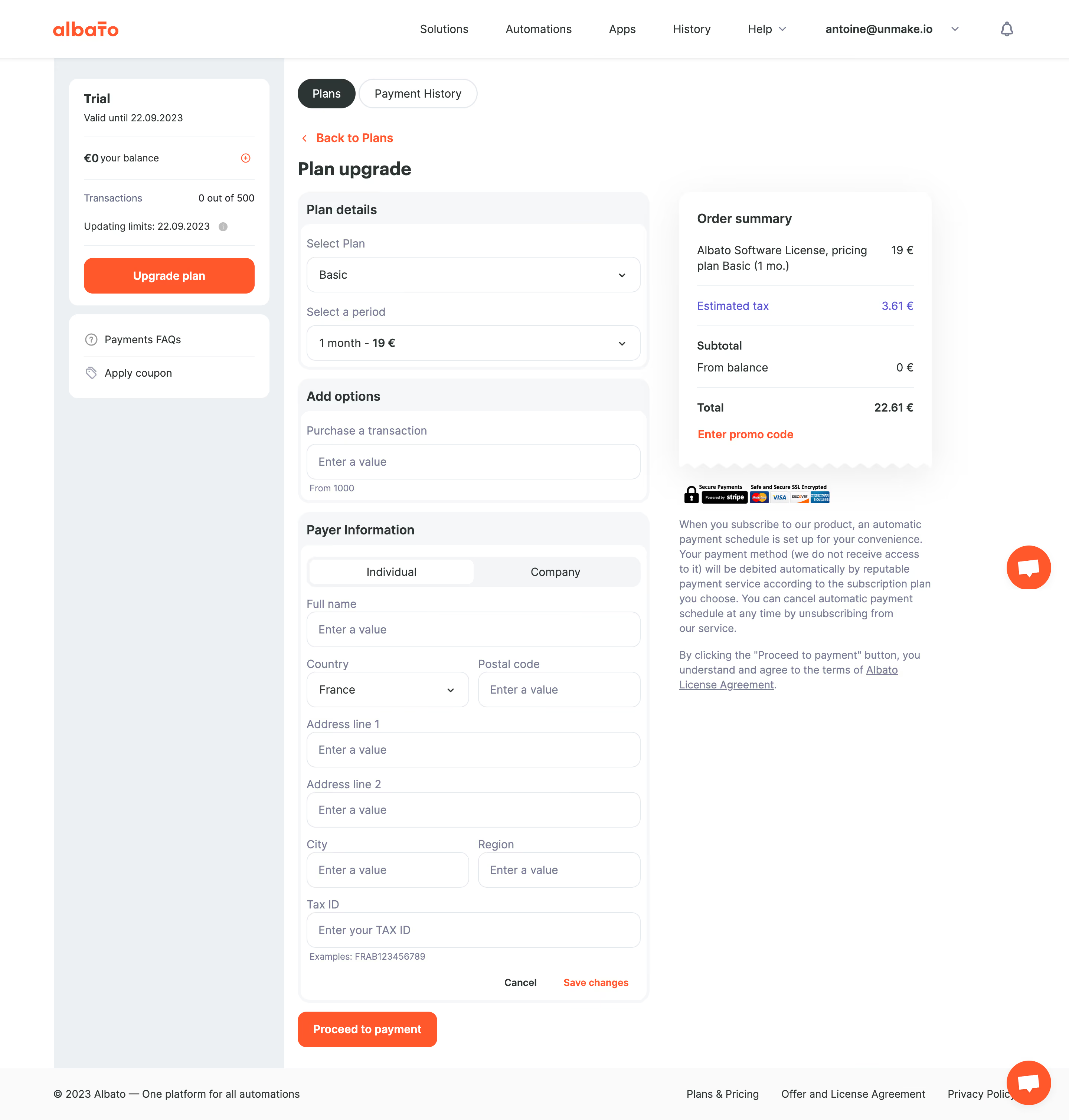
# Design from Reference: Albato Checkout
Create an original, high-fidelity visual design inspired by the reference. Prioritize composition, typography, colors, spacing, and component styling over technical implementation.
## Reference
- **Product:** Albato
- **Category:** Checkout
- **Screenshot:** https://cdn.prod.website-files.com/5e9dc792e1210c5325f7ebbc/6acada65a43009b06fe6f2e0_6acad9fcbf4db4ed6805bece_cms-be981c4c40934242aa770ad2.webp
Analyze the screenshot first. If inaccessible, request it rather than guessing.
## Content
{{content.instructions}}
{{content.data}}
Preserve essential messaging and factual accuracy. Adapt structure and copy length for visual balance; never invent product claims.
## Visual Design
### Overall aesthetic
- **Style:** Practical subscription checkout with white forms, pale-gray section wrappers, orange actions and a receipt-like order summary.
- **Capture scale:** Source 2880 × 3018px. Dimensions estimate a 1440px-wide CSS layout at 2× capture scale.
### Page composition
- **Global header:** Albato branding sits left, application links center and account/notification controls right.
- **Left rail:** A roughly 310px pale-gray column contains a trial/balance card and a smaller payment-help/coupon card.
- **Checkout:** Main content begins near x400 with Plans/Payment History pills, back link and Plan upgrade heading.
- **Working columns:** A roughly 475px form column sits beside a 340px order-summary column. Footer links span the bottom.
### Information hierarchy
- **Plan selection:** Plan details includes plan and billing-period selects; Add options provides a transaction quantity field.
- **Payer details:** Individual/Company tabs precede full name, country/postal code, address lines, city/region and tax identifier.
- **Summary:** Item price, estimated tax, balance contribution and total are displayed before a promo-code link.
- **Progression:** Save changes belongs to payer information; the stronger Proceed to payment action sits outside and below that section.
### Typography
- **Family:** Humanist sans-serif; exact font identity is unverified.
- **Roles:** Estimated page heading 24px bold, section headings 18px semibold, fields/body 16px/22px, helper text 13px and compact buttons 14px bold.
- **Summary emphasis:** Total and key amounts use heavier weight; explanatory subscription copy is muted blue-gray.
### Colors & surfaces
- **Sampled palette:** ICC-aware sRGB samples include white #FFFFFF, rail #ECF0F2, pale #FAFAFA and #F6F7F8, and orange #FF4600.
- **Accents:** Orange marks upgrade/payment actions, back link and promo link. Estimated tax uses a violet-blue accent.
- **Depth:** Rounded section wrappers use pale fills; the white summary has a broad soft shadow and a zigzag receipt edge.
### Components
- **Plan controls:** Full-width outlined selects around 450 × 48px with 12px corners and right chevrons.
- **Payer form:** White inner card within a pale wrapper, compact labels, full-width fields and paired country/postal and city/region rows.
- **Payer tabs:** Light segmented control with a white selected Individual pill.
- **Order summary:** White receipt-like card with fine horizontal rules, left labels/right amounts and orange promo-code link.
- **Actions:** Orange Upgrade plan and Proceed to payment rectangles use roughly 12px corners. Cancel/Save changes remain small text actions inside the payer section.
- **Trust details:** Payment-security/card-brand badges sit below the summary, followed by subscription terms and an agreement link.
### Visual rhythm
- **Vertical sequence:** Plan, add-ons and payer details repeat the same pale-header/white-body structure with short gaps.
- **Alignment:** Labels and controls share stable insets; summary amounts align right. The summary stays near the top while the longer payer form extends downward.
- **Whitespace:** Broad white space under the summary avoids competing with the form.
### Responsive
- **Recommended adaptation:** Only desktop is observed. Move account/trial details into a compact summary, stack checkout and receipt and collapse paired fields on narrow screens.
- **Payment clarity:** Keep totals and terms close to the progression action without hiding important price details.
### Adaptation guidance
- **Preserve:** Keep plan configuration, payer details and order totals clearly separated, with explicit tax and balance treatment.
- **Adapt:** Use current real pricing, taxes, payment terms and supported payer fields. Do not carry historical dates or example tax identifiers into another checkout.
Use this context to reproduce the reference's visual language: layout, typography, colors, spacing, borders, radii, and distinctive elements. The screenshot takes priority if descriptions conflict.
## Direction
{{preferences.fidelityInstructions}}
## Output
{{output.instructions}}
Deliver a polished, cohesive design with precise alignment, hierarchy, and spacing. Produce the requested visual artifact, not just a description. If unsupported, explain the limitation.