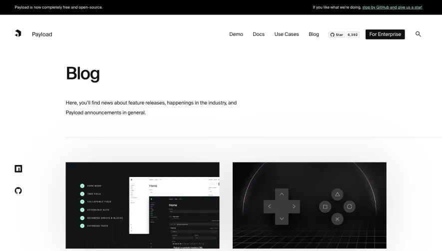
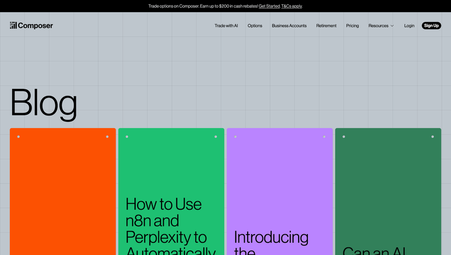
Generate a new design based on this screen using your own content.
Thank you! Your submission has been received!
Oops! Something went wrong while submitting the form.
# Design from Reference: Acquire Blog Feed
Create an original, high-fidelity visual design inspired by the reference. Prioritize composition, typography, colors, spacing, and component styling over technical implementation.
## Reference
- **Product:** Acquire
- **Category:** Blog Feed
- **Screenshot:** https://cdn.prod.website-files.com/5e9dc792e1210c5325f7ebbc/62f272d4533cf234de4aff40_1660054836291-b8093284-0aa0-497b-8d71-d1fc85abf46d-name%3DAcquireBlogFeed.webp
Analyze the screenshot first. If inaccessible, request it rather than guessing.
## Content
{{content.instructions}}
{{content.data}}
Preserve essential messaging and factual accuracy. Adapt structure and copy length for visual balance; never invent product claims.
## Visual Design
Use this context to reproduce the reference's visual language: layout, typography, colors, spacing, borders, radii, and distinctive elements. The screenshot takes priority if descriptions conflict.
## Direction
{{preferences.fidelityInstructions}}
## Output
{{output.instructions}}
Deliver a polished, cohesive design with precise alignment, hierarchy, and spacing. Produce the requested visual artifact, not just a description. If unsupported, explain the limitation.
Acquire.io’s blog unveils a refreshingly modern and professional SaaS design, blending minimalism with just enough vibrance to feel inviting. Clean layouts, ample whitespace, and a restrained color palette keep the experience uncluttered and accessible, supporting a tone of credibility, relevance, and approachability.
Layout and Structure
The page greets visitors with a hero section featuring a bold headline and subtle animations, immediately communicating value. Blog articles are arranged in card-based grids for scannability, with filtering options clearly accessible atop the listings. A sticky navigation header maintains site-wide cohesion, while the thoughtfully designed footer goes beyond basics with helpful links, social icons, and company branding.
Visual Elements
Custom illustrations punctuate the page, adding warmth and humanity to the SaaS topic. Discreet iconography and strategic splashes of photography enhance content without overpowering it. Hover animations and micro-interactions bring the design to life, offering tactile feedback that elevates usability and modernity.
Color Palette and Typography
The core palette combines deep navy and fresh white with pops of electric blue and mint green, guiding attention to calls to action and navigation. Typography leverages a strong sans-serif for headers and a crisp body font, ensuring hierarchy and **beautiful legibility** throughout.
User Experience Patterns & Unique Choices
Sticky filters, conspicuous CTAs, and seamless article previews create an effortless journey for readers. Unique design choices include animated transitions on card hovers, subtle background gradients in sections, and the use of playful line-drawn illustrations that cement a brand personality both energetic and innovative.