Date & Time Picker
50
Simplify time-selection with SaaS Date and Time Picker patterns. Explore calendar dropdowns, relative date ranges (e.g., 'Last 30 Days'), and time-zone selectors for global software.

A date and time picker helps users specify when something happened, when it should happen, or which period to inspect. These are different tasks. Recording a past interaction, scheduling a future message, and filtering a report may share visual controls while requiring different defaults, validation, and timezone behavior.
The interface should make the meaning of the selection clear before it makes the calendar attractive. Users need to know whether they are choosing a date, an exact moment, or an interval. A selected day can look correct while referring to the wrong locale, timezone, or business rule.
A date-only field fits events that belong to a calendar day without a precise hour. A scheduled delivery needs both a date and a time. A report filter may need a start and end boundary. Avoid adding time selection when it introduces unnecessary precision.
Some tasks are easier with direct entry than a calendar. A birth date or a known historical date can require excessive month navigation. A near-term appointment is often easier to choose visually. Offer the route that matches how people know the answer.
For intervals, label both boundaries and define their meaning. “From” and “To” may still leave uncertainty about whether the final day is included. A reporting interface should show an understandable period summary rather than require users to infer query boundaries.
Keep the form label tied to the task. “Date” may be sufficient inside a clearly named interaction dialog; “Send date” or “Reporting period” can prevent confusion in more complex screens.
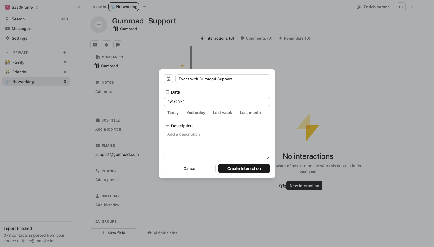
The Folk capture shows a dialog for creating an interaction with a contact. The date field is followed by Today, Yesterday, Last week, and Last month shortcuts. A description field and Create interaction action complete the form.
These shortcuts fit a retrospective task. People recording a recent conversation may remember “yesterday” more readily than the exact date. The choices reduce the effort of translating that recollection into calendar navigation.
The design still needs precise definitions in implementation. “Last week” can mean a day seven days earlier or a previous calendar week. In a single-date field, the shortcut should produce a clearly visible exact date so users can verify the interpretation.
The captured date uses slash-separated numbers. That format can be ambiguous across locales. A designer evaluating a similar interface should ensure that the expected order is clear and that entry and display follow the user’s supported locale conventions.
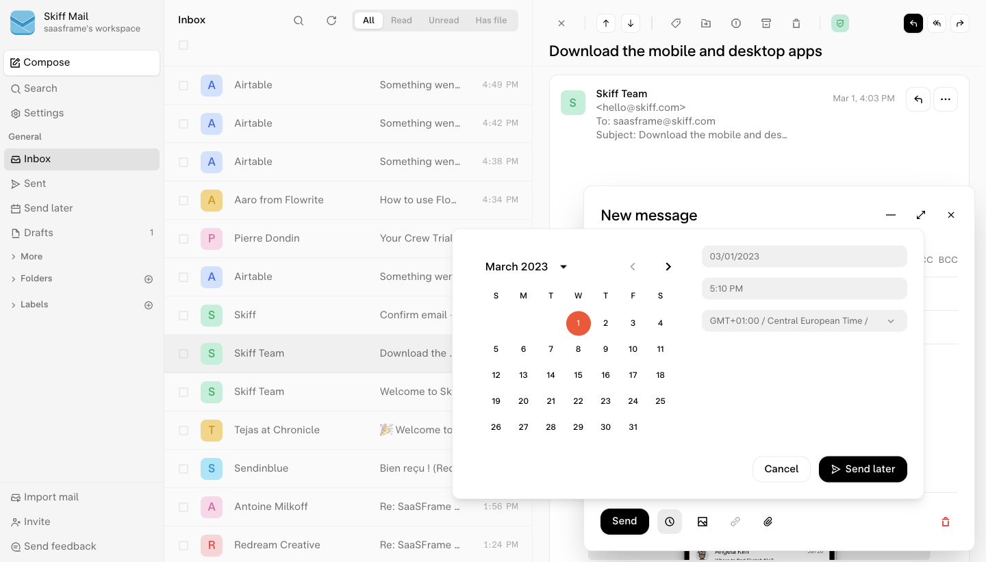
The archived Skiff screenshot shows a Send later interface with a month calendar on the left and date, time, and timezone controls on the right. Cancel and Send later actions appear below. The selected timezone is explicitly displayed rather than being hidden in account settings.
Scheduling a message is an exact-moment task. The timezone determines when that moment occurs for the sender and recipient. Showing it beside the time makes the interpretation available before commitment.
The screenshot also separates selection from submission. Users can inspect the date and time before choosing Send later. A production journey should repeat the scheduled moment after confirmation and provide a route to review or change it if the product supports that.
Skiff’s screenshot is a historical design example, not a current product recommendation. It illustrates the relationship between the calendar, direct fields, timezone, and final action.
If users can type a date and select one from a calendar, both routes should represent the same value. Selecting a day updates the field; typing an accepted date updates the calendar. Avoid separate states that disagree until submission.
Show the expected format when ambiguity is likely. A format hint is useful, but parsing should also handle the supported entry conventions predictably. If the value is invalid, explain the accepted form without silently converting it into a different valid date.
Preserve the user’s input during correction. Replacing an invalid date with today can conceal the original mistake and lead to accidental scheduling. A clear message and retained text give users the information needed to fix it.
For time entry, state whether the interface uses a 12-hour or 24-hour format. If AM and PM apply, make that choice visible and easy to verify. A scheduling error caused by an overlooked period can be much larger than a small date-selection mistake.
A default should suit the task, not merely use the current date because it is available. Recording an interaction may reasonably start with today. Scheduling a message needs a future value that remains valid by the time the user confirms.
If the user opens the picker near a boundary such as midnight, recheck the final value when submitting. A previously valid “today” or time may no longer meet the product’s rules. Explain the issue rather than silently shifting the selection.
When the product suggests a time, describe it as a suggestion. Do not imply that it is universally optimal unless a concrete basis exists. Give users control to choose another moment and show the resulting exact value.
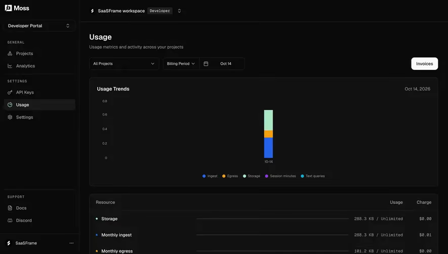
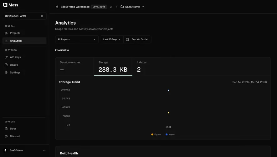
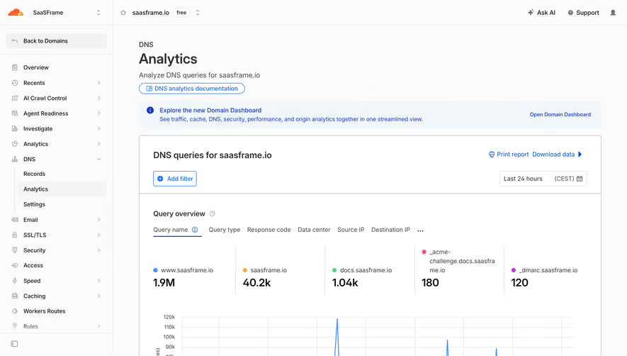
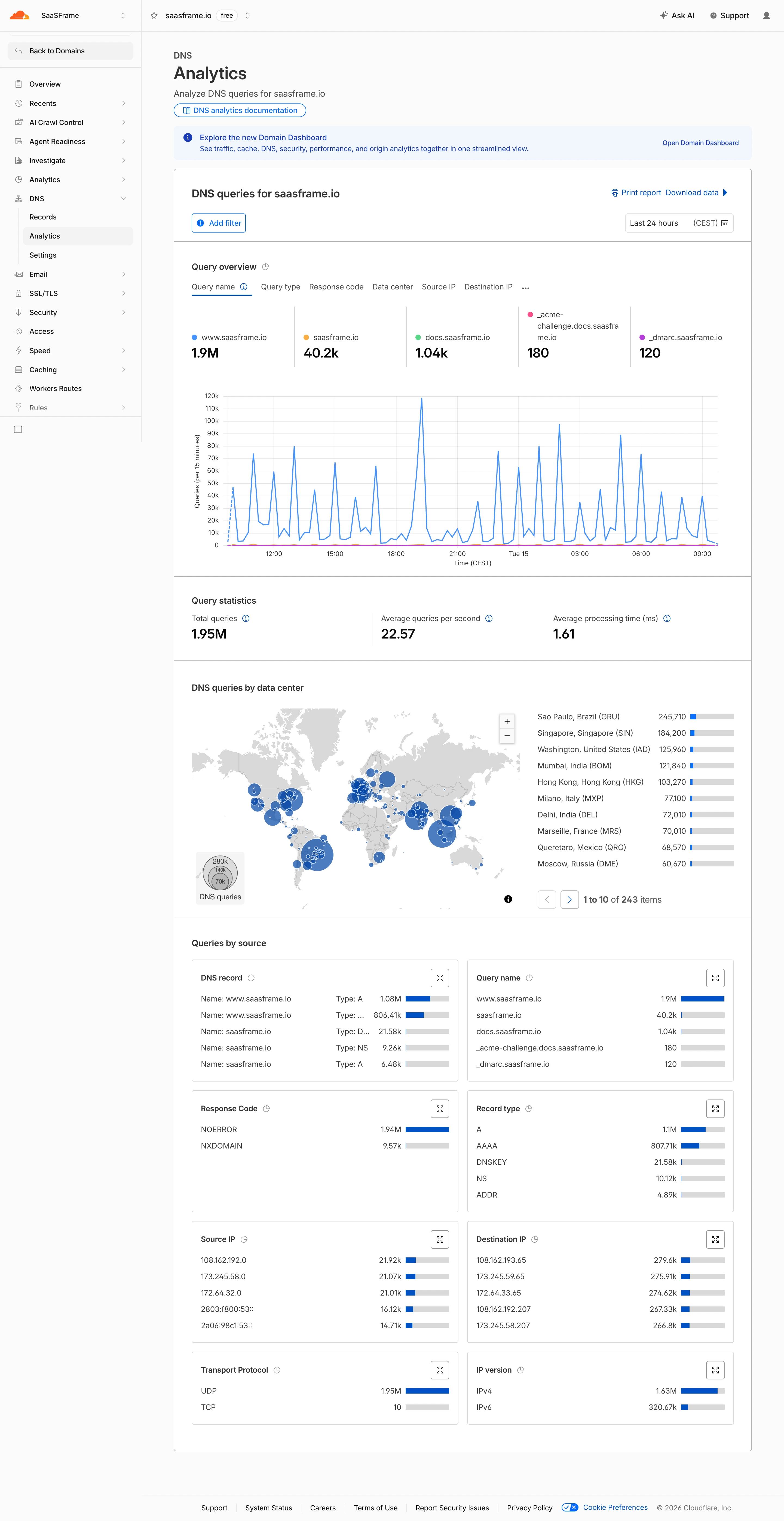
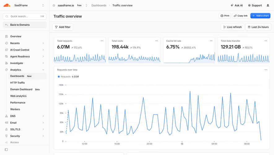
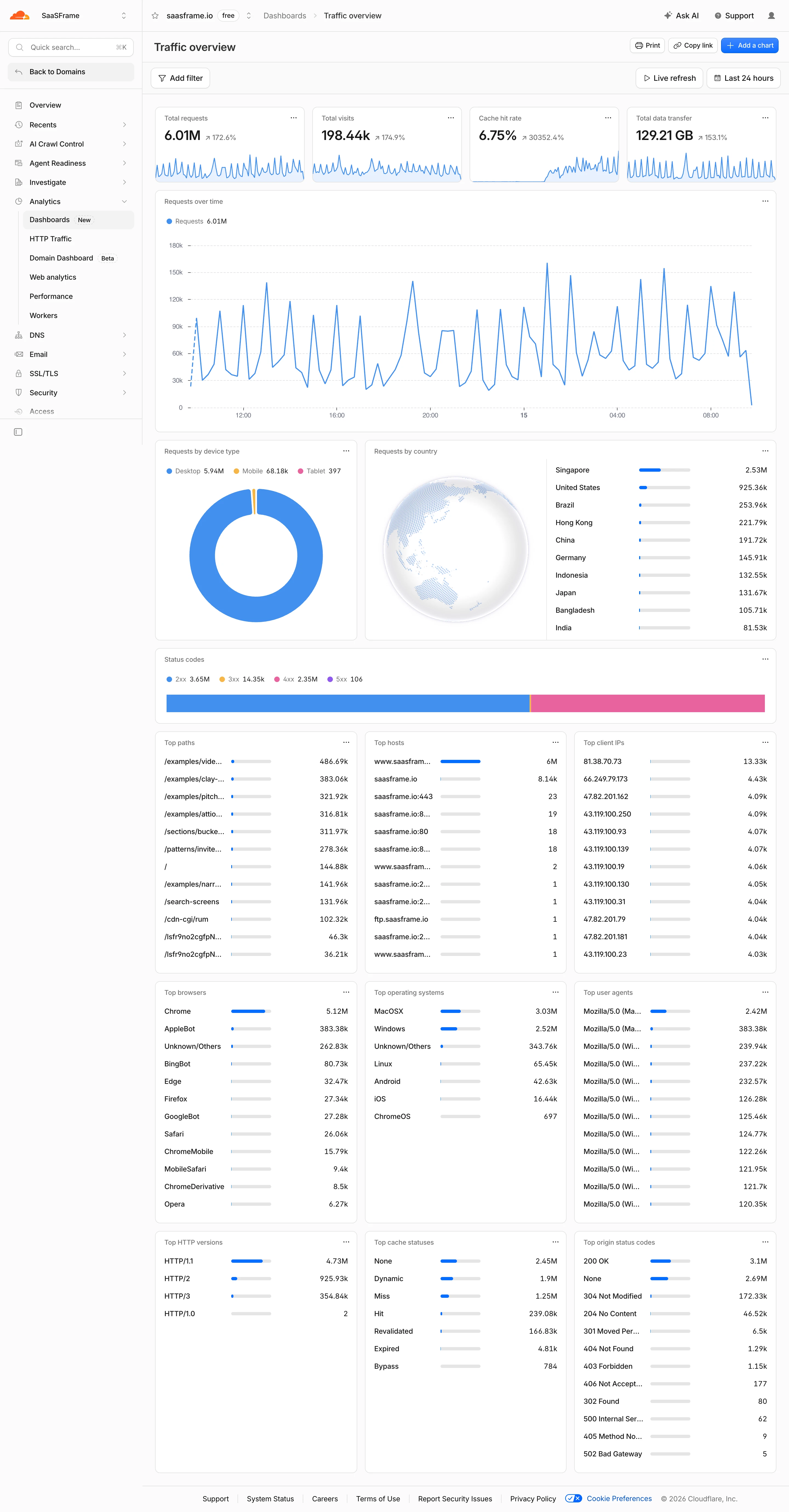
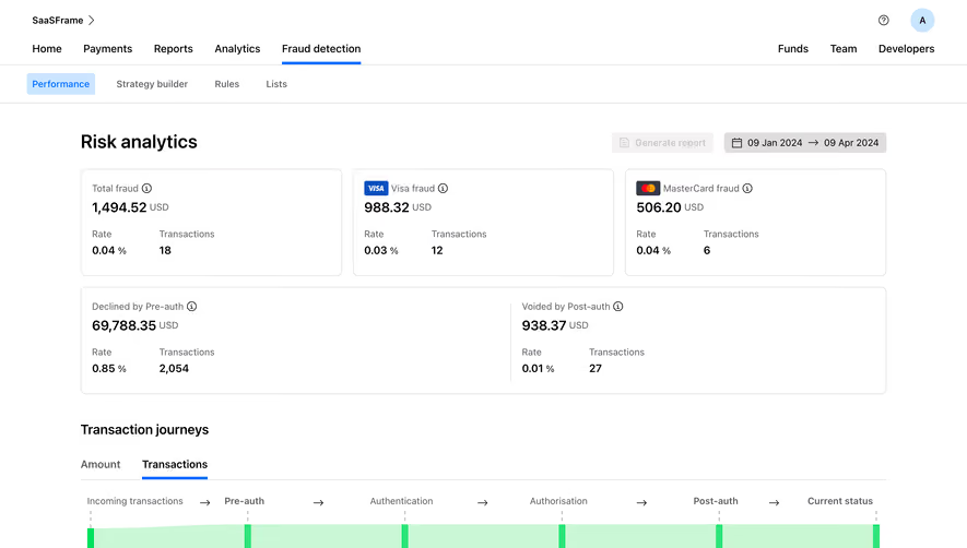
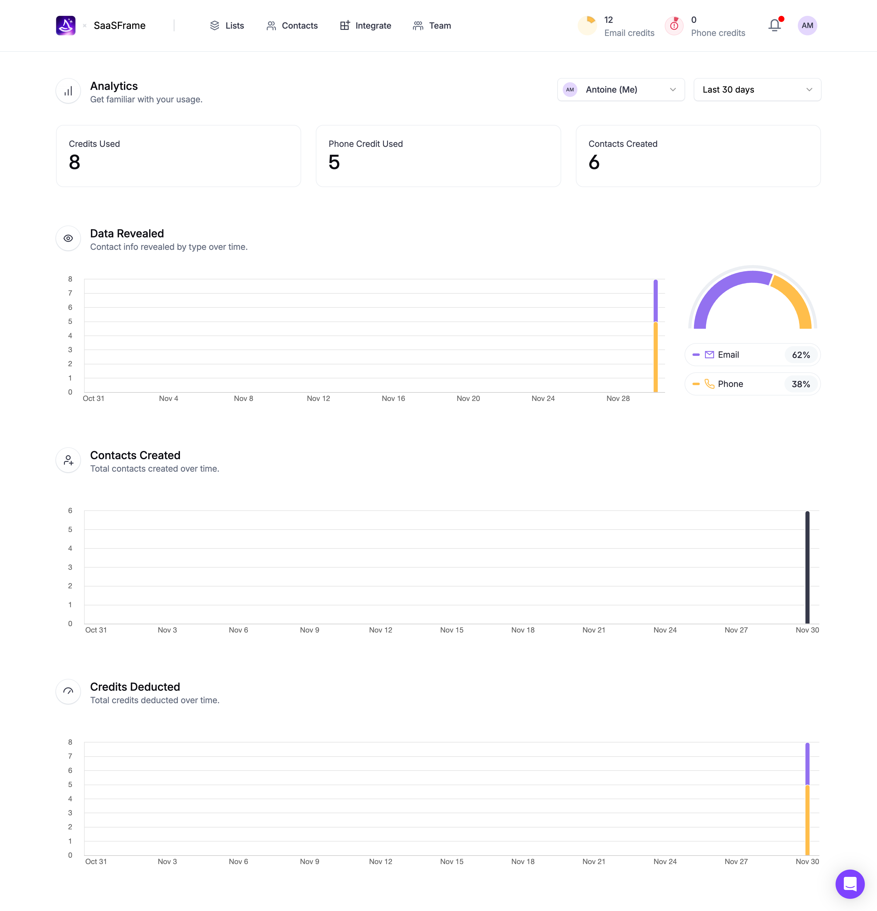
For reporting presets, name the period accurately. “Last 30 days,” “This month,” and “Previous month” are different intervals. The selected range summary should make the distinction visible after the menu closes.
Some dates may be unavailable because of task rules, availability, or system limits. A disabled day should be visually distinct, and the reason should be discoverable when it helps the user choose. Do not make unavailable dates look selectable and reject them only at the end.
For scheduling, explain whether past times are forbidden and whether there is a minimum lead time. For historical records, avoid restricting older dates simply because the calendar initially shows the current month.
For intervals, prevent or clearly explain a start after the end. If the interface automatically adjusts the second boundary, make the change visible. An automatic correction should not silently widen a report period or alter an appointment.
Where availability is loaded remotely, distinguish unavailable dates from dates whose availability is not yet known. A temporary loading state should not be rendered as a permanent disabled condition.
A date-only record often has different needs from an exact timestamp. A birthday should not jump to another day simply because the viewer changes timezone. A scheduled message, by contrast, needs a defined instant that can be displayed appropriately in different locations.
When a user changes timezone after choosing a time, decide whether the interface preserves the wall-clock time or the exact instant. Either can be appropriate in a particular workflow, but the resulting change should be clear. Users should not discover it only after delivery.
Use recognizable timezone labels and consider whether the name, region, or offset is most useful. An offset alone may not explain a location’s future seasonal behavior. The final schedule summary should be based on the product’s actual time interpretation.
Test seasonal clock changes and unusual local times with the working system. If a selected time is ambiguous or unavailable under the supported timezone rules, provide a specific resolution. Do not claim timezone correctness from a static mockup.
A calendar works well for nearby dates but can become tedious for dates years away. Provide month and year navigation appropriate to the domain. Direct entry can be a useful alternative when the exact date is already known.
Keep the selected date recognizable when navigating away from its month. A user may browse availability and return to the original choice. Distinguish today, selection, focus, and disabled state so their meanings do not compete.
For an interval, show both selected endpoints and the intervening range. The visual treatment should remain clear when the range crosses months or extends beyond the displayed view. Include a textual summary for confirmation.
On narrow screens, avoid compressing day cells until they become difficult to activate. A full-width picker may serve the task better than a tiny anchored popover. Preserve the form’s original context and a predictable return path.
Keyboard users should be able to enter a value, navigate the picker where provided, confirm it, and close the control without losing their place. Calendar cells need meaningful date labels rather than isolated numbers without month context.
Expose selection and unavailable states to assistive technology. If the picker opens a dialog, keep its focus behavior and dismissal predictable. Test the actual component instead of assuming that a familiar calendar grid is accessible.
Do not rely on color alone to distinguish the selected day from today. Use additional visual cues and readable labels. Error messages should connect to the relevant field and explain whether the date, time, or timezone needs correction.
Relative shortcuts need accessible names that match their behavior. After selecting one, show the resolved value so users can confirm the exact result. This is especially useful for shortcuts whose everyday meaning can vary.
After scheduling, show when the action will occur and how to review it. After recording an interaction, show the stored date with the record. After applying a report range, show that range near the results so the user can interpret the data.
Keep cancellation distinct from clearing. Cancel should usually leave the previous confirmed value intact; Clear removes it if the field permits an empty state. A close icon should not unexpectedly commit a partially edited value.
Test a typed date, a calendar choice, a shortcut, an invalid range, a timezone change, and a value that becomes outdated before submission. The successful outcome is a correctly understood stored value, not simply a selected day.
No. A calendar helps with nearby dates and visual availability. Direct entry may be faster for known historical dates. Choose based on the task and provide complementary routes where useful.
Show it when it affects the meaning of an exact scheduled moment or report boundary. Do not add unnecessary timezone complexity to a date-only record.
They should resolve to an exact visible value or interval. A user should be able to verify what Today, Last week, or another preset means before committing.
Explore SaaSFrame’s date and time picker examples with calendars, text inputs, and filters to compare selection, scheduling, and reporting tasks.