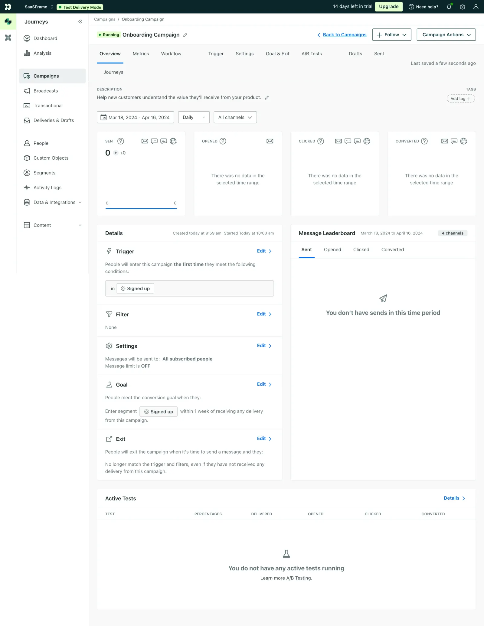
First thing you notice is how much information is packed in here without it feeling overwhelming. Customer.io nails the hierarchy with that green "Running" badge next to the campaign title. Instantly tells you the status. The horizontal tab navigation up top keeps everything accessible without burying features in dropdowns.
Structure That Guides Your Eyes
The overview splits into two clear columns below the metrics bar. Left side handles campaign logic like triggers, filters, goals. Right side shows the Message Leaderboard with its own tab set for Sent, Opened, Clicked, Converted. Smart separation. The four metric cards at the top use consistent layouts with those tiny channel icons. Even with zero data, the empty states are handled gracefully.
What Makes It Stand Out
Typography is restrained. Small caps for labels, clear weight differences between headers and body text. The color palette barely exists outside of functional greens and blues, which keeps focus on the data. That "Test Delivery Mode" pill in the top bar is a clever safety net detail you rarely see surfaced so prominently.
 SaaSFrame
 Customer.ioCustomer engagement for tech-savvy marketers