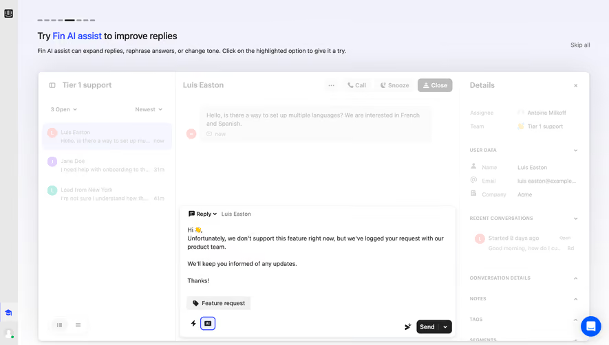
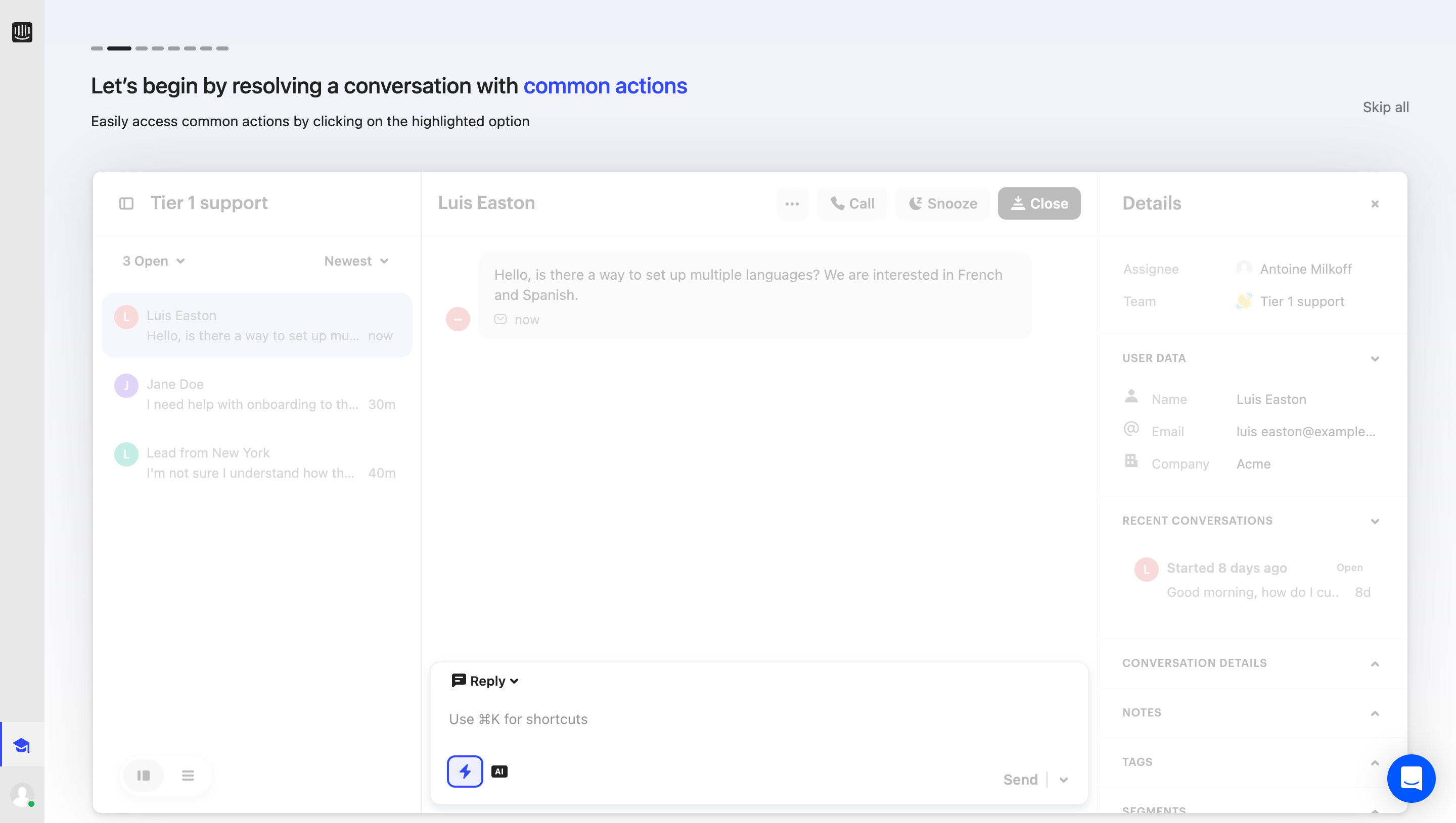
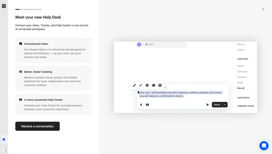
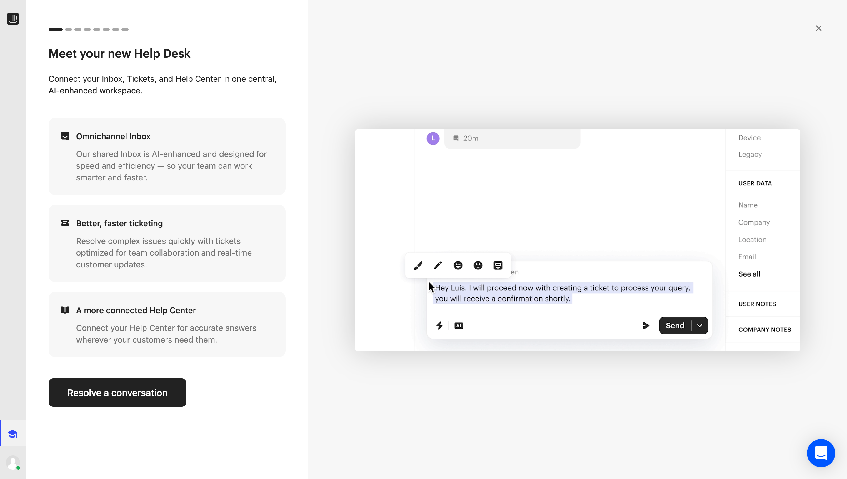
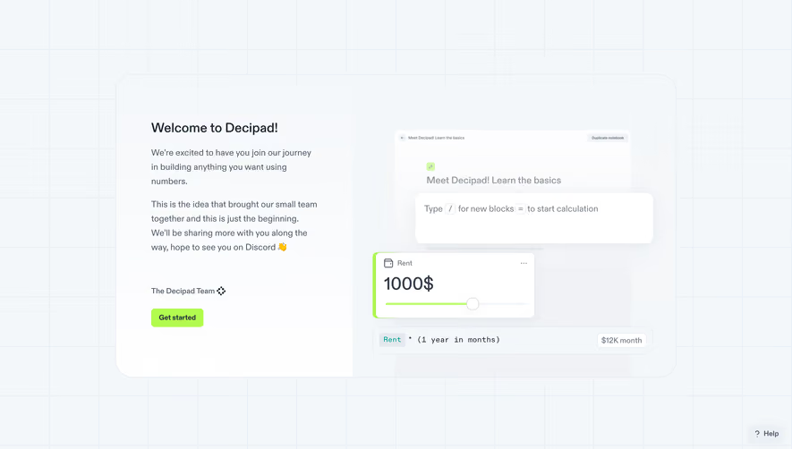
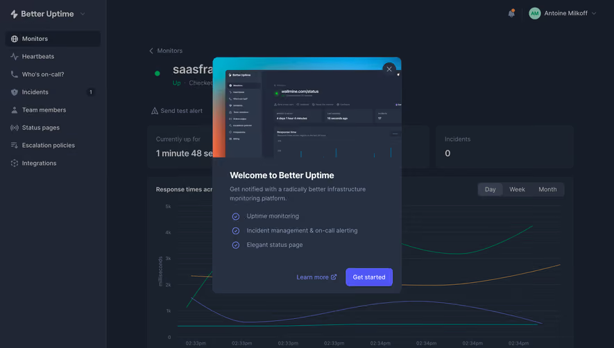
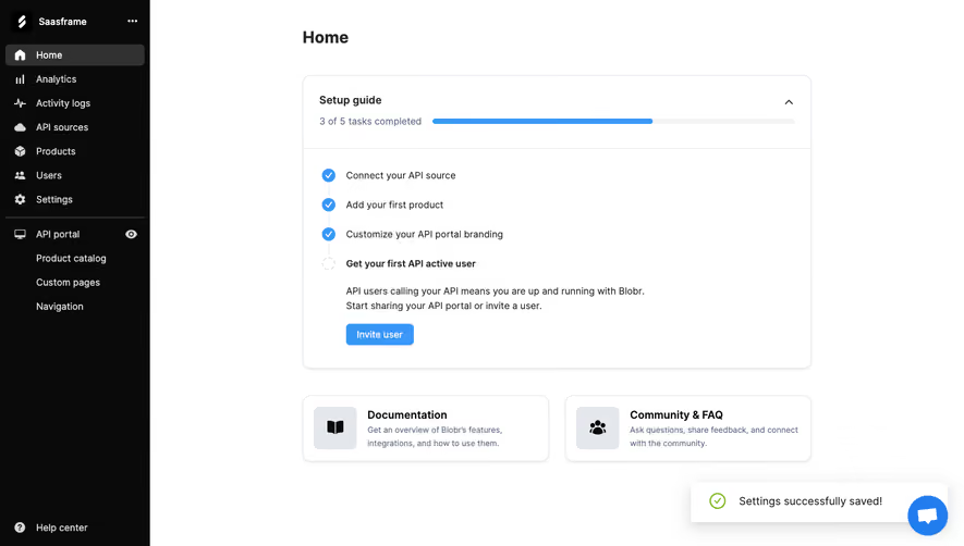
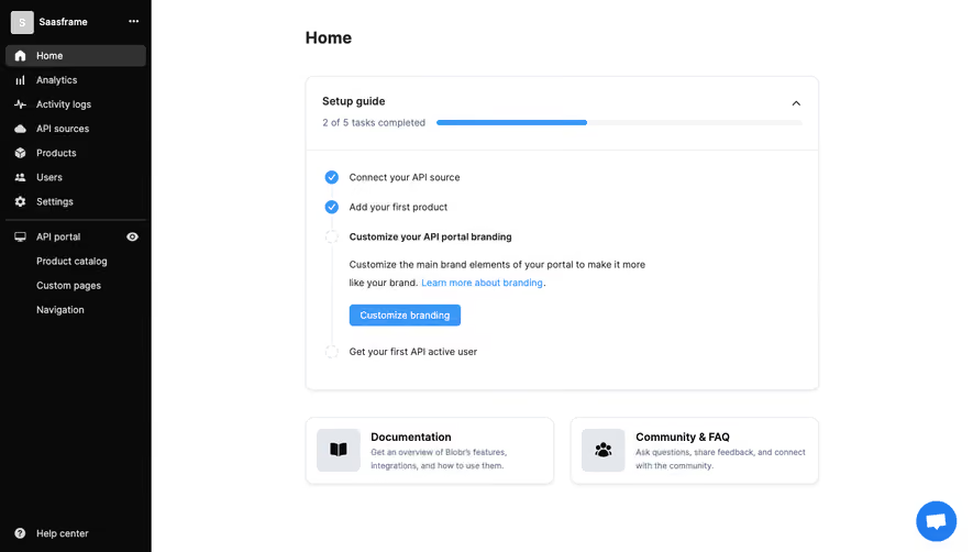
Optimize your first-run experience with comprehensive SaaS User Onboarding flows. This collection covers everything from welcome modals to interactive setup wizards that guide users to success in their first session.
Browse 350 real SaaS User Onboarding with modern UI patterns and conversion strategies.
We sell SaaSFrame licenses on Gumroad, a secured online selling platform for creators.
What about future updates and versions?
SaaSFrame gets updated all the time! Every new update and version will immediately be made available to all SaaSFrame users.
I didn't receive my licence key, what should I do?
The licence key required to create your SaaSFrame account is send by Gumroad once you made your purchase. If this email is blocked by your email client, send me an email at antoine[at]unmake[dot]io so I can resend the licence key.
Can you send me an invoice?
You can generate an invoice on Gumroad once you purchased SaaSFrame. You will find the link in the order confirmation email.
Can I get a refund?
If you're not satisfied, you can ask for a refund within 7 days. Just send me an email at antoine[at]unmake[dot]io
User Onboarding Design Guide
SaaS user onboarding helps a new user reach a useful outcome with enough understanding to repeat it. That outcome might be creating a first campaign, connecting a design source, or organizing a working list. A welcome screen is only one part of the experience. The more important question is whether the product makes the route from intention to value understandable.
The SaaSFrame references below show onboarding embedded in different products and tasks. They are captured design examples, rather than evidence that a particular flow improves activation. Use them to study sequence, context, and feedback, then validate the approach against your own users and product dependencies.
Start with a useful outcome rather than a tour
Define what the user should accomplish during their first meaningful session. “Finish onboarding” describes your interface, while “create a campaign ready for testing” describes a user outcome. The latter makes it easier to decide which steps are necessary and which can wait.
Different roles may need different routes. A workspace owner may configure access and integrations; an invited teammate may only need to find assigned work. Asking both people to complete the same administrative checklist adds friction without necessarily improving understanding.
Identify the minimum knowledge and product state required for the outcome. If a user needs a connected data source before meaningful work is possible, explain that dependency. If sample data or a template can provide an honest preview first, use it to reduce the cost of exploring.
Separate onboarding from account setup
Account setup establishes identity, workspace context, preferences, and required configuration. Onboarding teaches people how to achieve something in the product. The two can overlap, but they have different reasons for existing.
Collecting a company size or preferred language is not automatically progress toward user value. A useful sequence connects each request to what it enables next. If information only helps internal segmentation, consider whether asking for it before the first useful action is justified.
The account setup guide focuses on those configuration choices. This guide focuses on the transition from a configured account to meaningful product use. Keep that distinction clear in the language of your interface, even when both processes share a progress indicator.
Make the next action concrete
An onboarding screen should answer three questions: what should I do, why does it matter, and what happens after I do it? A generic “Get started” label may be appropriate at the entrance, but later steps benefit from a specific action such as connecting a source or creating a first list.
Place instructions beside the relevant control where possible. A disconnected tutorial can force users to remember a sequence while navigating a different screen. Contextual guidance reduces that translation effort and makes the product's real interaction model easier to learn.
Avoid presenting several equally prominent starting actions when only one is required. When multiple paths are valid, describe the outcomes so people can choose according to their intent. A useful choice is between meaningful routes, rather than between unexplained features.
Study how Specify organizes integration dependencies
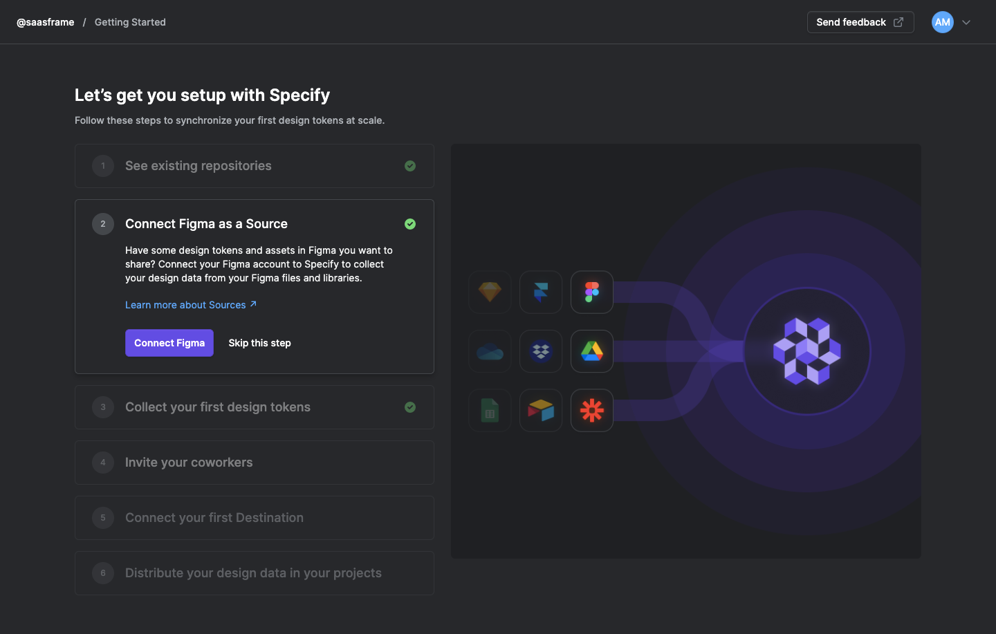
The Specify getting-started capture presents a numbered sequence covering repositories, a Figma connection, design tokens, coworkers, a destination, and data distribution. The expanded Figma step contains an explanation, a connection action, and a skip option.
This structure makes a multi-system workflow visible. Users can see that connecting a source is part of a broader route toward distributing data. Expanding the active step provides detail without requiring every explanation to compete for attention at once.
The skip control introduces an important design decision. If skipping is valid, explain what remains unavailable and how to return. If a connection is a hard dependency, a skip should lead to an honest alternative rather than a later dead end. The screenshot shows the control; it does not establish how that later behavior works.
Distinguish required work from optional exploration
Some onboarding tasks are necessary for the first outcome; others are helpful suggestions. Make that difference visible through labels, grouping, and completion rules. A long checklist that treats inviting coworkers and creating a first object as equally mandatory can misrepresent the actual product dependency.
Allow users to defer optional tasks without losing their work. A returning user should be able to find the unfinished task where it matters. Deferral is most useful when the system remembers the context and explains the consequences.
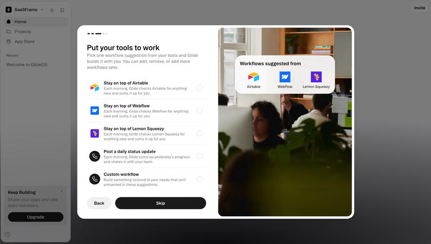
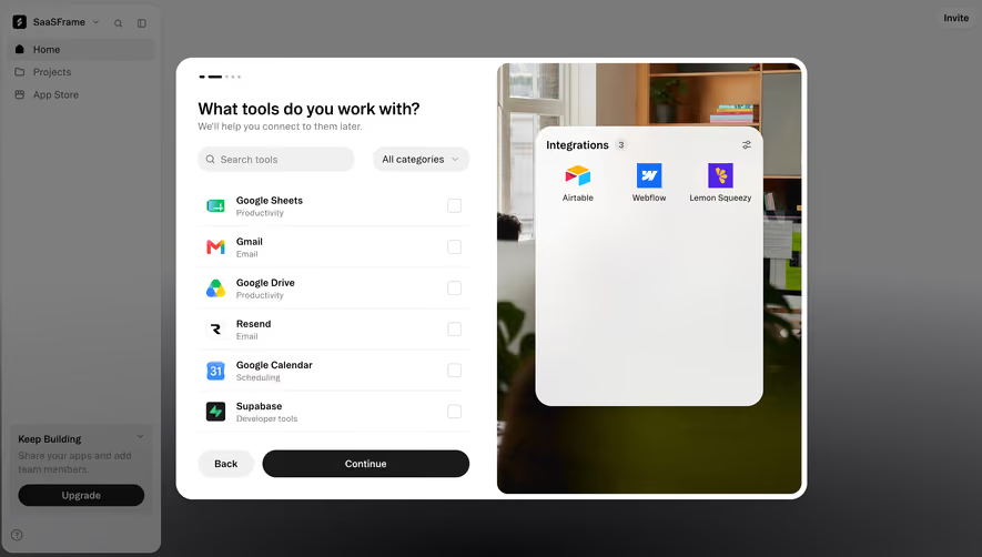
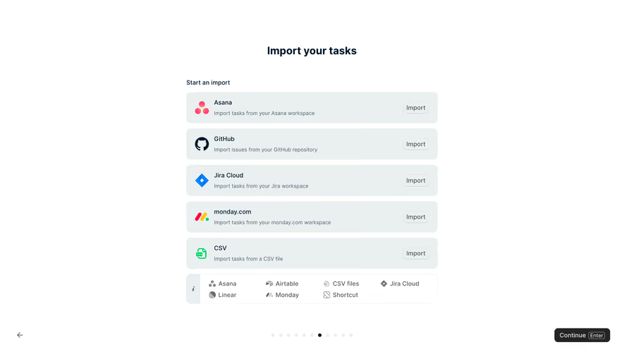
For integrations, distinguish choosing an interest from granting access. In the Glide work-tools capture, users can select tools and are told they can connect them later. This separates collecting context from completing a connection. Do not make a preference selection appear to authorize access to another service.
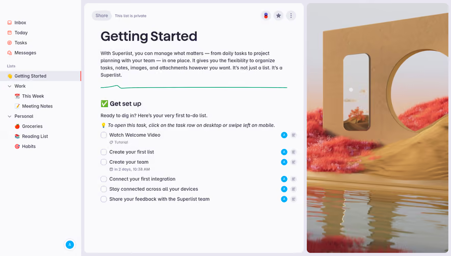
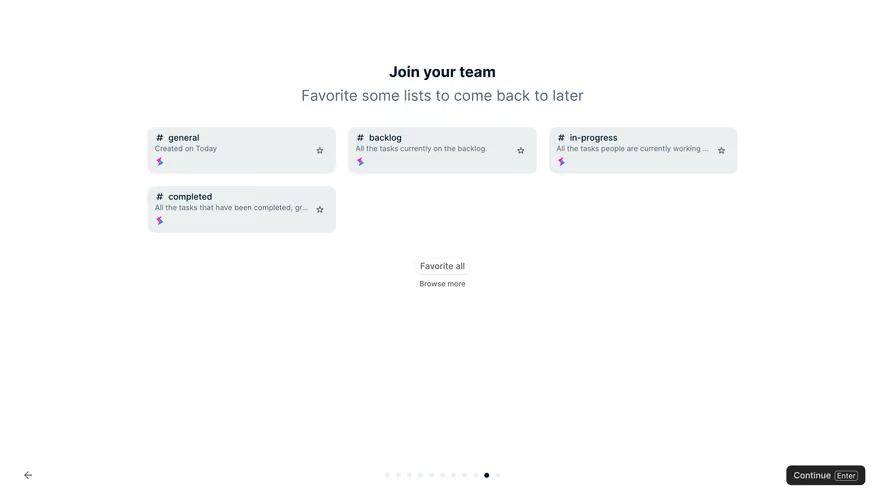
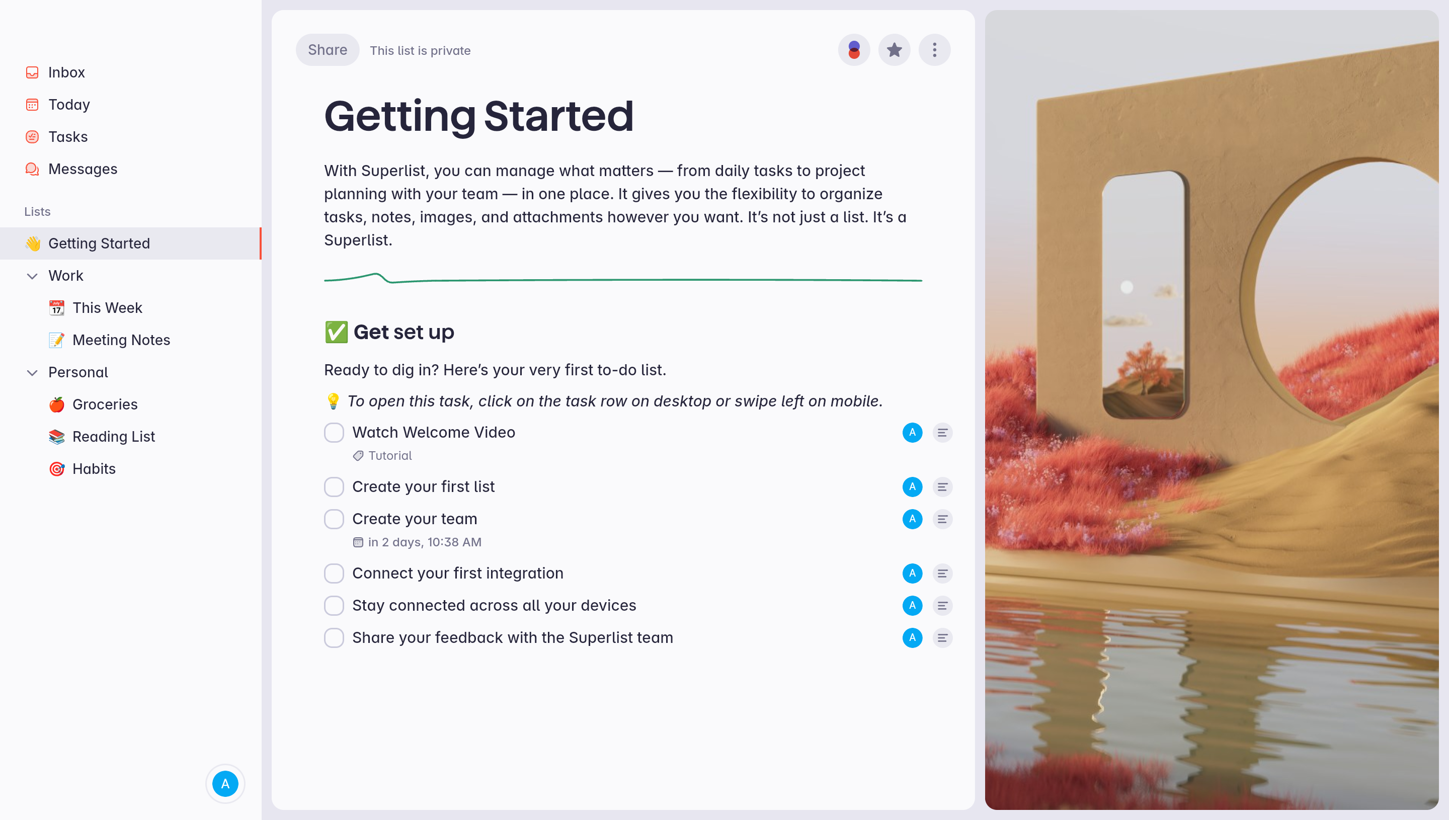
The Superlist getting-started capture uses a list inside the product as the onboarding surface. Its tasks include creating a first list, creating a team, connecting an integration, and exploring other devices. The surrounding navigation and sharing controls remain part of the normal product environment.
This approach can teach both content and interaction. A user sees how a list is organized while reading actions that help them use the product. It also creates a reusable place to return to, rather than a modal that disappears after dismissal.
A working example needs thoughtful maintenance. Explain whether users can edit, share, archive, or delete it. Keep sample content distinguishable from their actual work, especially when the product includes sensitive or collaborative information. The usefulness of a starter object depends on that boundary remaining understandable.
Use templates to reduce blank-page effort
Templates can make a first action easier by giving users a structure they can inspect and modify. They work best when their names describe recognizable tasks rather than internal product terminology. Explain what will be created before users commit.
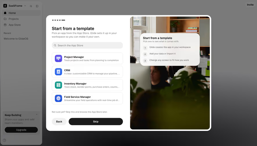
The Glide template-selection capture offers recognizable starting points such as project management, CRM, inventory, and field service. It also presents an option to skip and browse later. This combines a guided shortcut with a route for people whose needs do not match the suggested examples.
Do not assume a template is finished work. Help users identify which content is sample data, which fields need configuration, and which permissions or integrations still need attention. A polished example can otherwise create an impression of readiness that the underlying account has not earned.
Connect the first artifact to readiness and testing
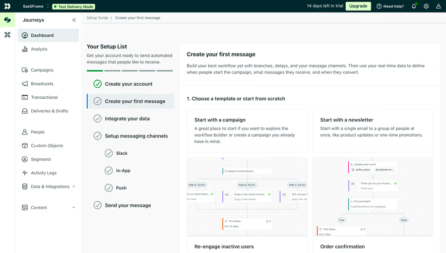
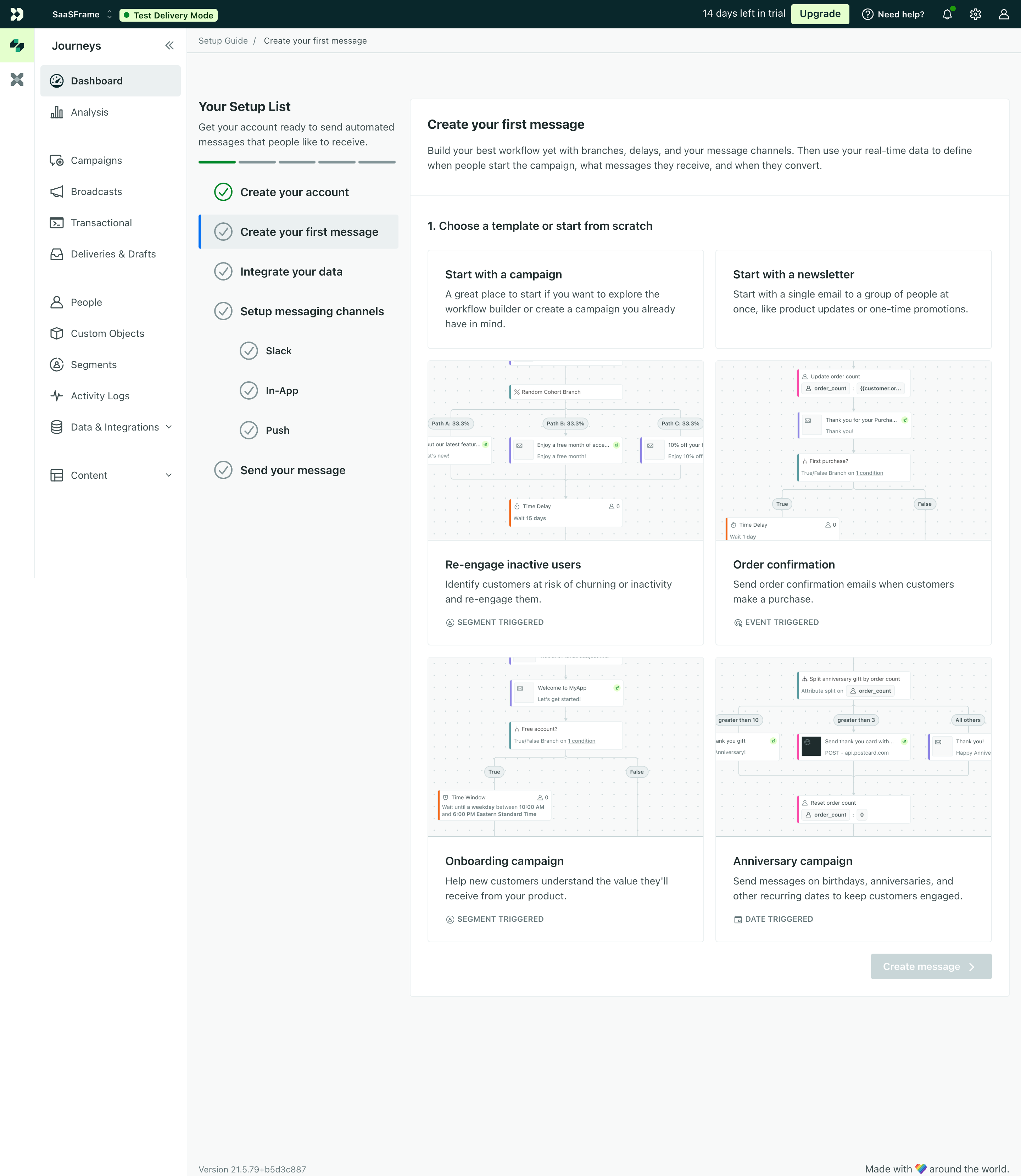
The Customer.io create-first-campaign capture places campaign and newsletter choices beside a setup sequence. The sidebar includes account creation, creating a first message, integrating data, setting up messaging channels, and sending a message. The page also shows a Test Delivery Mode banner.
This is useful because creating content and being ready to deliver it are different states. The interface can let users explore a first artifact while keeping configuration and delivery context visible. Templates for recognizable campaign purposes further reduce the work required to begin.
When adapting the model, make the distinction between a draft, a test, and a live action explicit. Completion of an onboarding step should not imply that a message has been sent or that an integration is ready. The displayed progress must follow the confirmed product state.
Keep progress accurate and explain its scope
Progress indicators help users estimate effort and understand where they are. They become misleading when the denominator changes without explanation, optional tasks count as failures, or a completed visual step hides unfinished system work.
Define completion in terms of the actual task. Opening an integration modal is different from confirming a successful connection. Viewing a template is different from creating an object. Use the state that matters for the user outcome rather than the easiest event to instrument.
For branching flows, use a progress model that can accommodate different routes. A checklist may fit independent tasks better than a rigid stepper. A short linear flow may benefit from a visible step count. The form of progress should reflect the structure of the work.
Preserve context through interruptions and errors
First sessions are often interrupted. Users may need credentials from a colleague, approval from an administrator, or time to gather data. Save completed work and make the return path understandable.
When a connection fails, explain what happened and provide a relevant next action. Do not reset unrelated steps or show a generic failure that hides whether any data was imported. If a task takes time, distinguish pending work from a confirmed result.
A dismissed guide should remain discoverable where practical. Returning users may need help again after switching roles or revisiting an unfamiliar feature. Provide a way to reopen guidance without making every session repeat the initial experience.
Adapt guidance to access, device, and experience
An invited member may lack permission to complete administrative tasks. Show guidance that fits their access and provide a clear route to request help where appropriate. Avoid a checklist that encourages actions the person cannot perform.
On small screens, preserve the active instruction and its associated control. A wide multi-column layout may need a different presentation, particularly when the user must switch between explanatory content and a form. Keyboard navigation and visible focus should work throughout the flow.
Do not rely only on hover tips, animations, or color to communicate progress. Users need understandable labels and accessible controls. Allow people to move at their own pace rather than requiring them to follow a timed sequence.
Measure meaningful activation and repeated use
Choose an activation event that corresponds to a useful outcome. A completed welcome modal or a dismissed tooltip says little about whether someone understands the product. Observe whether people can perform the task again without the guide.
Pair funnel measurements with direct observation. Where do users hesitate, misunderstand a request, or leave to gather information? A high completion rate can still conceal a flow that creates the wrong object or leaves users unsure what to do next.
Test new accounts, invited members, failed integrations, interrupted sessions, skipped tasks, and returning users. Use realistic data and permissions. These states reveal whether the onboarding system helps people accomplish work beyond the ideal demonstration.
Frequently asked questions about SaaS user onboarding
Should every product use a checklist?
No. A checklist works well for a set of visible tasks, particularly when some can happen independently. A contextual prompt, starter object, or short guided flow may fit a simpler first outcome better.
How many steps should onboarding contain?
Use the steps necessary for the intended outcome and defer requests that do not contribute to it. There is no universal count. The effort and dependencies of each step matter more than the number alone.
What belongs after the first useful outcome?
Introduce additional capabilities when they become relevant. A successful first session can lead naturally to collaboration, integrations, or deeper configuration without making those tasks prerequisites for every user.