Design with AI
Generate a new design based on this screen using your own content.
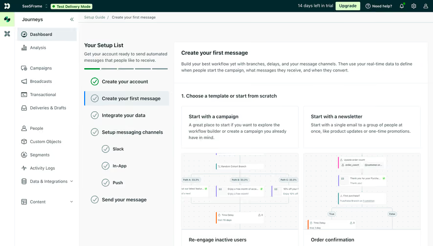
# Design from Reference: Customer.io Send First Campaign
Create an original, high-fidelity visual design inspired by the reference. Prioritize composition, typography, colors, spacing, and component styling over technical implementation.
## Reference
- **Product:** Customer.io
- **Category:** User Onboarding
- **Screenshot:** https://cdn.prod.website-files.com/5e9dc792e1210c5325f7ebbc/6aca27eeaca7079066e8e8c3_6aca2712fc79d3a6f5db307d_cms-07159f70c95ff6e1b40b7c11.webp
Analyze the screenshot first. If inaccessible, request it rather than guessing.
## Content
{{content.instructions}}
{{content.data}}
Preserve essential messaging and factual accuracy. Adapt structure and copy length for visual balance; never invent product claims.
## Visual Design
### Overall aesthetic
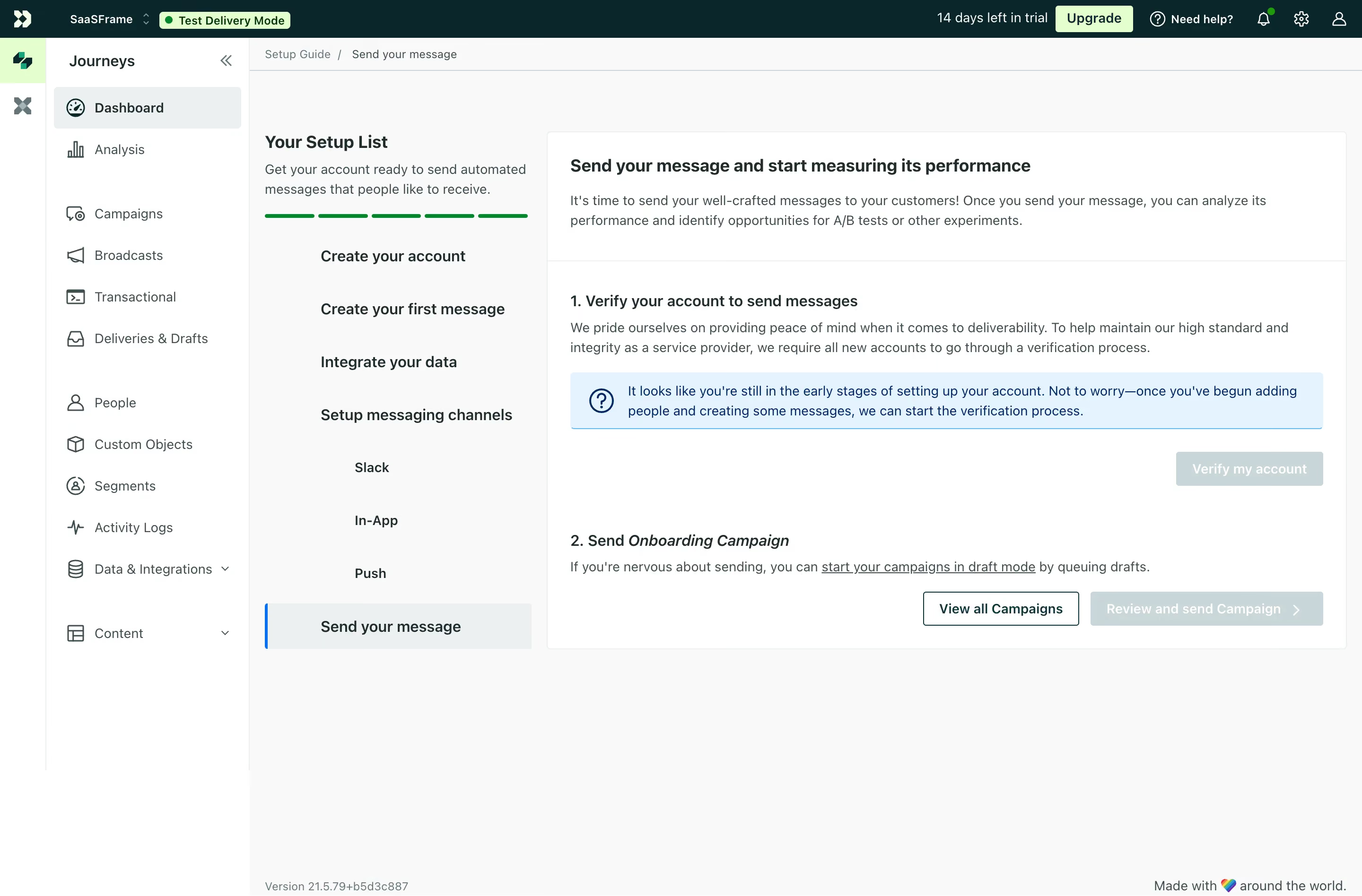
- **Character:** Light onboarding dashboard with dark-teal global chrome, white navigation/cards and a pale-gray task workspace.
- **State emphasis:** Blue information guidance and pale disabled actions communicate that sending prerequisites remain incomplete.
- **Scale:** The source measures 2880 × 1896 image px. Dimensions below estimate a 1440 × 948 CSS layout at 2× scale; device ratio and zoom are unverified.
### Page composition
- **Shell:** A thin icon rail, wider Journeys navigation and dark top account/trial bar frame the workspace.
- **Setup column:** A roughly 300 CSS px task list contains introduction, green progress segments and setup stages.
- **Main card:** A broad white bordered panel explains sending/measuring messages, with two numbered sections for account verification and campaign sending.
- **Actions:** Verification action sits right below an information banner; campaign controls align at the lower right.
- **Footer:** Small version/brand text appears along the bottom.
### Information hierarchy
- **Current stage:** Send your message is highlighted in the setup list with a blue left rule and pale selection.
- **Prerequisite:** The first numbered section explains verification and shows a blue notice about early setup status.
- **Campaign:** The second section names the campaign and provides a draft-mode guidance link.
- **Actions:** View all Campaigns is outlined and stronger than the pale review/send action.
- **State:** Test Delivery Mode is visible in the header. No campaign is sent or reviewed in this task.
### Typography
- **Family:** Neutral interface sans-serif; exact identity is unverified.
- **Headings:** Approximately 18–20 px bold in card/setup titles.
- **Body:** Around 14 px with 21–22 px leading.
- **Navigation:** Approximately 14 px, with selected items bold.
- **Small roles:** Header badges and footer metadata are smaller, around 12–13 px.
- **Emphasis:** Campaign name is italic within a numbered heading.
### Colors & surfaces
- **Measured base:** ICC-aware sRGB sampling yields #FFFFFF and #F8F9F9.
- **Measured dark:** #00282C is the global-bar/deep-teal tone; #3B4F50 and #1B2C2D are foreground variants.
- **Measured selection:** #EAF0F1 and #C6D7D8 occur in pale selected/disabled regions.
- **Measured guidance:** #E2F4FF is the information-banner surface, with dark blue #002964 text/details.
- **Measured accent:** #DDFFC8 appears in pale-green header/action areas.
### Components
- **Top mode badge:** Light-green Test Delivery Mode pill with green dot.
- **Navigation rows:** Outline icons precede text; selected Dashboard has pale-gray fill.
- **Setup progress:** Five short green segments sit above a vertical list, with nested channel entries.
- **Info banner:** Pale-blue rectangle contains a question icon and two-line guidance.
- **Buttons:** Outlined campaign-view action contrasts with pale disabled verification/review controls.
- **Card divisions:** Thin horizontal rule separates the introduction from numbered setup details.
### Visual rhythm
- **Columns:** Dense navigation, medium setup list and broad content card create a three-level structure.
- **Spacing:** Generous card padding separates explanation, notice and actions.
- **Alignment:** Numbered headings and body copy share a left axis.
- **Whitespace:** Large unused lower workspace keeps focus on the current checklist step.
### Responsive
- **Evidence limit:** Only desktop is shown; recommendations follow.
- **Shell:** Collapse icon/navigation rails.
- **Setup:** Convert checklist to a compact progress drawer or stack above content.
- **Actions:** Wrap campaign controls and maintain visible prerequisite guidance.
- **Text:** Keep notice and numbered sections readable without horizontal scrolling.
### Adaptation guidance
- **Reusable pattern:** Present send prerequisites and campaign progression within a persistent setup checklist.
- **State clarity:** Explain unavailable actions and distinguish test mode from live sending.
- **Accessibility:** Expose selected step, disabled reasons and information status semantically.
- **Interaction truth:** Do not infer delivery from a pre-send setup screen.
Use this context to reproduce the reference's visual language: layout, typography, colors, spacing, borders, radii, and distinctive elements. The screenshot takes priority if descriptions conflict.
## Direction
{{preferences.fidelityInstructions}}
## Output
{{output.instructions}}
Deliver a polished, cohesive design with precise alignment, hierarchy, and spacing. Produce the requested visual artifact, not just a description. If unsupported, explain the limitation.