A Clean Onboarding Flow That Actually Respects Your Time
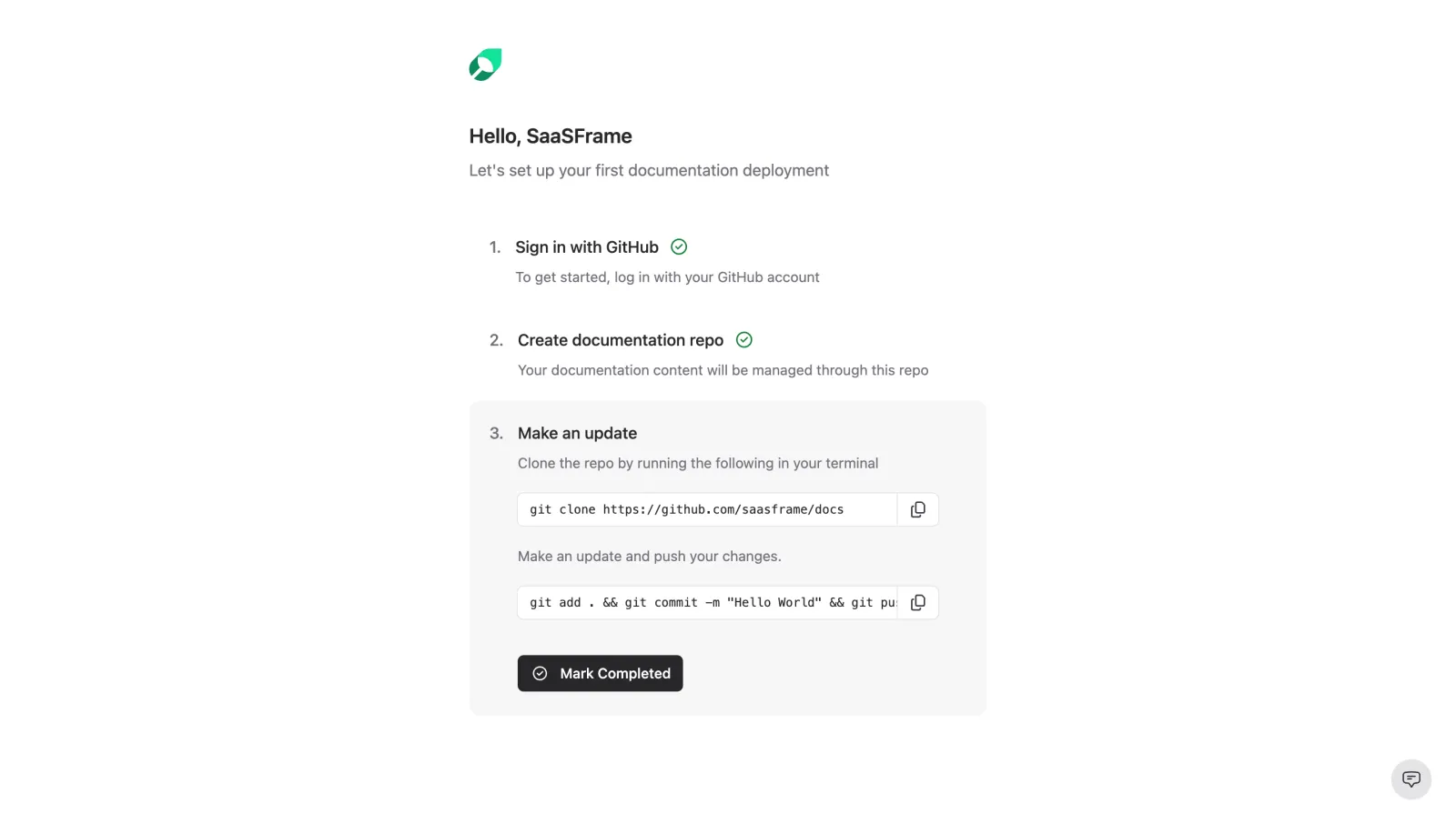
First thing you notice is how much breathing room this page has. The whitespace is doing serious heavy lifting here. SaaSFrame's setup wizard strips everything down to three numbered steps, each with a short description and a clear completion state. Those green checkmarks next to steps 1 and 2 give you instant progress feedback without any unnecessary fanfare.
Typography and Layout That Stay Out of the Way
The type hierarchy is dead simple. Bold step titles, lighter gray descriptions underneath. Nothing fights for attention. The code blocks in step 3 are nicely contained with a subtle border and copy buttons tucked to the right. That "Mark Completed" button in dark with a checkmark icon is the only real call to action on the page, and it lands perfectly because everything else is so restrained.
What Makes It Stand Out
The small green leaf logo up top feels fresh without being distracting. What I really like is how this feels more like a checklist than a traditional onboarding wizard. No progress bars, no multi-page flows. Just do the thing and move on. Designers building developer-facing products should study this approach.
 SaaSFrame
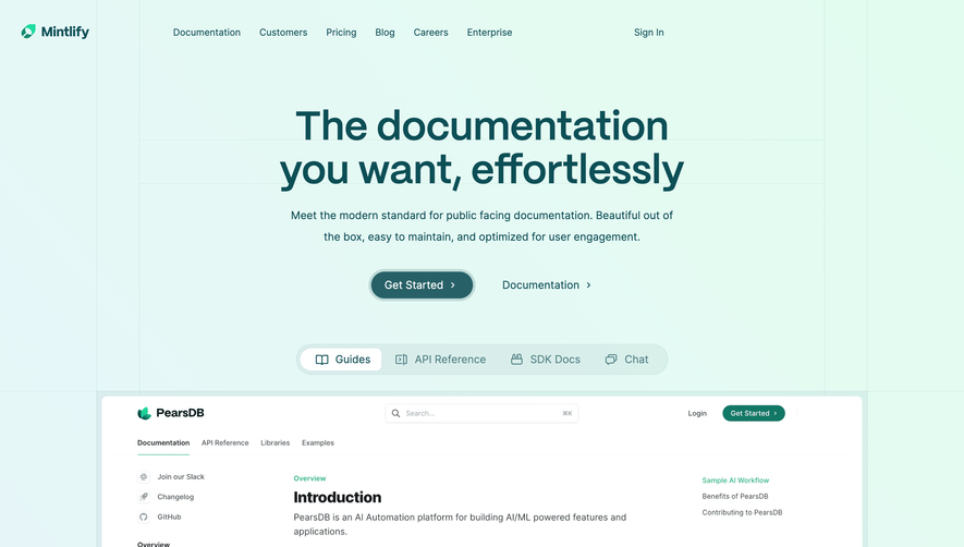
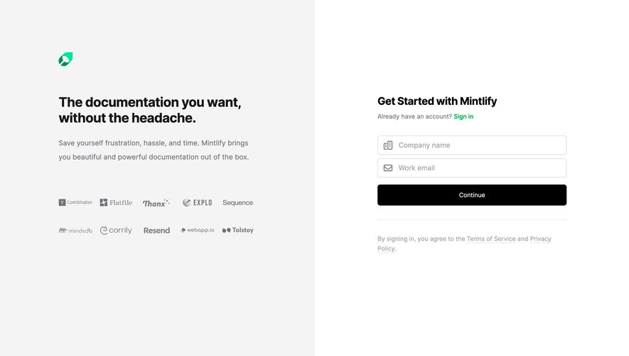
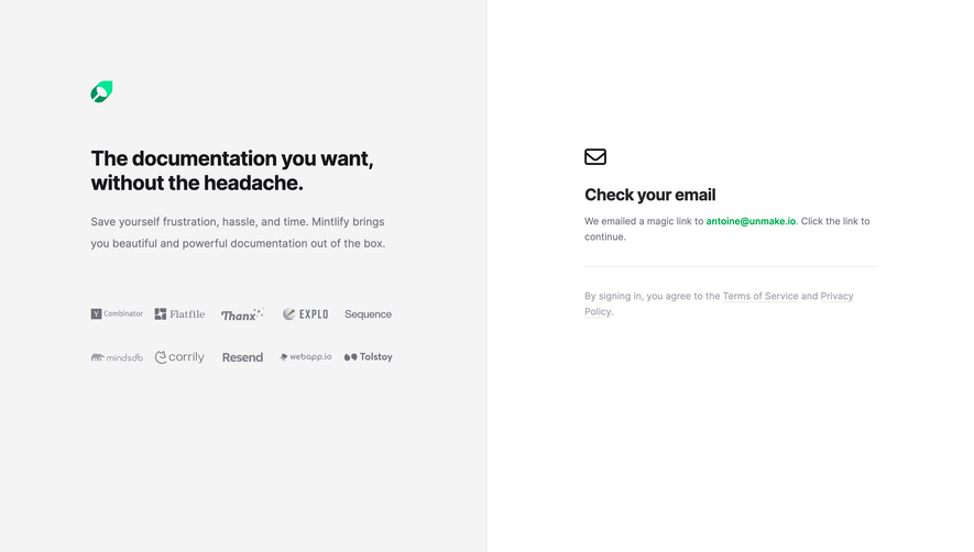
 MintlifyBeautiful documentation that converts users