Pagination
43
Manage large datasets with SaaS Pagination patterns. Compare 'Load More' buttons, infinite scroll, and numbered page navigation for tables and search results.

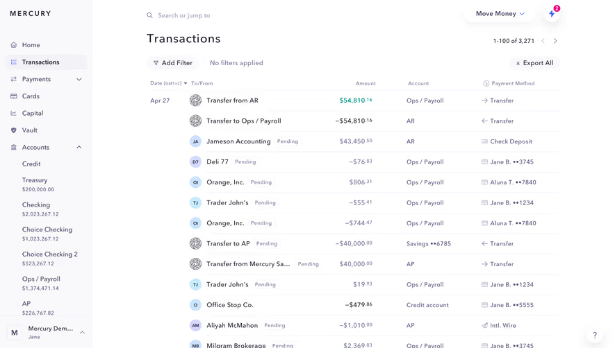
Pagination divides a collection into manageable result segments and provides controls for moving between them. In SaaS products, it supports transaction histories, recordings, contacts, search results, and other collections where users need to inspect a bounded set without loading everything at once.
A useful pagination interface explains three things: where the user is, what the current segment contains, and how to reach another segment. The controls also need to remain consistent with filters, sorting, selection, and a dataset that may change while the person is browsing.
Pagination is valuable when users benefit from bounded groups and repeatable positions. Someone reviewing a history or checking several records may need to leave an item, return to the collection, and continue from the same place. A continuously expanding feed can make that return journey harder to understand.
Numbered pages are one option, not the definition of the pattern. Previous and Next controls can support sequential browsing without presenting a page count. Range indicators can show which items are visible. Choose the interface according to the navigation the data source and task can reliably support.
Do not add a long row of page numbers simply because a collection is large. People rarely know that a particular customer will be on page 47. Search and filters solve discovery; pagination controls movement through the resulting collection. Treat those responsibilities separately.
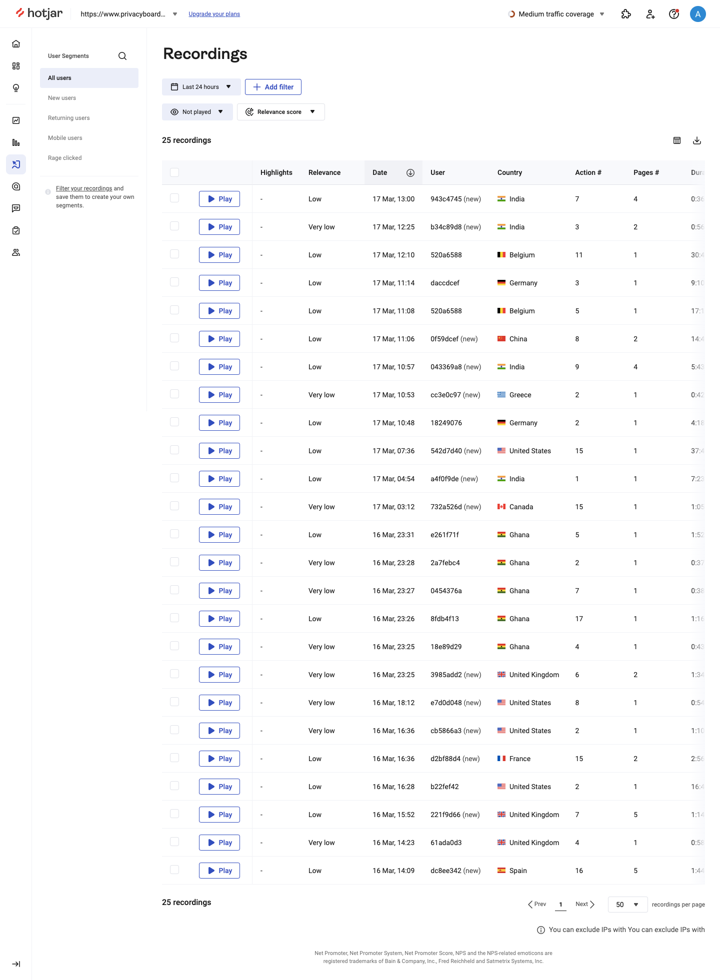
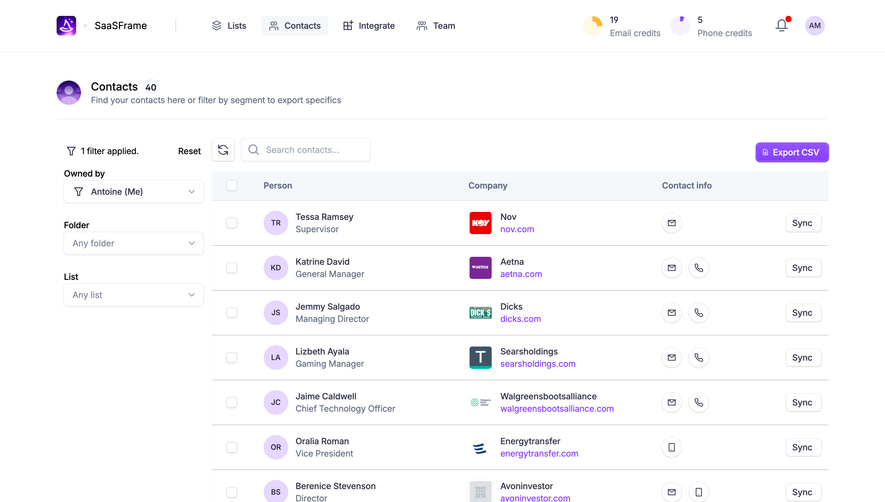
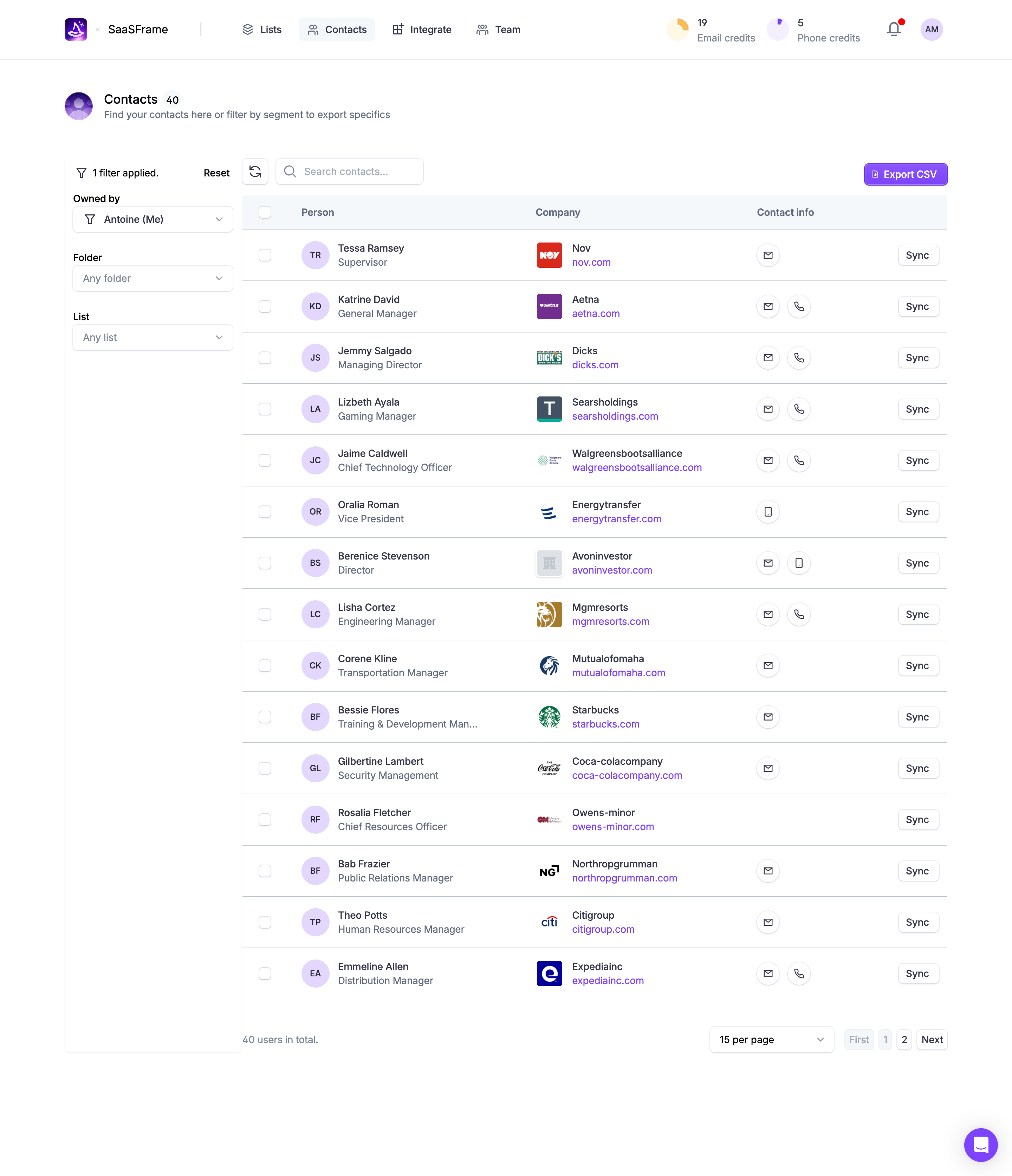
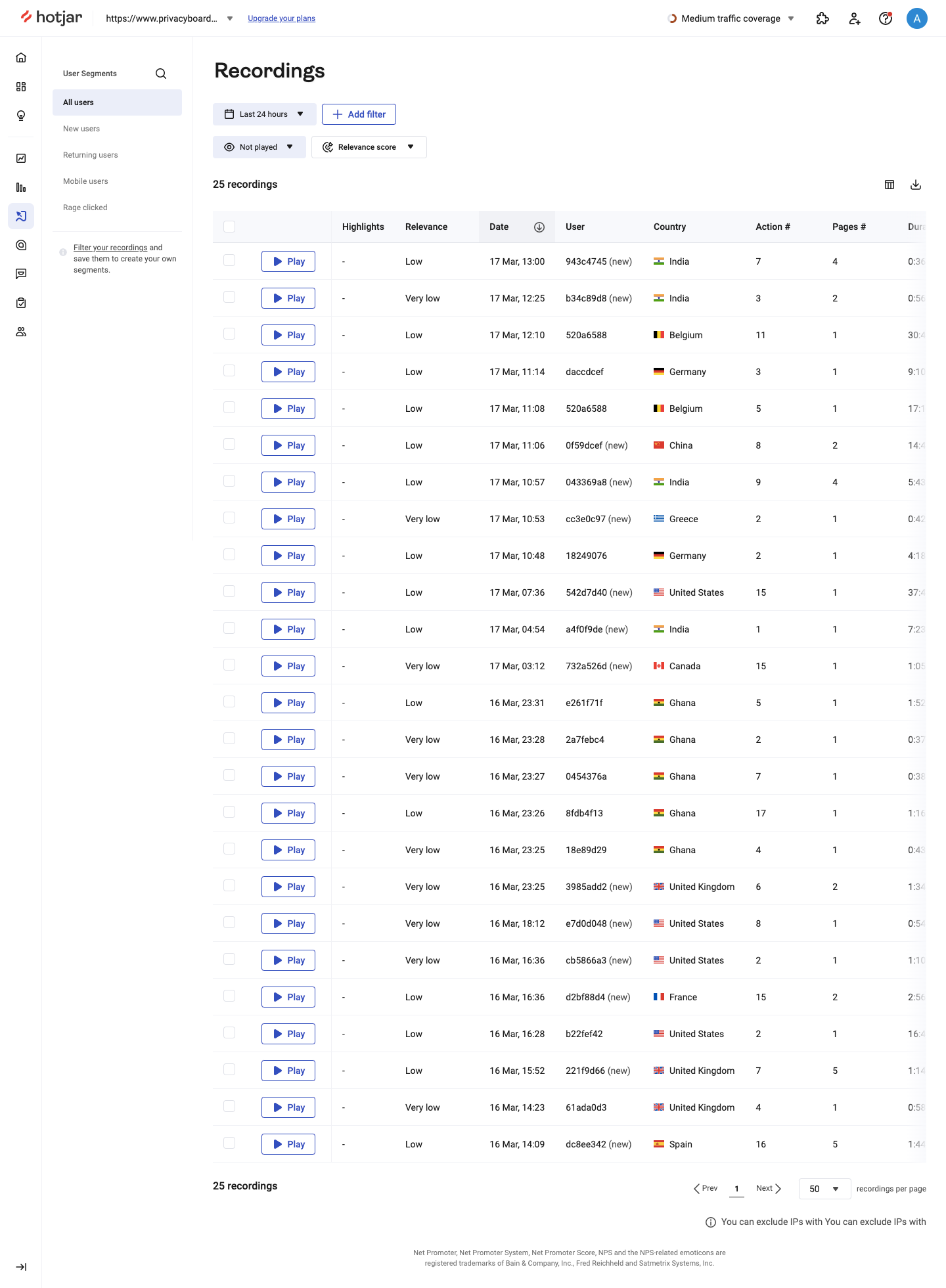
The Hotjar screenshot shows a recordings table with a visible count of 25 recordings. The footer contains Previous, a marked page 1, Next, and a selector displaying 50 recordings per page. Filters above the table include a time range, playback status, and relevance-related controls.
The distinction between count and page size matters. A setting of 50 per page does not mean that 50 records exist. In the captured state, the total count is smaller than the selected page capacity. Users should be able to understand that relationship without interpreting a short final page as a loading failure.
The control's unit is explicit: recordings per page. That is clearer than an unlabeled dropdown containing numbers. When a product has several tables or object types, naming the unit helps people understand which collection the setting affects.
The screenshot does not demonstrate whether changing page size resets the page or preserves the current record position. Those rules need to be defined in your implementation. They affect the user's place in the collection just as much as the visual navigation controls do.
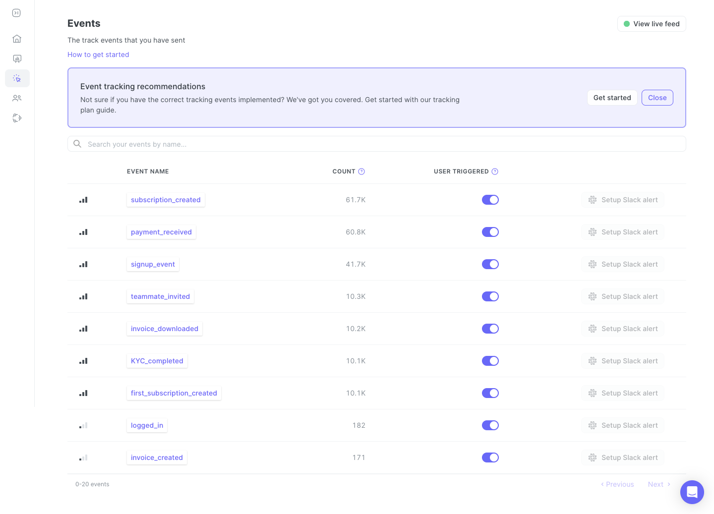
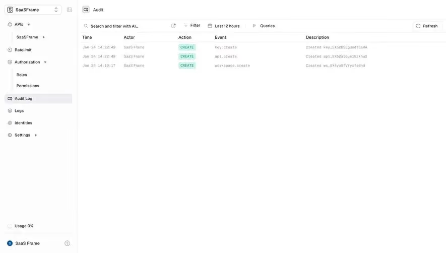
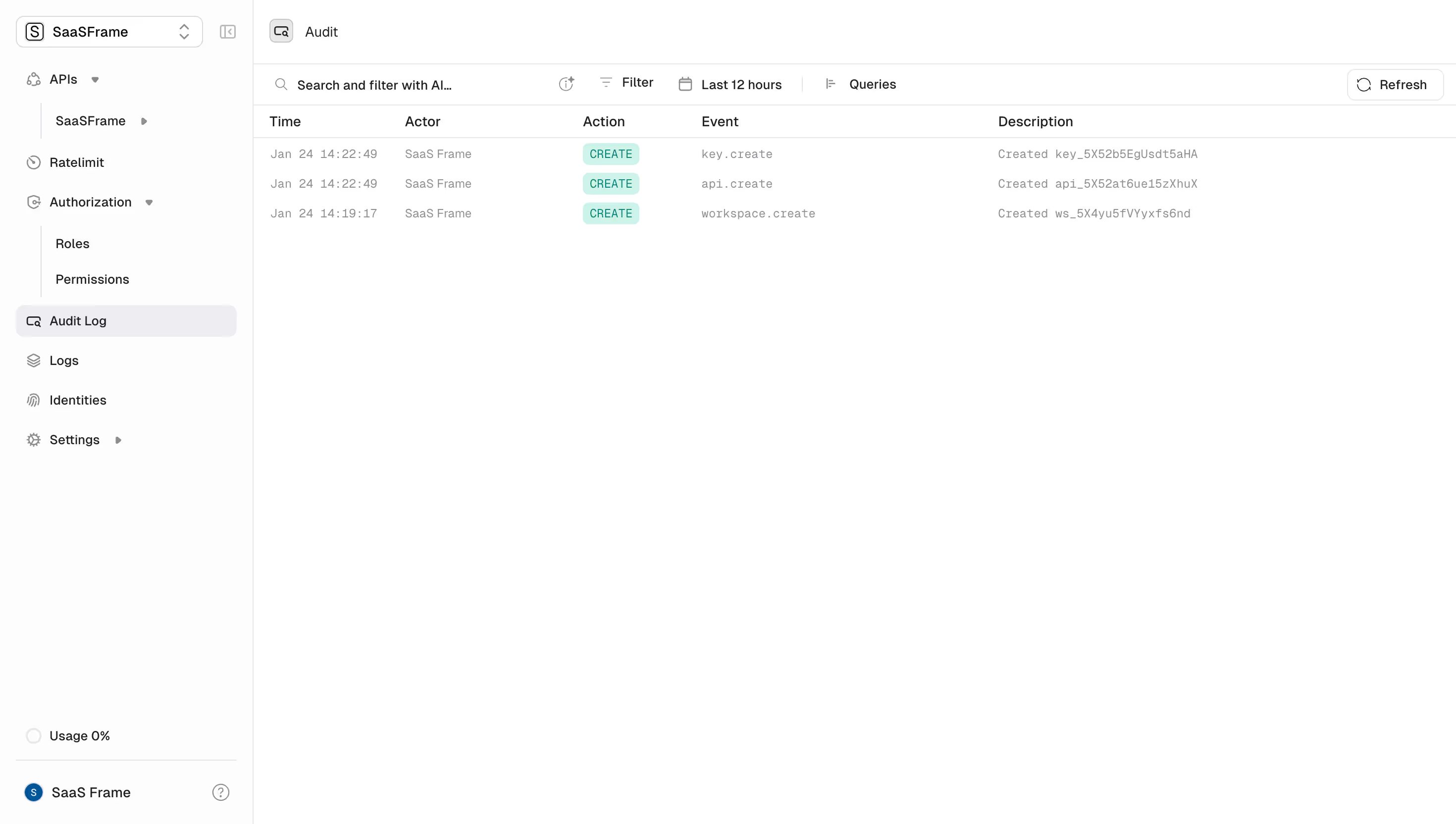
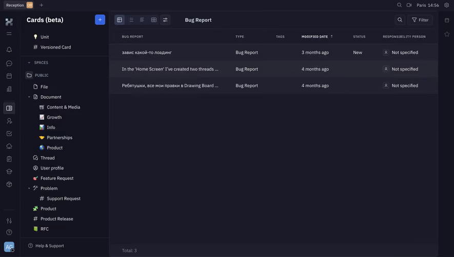
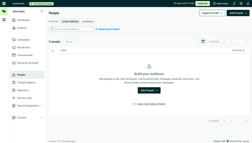
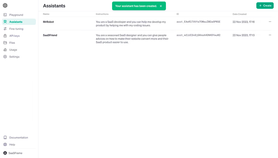
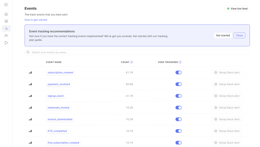
The June screenshot presents an event list with names, counts, and user-triggered switches. A search field sits above it. At the bottom, a range-style label appears alongside Previous and Next controls, without a visible sequence of numbered pages.
This compact treatment can suit a workflow focused on moving through adjacent groups. It avoids suggesting that users need to pick an arbitrary page number. However, the range wording must be unambiguous. A label beginning at zero can be read differently from a human-readable first-item count; choose a convention users can interpret.
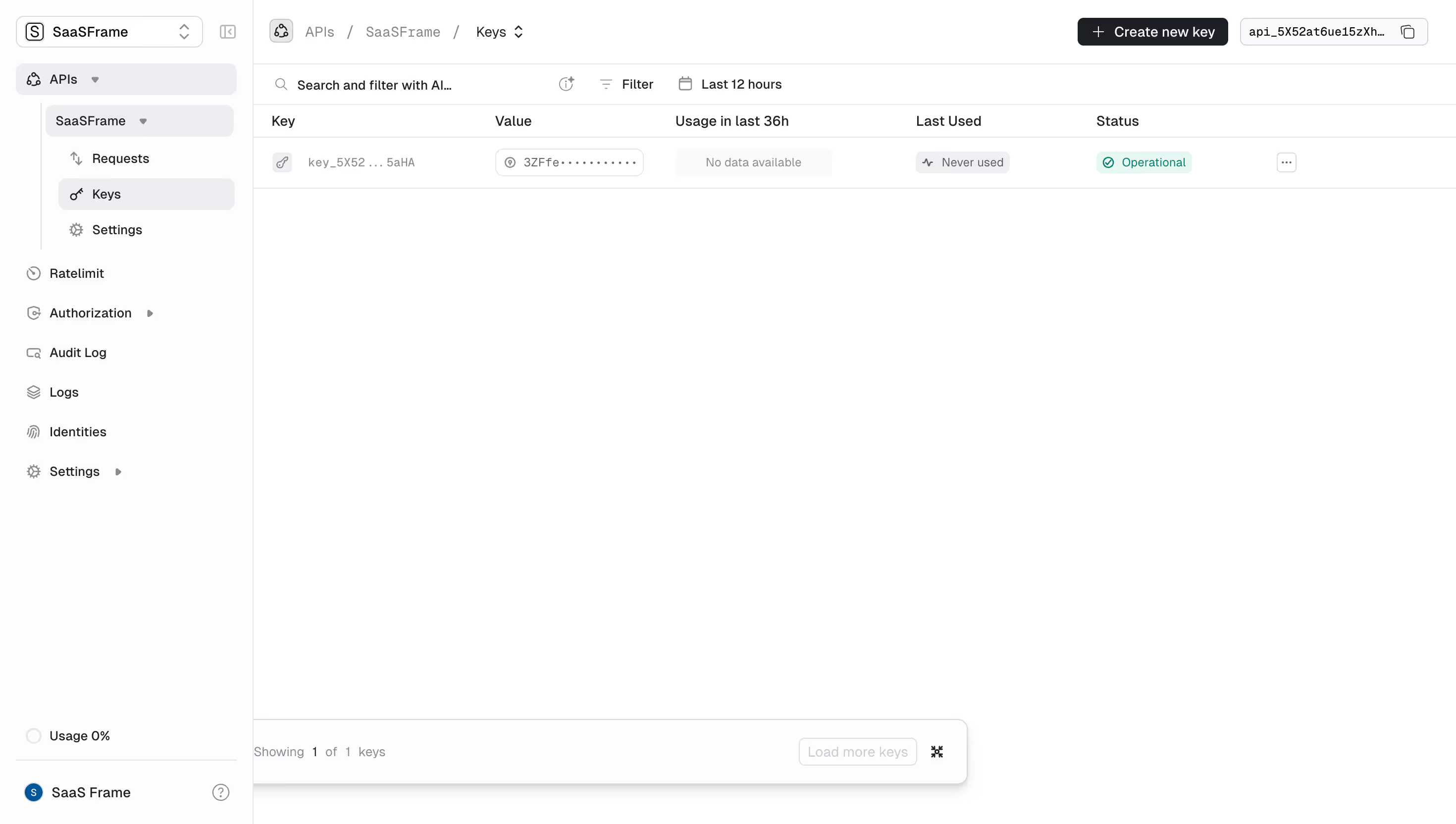
The captured image cannot establish the underlying page size, total count, or backend navigation model. It does show the importance of labeling the current segment. A compact footer still needs to explain what the user is seeing, especially when a search query changes the available results.
Compare this approach with Hotjar's explicit page and page-size controls. The useful question is not which footer looks cleaner. It is which information a user needs to keep their place while reviewing this particular collection.
A range such as “21–40 of 126” should describe the current filtered results, if that is what the table displays. A count of all records in the workspace can be misleading when only a constrained subset is being browsed. Define the count's scope and use it consistently.
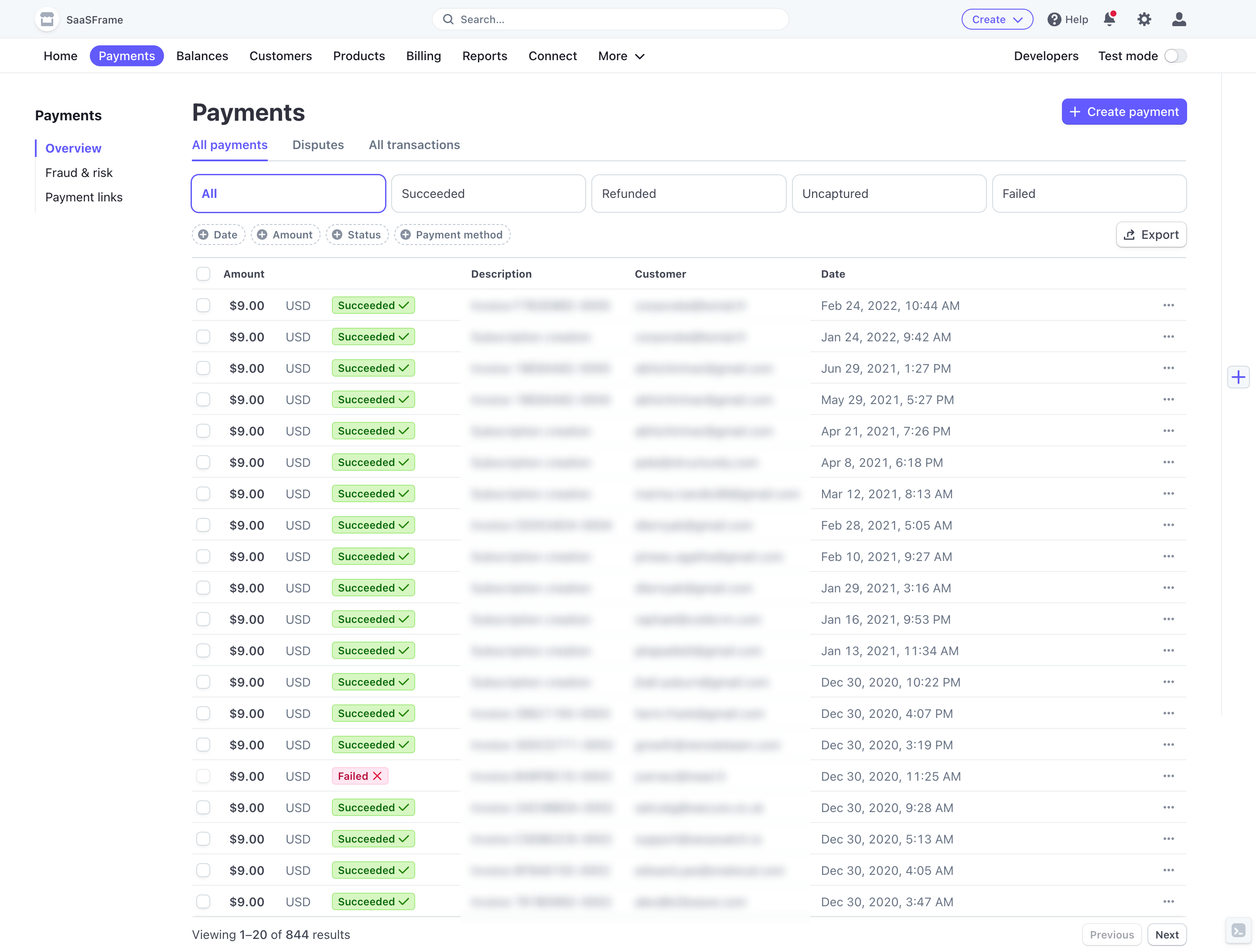
If the total is unknown or expensive to obtain, use honest navigation language rather than inventing a precise page count. Sequential controls can work without an exact total. The interface should not imply that the last page is known when the system cannot determine it reliably.
Handle partial final segments naturally. Showing fewer rows than the chosen capacity is expected at the end of a collection. A clear range and disabled forward control can communicate that boundary. Do not fill the table with empty rows that resemble missing records unless they serve a specific layout purpose.
A person on a later page may apply a filter that produces only a few results. Keeping the old page index can create a false empty state. In many interfaces, returning to the beginning of the new result set is the clearest behavior, but that transition should be predictable.
Apply the same reasoning to search, sorting, and tabs. Decide which changes create a new result set and which preserve the current location. Document the rules so that similar collections do not behave differently without a reason.
Keep the controls aligned with the displayed data during asynchronous updates. A footer should not show the new page number while the table still presents the previous page as if it belongs to that number. Use a clear loading state and prevent conflicting requests from leaving the view in an inconsistent state.
A larger page size can help users scan more objects without navigating, but it also creates a longer review surface and may require more loading. Offer values appropriate to the object type and the interface's actual performance.
Specify what happens when the size changes. The product can return to the first segment or try to keep the current item visible. Either approach needs consistent implementation. Otherwise, users can feel that rows disappeared or were skipped when the grouping changed.
Consider whether the preference persists. A per-table preference and a global preference have different effects. If users routinely review long lists, persistence can reduce repeated setup. Do not assume that a choice suitable for one collection is appropriate for every collection in the product.
Opening a detail view should not erase the user's place without a reason. Preserve the relevant query, filters, sort, page, and scroll position where feasible. Those pieces together describe the browsing context; remembering only the page number may be insufficient.
Support a stable route when users need to share or bookmark a collection state. Decide which parts belong in the URL and which remain personal preferences. The shared destination should be meaningful to another authorized user even if their page-size preference differs.
Browser back navigation deserves direct testing. A person who returns from a transaction or recording should recognize the collection they left. Unexpected resets can turn a quick investigation into repeated work, particularly in long histories.
Live collections can gain, lose, or reorder records while users move through them. New objects inserted at the beginning can shift later segments. Deleted objects can shorten a page. The interface needs a strategy that fits the task rather than assuming that page boundaries are permanent.
For workflows where continuity is important, consider whether the user should refresh explicitly, browse a stable snapshot, or receive a notice that newer results are available. The appropriate implementation depends on the data source. Make the visible behavior understandable without exposing backend mechanics unnecessarily.
Use a stable ordering rule so that equal values do not produce unpredictable row movement. Test a collection where several objects have the same displayed date or score. Users should not encounter duplicate or skipped-looking items merely because the ordering lacks a consistent tie-breaker.
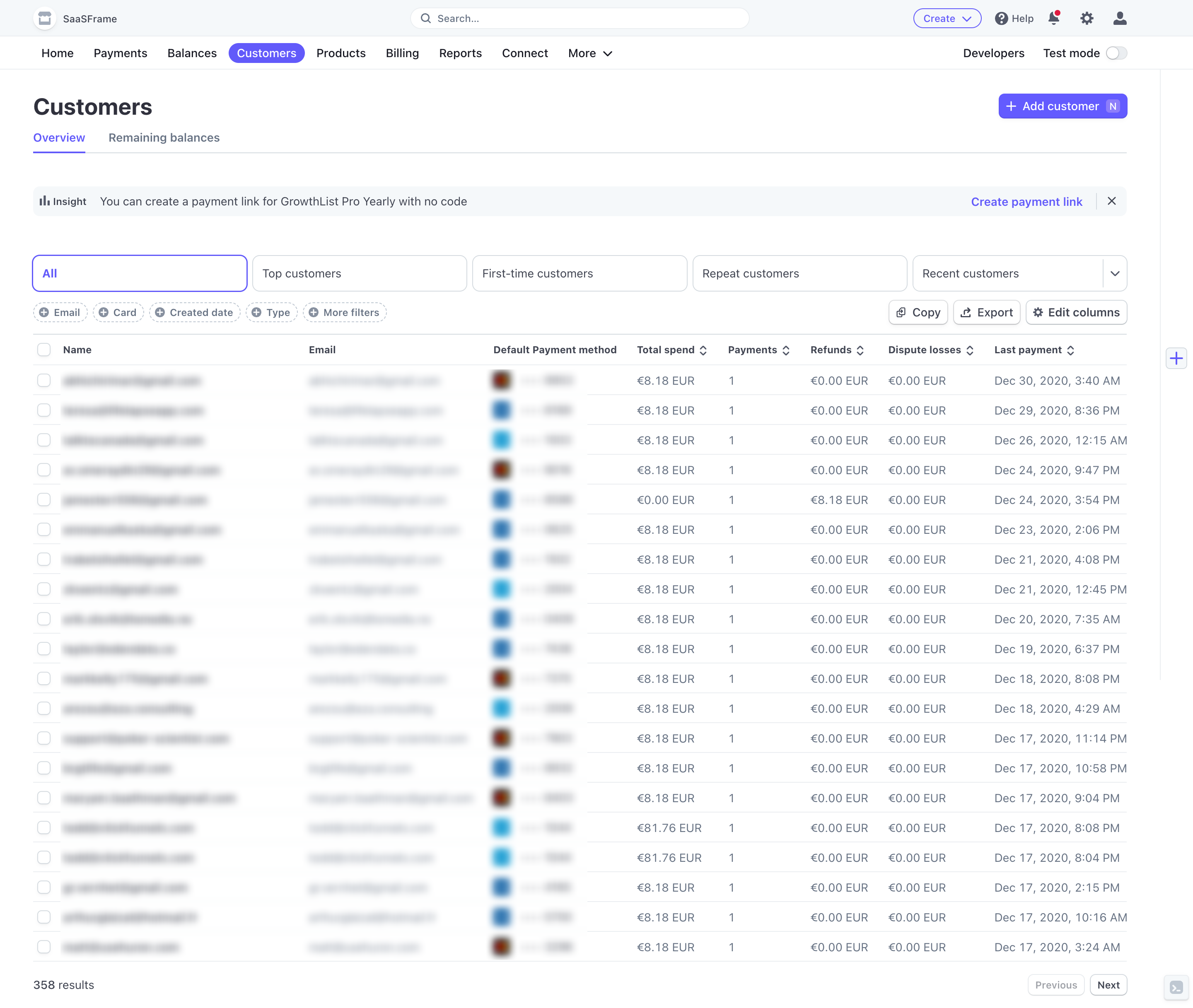
A select-all checkbox can mean all visible rows or all matching records. Those are materially different actions. State the scope before a batch operation, and show an accurate selected count. Moving to another page should not silently change the interpretation.
If selection persists across pages, users need a way to inspect or clear it. If selection is limited to the current segment, communicate that rule. Destructive actions should identify the affected set rather than rely on assumptions about pagination.
Exports also need an explicit scope. “Export current page” and “Export all matching results” should not share a vague label when they produce different files. The pagination boundary is a display choice; it should not accidentally determine what the user receives.
Navigation controls need clear names and recognizable current state. Previous and Next icons should not depend on arrow shape alone. Numbered pages should identify the active page, and unavailable movements should have a coherent disabled or omitted state.
After navigation, place focus and scroll in a way that supports reviewing the new results. A person using a keyboard should not have to traverse an entire footer again without understanding that the collection changed. Test the actual reading and navigation sequence.
Place controls where the task requires them. A footer is natural after reviewing a table, while a second compact control near the top can help in long collections. If both are present, they must reflect the same state and not offer conflicting page-size settings.
Include no results, one result, an exact page-size multiple, a short final page, and a filter applied from a later page. Check loading failures, changed totals, deleted records, and returning from details. These cases reveal misleading ranges and stranded navigation.
Pagination can help with bounded review and returning to a known position. Continuous loading can support exploratory browsing. Choose based on the task and test the return journey, not just initial scrolling.
No. If the total is unavailable, sequential navigation can still be useful. Be clear about the current segment and avoid presenting a fabricated last-page count.
Often it should, because the new result set may not contain the previous page. Define a consistent rule and ensure that the table and footer update together.
Explore pagination examples on SaaSFrame to compare range labels, page-size settings, and navigation controls in real SaaS collections.