
Thank you! Your submission has been received!
Oops! Something went wrong while submitting the form.
Get SaaSFrame Pro
Monthly
$18
Quarterly
$48
Yearly
$180
Upgrade to access this feature
Browse all screens & flows
Filter and search screens & flows
Access Figma files
Access mobile versions
Bookmark screens & flows
Join now
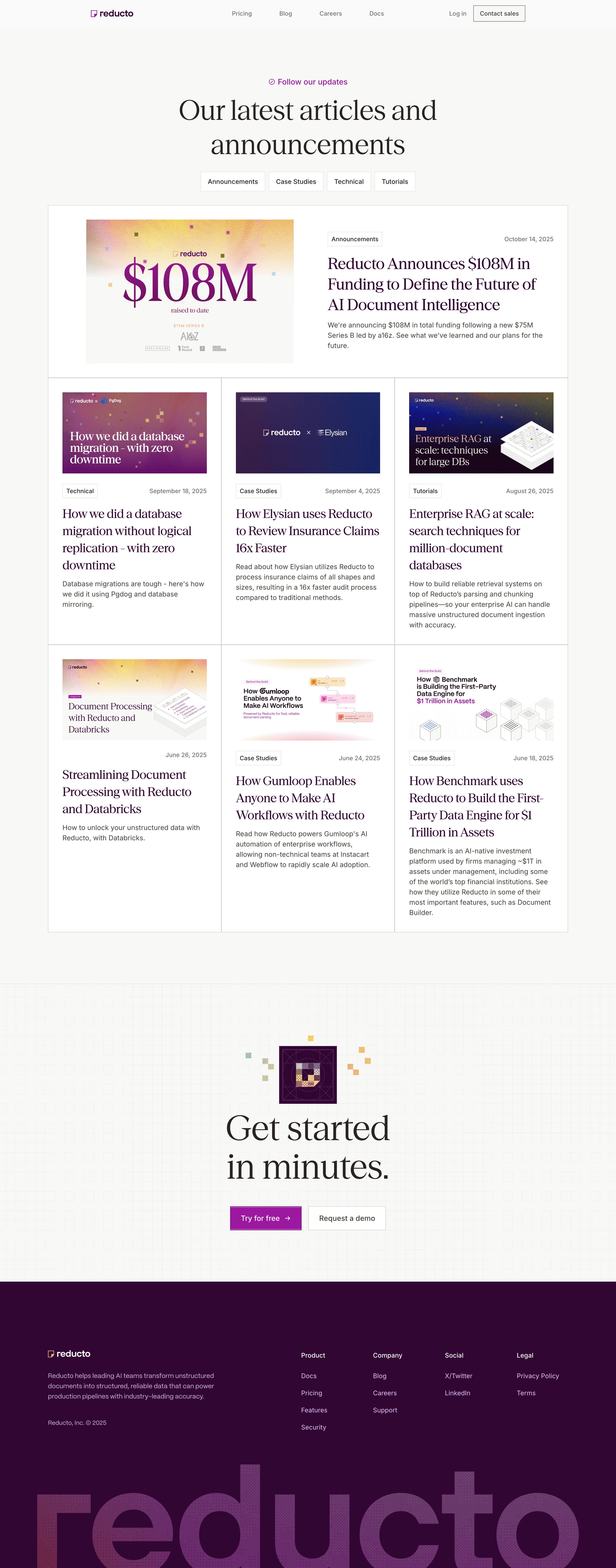
Reducto Blog Feed

Reducto
Document intelligence platform
Designed by


Bookmark
Bookmark

Design with AI
Thank you! Your submission has been received!
Oops! Something went wrong while submitting the form.
# Design from Reference: Reducto Blog Feed
Create an original, high-fidelity visual design inspired by the reference. Prioritize composition, typography, colors, spacing, and component styling over technical implementation.
## Reference
- **Product:** Reducto
- **Category:** Blog Feed
- **Screenshot:** https://cdn.prod.website-files.com/5e9dc792e1210c5325f7ebbc/6acad40ec910b3adf9e48d72_6acad1a5c2028efdec712489_cms-8682712fc66bcb11947533b2.webp
Analyze the screenshot first. If inaccessible, request it rather than guessing.
## Content
{{content.instructions}}
{{content.data}}
Preserve essential messaging and factual accuracy. Adapt structure and copy length for visual balance; never invent product claims.
## Visual Design
### Overall aesthetic
- **Character:** An editorial blog index mixes elegant high-contrast serif headlines with utilitarian sans-serif metadata, a warm near-white background, square-edged card grids, and rich plum branding.
- **Evidence:** The screenshot is 2880 × 7326 image pixels, inspected across three readable crops at 1400 px width. Measurements below are approximate CSS-scale estimates assuming a 1440 px desktop layout at 2× capture; capture ratio is unverified.
- **Motifs:** Pixel-like colored squares, geometric grids, and document illustrations create a technical counterpoint to the traditional serif typography.
### Page composition
- **Header:** A restrained horizontal bar places the small Reducto logo left, four central navigation links, and login plus an outlined sales button right.
- **Introduction:** A small purple update label precedes a large centered two-line serif heading. Four outlined category controls sit beneath it.
- **Featured article:** A wide white bordered panel contains a large left thumbnail and right-side category/date, multi-line title, and short excerpt.
- **Article grid:** Six more previews form two rows of three equal white cells sharing thin borders. Each contains a landscape image, metadata, serif headline, and sans-serif summary.
- **Closing CTA:** A pale geometric-pattern band centers a small plum graphic, very large two-line serif message, and two rectangular actions.
- **Footer:** A deep plum section pairs brand/description/copyright with four link groups. An enormous textured wordmark clips at the bottom edge.
### Information hierarchy
- **Editorial entry:** The large serif page heading dominates the introduction, while the small purple label supplies a secondary cue.
- **Featured priority:** The first article receives a full-width split layout and a larger image/title treatment than the grid below.
- **Article anatomy:** Category chips and right-aligned dates form the metadata line above headlines. Excerpts are smaller, darker-gray prose.
- **Category controls:** Four equal-style outlined buttons indicate content categories. No selected filter behavior is established.
- **Closing emphasis:** Large serif CTA text and a filled purple free-trial button precede the darker footer, creating a clear final conversion point.
### Typography
- **Families:** High-contrast serif type is used for the main heading, article titles, and closing CTA. Navigation, labels, body, and footer use a neutral sans serif. Exact font identities are unverified.
- **Page heading:** Approximately 64–68 CSS px with 78–82 px line-height and regular weight.
- **Feature title:** Approximately 38–40 px with 48 px line-height; grid headlines are approximately 30–32 px with 39–41 px line-height.
- **Body:** Excerpts and navigation are approximately 15–16 px, with excerpt line-height around 24 px. Dates and category labels are around 14 px.
- **CTA and footer:** Closing serif text is approximately 80–84 px with broad line-height. Footer group labels and links are about 15–16 px; descriptive copy uses roughly 24 px leading.
### Colors & surfaces
- **Measured palette:** Sampled source pixels include warm near-white #F8F8F6, white #FFFFFF, deep plum #330634, near-white #FAFAFA, pale gray #F0F0EF, and related plum #320632.
- **Semantic use:** Near-white grounds the page; white distinguishes article panels. Plum marks article headlines, branding, and the entire footer.
- **Accent:** A bright purple-magenta highlights the update label and primary CTA. Thumbnail artwork adds orange/yellow gradients, pink, navy, and pixel-texture accents.
- **Borders:** Thin warm-gray outlines divide cards and category controls. Shadows and rounded floating-card effects are absent from the main article grid.
### Components
- **Category controls:** White rectangular buttons around 45 px high with thin gray outlines, minimal corner rounding, and comfortable side padding.
- **Featured panel:** Approximately 1215 × 400 CSS px, with generous internal padding and a roughly equal image/text split. The left image is about 485 × 336 px.
- **Standard previews:** Approximately 405 px wide; inner thumbnails are around 337 × 190 px. Cells have roughly 32–34 px padding and expand to a common row height.
- **Metadata chips:** Small outlined rectangles contain category labels. Dates align to the opposite side; one displayed grid article has a date without a visible category chip.
- **CTA buttons:** A filled purple Try for free rectangle with arrow and an outlined Request a demo control sit side by side, approximately 56 px high.
- **Footer assets:** A compact white logo with yellow outline symbol sits above prose; the lower giant wordmark uses a subtle multicolor textured fill on plum.
### Visual rhythm
- **Container:** Article content spans roughly 1215 CSS px with about 110 px outer gutters. Header content is narrower and centered.
- **Whitespace:** Large top spacing isolates the introduction. The gap after filters is smaller, leading directly into the feature panel.
- **Grid cadence:** Shared borders align the feature width and all three lower columns. Long titles and summaries create differing internal density without breaking row alignment.
- **Closing rhythm:** A generous gap follows the grid, then the patterned CTA band. The footer combines spacious upper navigation with a visually dense oversized wordmark.
### Responsive
- **Observed limit:** Only desktop is visible; actual responsive rules, filters, and hover states are unverified.
- **Recommended cards:** Stack the featured image above text, reduce the grid to two and then one column, and preserve metadata-title-summary order.
- **Recommended type:** Reduce serif display sizes fluidly and allow category controls to wrap. Avoid forcing long article titles into fixed-height boxes.
- **Recommended footer:** Stack brand and navigation groups, scale decorative wordmark cropping independently, and keep actions comfortably tappable.
- **Recommended gutters:** Use roughly 20–24 CSS px side spacing on narrow screens while keeping readable paragraph line lengths.
### Adaptation guidance
- **Preserve:** Keep the serif/sans contrast, square editorial grid, plum palette, and pixel/geometric artwork system.
- **Build:** Use featured and standard variants of one article-preview model with image, category, date, title, and summary fields.
- **Assets:** Treat headline artwork and document diagrams as editorial images. Provide useful alternatives rather than transcribing every embedded graphic label.
- **Accessibility:** Ensure link focus, category-control semantics, sufficient footer contrast, and descriptive article links.
- **Validate:** Confirm font families, actual CSS sizing, filter behavior, long-title wrapping, and CTA states in implementation. Funding or performance claims in thumbnails are observed content, not independently verified facts.
Use this context to reproduce the reference's visual language: layout, typography, colors, spacing, borders, radii, and distinctive elements. The screenshot takes priority if descriptions conflict.
## Direction
{{preferences.fidelityInstructions}}
## Output
{{output.instructions}}
Deliver a polished, cohesive design with precise alignment, hierarchy, and spacing. Produce the requested visual artifact, not just a description. If unsupported, explain the limitation.


Category
Patterns
No items found.
Tech Stack

Added on
October 16, 2025
Similar screens




Upgrade to SaaSFrame Pro now to see similar examples.
Monthly
$18 /month
Billed $18 monthly
Browse all screens & flows
Filter and search screens & flows
Search text in screenshots
Access Figma files
Access mobile versions
Join now
Quarterly
$16 /month
Billed $48 quarterly
Browse all screens & flows
Filter and search screens & flows
Search text in screenshots
Access Figma files
Access mobile versions
Join now
Yearly
$15 /month
Billed $180 yearly
Browse all screens & flows
Filter and search screens & flows
Search text in screenshots
Access Figma files
Access mobile versions
Join now