Design with AI
Generate a new design based on this screen using your own content.
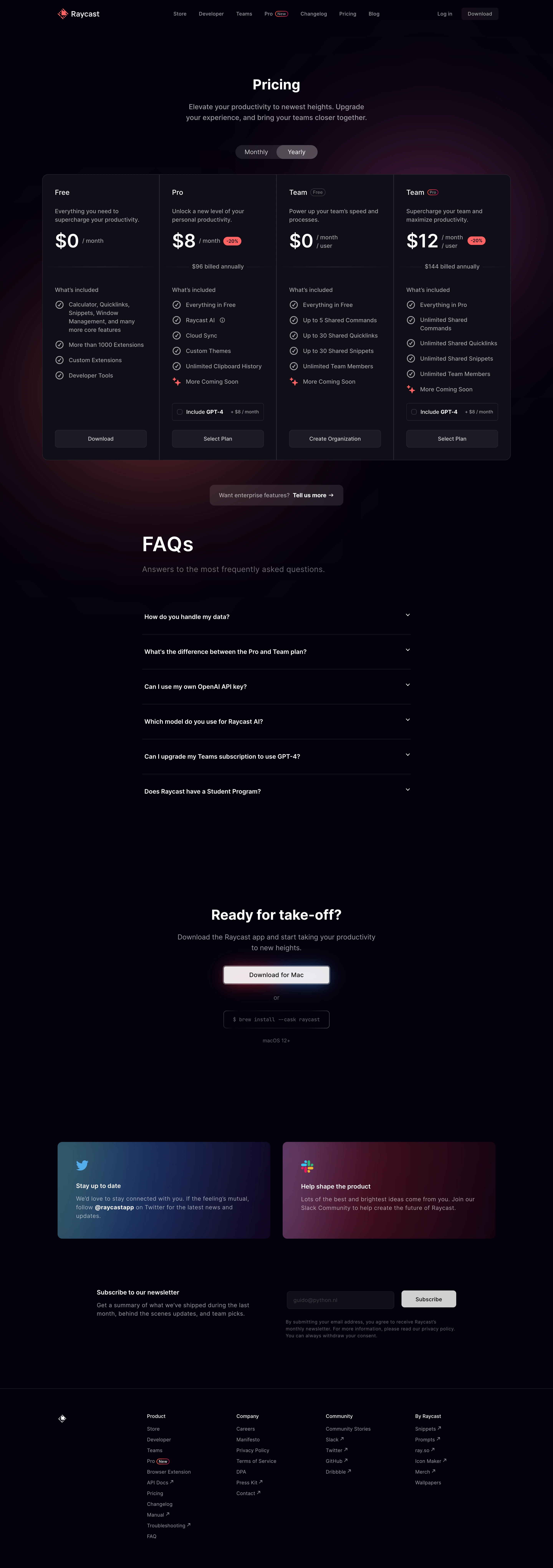
# Design from Reference: Raycast Pricing Page
Create an original, high-fidelity visual design inspired by the reference. Prioritize composition, typography, colors, spacing, and component styling over technical implementation.
## Reference
- **Product:** Raycast
- **Category:** Pricing Page
- **Screenshot:** https://cdn.prod.website-files.com/5e9dc792e1210c5325f7ebbc/6acbcc4ce13ab9df8f053282_6acbcaf833302e716ea9d16f_cms-31dae93477467c82408f7a3e.webp
Analyze the screenshot first. If inaccessible, request it rather than guessing.
## Content
{{content.instructions}}
{{content.data}}
Preserve essential messaging and factual accuracy. Adapt structure and copy length for visual balance; never invent product claims.
## Visual Design
### Overall aesthetic
- **Character:** Premium dark pricing page with restrained red accents and diffuse colored glows.
### Page composition
- **Canvas:** 2880 × 8170 screenshot pixels. Navigation, centered introduction and billing switch, four connected plan columns, enterprise callout, FAQ, download CTA, two community cards, newsletter, and footer form the page.
### Information hierarchy
- **Priority:** Plan names, large prices, feature lists, and aligned actions dominate. FAQ narrows to a centered column before the separate download section.
### Typography
- **Scale:** Estimated CSS at assumed 2× capture: heading 36 px, FAQ heading 52 px, prices 48 px, body 16–18 px, navigation 14 px. Sans serif family unverified; installation command is monospace.
### Colors & surfaces
- **Palette:** Sampled sRGB near-black #06010E, panel #120E1A, and control #1C1A26. White text and muted gray copy contrast with coral-red badges; burgundy glows sit behind pricing, blue and magenta gradients fill community cards.
### Components
- **Details:** Four-column bordered container has approximately 16 CSS px outer corners and internal dividers. Monthly/yearly switch is pill-shaped; plan actions align at the bottom. Check icons, discount pills, add-on checkboxes, FAQ chevrons, and outlined command box add detail.
### Visual rhythm
- **Spacing:** Estimated main width 1220 CSS px, plan padding 32 px, and large 100–160 px section gaps. The centered download area uses especially generous whitespace.
### Responsive
- **Adaptation:** Mobile is not shown. Stack plans, preserve equal internal order, and convert community/newsletter layouts to one column.
### Adaptation guidance
- **Transfer:** Retain dark surfaces, subtle glows, connected plans, and aligned conversion controls. Replace historical prices, discounts, platform requirements, and add-ons with verified information.
Use this context to reproduce the reference's visual language: layout, typography, colors, spacing, borders, radii, and distinctive elements. The screenshot takes priority if descriptions conflict.
## Direction
{{preferences.fidelityInstructions}}
## Output
{{output.instructions}}
Deliver a polished, cohesive design with precise alignment, hierarchy, and spacing. Produce the requested visual artifact, not just a description. If unsupported, explain the limitation.