Design with AI
Generate a new design based on this screen using your own content.
# Design from Reference: Hypercontext oapbox Pricing Page
Create an original, high-fidelity visual design inspired by the reference. Prioritize composition, typography, colors, spacing, and component styling over technical implementation.
## Reference
- **Product:** Hypercontext
- **Category:** Pricing Page
- **Screenshot:** https://cdn.prod.website-files.com/5e9dc792e1210c5325f7ebbc/62eca43edf1bb87e3cf90c4d_1659674889627-62ec9c9fd64065486299bad9_screenshot-device-fb20e7c859ec5fbb2b1cff8922872fef-1659617468194.webp
Analyze the screenshot first. If inaccessible, request it rather than guessing.
## Content
{{content.instructions}}
{{content.data}}
Preserve essential messaging and factual accuracy. Adapt structure and copy length for visual balance; never invent product claims.
## Visual Design
### Overall aesthetic
- **Style:** Conventional SaaS pricing page with white space, navy typography, blue conversion accents and extensive comparison/support content.
- **Scale:** Source 1440 × 6791px. Sizes below refer to the 1200px-wide inspection rendering; CSS scale is unverified.
### Page composition
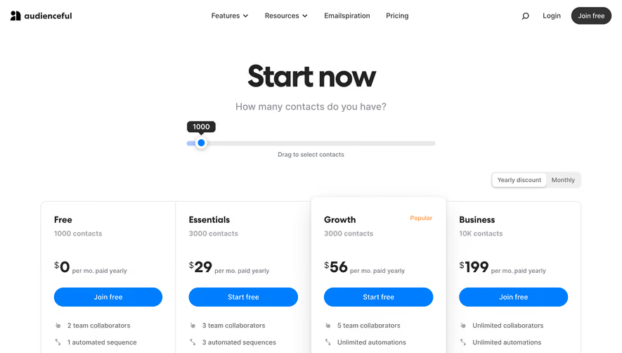
- **Opening:** Compact navigation precedes centered Pricing heading/subtitle and three equal plan cards.
- **Proof and offer:** A six-logo customer strip leads to a wide small-team offer panel with copy left and blue price block right.
- **Testimonials:** A three-column staggered grid of customer quote cards occupies a substantial middle section.
- **Comparison:** A long four-column feature matrix groups features, authentication and integrations, repeating plan actions.
- **Closing:** A narrow static FAQ includes a small volume-pricing table, followed by a demo CTA and black multi-column footer.
### Information hierarchy
- **Plan choice:** Basic, Pro and Business show price, cadence, positioning, four benefits and individual actions. Pro is highlighted blue.
- **Alternative offer:** Small team starter plan receives a separate flat-monthly-price promotion.
- **Detailed evaluation:** Testimonials precede a comprehensive checkmark comparison, then pricing/admin FAQs.
- **Final action:** Looking for more? pairs explanatory copy with Book a Demo.
### Typography
- **Family:** Compact sans-serif; exact font identity is unverified.
- **Roles:** Pricing title about 40px bold, plan prices 38–40px, section headings 24–34px and body 12–14px/20px at inspection scale.
- **Tables:** Small navy headers, muted body labels and blue circular checks support dense comparison.
### Colors & surfaces
- **Sampled palette:** ICC-aware sRGB samples include white #FFFFFF, black #000000, pale near-whites #FFFEFF/#FFFFFD and neutral border #E7E7E7.
- **Accents:** Bright blue marks the promoted plan, checks and key actions; navy headings contrast with muted gray-purple body copy.
- **Depth:** Fine card borders dominate; the starter offer has a broad pale-blue glow/shadow.
### Components
- **Plan cards:** Approximately 244 × 372px at inspection scale, small corners, inset titles/prices and aligned bottom actions.
- **Starter offer:** Wide white split panel with blue gradient price block, small tilted promotional badge and compact white action.
- **Quote cards:** Rounded outlined white cards contain company logo, quote, circular portrait and bold attribution; heights vary.
- **Comparison matrix:** Feature names left, three plan columns right, thin horizontal rules and information icons beside labels.
- **FAQ:** Questions and answers are permanently visible, separated by large gaps rather than accordion controls.
- **Footer:** Black background, five link columns, app-store badges, legal links and small social icons.
### Visual rhythm
- **Density progression:** Sparse plan choice gives way to testimonials and a long dense matrix, then returns to a narrow FAQ reading measure.
- **Alignment:** Plan/card columns and table plan columns retain consistent centered structure.
### Responsive
- **Recommended adaptation:** Only desktop is observed. Stack plan cards and offer halves, reduce testimonial columns and make comparison horizontally scrollable.
- **Readability:** Retain feature labels and billing units; avoid reducing the entire matrix to tiny text.
### Adaptation guidance
- **Preserve:** Keep concise plan choice separate from exhaustive comparison and pricing support.
- **Adapt:** Use current verified prices, feature entitlements and testimonials. Do not copy historical tax, discount or refund terms into another product.
Use this context to reproduce the reference's visual language: layout, typography, colors, spacing, borders, radii, and distinctive elements. The screenshot takes priority if descriptions conflict.
## Direction
{{preferences.fidelityInstructions}}
## Output
{{output.instructions}}
Deliver a polished, cohesive design with precise alignment, hierarchy, and spacing. Produce the requested visual artifact, not just a description. If unsupported, explain the limitation.