
Thank you! Your submission has been received!
Oops! Something went wrong while submitting the form.
Get SaaSFrame Pro
Monthly
$18
Quarterly
$48
Yearly
$180
Upgrade to access this feature
Browse all screens & flows
Filter and search screens & flows
Access Figma files
Access mobile versions
Bookmark screens & flows
Join now
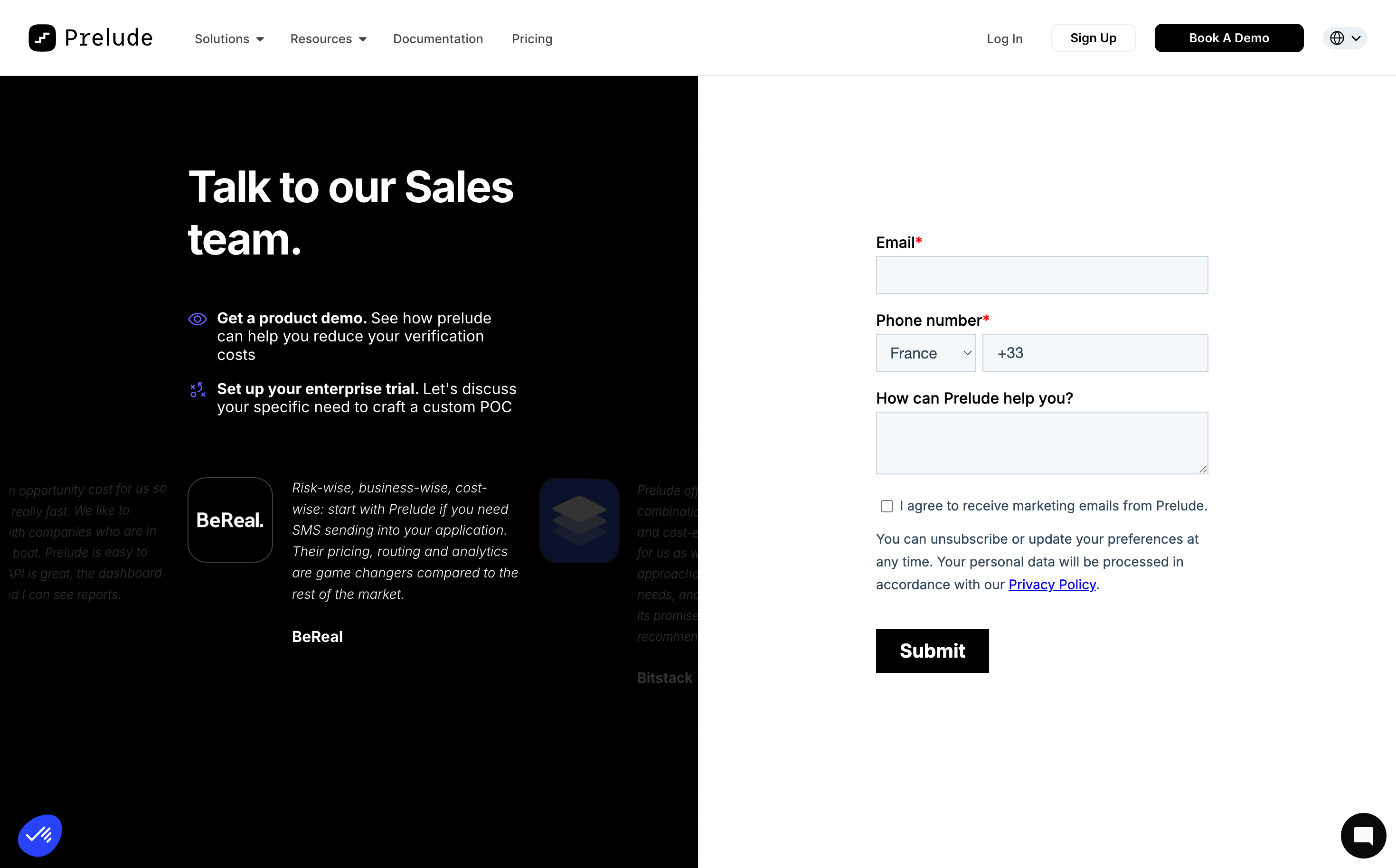
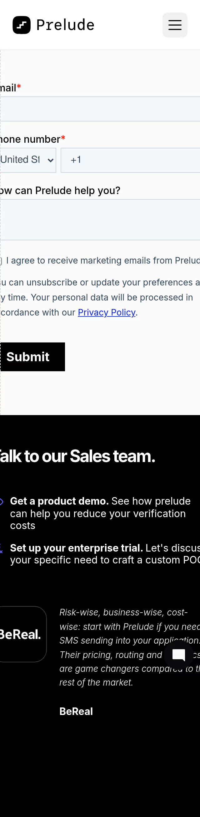
Prelude Demo Request

Prelude
Send verification phone messages
Designed by
No items found.

Bookmark
Bookmark

Design with AI
Thank you! Your submission has been received!
Oops! Something went wrong while submitting the form.
# Design from Reference: Prelude Demo Request
Create an original, high-fidelity visual design inspired by the reference. Prioritize composition, typography, colors, spacing, and component styling over technical implementation.
## Reference
- **Product:** Prelude
- **Category:** Demo Request
- **Screenshot:** https://cdn.prod.website-files.com/5e9dc792e1210c5325f7ebbc/6acad3aac2028efdec71b029_6acad152135f2125f42908bb_cms-08ed74bcdc190790a09935fd.webp
Analyze the screenshot first. If inaccessible, request it rather than guessing.
## Content
{{content.instructions}}
{{content.data}}
Preserve essential messaging and factual accuracy. Adapt structure and copy length for visual balance; never invent product claims.
## Visual Design
### Overall aesthetic
- **Character:** A stark split-screen sales page with black explanatory content on the left and a white form on the right.
- **Tone:** Bold typography and minimal decoration emphasize the demo request, with subdued testimonial content below the left introduction.
### Page composition
- **Capture scale:** The source measures 2940 × 1828 pixels. A roughly 1470 × 914 CSS-pixel viewport at 2× scale is plausible but unverified.
- **Header:** A white full-width navigation row contains the Prelude brand, product/resource links and account/demo actions.
- **Split body:** Equal black and white halves begin beneath the header and extend to the bottom of the capture.
- **Left region:** A large two-line sales heading and two icon-led benefits occupy the upper area, followed by a horizontally clipped testimonial strip.
- **Right region:** A narrow form around 350 estimated CSS pixels wide is centered vertically in the white half; floating utility/chat launchers sit at lower corners.
### Information hierarchy
- **Sales introduction:** Large white text leads into two benefits with bold introductory phrases and regular explanations.
- **Form:** Required email and phone labels precede empty controls; an optional help textarea follows.
- **Consent:** An unchecked marketing-consent box and privacy explanation sit above a black Submit button.
- **Testimonials:** Company marks, italic quotes and company labels provide supporting context on the black side, with neighboring entries partially faded/clipped.
### Typography
- **Family:** A clean sans serif is visible; exact identity is unverified. The Prelude wordmark uses a distinct monospaced-looking treatment.
- **Main heading:** Approximately 46–48 estimated CSS pixels, bold, with a 54-pixel line height.
- **Benefits:** Around 16 pixels with 20-pixel line height; bold lead phrases create emphasis.
- **Form:** Labels are approximately 16 pixels, semibold; consent/privacy text is around 14 pixels with 24-pixel line height.
- **Submit:** Roughly 20 pixels, bold and white.
### Colors & surfaces
- **Measured palette:** ICC-aware sRGB sampling yields white #FFFFFF, black #000000, input fill #F5F8FA, dark navy #0B112B, muted text #32475B and border #CBD6E2.
- **Accents:** Small purple-blue benefit icons and blue privacy links provide restrained color; required asterisks are red.
- **Treatment:** Form controls use thin blue-gray outlines and nearly square corners. The layout relies on the black/white split rather than cards or shadows.
### Components
- **Header actions:** Outlined Sign Up and filled black Book A Demo buttons sit beside login and a compact language selector.
- **Phone row:** A country dropdown and phone-number field share one horizontal line, with country/prefix defaults visible but no personal phone number entered.
- **Textarea:** A shallow multi-line help field matches the input width and pale fill.
- **Consent controls:** A small empty checkbox precedes marketing copy, followed by an underlined Privacy Policy link.
- **Submit:** A compact black rectangular button, around 120 × 46 estimated CSS pixels, aligns with the form's left edge.
- **Testimonial strip:** Logos and italic copy appear on black with low-contrast neighboring slides; carousel behavior is not verified.
### Visual rhythm
- **Vertical spacing:** Form labels sit close above their controls, with roughly 20-pixel gaps between groups and more space before Submit.
- **Alignment:** Left copy uses a constrained reading width, while all right-side form elements share one left edge.
- **Contrast:** The central vertical boundary is sharp and uninterrupted, creating two distinct content roles.
### Responsive
- **Recommendation:** Stack the sales explanation above the form on phones and reduce the testimonial strip's footprint.
- **Recommendation:** Keep phone controls readable, allow consent copy to wrap and preserve an adequately sized Submit target. No mobile state is shown.
### Adaptation guidance
- **Preserve:** Retain the direct sales proposition, two concise benefits and focused form.
- **Implement:** Use accessible labels, required-state messaging and explicit consent semantics; actual submission behavior is not evidenced by the screenshot.
- **Contrast:** Improve any overly faint testimonial content in a new implementation and avoid relying on clipped quotes for essential information.
Use this context to reproduce the reference's visual language: layout, typography, colors, spacing, borders, radii, and distinctive elements. The screenshot takes priority if descriptions conflict.
## Direction
{{preferences.fidelityInstructions}}
## Output
{{output.instructions}}
Deliver a polished, cohesive design with precise alignment, hierarchy, and spacing. Produce the requested visual artifact, not just a description. If unsupported, explain the limitation.


Category
Patterns
No items found.


Added on
January 7, 2026
Similar screens
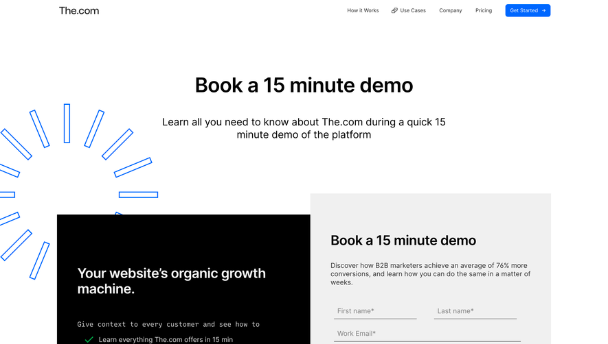


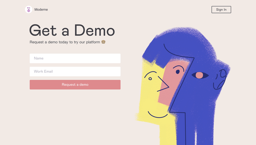

Upgrade to SaaSFrame Pro now to see similar examples.
Monthly
$18 /month
Billed $18 monthly
Browse all screens & flows
Filter and search screens & flows
Search text in screenshots
Access Figma files
Access mobile versions
Join now
Quarterly
$16 /month
Billed $48 quarterly
Browse all screens & flows
Filter and search screens & flows
Search text in screenshots
Access Figma files
Access mobile versions
Join now
Yearly
$15 /month
Billed $180 yearly
Browse all screens & flows
Filter and search screens & flows
Search text in screenshots
Access Figma files
Access mobile versions
Join now