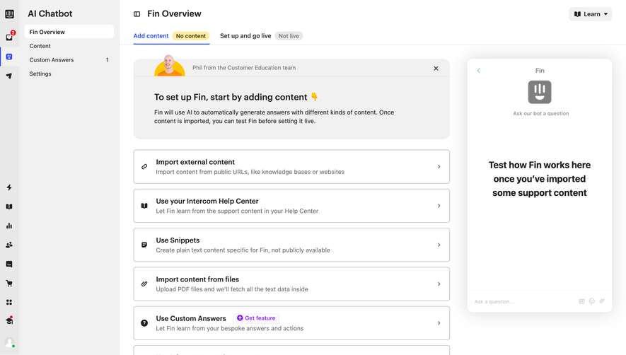
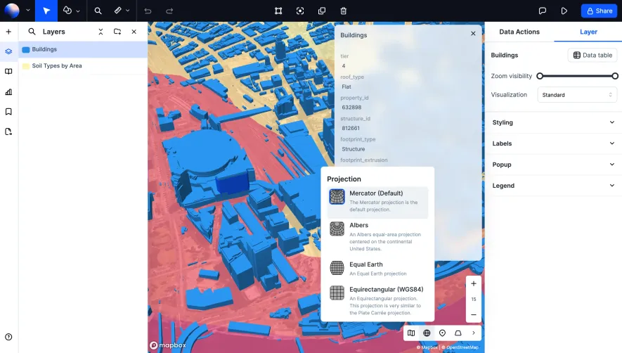
Generate a new design based on this screen using your own content.
Thank you! Your submission has been received!
Oops! Something went wrong while submitting the form.
# Design from Reference: Huly Office
Create an original, high-fidelity visual design inspired by the reference. Prioritize composition, typography, colors, spacing, and component styling over technical implementation.
## Reference
- **Product:** Huly
- **Category:** Empty
- **Screenshot:** https://cdn.prod.website-files.com/5e9dc792e1210c5325f7ebbc/6acad3ffc910b3adf9e48a9a_6acad17c5de9841cab63d292_cms-fe66663f11b1a6010c9fa54f.webp
Analyze the screenshot first. If inaccessible, request it rather than guessing.
## Content
{{content.instructions}}
{{content.data}}
Preserve essential messaging and factual accuracy. Adapt structure and copy length for visual balance; never invent product claims.
## Visual Design
Use this context to reproduce the reference's visual language: layout, typography, colors, spacing, borders, radii, and distinctive elements. The screenshot takes priority if descriptions conflict.
## Direction
{{preferences.fidelityInstructions}}
## Output
{{output.instructions}}
Deliver a polished, cohesive design with precise alignment, hierarchy, and spacing. Produce the requested visual artifact, not just a description. If unsupported, explain the limitation.
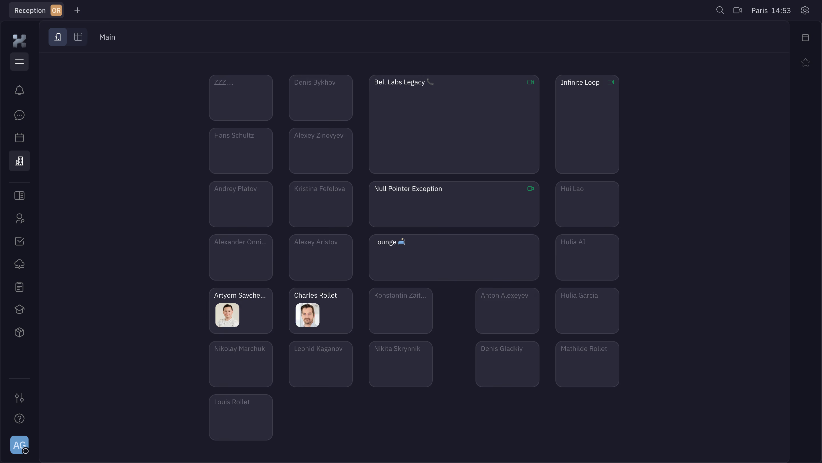
First thing you notice is the deep charcoal background paired with soft gray cards. It's not trying too hard. The grid layout of user tiles and room cards creates a clean visual rhythm that's easy to scan. Two people even have avatar photos, which breaks up the monotony of empty placeholder cards in a subtle way.
Room Cards With Purpose
The larger cards like "Bell Labs Legacy" and "Null Pointer Exception" stand out immediately because they're wider and taller than the individual user tiles. Smart hierarchy without shouting. Little camera icons in the corners signal active video rooms. The "Lounge" card has a couch emoji. Tiny details like that add personality.
Navigation That Stays Out of the Way
The left sidebar uses simple icon-only navigation on a slightly lighter dark tone. No labels cluttering things up. The "Reception" tab at top left with an orange badge gives you a clear home base. Typography is clean, likely a geometric sans-serif, keeping everything readable without being boring. The Paris timezone stamp top-right is a thoughtful touch for distributed teams.