
Thank you! Your submission has been received!
Oops! Something went wrong while submitting the form.
Get SaaSFrame Pro
Monthly
$18
Quarterly
$48
Yearly
$180
Upgrade to access this feature
Browse all screens & flows
Filter and search screens & flows
Access Figma files
Access mobile versions
Bookmark screens & flows
Join now
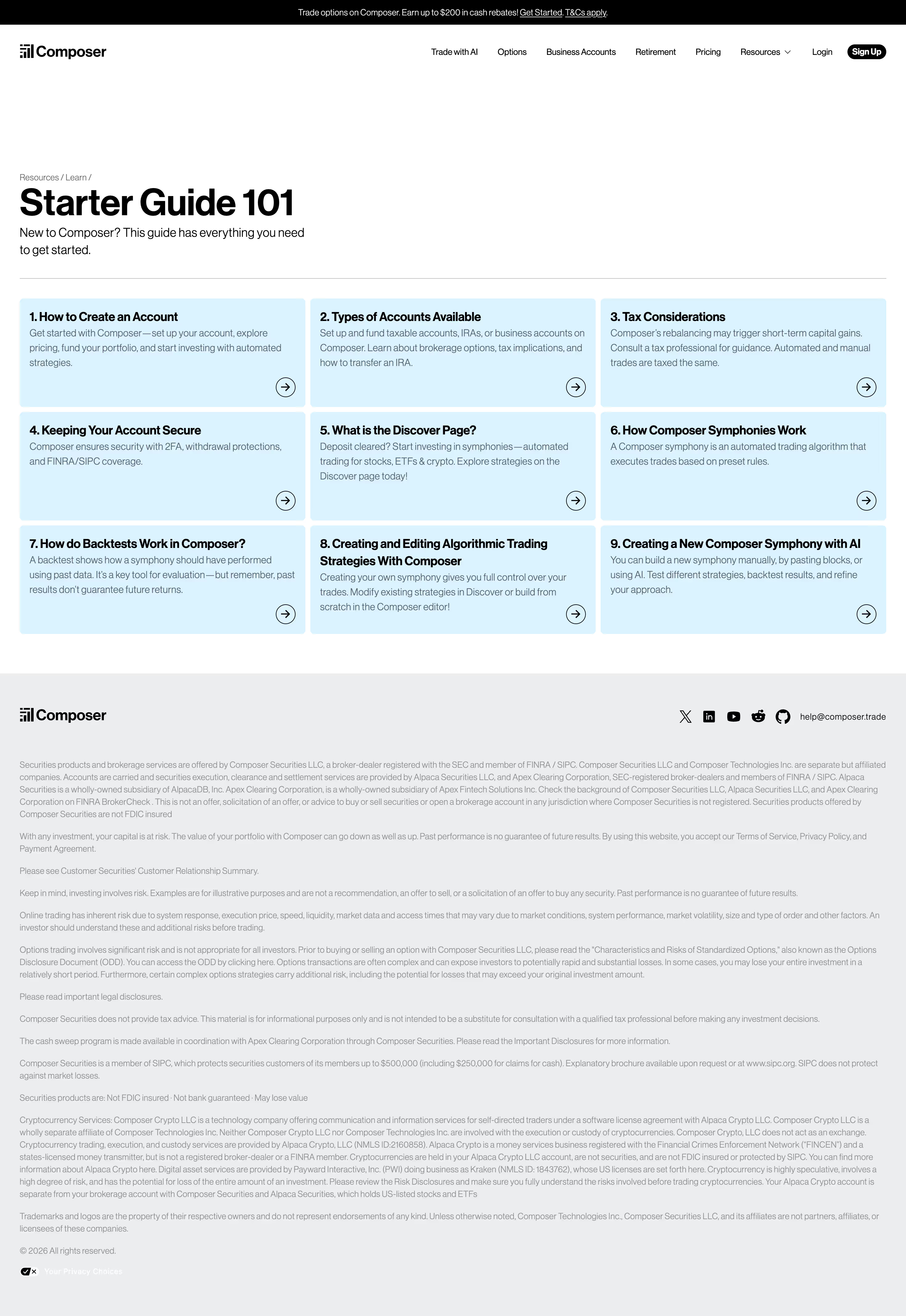

Composer FAQ Page

Composer
Build trading algorithms with AI
Designed by
No items found.

Bookmark
Bookmark

Design with AI
Thank you! Your submission has been received!
Oops! Something went wrong while submitting the form.
# Design from Reference: Composer FAQ Page
Create an original, high-fidelity visual design inspired by the reference. Prioritize composition, typography, colors, spacing, and component styling over technical implementation.
## Reference
- **Product:** Composer
- **Category:** FAQ Page
- **Screenshot:** https://cdn.prod.website-files.com/5e9dc792e1210c5325f7ebbc/6965133fc6a30bc8577e8df5_NeJGe0itPngAvi0LzBTlWeURsoB6EVWZxGetXdt4QV0.avif
Analyze the screenshot first. If inaccessible, request it rather than guessing.
## Content
{{content.instructions}}
{{content.data}}
Preserve essential messaging and factual accuracy. Adapt structure and copy length for visual balance; never invent product claims.
## Visual Design
### Overall aesthetic
- **Character:** A simple educational resource hub uses bold black sans-serif headings, pale blue topic cards, a white main canvas, and an extensive light-gray disclosure footer.
- **Evidence:** Original dimensions are 2940 × 4268 px, inspected in two readable crops at 1400 px width. Measurements below use inspection pixels; true CSS scale is unverified.
- **Visible page type:** The screenshot presents a starter-guide index of nine linked topics, rather than an expanded question-and-answer accordion.
### Page composition
- **Top strip:** A narrow black promotional bar spans the viewport, with small centered white copy and underlined links.
- **Navigation:** A white bar places the Composer logo left and a long row of product links, login, and a compact black signup pill right.
- **Introduction:** After a large vertical gap, breadcrumbs, a bold starter-guide heading, and two lines of introductory copy align to the left page gutter.
- **Topic grid:** A horizontal rule separates the introduction from nine equal pale-blue cards in three columns and three rows.
- **Footer:** A gray region starts below the grid. Brand appears left, social icons/contact right, and many full-width disclosure paragraphs extend to copyright and privacy controls at the bottom.
### Information hierarchy
- **Heading:** The heavy page title is the main landmark, with breadcrumb text much smaller and muted above it.
- **Topics:** Each card begins with a numbered bold title, followed by short gray explanatory copy and a circled arrow at lower right.
- **Equal emphasis:** All nine topics share the same surface and structure; no active or featured topic is visibly highlighted.
- **Secondary material:** Dense footer text uses small low-contrast type and broad lines, clearly subordinate to the guide grid.
### Typography
- **Family:** A compact modern sans serif runs through the page. Exact identity is unverified.
- **Display:** Page heading is approximately 56 inspection px, very bold, with close line-height and slightly tight tracking.
- **Topic titles:** Around 19–20 px bold with 24 px line-height; longer titles wrap to two lines.
- **Descriptions:** Approximately 15 px with 23–24 px line-height, in muted gray-blue.
- **Utility:** Navigation and breadcrumbs are around 13–14 px. Disclosure copy is about 13 px with 19–20 px leading.
### Colors & surfaces
- **Measured palette:** Source samples include light gray #ECEDEE, white #FFFFFF, pale blue #DAF3FF, black #000000, muted gray #8E8E8F, and slate #576166.
- **Semantic use:** Black grounds titles, logo, arrows, and the top bar. Pale blue identifies all topic surfaces; light gray groups the footer.
- **Borders:** A thin gray rule marks the grid boundary. Card surfaces have no visible shadow and only modest corner rounding.
- **Footer contrast:** Disclosures are visibly lighter than navigation and topic copy; verify their contrast if reproducing the page.
### Components
- **Topic cards:** Approximately 442 × 168 inspection px, with 6 px radii, around 15 px padding, and narrow 7–8 px gutters.
- **Card arrows:** Small outlined circles about 30 px in diameter contain right arrows and sit consistently near the lower-right corner.
- **Header signup:** A small black pill with white bold text, visually more compact than a large marketing CTA.
- **Footer contact row:** Black social icons and a text email link share the same baseline opposite the brand.
- **Privacy item:** A small contrasting privacy-choice symbol and label appear beneath copyright.
### Visual rhythm
- **Page gutters:** Roughly 30 inspection px on each side produce a nearly full-width grid.
- **Opening space:** A substantial blank region separates navigation from content, making the heading feel independent from the header.
- **Grid cadence:** Equal row heights and narrow gaps create a compact directory. Internal copy remains top-aligned while arrows share lower alignment.
- **Footer density:** Wide legal paragraphs and modest paragraph gaps contrast with the clear card grid above.
### Responsive
- **Observed limit:** Only desktop is supplied; actual breakpoints and navigation behavior are unverified.
- **Recommended grid:** Reduce to two and then one column, allowing cards to grow with text rather than fixing the desktop height.
- **Recommended header:** Collapse the long navigation without compressing link labels. Keep the promotional strip readable when it wraps.
- **Recommended disclosures:** Limit prose width and retain readable type on small screens; wrap social/contact controls naturally.
### Adaptation guidance
- **Preserve:** Keep the numbered directory, equal topic treatment, restrained pale-blue surfaces, and consistent lower-right arrows.
- **Build:** Use a reusable linked-topic component with title and summary. Make the whole card target accessible while providing a descriptive name.
- **Content boundaries:** Treat financial and promotional wording as observed screenshot content, not verified current advice or terms.
- **Validate:** Confirm fonts, true CSS dimensions, focus states, disclosure contrast, and long-title wrapping. No expanded FAQ or clicked-topic state is visible.
Use this context to reproduce the reference's visual language: layout, typography, colors, spacing, borders, radii, and distinctive elements. The screenshot takes priority if descriptions conflict.
## Direction
{{preferences.fidelityInstructions}}
## Output
{{output.instructions}}
Deliver a polished, cohesive design with precise alignment, hierarchy, and spacing. Produce the requested visual artifact, not just a description. If unsupported, explain the limitation.


Category
Patterns
No items found.
Tech Stack



Added on
January 12, 2026
Similar screens
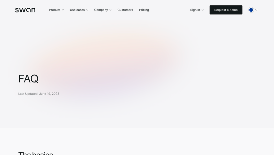


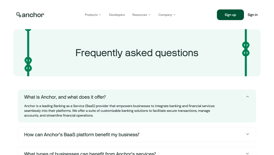

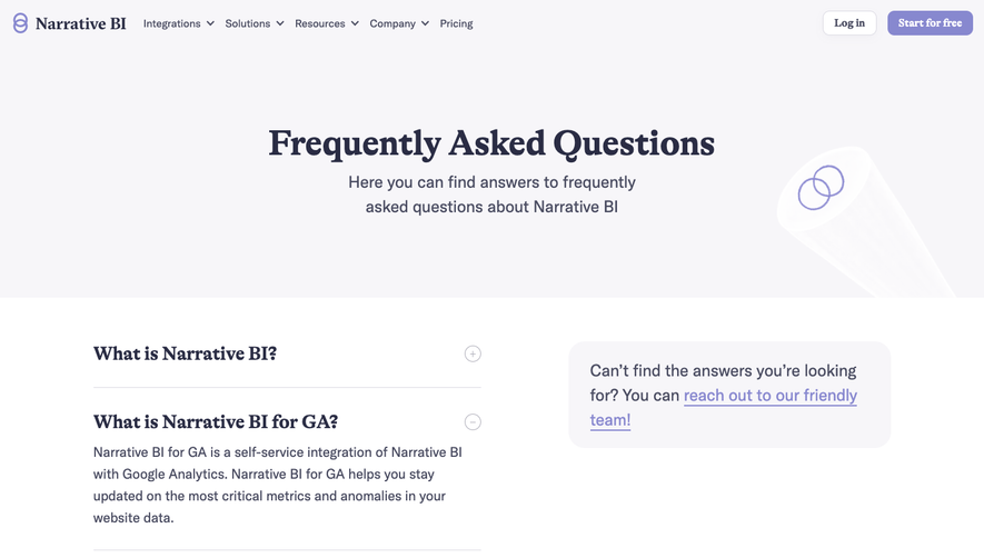

Upgrade to SaaSFrame Pro now to see similar examples.
Monthly
$18 /month
Billed $18 monthly
Browse all screens & flows
Filter and search screens & flows
Search text in screenshots
Access Figma files
Access mobile versions
Join now
Quarterly
$16 /month
Billed $48 quarterly
Browse all screens & flows
Filter and search screens & flows
Search text in screenshots
Access Figma files
Access mobile versions
Join now
Yearly
$15 /month
Billed $180 yearly
Browse all screens & flows
Filter and search screens & flows
Search text in screenshots
Access Figma files
Access mobile versions
Join now