Generate a new design based on this screen using your own content.
Thank you! Your submission has been received!
Oops! Something went wrong while submitting the form.
# Design from Reference: Narrative BI FAQ
Create an original, high-fidelity visual design inspired by the reference. Prioritize composition, typography, colors, spacing, and component styling over technical implementation.
## Reference
- **Product:** Narrative BI
- **Category:** FAQ Page
- **Screenshot:** https://cdn.prod.website-files.com/5e9dc792e1210c5325f7ebbc/6acbbecd39e7f22db4028a0f_6acbbe163a787595fbdd2f2c_cms-2312f1f19ff8f00644d4ac30.webp
Analyze the screenshot first. If inaccessible, request it rather than guessing.
## Content
{{content.instructions}}
{{content.data}}
Preserve essential messaging and factual accuracy. Adapt structure and copy length for visual balance; never invent product claims.
## Visual Design
Use this context to reproduce the reference's visual language: layout, typography, colors, spacing, borders, radii, and distinctive elements. The screenshot takes priority if descriptions conflict.
## Direction
{{preferences.fidelityInstructions}}
## Output
{{output.instructions}}
Deliver a polished, cohesive design with precise alignment, hierarchy, and spacing. Produce the requested visual artifact, not just a description. If unsupported, explain the limitation.
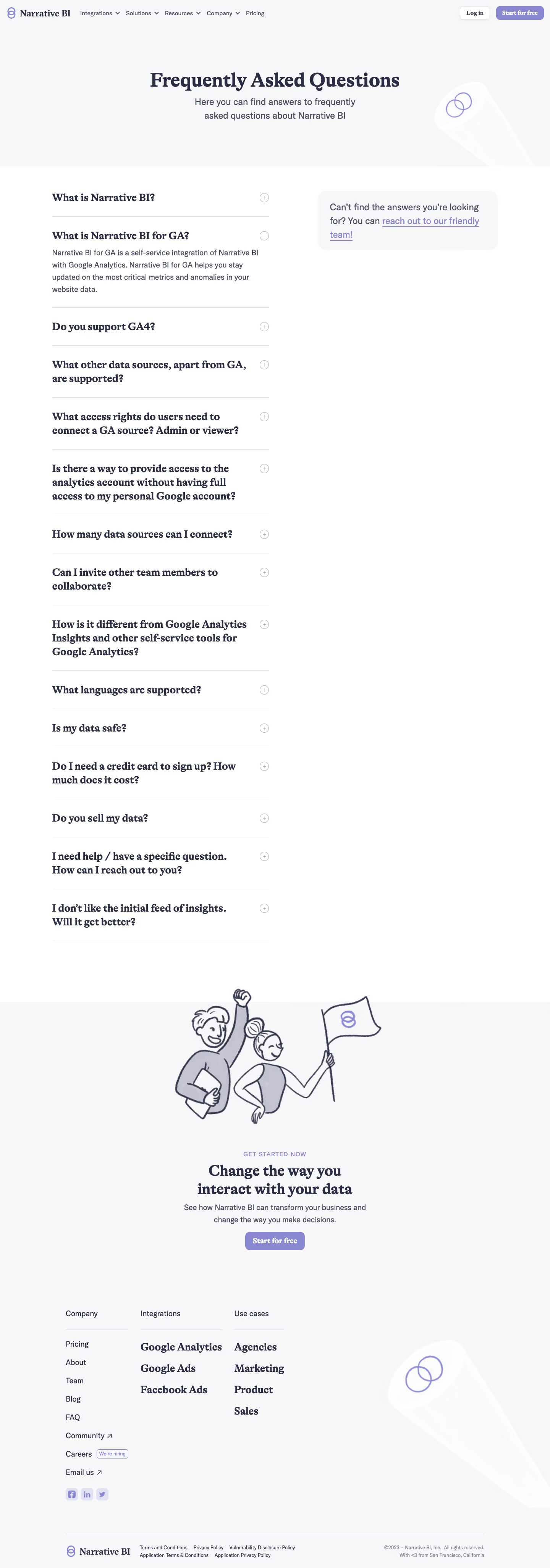
Narrative BI’s FAQ page showcases a refined minimalist aesthetic, where ample white space gives the content room to breathe. The design feels modern and highly professional, balancing clarity with accessibility. Subtle color accents and understated details create an inviting, trustworthy atmosphere—essential for a SaaS product targeting business users.
Layout and Structure
The page structure is clear and purposeful. The top navigation is streamlined, floating above the content to ensure persistent accessibility. The FAQ content is organized into clearly demarcated question-and-answer blocks, enabling visitors to scan or deep dive with minimal friction. The footer quietly anchors the page with essential links and contact info while maintaining the minimalist ethos.
Visual Elements
Custom vector icons add visual interest to category headers without overwhelming the core content. The design eschews heavy illustration or photography, leveraging negative space and subtle hover animations to maintain focus on the information. Accordion-style dropdowns for each FAQ inject tactile interactivity, making exploration feel effortless.
Color Palette and Typography
A restrained color palette—predominantly white with deep blues and pops of accent teal—evokes reliability and calm. Headings are set in a geometric sans-serif font for clarity and modernity, with body text easily legible in a warmer, slightly muted gray. Hierarchy is established through clear font sizing, boldness, and spacing.
User Experience Patterns and Unique Choices
Navigational elements are persistently visible, and primary CTAs gently stand out with accent colors. The FAQ’s collapsible panels create a seamless browsing experience, minimizing cognitive load. Standout touches include micro-interactions on hover and smooth transitions on content toggling, which subtly enrich engagement. The overall tone is authoritative yet approachable—projecting Narrative BI as both innovative and customer-centric.