



Figma file available



Steep Design System
Stack \- Framework: Next.js (App Router, \_next/ asset paths confirmed) \- Styling: Tailwind CSS + custom CSS modules (utility-first inferred) \- Fonts: Geometric sans-serif display, humanist sans body (custom/licensed) \- Icons: Custom SVG set \- Images: Next.js Image optimization (\_next/image?url=...&w=3840&q=75)
Typography \- Display: Large bold geometric sans, 48-72px, mixed roman + italic for brand keywords \- H2: 32-40px bold \- H3: 24px medium \- Body: 16-18px humanist sans-serif \- Caption/meta: 12-14px \- Italic used deliberately for emotional emphasis (zero chaos, your business) \- Tight tracking on large headings, normal on body text
Color Philosophy \- Dark-first marketing canvas: deep charcoal/near-black full-bleed backgrounds with photography \- Accent trio: coral-pink, sky-blue, warm gray (visible in hero UI block illustrations) \- Light sections: off-white (~#F7F6F2) for contrast alternation \- CTAs: filled dark pill (Get started), ghost/outlined pill (Book a demo) \- App UI screenshots: light-mode product on dark marketing background
Spacing \- Section vertical padding: 80-120px \- Container max-width: ~1200px centered \- Grid gaps: 24-32px \- Component internal padding: 16-24px
Component Defaults \- Buttons: pill shape (border-radius: 9999px), filled + ghost variants \- Cards: ~12px radius, subtle shadow or border \- Nav: transparent-to-sticky minimal top bar \- Logo strip: marquee infinite scroll animation \- Feature sections: tab switcher with animated panel transitions
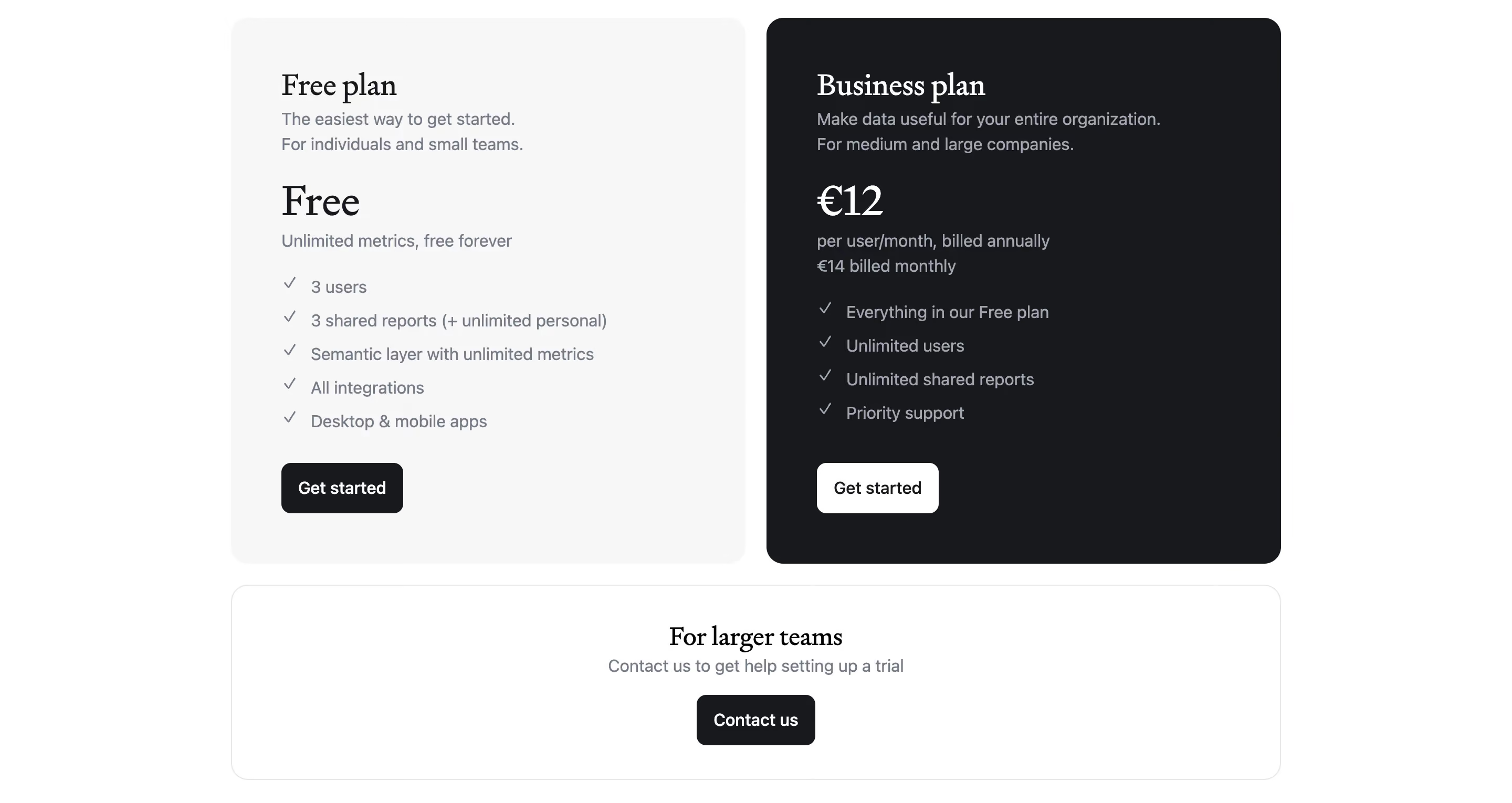
Layout \- Full-bleed hero with centered text + product screenshot \- Alternating dark/light sections for visual rhythm \- 3-column feature grids on desktop, single column mobile \- Pricing: 3-column card layout with comparison table below
:root { / Typography / --font-sans: 'Inter', 'DM Sans', ui-sans-serif, system-ui, sans-serif; --font-display: var(--font-sans); --font-size-xs: 0.75rem; / 12px / --font-size-sm: 0.875rem; / 14px / --font-size-base: 1rem; / 16px / --font-size-lg: 1.125rem; / 18px / --font-size-xl: 1.25rem; / 20px / --font-size-2xl: 1.5rem; / 24px / --font-size-3xl: 2rem; / 32px / --font-size-4xl: 2.5rem; / 40px / --font-size-5xl: 3rem; / 48px / --font-size-display: 4.5rem; / 72px / --font-weight-normal: 400; --font-weight-medium: 500; --font-weight-semibold: 600; --font-weight-bold: 700; --line-height-tight: 1.15; --line-height-snug: 1.35; --line-height-normal: 1.5; --line-height-relaxed: 1.65; --letter-spacing-tight: -0.03em; --letter-spacing-normal: 0em;
/ Colors — Light mode / neutral base / --color-bg: #ffffff; --color-bg-secondary: #F7F6F2; --color-bg-dark: #0E0E0E; --color-bg-dark-section: #111111; --color-surface: #ffffff; --color-surface-raised: #F2F1ED; --color-border: #E5E4DF; --color-border-strong: #C9C8C3;
--color-text-primary: #0E0E0E; --color-text-secondary: #5C5B57; --color-text-muted: #9E9D99; --color-text-inverse: #ffffff;
/ Brand accents / --color-accent-pink: #F4A5A0; --color-accent-pink-strong: #E87870; --color-accent-blue: #7BB8F0; --color-accent-blue-strong: #4A9AE8; --color-accent-gray: #C8C7C2;
/ CTA / Interactive / --color-cta-bg: #0E0E0E; --color-cta-text: #ffffff; --color-cta-border: #0E0E0E; --color-cta-ghost-text: #0E0E0E; --color-cta-ghost-border: #0E0E0E;
/ Spacing scale / --space-1: 0.25rem; / 4px / --space-2: 0.5rem; / 8px / --space-3: 0.75rem; / 12px / --space-4: 1rem; / 16px / --space-5: 1.25rem; / 20px / --space-6: 1.5rem; / 24px / --space-8: 2rem; / 32px / --space-10: 2.5rem; / 40px / --space-12: 3rem; / 48px / --space-16: 4rem; / 64px / --space-20: 5rem; / 80px / --space-24: 6rem; / 96px / --space-32: 8rem; / 128px /
/ Border radius / --radius-sm: 4px; --radius-md: 8px; --radius-lg: 12px; --radius-xl: 16px; --radius-2xl: 24px; --radius-full: 9999px;
/ Shadows / --shadow-sm: 0 1px 2px rgba(0,0,0,0.06); --shadow-md: 0 4px 12px rgba(0,0,0,0.08); --shadow-lg: 0 8px 32px rgba(0,0,0,0.12); --shadow-xl: 0 16px 64px rgba(0,0,0,0.16);
/ Layout / --container-max: 1200px; --container-padding: 1.5rem; --section-padding-y: 5rem; --section-padding-y-lg: 7.5rem;
/ Transitions / --transition-fast: 150ms ease; --transition-base: 250ms ease; --transition-slow: 400ms ease; }
/ Dark mode (marketing hero sections + dark feature blocks) / [data-theme='dark'], .section-dark { --color-bg: #0E0E0E; --color-bg-secondary: #1A1A1A; --color-surface: #1A1A1A; --color-surface-raised: #242424; --color-border: #2E2E2E; --color-border-strong: #444444; --color-text-primary: #F5F4F0; --color-text-secondary: #A8A7A2; --color-text-muted: #6B6A66; --color-cta-bg: #F5F4F0; --color-cta-text: #0E0E0E; --color-cta-ghost-text: #F5F4F0; --color-cta-ghost-border: rgba(245,244,240,0.3); }
Color Tokens
| Token | Value | Usage |
|---|---|---|
| --color-bg | #ffffff | Page background (light sections) |
| --color-bg-secondary | #F7F6F2 | Alternate section background |
| --color-bg-dark | #0E0E0E | Hero and dark sections |
| --color-text-primary | #0E0E0E | Main body text |
| --color-text-secondary | #5C5B57 | Supporting / meta text |
| --color-text-muted | #9E9D99 | Placeholder, captions |
| --color-text-inverse | #ffffff | Text on dark backgrounds |
| --color-accent-pink | #F4A5A0 | Hero decorative blocks, highlights |
| --color-accent-pink-strong | #E87870 | Stronger pink emphasis |
| --color-accent-blue | #7BB8F0 | Hero decorative blocks |
| --color-accent-blue-strong | #4A9AE8 | Interactive states |
| --color-accent-gray | #C8C7C2 | Neutral decorative block |
| --color-border | #E5E4DF | Subtle dividers |
| --color-cta-bg | #0E0E0E | Primary button fill |
| --color-cta-text | #ffffff | Primary button label |
Spacing Tokens
| Token | Value | px equiv |
|---|---|---|
| --space-1 | 0.25rem | 4px |
| --space-2 | 0.5rem | 8px |
| --space-3 | 0.75rem | 12px |
| --space-4 | 1rem | 16px |
| --space-6 | 1.5rem | 24px |
| --space-8 | 2rem | 32px |
| --space-12 | 3rem | 48px |
| --space-16 | 4rem | 64px |
| --space-20 | 5rem | 80px |
| --space-24 | 6rem | 96px |
| --space-32 | 8rem | 128px |
Typography Tokens
| Token | Value | Usage |
|---|---|---|
| --font-size-base | 1rem / 16px | Body text |
| --font-size-lg | 1.125rem / 18px | Large body |
| --font-size-2xl | 1.5rem / 24px | H3 / subheadings |
| --font-size-3xl | 2rem / 32px | H2 section titles |
| --font-size-4xl | 2.5rem / 40px | Large H2 |
| --font-size-5xl | 3rem / 48px | H1 |
| --font-size-display | 4.5rem / 72px | Hero display text |
| --font-weight-bold | 700 | Headings |
| --font-weight-medium | 500 | Nav, labels |
| --line-height-tight | 1.15 | Display headings |
| --line-height-normal | 1.5 | Body |
| --letter-spacing-tight | -0.03em | Display headings |
Border Radius Tokens
| Token | Value | Usage |
|---|---|---|
| --radius-sm | 4px | Small badges, tags |
| --radius-md | 8px | Input fields |
| --radius-lg | 12px | Cards, panels |
| --radius-xl | 16px | Large cards |
| --radius-2xl | 24px | Hero image frames |
| --radius-full | 9999px | Buttons (pill shape) |
Shadow Tokens
| Token | Value | Usage |
|---|---|---|
| --shadow-sm | 0 1px 2px rgba(0,0,0,0.06) | Subtle lift |
| --shadow-md | 0 4px 12px rgba(0,0,0,0.08) | Cards |
| --shadow-lg | 0 8px 32px rgba(0,0,0,0.12) | Modals, dropdowns |
| --shadow-xl | 0 16px 64px rgba(0,0,0,0.16) | Hero screenshot frames |
Framework: Next.js (App Router) confirmed via next/static/ asset paths and next/image optimization. Styling is likely Tailwind CSS (utility-first pattern) with custom component overrides — no raw CSS custom properties were extractable from the rendered HTML (Next.js inlines or chunks CSS).
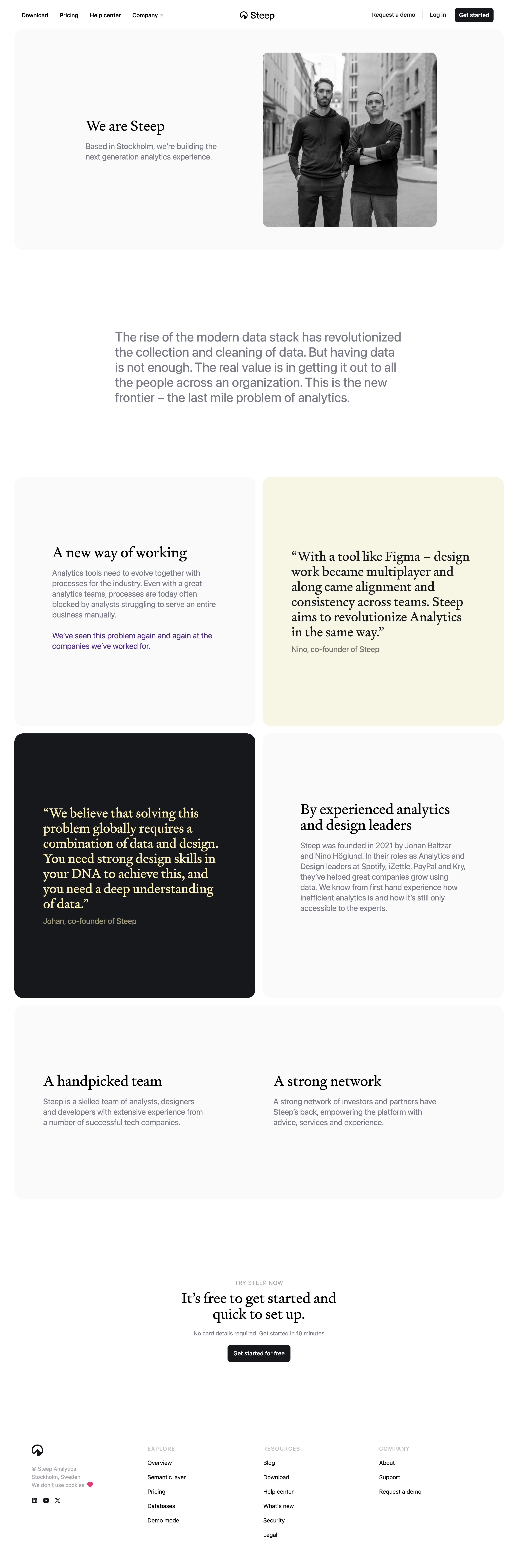
Theme support: The site uses a dual-mode design — a dark marketing canvas for hero and feature sections (near-black #0E0E0E with photographic backgrounds), alternating with off-white light sections. The product app UI shown in screenshots appears to be light-mode only. No system prefers-color-scheme dark mode toggle detected on the marketing site.
Data confidence: MEDIUM. CSS variables were inferred from visual analysis of multiple pages (homepage, pricing, AI, about, blog) and standard Next.js/Tailwind conventions. No raw stylesheet was accessible. Colors derived from OG images, UI block screenshots (pink/blue/gray hero blocks), and background image URLs. Font family is inferred — likely Inter or DM Sans based on the geometric humanist style visible in headings and body copy.
Notable patterns: \- Heavy use of full-bleed photographic backgrounds for dark sections \- Italic text used as a brand signature for emotional keywords in headings \- Pill-shaped buttons throughout (border-radius: 9999px) — consistent CTA pattern \- Decorative colored blocks (pink, blue, gray) floating in hero area as visual system anchors \- Infinite marquee scroll for customer logo social proof strip \- 1200px max container width, generous section padding \- Product screenshots rendered as large framed images within the dark canvas \- Pricing page uses a 3-column tier card layout with a detailed feature comparison table below \- Stockholm-based team, Scandinavian design sensibility: restrained, clean, functional