




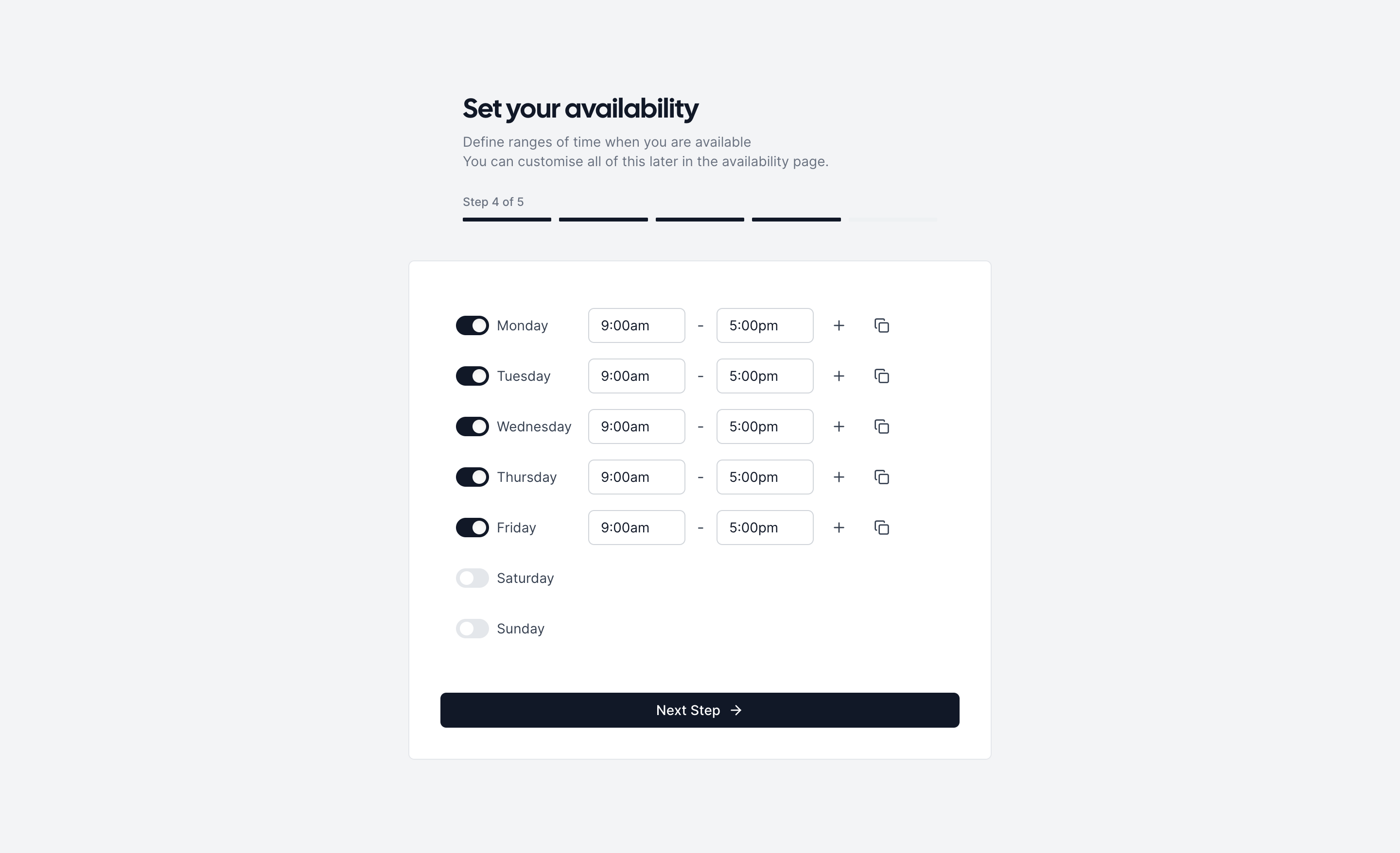


Figma file available
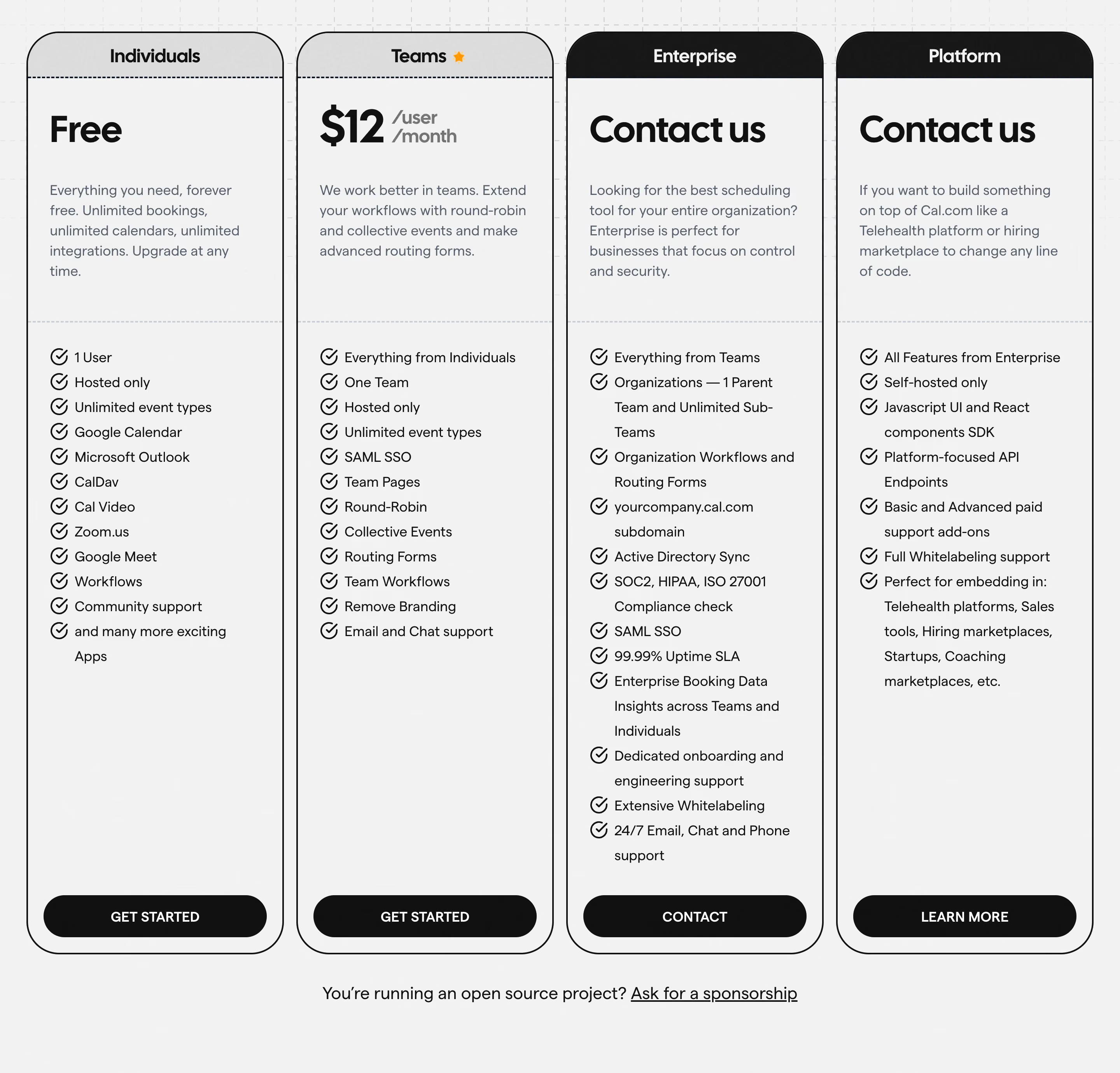


Cal.com is a Next.js (App Router) monorepo built with TypeScript. The UI layer relies on Tailwind CSS v4 (with the @import "tailwindcss" pattern), supplemented by Radix UI primitives, Class Variance Authority (CVA) for variant management, and tailwindcss-radix for state-driven utilities. Components are distributed from a shared packages/ui workspace package. The platform ships a desktop app via ToDesktop, embeddable scheduling atoms via packages/platform/atoms, and a shadow-DOM-safe embed bundle — all consuming the same design-token layer.
Cal.com uses two custom variable typefaces it designed in-house, referenced via CSS custom properties:
--font-cal) — display / heading face. A geometric sans-serif with a distinctive rounded "a". Used for hero text and marketing headings.--font-sans) — UI body face. High-legibility, optimised for dense scheduling interfaces.Font smoothing is enabled globally (-webkit-font-smoothing: antialiased, text-rendering: optimizeLegibility). Button text is consistently text-sm font-medium (14 px, weight 500). Scale variants in Button: xs → 12 px, sm/base → 14 px, lg → 14 px with larger padding.
Cal.com uses a semantic HSL token system with two tiers:
--cal-bg, --cal-text, --cal-border with four intensity levels each: emphasis / default / subtle / muted.-subtle (tinted backgrounds) and -emphasis (vivid accent) variants.The brand color in light mode is near-black (hsl(221, 39%, 11%)), and flips to white in dark mode — enabling a single --cal-brand variable to power both themes without conditional logic at the component level. Visualization palette covers 7 distinct hues for charts and calendars.
Spacing follows the default Tailwind 4-point grid (1 unit = 0.25 rem = 4 px). Padding conventions observed in components: buttons use px-2.5 py-2 (base), px-3 py-2.5 (lg), p-2 (xs). Layout sections use 4 / 6 / 8 / 12 / 16-unit steps. A custom stack-y-_ utility recreates Tailwind v3 space-y-_ semantics for backwards compatibility during the v4 migration.
Buttons default to variant="button", color="primary", size="base", and rounded-[10px] (custom 10 px radius, overriding the global --radius). CVA drives all variant combinations. Key component patterns:
primary (brand-filled), secondary (outline), minimal (ghost), destructive (red outline).button, icon, fab (floating action, responsive).shadow-button-solid-brand-focused box-shadow tokens instead of native browser outlines.--brand-color.The app uses a sidebar + main content layout pattern with a draggable header region on the desktop app. Max-width containers are used for the marketing site. Mobile breakpoint hides chat FABs and adjusts Beacon/Zendesk/Intercom widgets at 768 px. The booking UI is a responsive date picker / time slot grid. RTL (right-to-left) support is implemented via html[dir="rtl"] overrides (e.g., phone flag dropdown repositioning).
/\* ============================================================
   Cal.com Design Token CSS Variables
   Source: packages/config/theme/tokens.css
   ============================================================ \*/

:root,
:host {

  /_ --- Border Radius --- _/
  --radius:      0.25rem;   /_ 4px  — default _/
  --radius-sm:   0.125rem;  /_ 2px  _/
  --radius-md:   0.375rem;  /_ 6px  _/
  --radius-lg:   0.5rem;    /_ 8px  _/
  --radius-xl:   0.75rem;   /_ 12px _/
  --radius-2xl:  1rem;      /_ 16px _/
  --radius-3xl:  1.5rem;    /_ 24px _/
  --radius-none: 0px;

  /_ Button component uses rounded-[10px] = 10px, not a token _/

  /_ --- Background: Standard --- _/
  --cal-bg:           hsla(0,   0%,  100%, 1);  /_ white         _/
  --cal-bg-emphasis:  hsla(220, 13%, 91%,  1);  /_ light gray    _/
  --cal-bg-subtle:    hsla(220, 14%, 94%,  1);  /_ off-white     _/
  --cal-bg-muted:     hsla(210, 20%, 97%,  1);  /_ near-white    _/
  --cal-bg-inverted:  hsla(210, 30%, 4%,   1);  /_ near-black    _/

  /_ --- Background: Primary --- _/
  --cal-bg-primary:          hsla(214, 30%, 16%, 1);
  --cal-bg-primary-emphasis: hsla(220, 6%,  25%, 1);
  --cal-bg-primary-muted:    hsla(220, 14%, 94%, 1);

  /_ --- Background: Semantic --- _/
  --cal-bg-semantic-info-subtle:        hsla(212, 88%, 97%, 1);
  --cal-bg-semantic-info-emphasis:      hsla(236, 80%, 25%, 1);
  --cal-bg-semantic-success-subtle:     hsla(167, 54%, 93%, 1);
  --cal-bg-semantic-success-emphasis:   hsla(158, 74%, 38%, 1);
  --cal-bg-semantic-attention-subtle:   hsla(34,  100%, 92%, 1);
  --cal-bg-semantic-attention-emphasis: hsla(15,  79%,  34%, 1);
  --cal-bg-semantic-error-subtle:       hsla(0,   93%,  94%, 1);
  --cal-bg-semantic-error-emphasis:     hsla(0,   63%,  24%, 1);

  /_ --- Background: Visualization (7-hue palette) --- _/
  --cal-bg-visualization-1-subtle:    hsla(326, 78%, 95%, 1);
  --cal-bg-visualization-1-emphasis:  hsla(330, 81%, 60%, 1); /_ pink      _/
  --cal-bg-visualization-2-subtle:    hsla(256, 86%, 91%, 1);
  --cal-bg-visualization-2-emphasis:  hsla(256, 85%, 57%, 1); /_ purple    _/
  --cal-bg-visualization-3-subtle:    hsla(217, 87%, 91%, 1);
  --cal-bg-visualization-3-emphasis:  hsla(235, 100%, 63%, 1);/_ blue      _/
  --cal-bg-visualization-4-subtle:    hsla(167, 54%, 93%, 1);
  --cal-bg-visualization-4-emphasis:  hsla(158, 74%, 38%, 1); /_ green     _/
  --cal-bg-visualization-5-subtle:    hsla(55,  97%,  88%, 1);
  --cal-bg-visualization-5-emphasis:  hsla(45,  93%,  47%, 1); /_ yellow   _/
  --cal-bg-visualization-6-subtle:    hsla(34,  100%, 92%, 1);
  --cal-bg-visualization-6-emphasis:  hsla(25,  95%,  53%, 1); /_ orange   _/
  --cal-bg-visualization-7-subtle:    hsla(0,   96%,  89%, 1);
  --cal-bg-visualization-7-emphasis:  hsla(0,   84%,  60%, 1); /_ red      _/

  /_ --- Legacy Background Components --- _/
  --cal-bg-info:       hsla(221, 91%, 93%, 1);
  --cal-bg-success:    hsla(142, 76%, 94%, 1);
  --cal-bg-attention:  hsla(33,  100%, 92%, 1);
  --cal-bg-error:      hsla(3,   66%,  93%, 1);
  --cal-bg-dark-error: hsla(2,   55%,  30%, 1);

  /_ --- Borders --- _/
  --cal-border:           hsla(216, 12%, 84%, 1);
  --cal-border-emphasis:  hsla(218, 11%, 65%, 1);
  --cal-border-subtle:    hsla(220, 13%, 91%, 1);
  --cal-border-muted:     hsla(220, 14%, 94%, 1);
  --cal-border-error:     hsla(0,   96%,  89%, 1);
  --cal-border-booker:    var(--cal-border-subtle);

  /_ --- Text / Content --- _/
  --cal-text:           hsla(220, 6%,  25%, 1);  /_ body text      _/
  --cal-text-emphasis:  hsla(210, 30%, 4%,  1);  /_ headings       _/
  --cal-text-subtle:    hsla(220, 9%,  46%, 1);  /_ secondary text _/
  --cal-text-muted:     hsla(218, 11%, 65%, 1);  /_ placeholder    _/
  --cal-text-inverted:  hsla(0,   0%,  100%, 1); /_ on dark bg     _/

  /_ Text Semantic _/
  --cal-text-semantic-info:       hsla(236, 80%, 25%, 1);
  --cal-text-semantic-success:    hsla(150, 84%, 22%, 1);
  --cal-text-semantic-attention:  hsla(15,  79%,  34%, 1);
  --cal-text-semantic-error:      hsla(0,   63%,  24%, 1);

  /_ --- Brand --- _/
  --cal-brand:          hsla(221, 39%, 11%, 1);  /_ near-black    _/
  --cal-brand-emphasis: hsla(0,   0%,  6%,  1);  /_ darker black  _/
  --cal-brand-text:     hsla(0,   0%,  100%, 1); /_ white on brand _/

  /_ --- Box Shadows --- _/
  --shadow-dropdown:     0px 5px 20px 0px rgba(0,0,0,0.10),
                         0px 10px 40px 0px rgba(0,0,0,0.03);
  --shadow-elevation-low: 0px 1px 1px 0px rgba(0,0,0,0.07),
                          0px 1px 2px 0px rgba(0,0,0,0.08),
                          0px 2px 2px 0px rgba(0,0,0,0.10),
                          0px 0px 8px 0px rgba(0,0,0,0.05);
  --shadow-button-solid-brand-default:
    0px 2px 3px 0px rgba(0,0,0,0.06),
    0px 1px 1px 0px rgba(0,0,0,0.08),
    1px 4px 8px 0px rgba(0,0,0,0.12),
    0px 2px 0.4px 0px rgba(255,255,255,0.12) inset,
    0px -3px 2px 0px rgba(0,0,0,0.04) inset;
  --shadow-button-solid-brand-hover:
    0px 1px 1px 0px rgba(0,0,0,0.10),
    0px 2px 3px 0px rgba(0,0,0,0.08),
    1px 4px 8px 0px rgba(0,0,0,0.12),
    0px -3px 2px 0px rgba(0,0,0,0.10) inset,
    0px 2px 0.4px 0px rgba(255,255,255,0.24) inset;
  --shadow-button-solid-brand-active:
    0px 3px 1px 0px rgba(0,0,0,0.10) inset,
    0px 0px 2px 0px rgba(0,0,0,0.10) inset;
  --shadow-button-solid-brand-focused:
    0px 0px 0px 1px rgba(255,255,255,0.40),
    0px 0px 0px 2px rgba(0,0,0,0.20),
    0px 1px 1px 0px rgba(0,0,0,0.10),
    0px 2px 3px 0px rgba(0,0,0,0.08),
    1px 4px 8px 0px rgba(0,0,0,0.12),
    0px -3px 2px 0px rgba(0,0,0,0.10) inset,
    0px 2px 0.4px 0px rgba(255,255,255,0.24) inset;
  --shadow-outline-gray-rested: 0px 2px 3px 0px rgba(0,0,0,0.03),
                                0px 2px 2px -1px rgba(0,0,0,0.03);
  --shadow-outline-gray-focused: 0px 0px 0px 1px rgba(255,255,255,0.20),
                                 0px 0px 0px 2px rgba(0,0,0,0.10);

  /_ --- Animations --- _/
  --animate-fade-in-up: fade-in-up 600ms var(--animation-delay, 0ms)
    cubic-bezier(0.21, 1.02, 0.73, 1) forwards;
  --animate-spinning: spinning 0.75s linear infinite;
  --animate-drawer-slide-left-and-fade:
    drawerSlideLeftAndFade 150ms cubic-bezier(0.16, 1, 0.3, 1);
}

/\* ============================================================
   DARK MODE OVERRIDES  (.dark class on )
   ============================================================ \*/

.dark {

  /_ Background Standard _/
  --cal-bg:           hsla(0, 0%, 6%,   1);  /_ #0F0F0F        _/
  --cal-bg-emphasis:  hsla(0, 0%, 25%,  1);  /_ dark gray      _/
  --cal-bg-subtle:    hsla(0, 0%, 15%,  1);  /_ #262626        _/
  --cal-bg-muted:     hsla(0, 0%, 9%,   1);  /_ #171717        _/
  --cal-bg-inverted:  hsla(0, 0%, 98%,  1);  /_ near-white     _/

  /_ Background Primary _/
  --cal-bg-primary:          hsla(0, 0%, 96%, 1);
  --cal-bg-primary-emphasis: hsla(0, 0%, 64%, 1);
  --cal-bg-primary-muted:    hsla(0, 0%, 15%, 1);

  /_ Background Semantic — dark _/
  --cal-bg-semantic-info-subtle:        hsla(236, 80%, 8%,  1);
  --cal-bg-semantic-info-emphasis:      hsla(229, 90%, 74%, 1);
  --cal-bg-semantic-success-subtle:     hsla(148, 88%, 16%, 1);
  --cal-bg-semantic-success-emphasis:   hsla(158, 74%, 38%, 1);
  --cal-bg-semantic-attention-subtle:   hsla(21,  86%, 8%,  1);
  --cal-bg-semantic-attention-emphasis: hsla(27,  96%, 61%, 1);
  --cal-bg-semantic-error-subtle:       hsla(0,   70%, 8%,  1);
  --cal-bg-semantic-error-emphasis:     hsla(0,   91%, 71%, 1);

  /_ Borders — dark _/
  --cal-border:          hsla(0, 0%, 30%, 1);
  --cal-border-emphasis: hsla(0, 0%, 45%, 1);
  --cal-border-subtle:   hsla(0, 0%, 15%, 1);
  --cal-border-muted:    hsla(0, 0%, 9%,  1);
  --cal-border-error:    hsla(0, 63%, 24%, 1);

  /_ Text — dark _/
  --cal-text:           hsla(0, 0%, 83%,  1);
  --cal-text-emphasis:  hsla(0, 0%, 98%,  1);
  --cal-text-subtle:    hsla(0, 0%, 64%,  1);
  --cal-text-muted:     hsla(0, 0%, 64%,  1);
  --cal-text-inverted:  hsla(0, 0%, 0%,   1);

  --cal-text-semantic-info:       hsla(229, 90%, 74%, 1);
  --cal-text-semantic-success:    hsla(161, 49%, 54%, 1);
  --cal-text-semantic-attention:  hsla(27,  96%, 61%, 1);
  --cal-text-semantic-error:      hsla(0,   91%, 71%, 1);

  /_ Brand — dark (inverted!) _/
  --cal-brand:          hsla(0, 0%, 100%, 1);  /_ white          _/
  --cal-brand-emphasis: hsla(218, 11%, 65%, 1);
  --cal-brand-text:     hsla(0, 0%, 0%,   1);  /_ black on brand _/
}
| Token | Light Value | Usage |
|---|---|---|
--cal-brand | hsl(221, 39%, 11%) — near-black | Primary CTA background, brand identity |
--cal-brand-text | hsl(0, 0%, 100%) — white | Text/icons on brand-colored surfaces |
--cal-brand-emphasis | hsl(0, 0%, 6%) — near-black | Hover state on brand button |
--cal-bg | hsl(0, 0%, 100%) — white | Default page background |
--cal-bg-emphasis | hsl(220, 13%, 91%) | Hover/active surface highlights |
--cal-bg-subtle | hsl(220, 14%, 94%) | Sidebar, card backgrounds |
--cal-bg-muted | hsl(210, 20%, 97%) | Input backgrounds, code blocks |
--cal-bg-inverted | hsl(210, 30%, 4%) | Dark overlays, tooltips on light bg |
--cal-text | hsl(220, 6%, 25%) | Body text |
--cal-text-emphasis | hsl(210, 30%, 4%) | Headings, high-contrast labels |
--cal-text-subtle | hsl(220, 9%, 46%) | Secondary / helper text |
--cal-text-muted | hsl(218, 11%, 65%) | Placeholder text, disabled labels |
--cal-text-inverted | hsl(0, 0%, 100%) | Text on dark/inverted backgrounds |
--cal-border | hsl(216, 12%, 84%) | Default input/card borders |
--cal-border-emphasis | hsl(218, 11%, 65%) | Focused/active borders |
--cal-border-subtle | hsl(220, 13%, 91%) | Dividers, subtle separators |
--cal-bg-semantic-info-subtle | hsl(212, 88%, 97%) | Info banner background |
--cal-bg-semantic-success-emphasis | hsl(158, 74%, 38%) | Success badge/icon fill |
--cal-bg-semantic-attention-subtle | hsl(34, 100%, 92%) | Warning banner background |
--cal-bg-semantic-error-subtle | hsl(0, 93%, 94%) | Error banner background |
--cal-bg-visualization-1-emphasis | hsl(330, 81%, 60%) — pink | Chart series 1 |
--cal-bg-visualization-2-emphasis | hsl(256, 85%, 57%) — purple | Chart series 2 |
--cal-bg-visualization-3-emphasis | hsl(235, 100%, 63%) — blue | Chart series 3 |
--cal-bg-visualization-4-emphasis | hsl(158, 74%, 38%) — green | Chart series 4 |
--cal-bg-visualization-5-emphasis | hsl(45, 93%, 47%) — yellow | Chart series 5 |
--cal-bg-visualization-6-emphasis | hsl(25, 95%, 53%) — orange | Chart series 6 |
--cal-bg-visualization-7-emphasis | hsl(0, 84%, 60%) — red | Chart series 7 |
| Token | Value | Usage |
|---|---|---|
| Button xs padding | p-2 (8px) | Extra-small buttons |
| Button sm padding | px-2 py-1.5 (8px / 6px) | Small buttons |
| Button base padding | px-2.5 py-2 (10px / 8px) | Default buttons |
| Button lg padding | px-3 py-2.5 (12px / 10px) | Large buttons |
| Base spacing unit | 4px (0.25rem) | Tailwind 4-point grid |
| Mobile breakpoint | 768px | Hide chat FABs, responsive layouts |
| Token | Value | Usage |
|---|---|---|
--font-cal | Cal Sans (variable) | Display headings, marketing hero text |
--font-sans | Cal Sans UI / Inter (variable) | UI body text, form labels, buttons |
| Button font size | text-sm (14px) | All button sizes (xs uses 12px) |
| Button font weight | font-medium (500) | All buttons |
| Font smoothing | antialiased + optimizeLegibility | Applied globally on body |
| Token | Value | Usage |
|---|---|---|
--radius | 0.25rem (4px) | Default global radius |
--radius-sm | 0.125rem (2px) | Small chips, tags |
--radius-md | 0.375rem (6px) | Inputs, small cards |
--radius-lg | 0.5rem (8px) | Cards, modals |
--radius-xl | 0.75rem (12px) | Large panels |
--radius-2xl | 1rem (16px) | Feature cards |
--radius-3xl | 1.5rem (24px) | Hero sections, pills |
| Button radius (hardcoded) | 10px (rounded-[10px]) | All standard button shapes |
| FAB button radius | 9999px → md: 10px | Floating action button (mobile full-circle) |
| Token | Value | Usage |
|---|---|---|
--shadow-dropdown | 5px/10px layered rgba blacks | Dropdown menus, popovers |
--shadow-elevation-low | 4-layer subtle black rgba | Cards, floating elements |
--shadow-button-solid-brand-default | Layered + inset highlight | Primary button resting state |
--shadow-button-solid-brand-hover | Elevated + stronger inset | Primary button hover |
--shadow-button-solid-brand-active | Deep inset only | Primary button pressed |
--shadow-button-solid-brand-focused | Outer ring + inner glow | Primary button keyboard focus |
--shadow-outline-gray-rested | Soft 2px spread | Secondary button resting |
--shadow-outline-gray-focused | White ring + black ring | Secondary button keyboard focus |
--shadow-switch-thumb | Tiny dual-layer | Toggle switch thumb |
Framework & Tooling
@import "tailwindcss" entry and @theme inline blocks for token-to-utility mapping.<Icon name="..." /> wrapper component..todesktop-platform-darwin, -win32, -linux).Theme Support
.dark class on <html> — no media-query-only approach.rgba(255,255,255,0.8) / rgba(0,0,0,0.6) frosted glass backgrounds on macOS via transparent windows.tokens.css file, ensuring full design parity for the embeddable booking widget.Data Confidence
packages/config/theme/tokens.css in the public GitHub repo (main branch, July 2025).packages/ui/components/button/Button.tsx), including all CVA variant definitions.--font-cal, --font-sans) and the homepage footer referencing "Cal Sans UI & Text — Our own variable typeface for user interface design."tailwind-preset.js file returned empty from GitHub raw.Notable Patterns
sm/md/lg — they are named by interaction state (-rested, -hover, -active, -focused) and component type (solid-brand, outline-gray, outline-red). This creates highly consistent micro-interactions.emphasis / default / subtle / muted) mirror the background and text scales — a cohesive tri-scale system across all three property types.html[dir="rtl"] overrides.stack-y-_ utility layer recreates Tailwind v3 space-y-_ behavior to ease the v3 → v4 migration.