Generate a new design based on this screen using your own content.
Thank you! Your submission has been received!
Oops! Something went wrong while submitting the form.
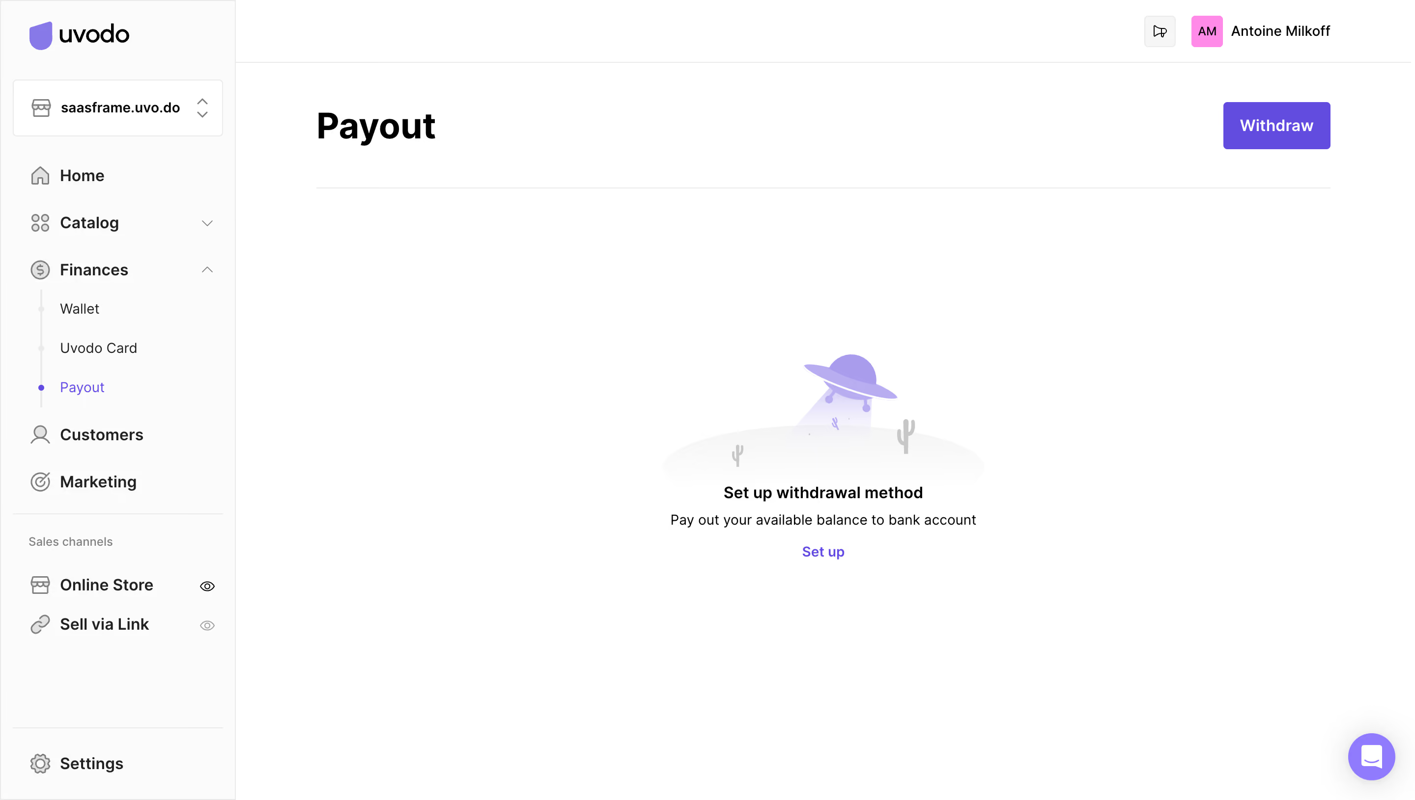
# Design from Reference: Uvodo Empty Payout Dashboard
Create an original, high-fidelity visual design inspired by the reference. Prioritize composition, typography, colors, spacing, and component styling over technical implementation.
## Reference
- **Product:** Uvodo
- **Category:** Empty State
- **Screenshot:** https://cdn.prod.website-files.com/5e9dc792e1210c5325f7ebbc/6acad66ed63d2caea65c63b3_6acad5fef29b80df5f103030_cms-f360cbabbcb38cb2cbf890aa.webp
Analyze the screenshot first. If inaccessible, request it rather than guessing.
## Content
{{content.instructions}}
{{content.data}}
Preserve essential messaging and factual accuracy. Adapt structure and copy length for visual balance; never invent product claims.
## Visual Design
Use this context to reproduce the reference's visual language: layout, typography, colors, spacing, borders, radii, and distinctive elements. The screenshot takes priority if descriptions conflict.
## Direction
{{preferences.fidelityInstructions}}
## Output
{{output.instructions}}
Deliver a polished, cohesive design with precise alignment, hierarchy, and spacing. Produce the requested visual artifact, not just a description. If unsupported, explain the limitation.
This SaaS admin payout page exemplifies a polished, minimalist design with a strong professional edge. The interface prioritizes clarity and ease of use, leveraging generous white space and clean lines to keep focus on actionable content.
Layout and Structure
The layout is highly structured and intuitive, with an accessible sidebar navigation anchoring the experience. The main content area features a sticky header for utility actions and filters, followed by a concise data table that presents user payouts. There’s no hero, testimonials, or overt marketing—this is a no-nonsense, task-focused layout ideal for admin workflows.
Visual Elements
Instead of decorative illustrations or animations, visuals serve function: crisp icons in tables and menus, minimalist button designs, and gentle hover highlights guide user attention. The use of badges, avatars, and status indicators within the table injects subtle color and immediate information at a glance.
Color Palette and Typography
The palette is restrained—predominantly white and light gray backgrounds complemented by deep blue primary actions, muted accent colors for statuses, and attention-grabbing green for success. Font choices skew modern and legible, with size and weight hierarchy ensuring headings and actions stand out without crowding the interface.
User Experience Patterns
Navigation is sticky and ever-present, with a persistent CTA for adding payouts. Filters and search enable efficient data manipulation, while clear, in-context action buttons minimize friction. Microinteractions like row highlights and responsive form behaviors enhance intuitiveness.
Unique or Notable Design Choices
The notable restraint in visual noise empowers users to focus on core tasks. The consistent use of space, alignment, and clear iconography underscores trustworthiness and operational clarity—making this page a standout example for those seeking inspiration in SaaS admin UI design.