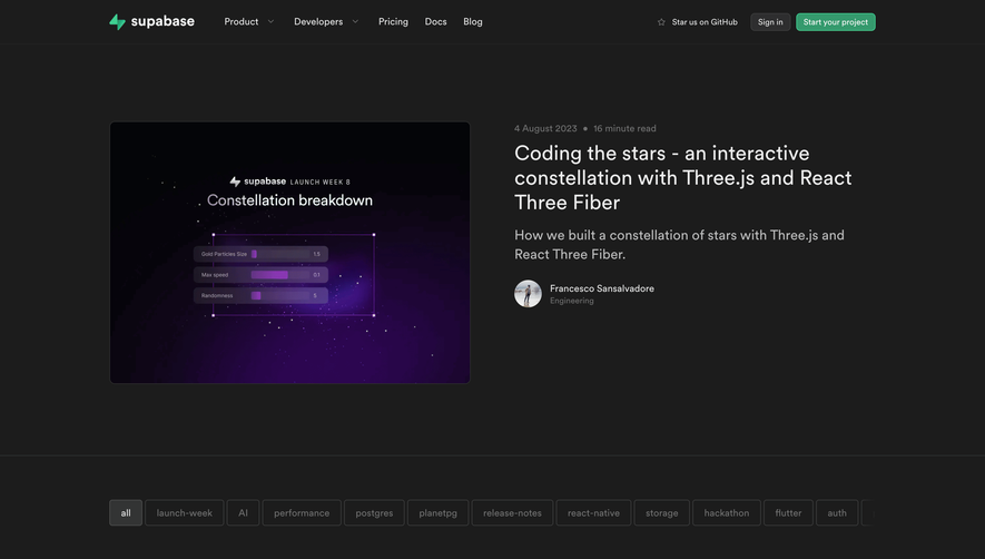
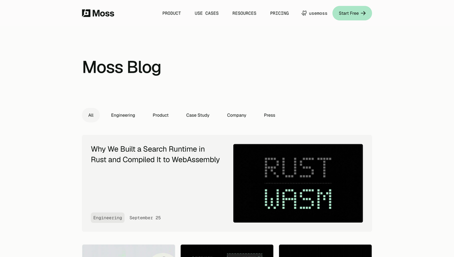
Generate a new design based on this screen using your own content.
Thank you! Your submission has been received!
Oops! Something went wrong while submitting the form.
# Design from Reference: Surfe Blog Feed
Create an original, high-fidelity visual design inspired by the reference. Prioritize composition, typography, colors, spacing, and component styling over technical implementation.
## Reference
- **Product:** Surfe
- **Category:** Blog Feed
- **Screenshot:** https://cdn.prod.website-files.com/5e9dc792e1210c5325f7ebbc/6acc0c3152f808a00f52b0d1_6acc0b832431bf40169114bc_cms-8ce7f53837b8ea3e8c0448de-optimized-v3.webp
Analyze the screenshot first. If inaccessible, request it rather than guessing.
## Content
{{content.instructions}}
{{content.data}}
Preserve essential messaging and factual accuracy. Adapt structure and copy length for visual balance; never invent product claims.
## Visual Design
Use this context to reproduce the reference's visual language: layout, typography, colors, spacing, borders, radii, and distinctive elements. The screenshot takes priority if descriptions conflict.
## Direction
{{preferences.fidelityInstructions}}
## Output
{{output.instructions}}
Deliver a polished, cohesive design with precise alignment, hierarchy, and spacing. Produce the requested visual artifact, not just a description. If unsupported, explain the limitation.
Surfe’s blog page exemplifies a modern, minimalist aesthetic with crisp lines, ample white space, and purposeful pops of vibrant color. The design feels both professional and approachable, balancing clean structure with subtle, playful accents. This results in a polished yet accessible atmosphere well-suited for a SaaS audience seeking both trust and relatability.
Layout and Structure
The layout is straightforward yet effective: a slim hero section introduces the blog with a prominent headline, followed by an organized grid of article cards. The navigation is fixed and streamlined, making content discovery effortless. There’s no clutter—just essential elements, with a clean footer providing secondary links and social touchpoints.
Visual Elements
Rich, custom illustrations embody a friendly, contemporary tone, while dynamic buttons and interactive hover effects offer a tangible sense of movement without overwhelming the page. The use of soft drop shadows and rounded corners adds depth and cohesion. Article thumbnails and author photos contribute both credibility and visual variety.
Color Palette and Typography
Surfe pairs bold blues and oranges for accent with a foundation of white and muted grays, generating contrast and highlighting CTAs. Typography is modern and legible, using sans-serif fonts with clear hierarchy—bold headlines, lighter body text, and highlighted metadata—guiding readers smoothly across the content.
User Experience Patterns & Unique Design Choices
Navigation is frictionless, with sticky menus and cleanly organized categories for easy content browsing. Subtle hover transitions and well-sized click targets enhance usability, while the editorial card grid adapts elegantly across device sizes. Notably, the playful illustration style fused with professional layout establishes Surfe as both innovative and trustworthy—a memorable SaaS blog experience.