
Thank you! Your submission has been received!
Oops! Something went wrong while submitting the form.
Get SaaSFrame Pro
Monthly
$18
Quarterly
$48
Yearly
$180
Upgrade to access this feature
Browse all screens & flows
Filter and search screens & flows
Access Figma files
Access mobile versions
Bookmark screens & flows
Join now
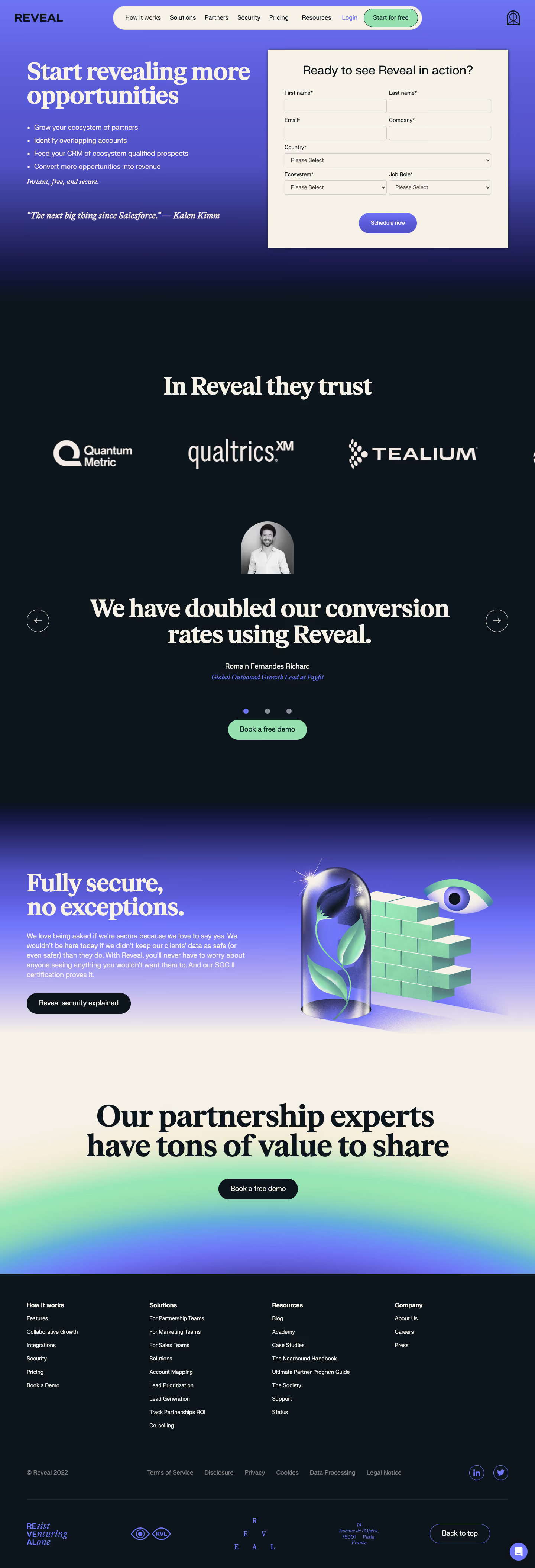

Reveal Demo Request

Reveal
Partnership, Growth, and Sales Ecosystem Solution
Designed by
No items found.

Bookmark
Bookmark

Design with AI
Thank you! Your submission has been received!
Oops! Something went wrong while submitting the form.
# Design from Reference: Reveal Demo Request
Create an original, high-fidelity visual design inspired by the reference. Prioritize composition, typography, colors, spacing, and component styling over technical implementation.
## Reference
- **Product:** Reveal
- **Category:** Demo Request
- **Screenshot:** https://cdn.prod.website-files.com/5e9dc792e1210c5325f7ebbc/6acbbe39476aea3982e3fa59_6acbbd692f4f4a7954382475_cms-8f769e6c292cadd2cec5db09.webp
Analyze the screenshot first. If inaccessible, request it rather than guessing.
## Content
{{content.instructions}}
{{content.data}}
Preserve essential messaging and factual accuracy. Adapt structure and copy length for visual balance; never invent product claims.
## Visual Design
### Overall aesthetic
- **Style:** Expressive demo-request page with bold cream serif headlines, near-black sections, purple gradients and mint conversion accents.
- **Capture scale:** Source 1440 × 4216px. Sizes below refer to the 1200px-wide inspection rendering; underlying CSS scale is unverified.
### Page composition
- **Header:** Reveal branding sits left of a cream navigation capsule; a small outline brand symbol sits far right.
- **Hero:** A two-column purple-to-dark gradient pairs a large promise and benefit bullets left with a cream demo form right.
- **Trust region:** A dark section contains a large centered trust heading, oversized customer logos and a testimonial carousel with portrait, quote, attribution, arrows, dots and demo action.
- **Security:** A purple-to-cream gradient section pairs text with a dimensional illustration of a rose under glass, mint wall and floating eye.
- **Closing:** A centered oversized partnership-expert statement and dark demo pill sit over cream/mint/purple glow, followed by a dark four-column footer and decorative brand strip.
### Information hierarchy
- **Demo proposition:** Start revealing more opportunities precedes four short ecosystem-growth benefits, a brief italic reassurance and a testimonial line.
- **Form:** Ready to see Reveal in action? introduces required first/last name, email/company, country, ecosystem and job-role fields.
- **Proof:** Customer logos lead to a very large testimonial statement; a mint Book a free demo action repeats the conversion path.
- **Security and final action:** Security explanation and a dedicated link precede the final demo invitation.
### Typography
- **Families:** Heavy editorial serif for major headlines and quotes; sans-serif for navigation, form and body; some italic serif accents. Exact font identities are unverified.
- **Display roles:** Hero headline around 54px/54px, testimonial around 56px/58px and final statement around 66px with tight leading at inspection scale.
- **Form roles:** Heading about 28px regular, labels and inputs 12–14px, button label around 12px.
- **Body:** Benefit/security text approximately 16px/22px; footer links around 13px with bold category headings.
### Colors & surfaces
- **Sampled palette:** ICC-aware sRGB samples include dark navy #0C151B, cream #F6F2E8 and mint #95E1B0, with near-dark #0C151C and warm #F6F1E6.
- **Gradients:** Violet/blue transitions into navy in the hero and into cream in the security section; the final conversion area adds a broad mint glow.
- **Contrast:** Cream headings and logos stand out against navy; form text is dark on cream. Purple marks small links, pagination and brand motifs.
### Components
- **Navigation capsule:** Fully rounded cream bar with compact links, violet Login and outlined mint Start for free action.
- **Demo form:** Approximately 540 × 445px cream panel with subtle shadow and small corners. Paired fields share rows; country spans the width.
- **Inputs:** Low-height outlined cream controls, around 32px high, with compact padding and chevrons on selects.
- **Schedule action:** Centered purple-gradient pill, approximately 130 × 46px.
- **Testimonial carousel:** Small grayscale arched portrait above a large centered quote; outlined circular arrows flank it and three dots indicate position.
- **Security artwork:** Glossy/noisy 3D forms contrast with the flat editorial text, using purple and mint lighting.
- **Footer:** Four link groups precede legal/social controls and a lower decorative brand/address row with Back to top.
### Visual rhythm
- **Spacing:** Large vertical gaps separate form, logos, testimonial, security and final conversion, producing a spacious editorial pace.
- **Alternation:** Dense form content contrasts with oversized standalone statements and illustrative regions.
- **Alignment:** Hero halves share a broad grid; later proof and conversion content recenters, while footer columns restore a structured left-aligned layout.
### Responsive
- **Recommended adaptation:** Only desktop is observed. Stack hero copy above the form, convert paired fields to one column and reduce display typography.
- **Media and footer:** Stack security artwork, wrap logos deliberately and collapse footer columns without shrinking legal text.
- **Carousel:** Keep arrows accessible and allow long quotes to wrap naturally.
### Adaptation guidance
- **Preserve:** Keep a clear demo form, strong benefit hierarchy, distinct proof/security regions and repeated but consistent conversion actions.
- **Adapt:** Use genuine customer logos, approved quotes and verified security claims. Replace form options with actual qualification fields and avoid copying historical claims as generic content.
Use this context to reproduce the reference's visual language: layout, typography, colors, spacing, borders, radii, and distinctive elements. The screenshot takes priority if descriptions conflict.
## Direction
{{preferences.fidelityInstructions}}
## Output
{{output.instructions}}
Deliver a polished, cohesive design with precise alignment, hierarchy, and spacing. Produce the requested visual artifact, not just a description. If unsupported, explain the limitation.


Category
Patterns
No items found.
Tech Stack

Added on
February 11, 2023
Similar screens




Upgrade to SaaSFrame Pro now to see similar examples.
Monthly
$18 /month
Billed $18 monthly
Browse all screens & flows
Filter and search screens & flows
Search text in screenshots
Access Figma files
Access mobile versions
Join now
Quarterly
$16 /month
Billed $48 quarterly
Browse all screens & flows
Filter and search screens & flows
Search text in screenshots
Access Figma files
Access mobile versions
Join now
Yearly
$15 /month
Billed $180 yearly
Browse all screens & flows
Filter and search screens & flows
Search text in screenshots
Access Figma files
Access mobile versions
Join now