
Thank you! Your submission has been received!
Oops! Something went wrong while submitting the form.
Get SaaSFrame Pro
Monthly
$18
Quarterly
$48
Yearly
$180
Upgrade to access this feature
Browse all screens & flows
Filter and search screens & flows
Access Figma files
Access mobile versions
Bookmark screens & flows
Join now

Prelude Comparison Page

Prelude
Send verification phone messages
Designed by
No items found.

Bookmark
Bookmark

Design with AI
Thank you! Your submission has been received!
Oops! Something went wrong while submitting the form.
# Design from Reference: Prelude Comparison Page
Create an original, high-fidelity visual design inspired by the reference. Prioritize composition, typography, colors, spacing, and component styling over technical implementation.
## Reference
- **Product:** Prelude
- **Category:** Comparison Page
- **Screenshot:** https://cdn.prod.website-files.com/5e9dc792e1210c5325f7ebbc/6acad3a7c2028efdec71afe9_6acad14f286c0f56719bf83a_cms-36885c525078dba6dc24dc56.webp
Analyze the screenshot first. If inaccessible, request it rather than guessing.
## Content
{{content.instructions}}
{{content.data}}
Preserve essential messaging and factual accuracy. Adapt structure and copy length for visual balance; never invent product claims.
## Visual Design
### Overall aesthetic
- **Character:** A long monochrome comparison page with thin architectural grids, black/white actions, schematic illustrations and a strong dark comparison table.
- **Evidence scale:** Original 1971 × 12680 pixels, inspected through seven readable crops. Measurements below refer to the 1400 px-wide inspection scale; actual CSS scale is unverified.
### Page composition
- **Header/hero:** Logo/navigation above split hero with two-line comparison heading, descriptive copy and paired actions left; stacked notification/OTP illustration right.
- **Logo band:** Eleven muted customer marks form two centered rows.
- **Problem narrative:** Two-column bordered region has introductory text left and a long sequence of five illustrated concerns/alternative messages right.
- **Comparison:** Wide black rounded panel contains centered introduction and three-column table with six feature rows.
- **Pricing:** Grid-framed statement, three value columns and a rounded email-pricing request card.
- **Security:** Introductory text column beside a two-by-two feature grid.
- **Migration:** Left benefit stack and right code example, followed by four numbered steps.
- **FAQ/closing:** Eight closed question rows beside a descriptive label, then paired trial/expert actions.
- **Footer:** Rounded white container with logo, five link/social columns and legal row. Blue/black floating utilities repeat at several vertical positions in the captured image.
### Information hierarchy
- **Hero:** Bold comparison heading is the opening landmark; selected phrases in body copy are bold.
- **Concerns:** Large mixed-weight text pairs with pale diagrams of billing, tickets, steps, fraud and a positive alternative.
- **Table:** Logos identify the compared columns; bold feature labels contrast with smaller monospaced values.
- **Sections:** Small muted icon/eyebrow labels sit above centered headings.
- **FAQ:** Bold closed questions and right chevrons imply expandable answers, but no open answer is visible.
- **Actions:** Black sales/pricing controls contrast with white outlined free-trial paths.
### Typography
- **Hero:** Unverified sans-serif, approximately 48 px bold at inspection scale, 56 px line height.
- **Section headings:** Around 30–32 px regular with bold phrase emphasis.
- **Body:** Approximately 16–18 px regular, 26–30 px line height.
- **Diagram/table:** Monospaced-style values around 16–18 px; feature labels roughly 24 px bold.
- **FAQ/footer:** Approximately 14–16 px medium/regular.
- **Tracking:** Mostly neutral, with slightly tight display headlines.
### Colors & surfaces
- **Base:** Measured #FAFAFA and white #FFFFFF.
- **Dark panel:** Black #000000.
- **Code surfaces:** Near-black #161820 and #16161A.
- **Structure:** Pale #EDEDED grids and muted lavender-gray supporting text.
- **Accents:** Red warning/fraud illustrations, bright lime positive illustration details, purple code syntax and blue floating utility.
### Components
- **Buttons:** Rounded pills with small leading icons; black filled sales actions and white outlined alternatives.
- **Hero illustration:** Layered translucent notification cards above four empty OTP boxes.
- **Problem diagrams:** Pale bars, pending ticket rows, sequential steps, red pixel-bug circles and a small celebratory alternative card.
- **Comparison table:** Rounded black shell, thin gray rules, three aligned columns and small crosshair details at grid intersections.
- **Pricing card:** Broad white rounded rectangle with copy left and email field/black Receive Pricing button right.
- **Security grid:** Four white cells with line icons and mixed bold/regular text.
- **Code example:** Dark rounded block with monospaced indented sample and colored syntax.
- **Migration rows:** Number, icon and short action sentence in ruled horizontal rows.
- **FAQ:** Eight approximately 66 px closed rows with fine dividers and trailing chevrons.
- **Footer shell:** Large radius, pale outline and compact links grouped by role.
### Visual rhythm
- **Page frame:** Repeated narrow grid lines align major content, with occasional crosshair marks.
- **Spacing:** Broad 60–100 px intervals separate major sections at inspection scale.
- **Contrast:** Long pale narrative transitions to black comparison, then returns to white grids.
- **Density:** Dense table/FAQ regions alternate with spacious illustrations and centered headings.
### Responsive
- **Observed limit:** Desktop only; smaller behavior is unverified.
- **Recommendation:** Stack split regions and preserve comparison row/column associations through a scrollable table.
- **Forms/code:** Stack pricing fields, keep code scrollable and retain readable FAQ targets.
- **Utilities:** Ensure floating controls do not overlap narrow-screen text.
### Adaptation guidance
- **Retain:** Use a structured sequence from proposition and problems through comparison, pricing, security, migration and FAQ.
- **Implement:** Reuse thin grids, restrained monochrome surfaces and limited semantic accents.
- **Verify:** Confirm fonts, CSS dimensions and current comparative/commercial claims separately; no pricing request, migration or API action was performed.
Use this context to reproduce the reference's visual language: layout, typography, colors, spacing, borders, radii, and distinctive elements. The screenshot takes priority if descriptions conflict.
## Direction
{{preferences.fidelityInstructions}}
## Output
{{output.instructions}}
Deliver a polished, cohesive design with precise alignment, hierarchy, and spacing. Produce the requested visual artifact, not just a description. If unsupported, explain the limitation.


Category
Patterns
No items found.


Added on
January 7, 2026
Similar screens
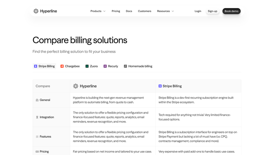



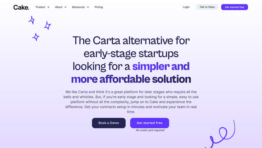

Upgrade to SaaSFrame Pro now to see similar examples.
Monthly
$18 /month
Billed $18 monthly
Browse all screens & flows
Filter and search screens & flows
Search text in screenshots
Access Figma files
Access mobile versions
Join now
Quarterly
$16 /month
Billed $48 quarterly
Browse all screens & flows
Filter and search screens & flows
Search text in screenshots
Access Figma files
Access mobile versions
Join now
Yearly
$15 /month
Billed $180 yearly
Browse all screens & flows
Filter and search screens & flows
Search text in screenshots
Access Figma files
Access mobile versions
Join now